Table of Contents
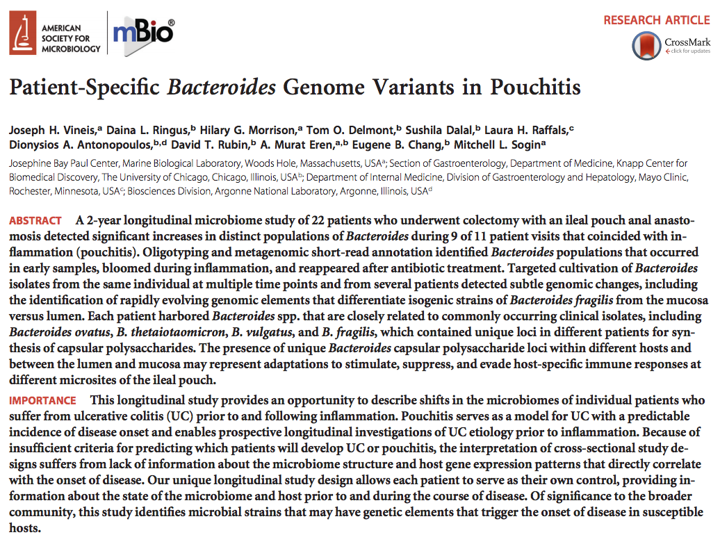
Here is a study that came out just a couple of days ago:
This was a collaboration between the University of Chicago, Argonne National Laboratory, Mayo Clinic, and the Marine Biological Laboratory.
I am writing this post primarily to show how metagenomes for each of the patients in this study can be displayed, and if you like, you can jump directly to the relevant section without losing any time!
My learnings from the Vineis et al. study
The published version of the study already says what we wanted to say as a group of collaborators, but here I would like to share my 2 cents on what I think makes this study interesting:
-
We used metagenomic binning to recover the genomic context of populations that showed epidemiological relevance, and then utilized this high-resolution information to guide cultivation efforts to isolate strains of interest. We managed to cultivate what we saw in the metagenomic data.
-
We identified B. fragilis populations that were highly abundant in multiple of our pouchitis patients during inflammation. These populations occurred in the lumen and mucosal samples, and they were virtually isogenic except a small number of genomic loci, which included capsular polysaccharide biosynthesis pathways.
We look at the same landscape, and see different things, and here is a list of things I saw through this one:
-
I think one of the main reasons we know so little about IBDs is because the experimental and computational approaches we widely rely upon lack proper resolution to facilitate proper investigations of host-microbe interactions (our study does not address this limitation either).
-
Identifying the potential links between these genomic islands and their relevance to the occurrence or progress of disease (or lack thereof) is the real work here, and will not be easy as it will require much more work at the bench side. But seeing the difference between populations of bacteria that harbor lumen and mucosa is the first basic step –which would have not been possible through the use of marker genes profiles, or by mapping shotgun metagenomic data against reference genomes. This is yet another evidence that reconstructing genomes from metagenomes is key.
-
Although I am not negating the importance of looking at every question from every perspective imaginable, this study convinced me that host-microbe interactions are far too complex to be resolved without proper experimentation that also takes the host side into serious consideration.
-
Recruiting larger and larger cohorts into cross-sectional studies without any real plan may not be the most efficient use of our scarce resources.
-
We are not going to win over the complexity of IDBs by playing the numbers game when we are so far from understanding the inner workings of even a single person’s gut ecosystem.
-
Cultivation efforts, and a stronger focus on time-series sampling, are critical. Without these, I can’t see how there can be real progress towards understanding mechanisms.
So there.
Before I continue with the data, I will have another 2 cents on the topic of data availability. This what happens when I don’t write blogs regularly. There is just too much to talk about :/
From fiction to reality: levels of ‘data availability’
I think people who do not make their raw sequence data available are doing a serious disservice to the science community. One of the arguments given to the ones who often complain about this is the “if you send me an e-mail I will make it available to you” argument. Shows the good intention, but it is not really an alternative to making the data public for anonymous access.
Fortunately the importance of providing access to the raw data is largely taken seriously, and many groups are doing their best to make sure they are on the right side of this story. That being said, especially from a practical perspective, having access to the raw data does not necessarily increase the reproducibility of science that much, simply due to the fact that getting the raw data and making sense of it based on the way data analyses are described in methods sections can be quite challenging even for hardcore bioinformaticians.
There are some groups that are putting a lot of effort into reproducible science. Among many who are pushing for it, Pat Schloss is one of the first names that come to my mind. For instance, from obtaining the raw data to generating figures and even generating the paper itself, you can reproduce every step done for this paper by Westcott and Schloss if you simply clone the relevant GitHub repository somewhere on your computer, and run the make file with GNU make after satisfying its basic dependencies. By creating a fork of this repository by the Reproducible Science Curriculum, anyone can start their next publication journey with one of the best practices of modern science. Although there are some available, you are not limited by any specific workflow either, and more ad hoc solutions are welcome, too: for instance, similar to the previous example, you can reproduce all the analyses done for this paper by Daniel J. McGlinn, Xiao Xiao, and Ethan P. White, using this GitHub repository. From snakemake to Nextflow, there are many modern options to achieve this, and every group that takes the hard path to overcome the initial learning curve will likely benefit from it a lot in the long run. In our lab we are envious of those who are good at implementing reproducible workflows, and one of our goals is to catch up with them very soon.
So, the raw data, and a recipe that fully reproduces analyses should definitely be the bare minimum of every study in 2016. But even that will not going to be enough for every study. The way to reproduce analyses can be documented with easy-to-use workflows, but not every project can be equally reproducible to everyone due to practical limitations. For instance, you can re-run Westcott and Schloss data in the background while watching one or two episodes of Black Mirror on Netflix, but if you would like to reproduce the CPR paper from the Banfield group from start to finish, not only you would need a couple of hundred cores in tens of nodes to take care of the assembly, gene calling, annotation, mapping, initial binning, and other steps in a reasonable amount of time, but you would also need a super computer for a couple of weeks to re-run the phylogenomic analysis using concatenated genes. Reproducible science is awesome, but good luck with metagenomics. Even if everything is reproducible in theory, in practice it is really hard to put relevant results out for public screening and criticism.
Going back to the Vineis et al. paper, the “Data Availability” section indeed lists all the relevant accession IDs to get the raw data both for shotgun metagenomes, and 16S rRNA gene amplicons. But again, we co-assembled large datasets, mapped short reads on these contigs, and did binning for each of our 22 patients to recover metagenome-assembled genomes. Expecting anyone to have enough personal and computational resources to do everything we did just to critically evaluate our results would be unrealistic, but the need to make those critical results available for everyone’s evaluation is quite important since metagenomic binning is far from being a well-established endeavor, and there are just too many ways to make mistakes.
But one of the purposes of anvi’o was this from the get go. And we did make our anvi’o merged profiles for each patient available, so anyone can visualize a patient’s metagenome, inspect Joe’s binning effort, repurpose the data for their own study, or simply play with it.
If you are reading these, and using anvi’o for data analysis, I hope you will consider doing the same for your next study.
Displaying a patient metagenome from Vineis et al.
To display the anvi’o merged profile mentioned in this section you will need to have the anvi’o v2.0.2 available to you. If you are not interested in installing anvi’o, you can use the anvi’o Docker image to run it on any major operating system. If you are using anvi’o like a hacker, you can simply go back to the right point in time in the codebase by typing git checkout tags/v2.0.2.
The following address gives access to not only to the high-resolution figures and primary and supplementary tables, but also the anvi’o profiles for each patient:
https://figshare.com/projects/Public_Data_for_Pouchitis_study_by_Vineis_et_al_2016/16140
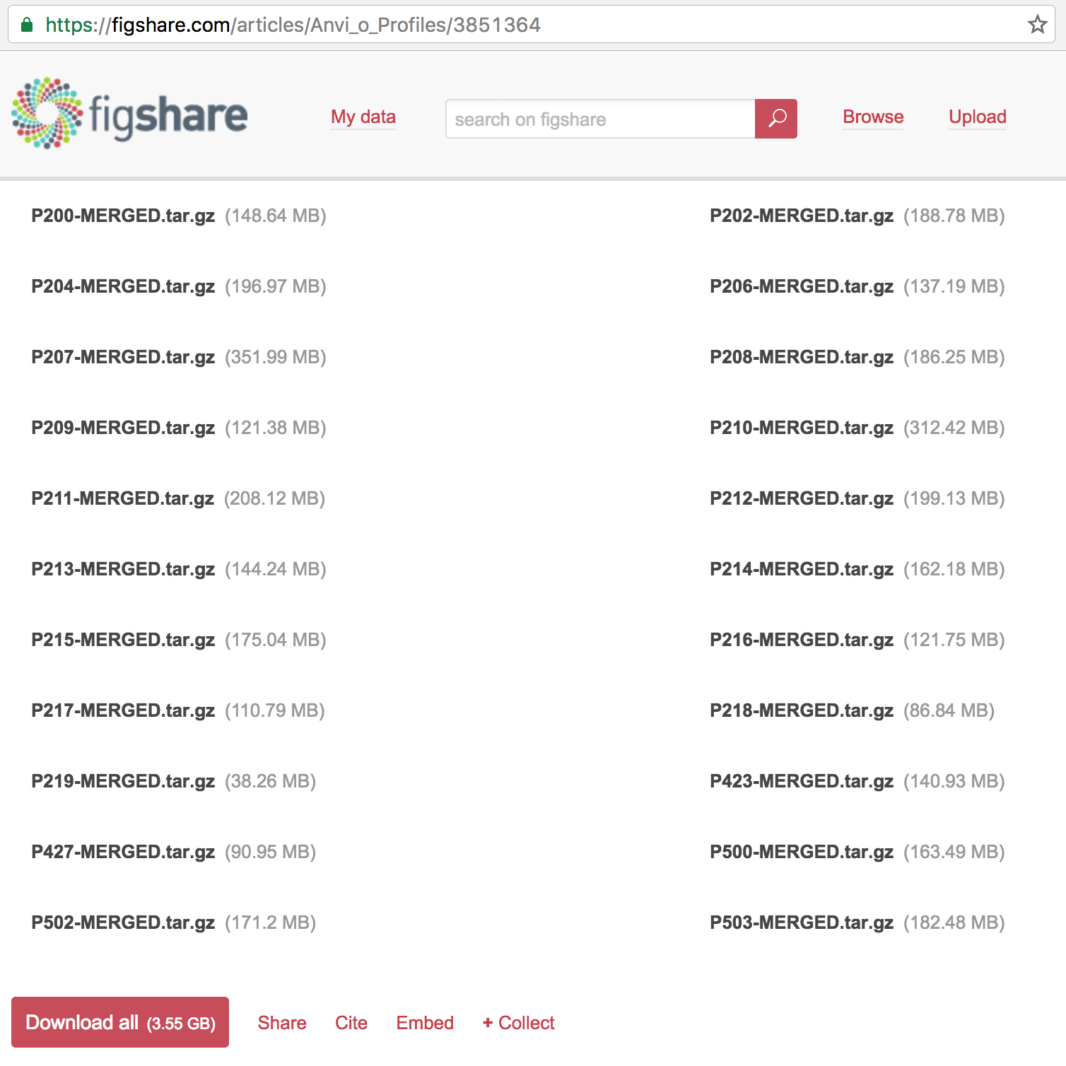
If you click that link you will see that one of the articles in that collection is the anvi’o profiles, which contains 22 items:
You can download everything if you like, but for the sake of simplicity, I will focus only on one patient: the patient 214, which is mentioned in multiple places in Vineis et al., including in the Fig. 3:
You can download the anvi’o profile for P214 and unpack it like this:
$ wget https://ndownloader.figshare.com/files/6035580 -O P214-MERGED.tar.gz
$ tar -zxvf P214-MERGED.tar.gz
$ cd P214-MERGED/
$ ls
AUXILIARY-DATA.h5    CONTIGS.db    CONTIGS.h5    PROFILE.db    RUNINFO.mcp
Once you are here, you can simply run anvi-interactive to initiate the display, and then click Draw to visualize the raw display, load CONCOCT bins, or the very conservative final bins used for the paper. But if you follow these steps, you will have a display that is identical to mine,
$ wget http://merenlab.org/files/P-214-state.json
$ anvi-import-state -p PROFILE.db -n default -s P-214-state.json
$ anvi-interactive -p PROFILE.db -c CONTIGS.db --split-hmm-layers
and see this when you following the last command:
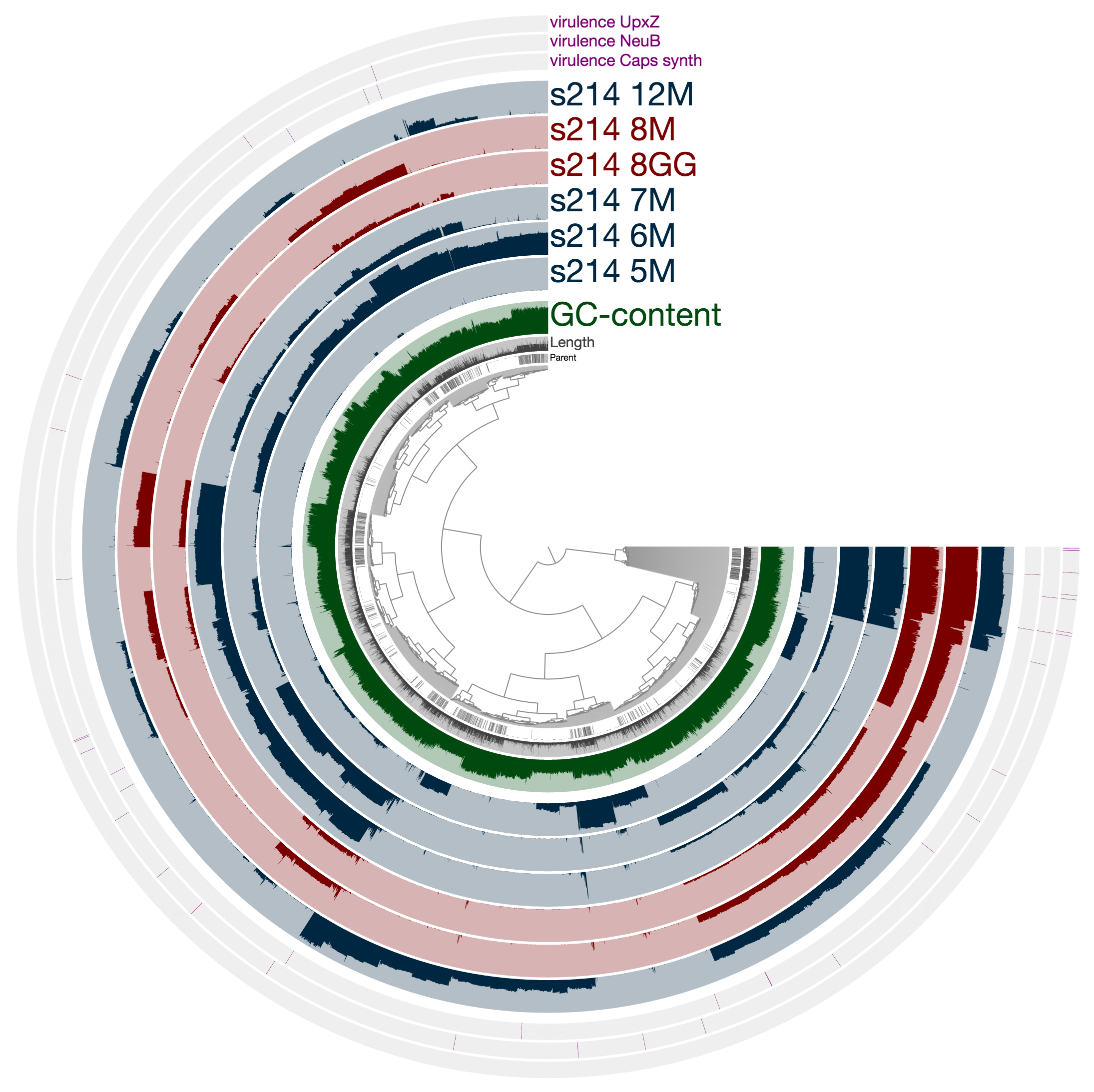
What you see is the metagenome of the patient 214.
Every layer represents a visit, and M and GG postfixes in sample names mark lumen and mucosal biopsy samples, respectively. As you can see, visit 8 has two samples: one lumen sample, and a mucosal biopsy (these details are in the paper, clearly). If you like, you can load CONCOCT bins, or Joe’s final selections using the Bins > Load Bin Collection menu. But I want to give you a bit of insight regarding what you are looking at, and what can you do with it.
Playing with data using anvi’o
If you find a mistake on this page or would you like to update something in it, please feel free to edit its source by clicking the edit button at the top-right corner (which you will see if you are logged in to GitHub) 😇
So what are these profiles good for? What can one do with an anvi’o merged profile?
Well, you can do so very much. I know this is a pretty useless answer to a very important question, but it is kinda true since that is the whole purpose of anvi’o (here is an example from a different context). We implemented anvi’o because we wanted to be able to do a lot with our data. Although, in retrospect, I don’t think we appreciated what a big challenge it was going to be to help people start using it efficiently. It is not easy to get proficient in anvi’o. But if you do, it will likely pay you back.
Yeah, sure, but what can you do with an anvi’o profile anyway? OK, ok. Here I will just give a couple of random examples without any direction in mind.
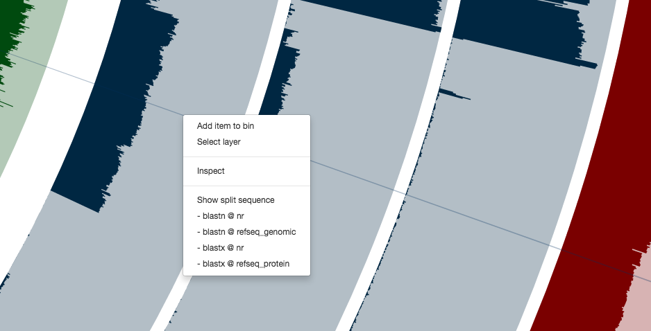
For instance, you can right click any of these contigs,
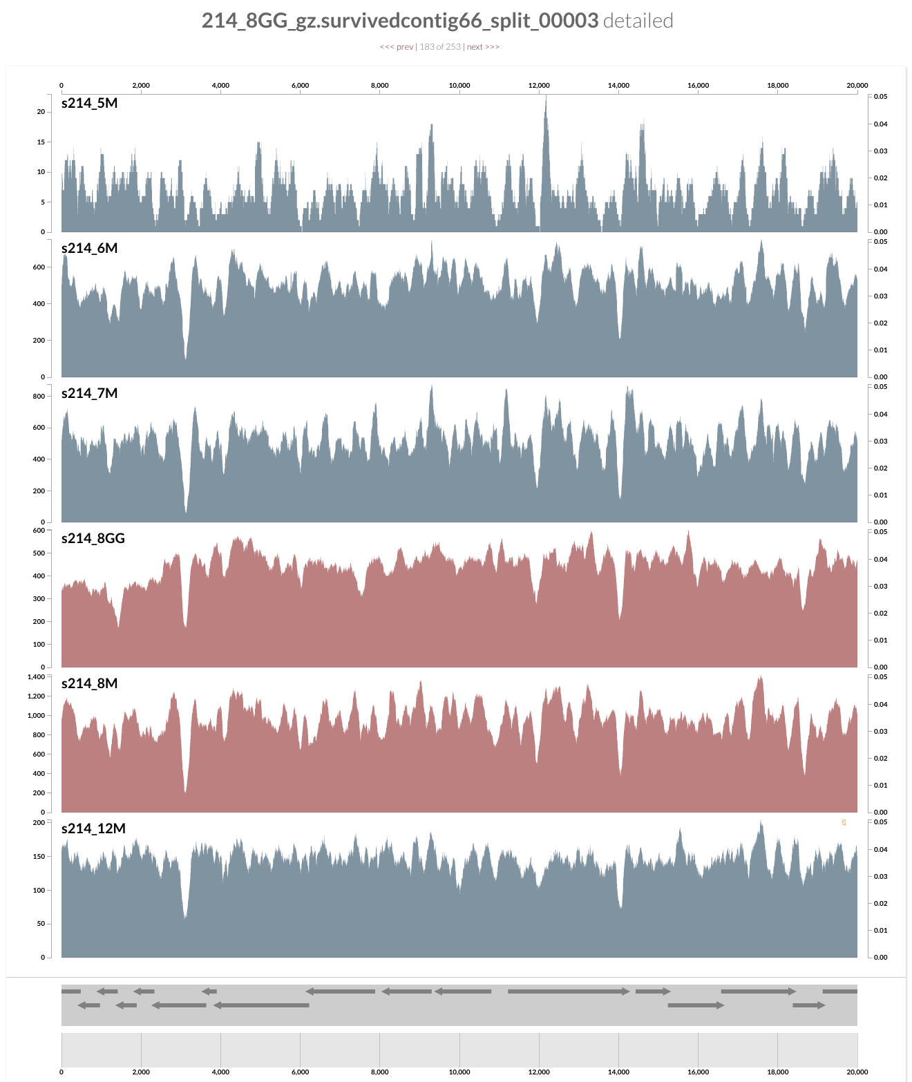
and can see everything at the level of single-nucleotide variants. Here is the inspection page that shows up for a random contig (which likely originates from a Coprococcus population according to a quick search on NCBI):
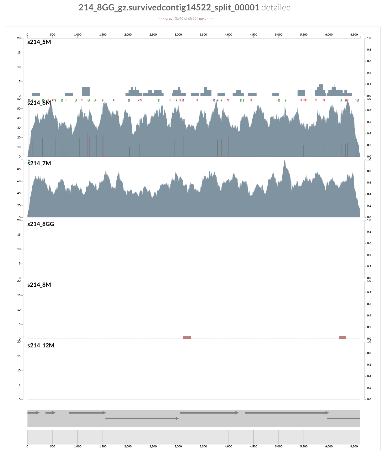
This population is barely detected during any of the visits except the second and third (6M and 7M). What is interesting is that it seems there was a genomic sweep between the two visits: despite the fact that the coverage of this contig does not change between the two visits, the occurrence of single-nucleotide variants change dramatically (look at the full size figure to see them). You can switch to the variability view from the left panel, and explore more genome sweep events. We have a post on this website to demonstrate anvi’o’s profiling capacity to make sense of single-nucleotide variants if you are interested. But now let’s focus on the infamous Bacteroides fragilis population.
If you remember the figure from the paper, the B. fragilis population is the most abundant population for all visits except the first one in the patient 214. So it is not really hard to spot it in this display:
If you zoom into that huge selection, you will see a contig that is sticking out with its coverage:
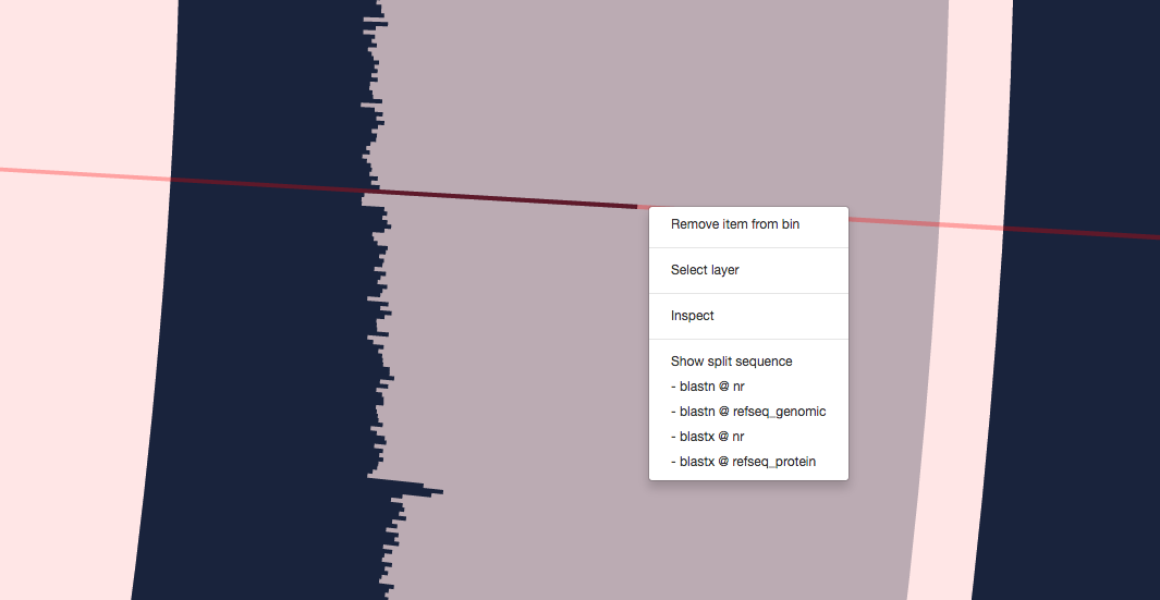
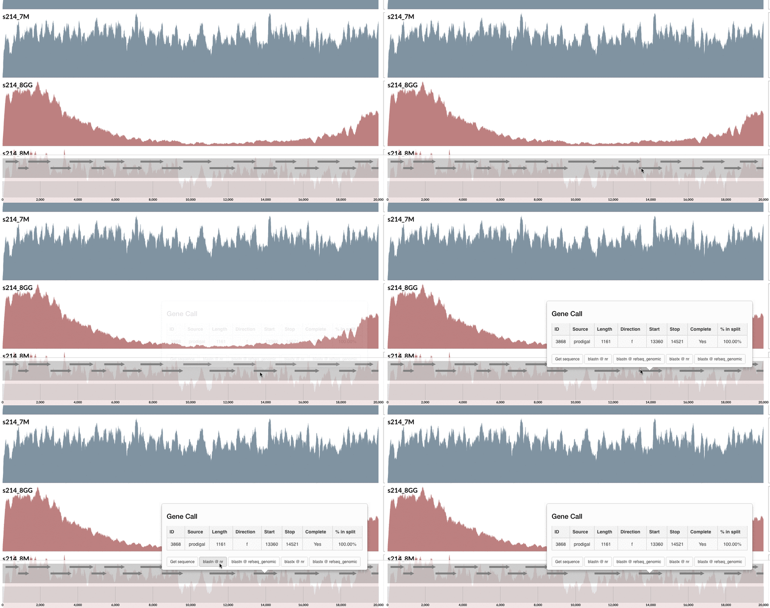
Clicking on the menu item blastn @ nr, I can see it probably is a plasmid:
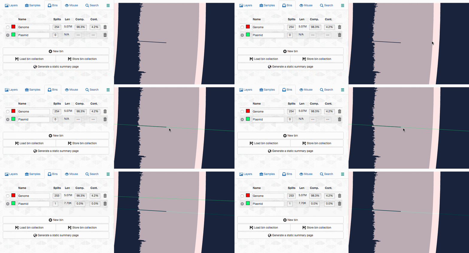
Let’s assume I got curious about the coverage of that plasmid throughout the sampling period with respect to the coverage of the genome. An opportunity to show how we work with collections and anvi’o summaries. First, I create a new bin called “Plasmid”, and then mark it as selected on the Bins tab. Then, I go back to the genome bin, and simply click on that particular contig so it is removed from the genome bin and added to the the ‘Plasmid’ bin:
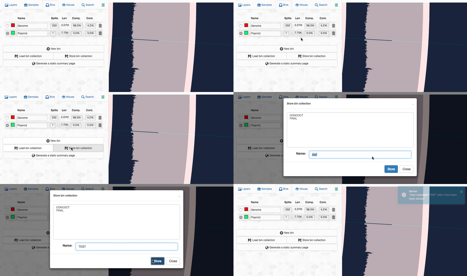
Then I store this collection in the profile database:
So far so good. Now I can go back to my terminal, and summarize this collection:
$ anvi-summarize -p PROFILE.db -c CONTIGS.db -o TEST_SUMMARY -C TEST
Auxiliary Data ...............................: Found: CONTIGS.h5 (v. 1)
Contigs DB ...................................: Initialized: CONTIGS.db (v. 6)
Auxiliary Data ...............................: Found: AUXILIARY-DATA.h5 (v. 1)
Profile DB ...................................: Initialized: PROFILE.db (v. 16)
HTML Output ..................................: P214-MERGED/TEST_SUMMARY/index.html
The index.html file in the resulting directory will have lots of information you may want to see. On the other hand, the directory also contains TAB-delimited files for direct terminal access. One of these files contain the average coverage values:
$ column -t TEST_SUMMARY/bins_across_samples/mean_coverage.txt
bins     s214_12M       s214_5M        s214_6M        s214_7M        s214_8GG       s214_8M
Genome   143.069861566  6.62167777657  500.294292782  528.968981796  410.745986651  969.598027009
Plasmid  1209.59690829  65.2529228371  4744.91036633  5498.59262146  3238.57300598  7485.47869577
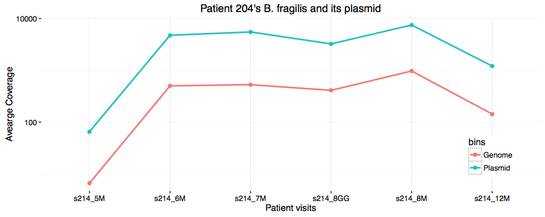
For instance, even though no visualization of this clean data is necessary for trained eyes, one could write an R script and visualize the content of this file. Let’s say I’m the one who writes an R script to do that:
#!/usr/bin/env Rscript
library(ggplot2)
library(reshape)

coverage <- melt(read.table(file = 'TEST_SUMMARY/bins_across_samples/mean_coverage.txt', header = TRUE , sep = "\t" ))
coverage$variable <- factor(coverage$variable, levels = c('s214_5M', 's214_6M', 's214_7M', 's214_8GG', 's214_8M', 's214_12M'))
g <- ggplot(coverage, aes(x=variable, y=value, group=bins, color=bins))
g <- g + geom_line(size=1) + scale_y_log10() + geom_point(size=2)
g <- g + theme_bw() + theme(panel.border = element_blank())
g <- g + xlab('Patient visits') + ylab('Avearge Coverage')
g <- g + ggtitle("Patient 204's B. fragilis and its plasmid")
g <- g + theme(legend.position = c(.9, .2))

pdf('genome_vs_plasmid.pdf',width=10,height=4,paper='special')
print(g)
dev.off()
I save it in my work directory under the file name show_coverages.R, then run chmod +x on it. When I run this script, it generates a PDF file displaying this:
Eh. I guess it is cool to see the strong correlation between the coverage of the genome, and the plasmid. But it definitely would have been cooler if there was no correlation between the two for other reasons. Well. Disappointments make up 95% of science.
Anvi’o collections
‘Collection’ is pretty important anvi’o concept. One can manually curate a collection from their arbitrary selections from the interactive interface. But it is also possible to import collections into a profile database using the program anvi-import-collection. These collections could be ad hoc selections of contigs, or results of an automatic binning software. Then you can run the program anvi-summarize on any collection, and get all the numbers you need to make sense of your data.
One of the most interesting stories in the paper was the presence of unique Bacteroides capsular polysaccharide loci between the lumen and mucosa samples within a single individual. Let’s take a closer look at it using the anvi’o profile.
Since we have the entire genomic selection stored as a bin in a collection (remember this?), using the program anvi-refine we could focus on this particular genome bin instead of the rest of the metagenome. When I run this on my terminal:
$ anvi-refine -p PROFILE.db -c CONTIGS.db -C TEST -b Genome
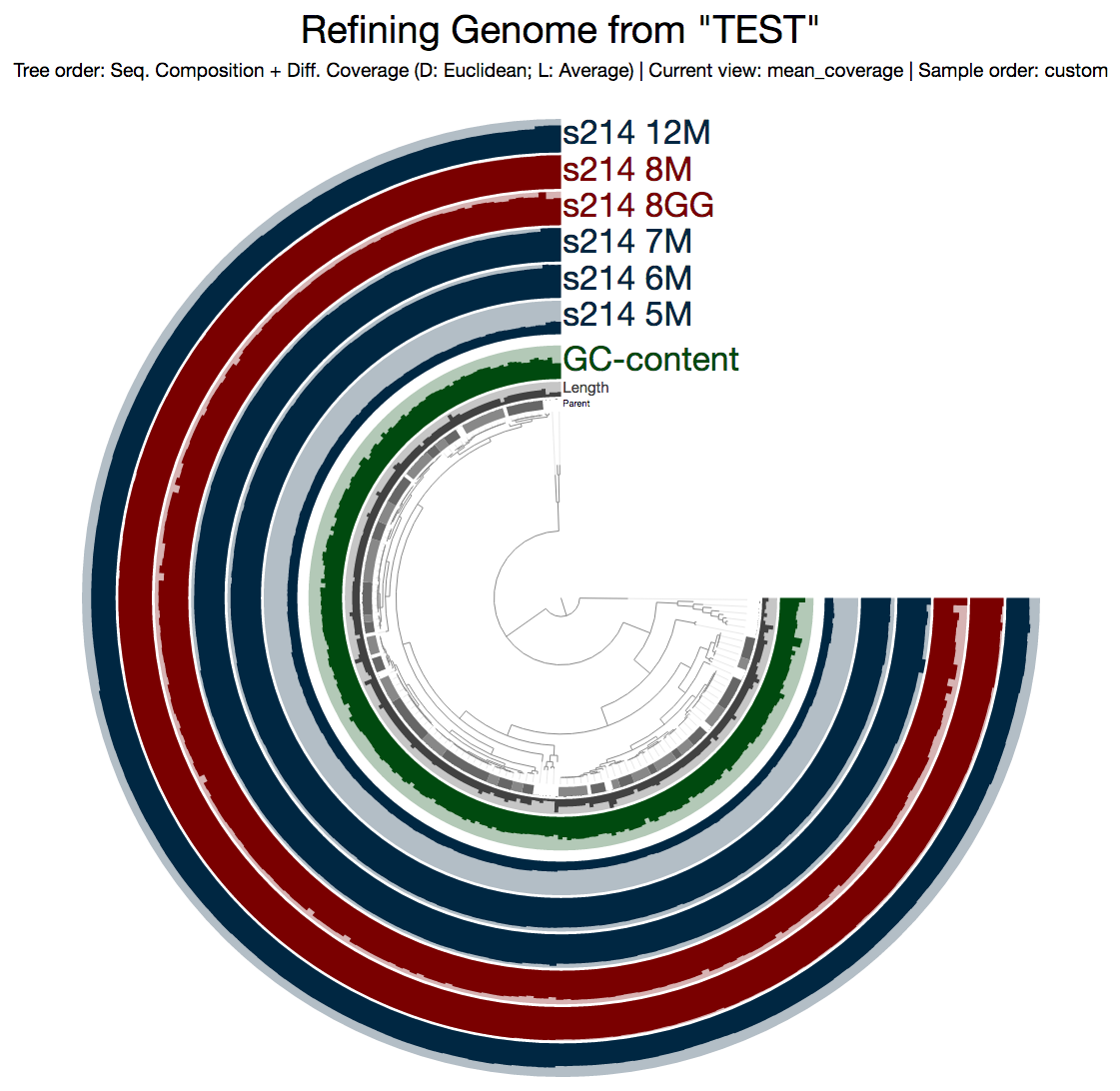
This is what I get:
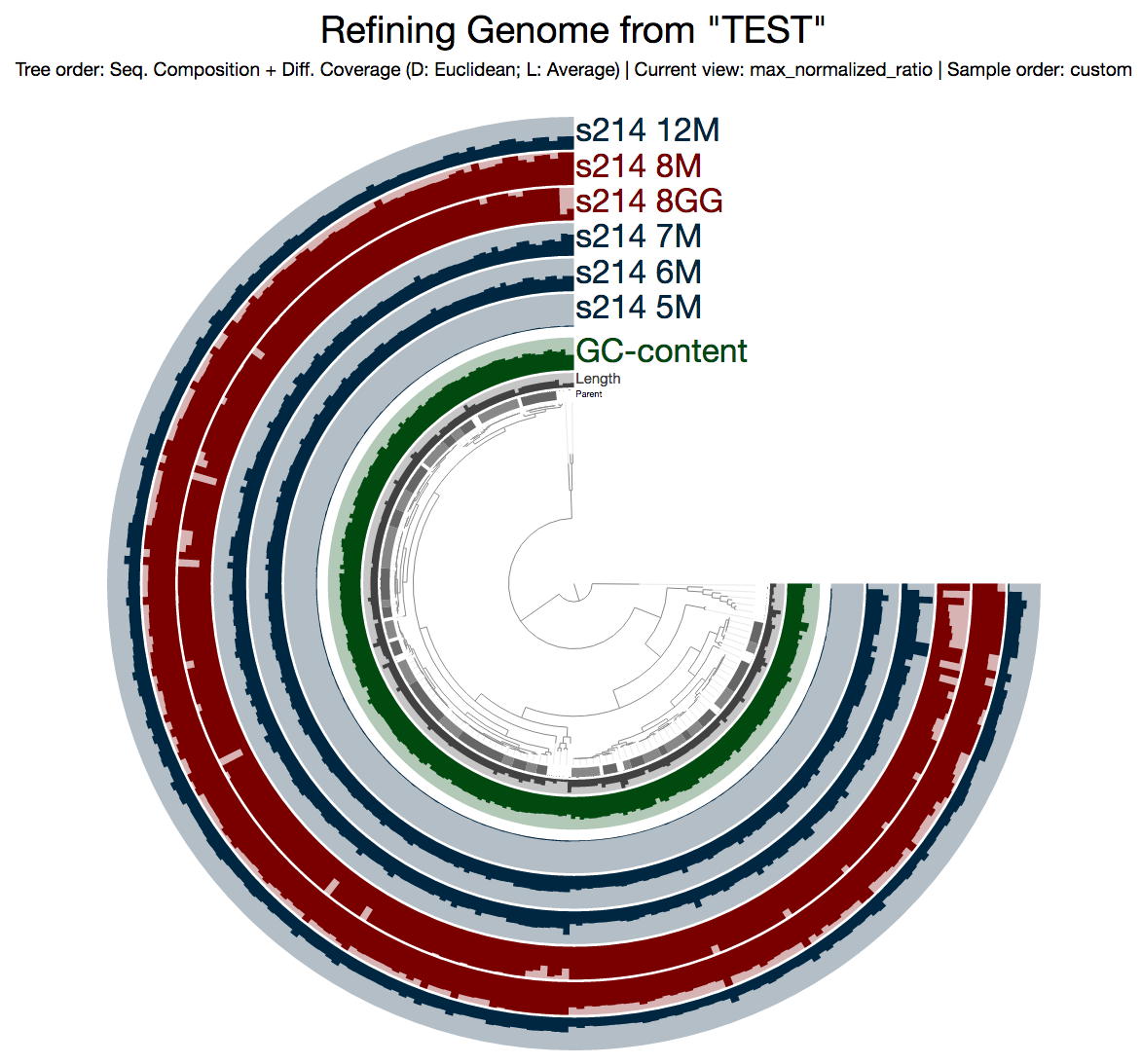
Even from this display, which shows the mean coverage of each contig, you can see some ‘dips’ due to lower amount of coverage. But it is much more striking if you switch to the Max-normalized ratio view, in which, every contig is separately normalized based on their coverage across samples (in the mean coverage view the data are normalized horizontally, in this view, they are normalized vertically, if you will):
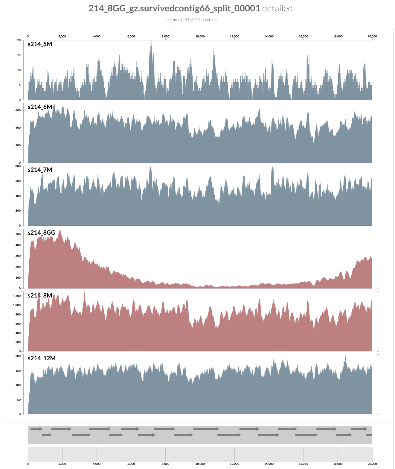
As you can see, the genome is much more covered in samples from inflamed visits (which are shown in red), yet mapping to some contigs from the lumen is missing a large amount of reads compared to the one sampled from lumen at the same time. Here what inspection shows for one of these loci:
And this is the upstream of this contig (I am just clicking next link shown on top):
Pretty intriguing if you ask me.
Are you curious whether one can find these genes anywhere else but our patient’s gut? Well, you can click on one of those guys down there, and take it wherever you like:
I don’t want to ruin it for you, but probably you already know the answer, and here is my 2 cents on that:
I am not a naive person, but I find the uniqueness of the genes in these loci absolutely fascinating. Although this particular B. fragilis population we access through mapping metagenomic short reads from the mucosal biopsy sample is virtually isogenic with the population that originates from the lumen, there are these crazy loci that have nothing to do with the ones in lumen, and here is one of them, right in front of you.
A reproducible science exercise with anvi'o: https://t.co/AYVnjcaQxf #anvio #metagenomics #openscience
— A. Murat Eren (@merenbey) November 22, 2016

