Table of Contents
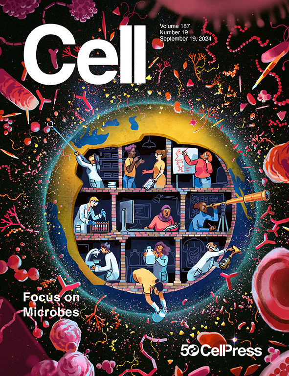
The purpose of this post is to share the story and the evolution of the cover image of the September 16th issue of Cell, which features a review article we wrote on ‘modern microbiology’.
If you are here just to see the cover, click here to jump to the relevant section. The more adventurous route which starts below includes more about the paper, the idea, and the artist.
The Paper
For those of you who may want to take a look at the article first, it is now published here:
- In which we claimed that microbiology is arguably the most important science of the mid-21st century and survived to tell the story.
- This paper was also the cover of Cell's anniversary focus issue on microbes. See this blog post by Meren to see the evolution of the cover.
The first step of this long path that resulted in the publication above was an invitation from Scott Behie, one of the Scientific Editors of the journal, to Jill Banfield. Scott was interested in a review article for the 50th anniversary of Cell, which aimed to highlight some of the recent advances in microbiology as well as the research themes that could be considered as the archetypes of its modern times. Next, Jill kindly asked me whether I would be interested in joining her in this effort. This was indeed a huge responsibility and I don’t do well with huge responsibilities. But I did not hesitate to accept it knowing that I was going to go into this with someone whose science and wisdom has been an inspiration for myself and my group for many years.
As I expected, bringing this work to completion took a lot of time and effort. I admit that a considerable part of my investment into this was a mental one. After all, and as we mentioned in our abstract and introduction without hesitation, it was a daunting task to define and discuss modern microbiology, especially when our attempts to capture its archetypes were certainly going to be incomplete. Hypothetically speaking, doing justice to both axes of this work would have required all scientists of our discipline. Yet we were only two. We did our best thanks to support not only from Scott Behie, but also from our colleagues near and far, including Steve Giovannoni, André Marques, Tom Delmont, Jessika Füssel, Carlotta Ronda, Lin-Xing Chen, Rodolphe Barrangou, Mary Ann Moran, as well as the members of my group (https://merenlab.org/) and colleagues in the Banfield Lab (https://www.banfieldlab.com/).
Our review is now online, and you will be the judge of it.
But I am here to tell you about something else that started once the manuscript was finally accepted for publication. As the title of this post suggests, this is about the cover of the issue in which our manuscript was scheduled to appear.
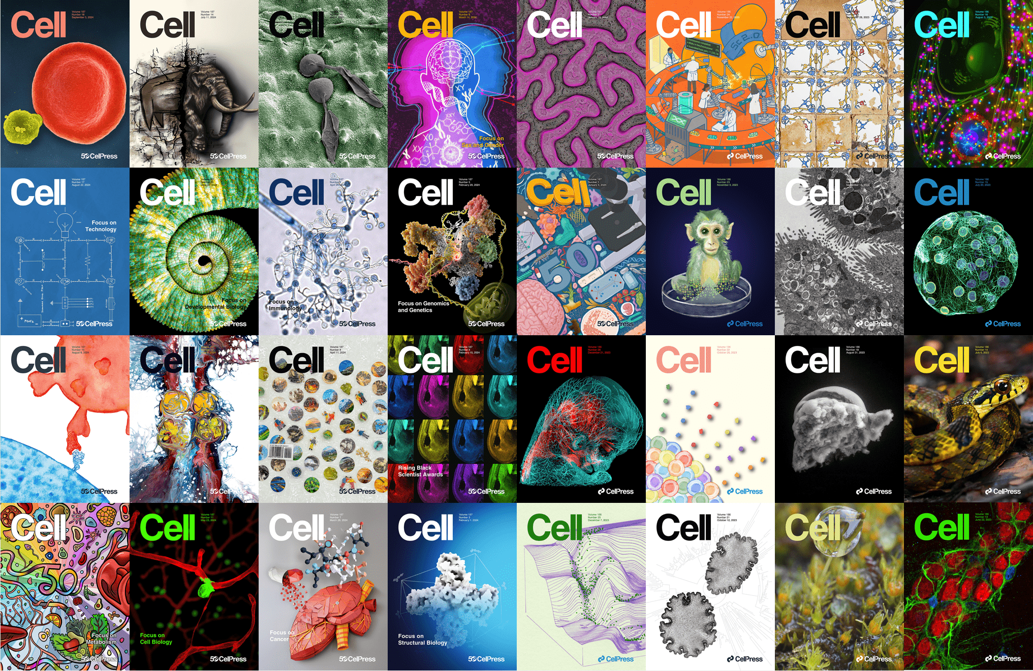
Along with the acceptance letter, we received a kind invitation from our editor to submit a cover image. As most of you probably already know, inviting someone to submit a cover image because they wrote a compelling paper is like inviting someone to try javelin throw at a competition because they looked comfortable carrying multiple grocery bags. In both instances (1) the invitation itself is quite an honor and (2) the likelihood that even your best attempt will not be enough is very high. One way to realize the size of the cover challenge is to take a look at some of the previous covers of Cell:
Printed cover images of Cell between September 5, 2024 and June 22, 2023 (starting from the most recent one).
Each cover is a piece of art. Congratulations to all the editors who managed to set and maintain such a high bar, and all the authors and the artists who were able to pass it. Suggesting that we kindly refuse this invitation (out of fear) was certainly an appealing thought for me. But we enjoyed working on this piece so much, and our editor has been so supportive and understanding of our work and timeline, entering the race with a genuine attempt seemed like the only option here.
I went to Jill first to discuss the idea of pursuing a cover submission, and she gave me the green light to approach artists in an attempt to pull something together. There were a few logistical challenges, though: not only we had less than two weeks until the deadline, but also both Jill and I were going to be in South Africa for the 19th edition of the ISME conference with multiple program responsibilities for the majority of this time. Regardless, the decision was made. I mounted the pressure coming from the previous covers of Cell, and started thinking about how to approach this.
Speaking of ISME
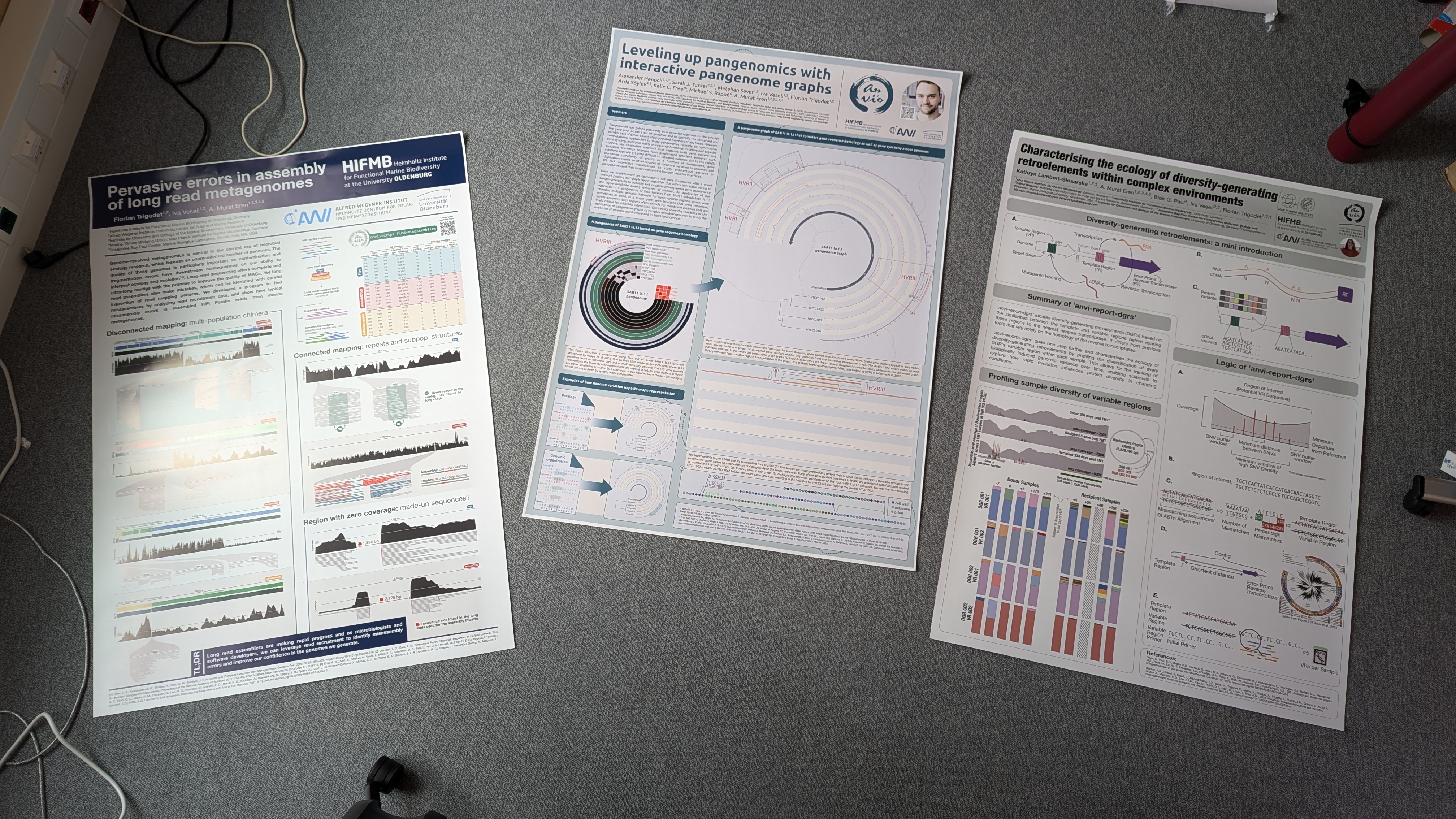
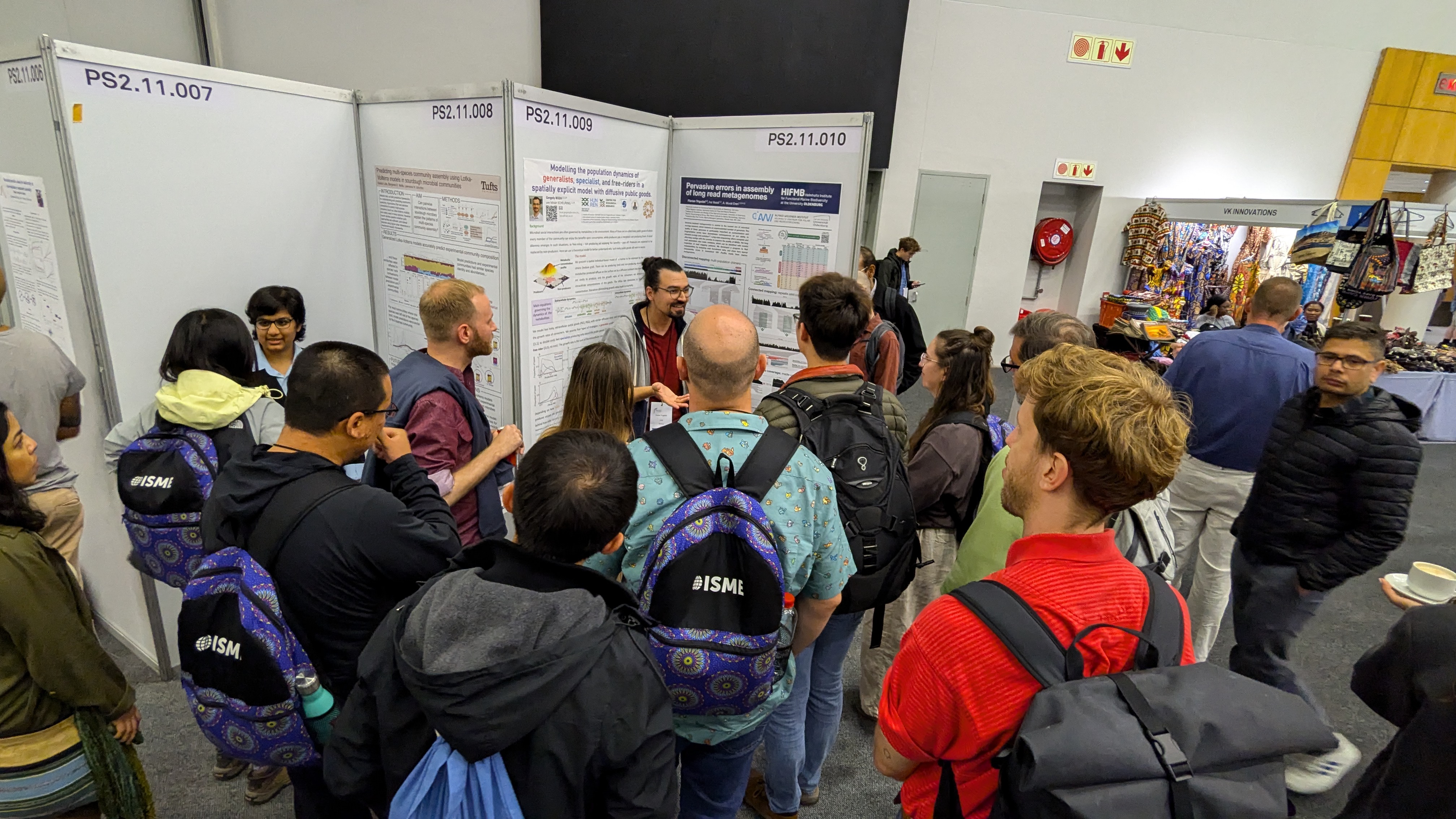
Just a very quick note for posterity, the ISME conference was great. Our group went here with three posters,
Posters by Florian Trigodet et al, Alexander Henoch (Alex) et al, Kathryn Lambert-Slosarska (Katy) et al.
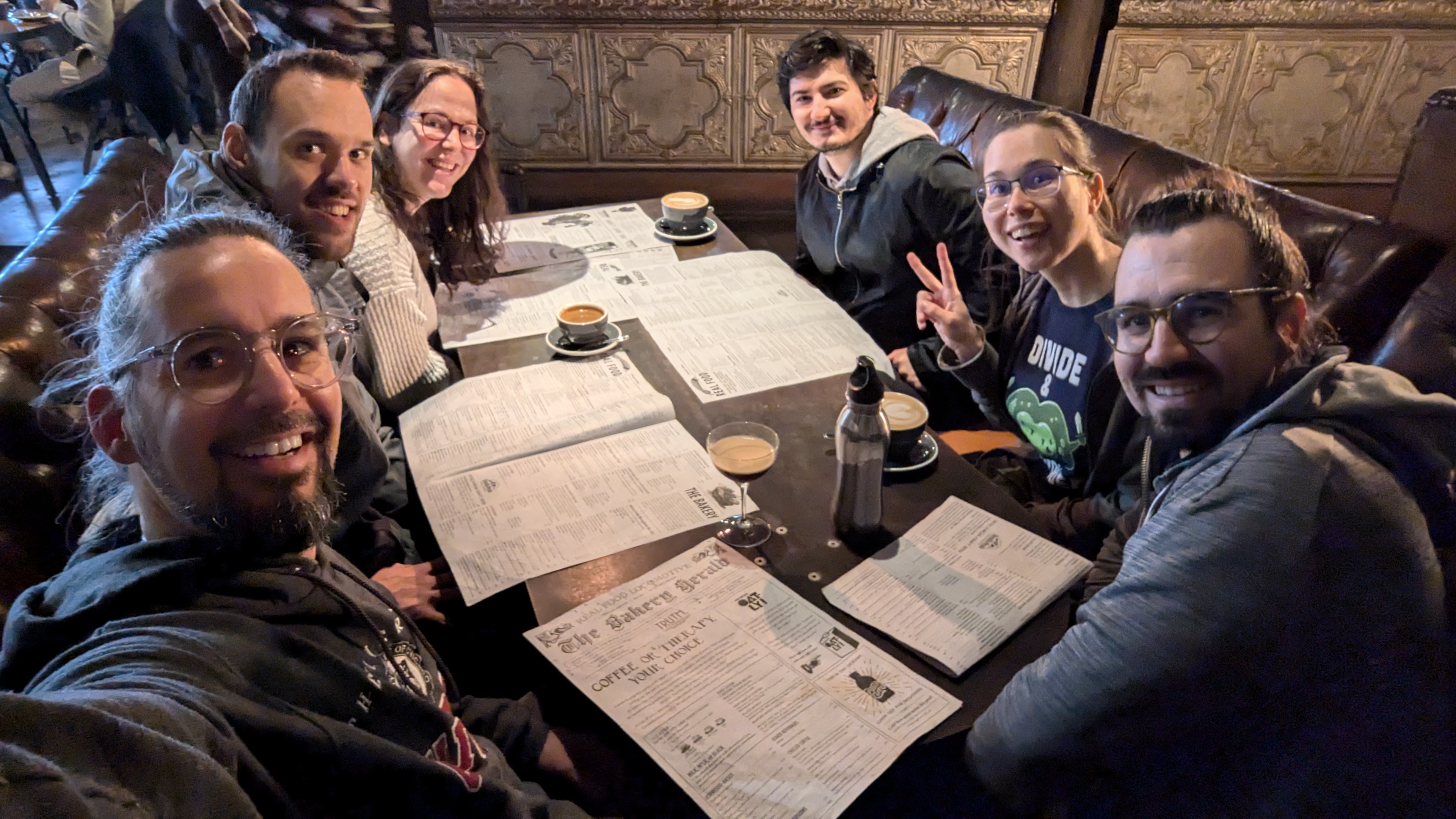
Enjoyed our time together,
Meren, Alex, Katy, Metehan Sever, Iva Veseli, Florian Trigodet.
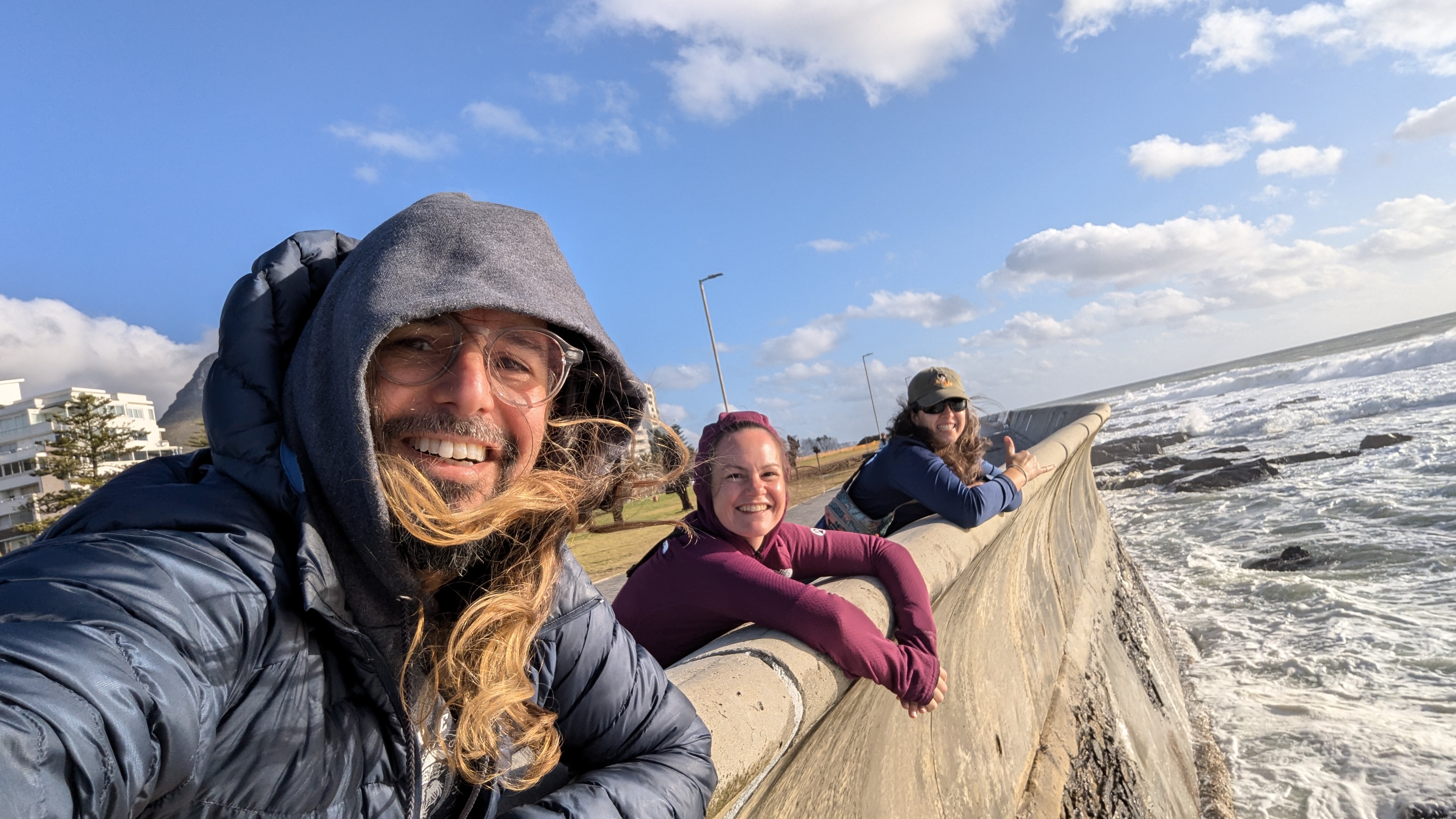
Meren, Sarah Tucker, and Kelle Freel.
and with others,
Florian is explaining how to characterize artifacts in long-read assemblies and their implications.
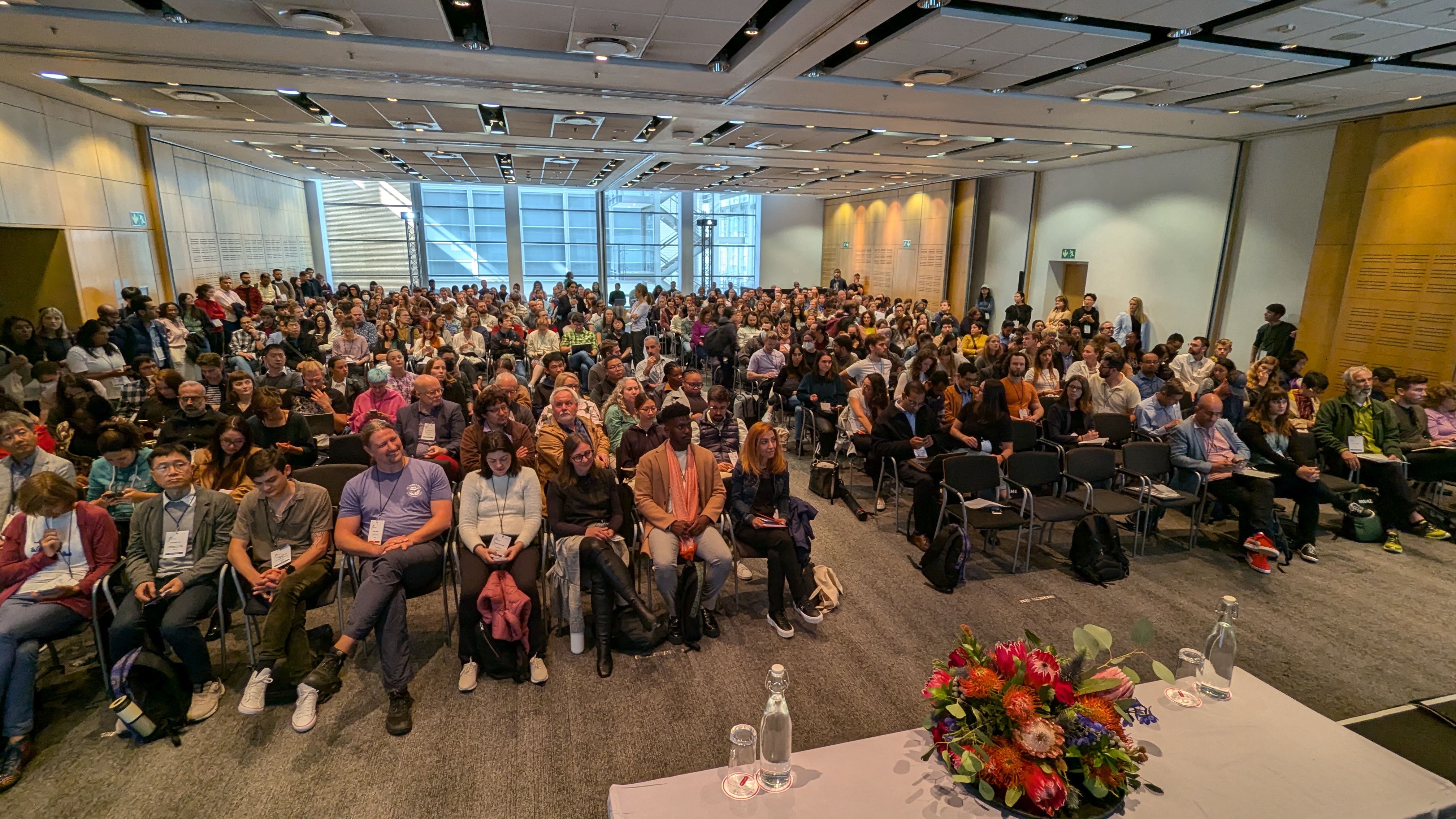
and, Mihaela Pertea (Ela) and I chaired a successful session on ‘Omics in Microbial Ecology:
Attendees of the ‘Omics in Microbial Ecology session which featured a great line of speakers that included Iva Veseli 🇩🇪, Daan Speth 🇦🇹, Esteban Bustos-Caparros 🇪🇸, Leo Lahti 🇫🇮, Libusha Kelly 🇺🇸, Maria Bonatelli 🇩🇪, Daniela Gaio 🇨🇭, Jane Fudyma 🇺🇸, Stephen Blaskowski 🇺🇸, Samuel Miravet-Verde 🇨🇭, Andrew Bissett 🇦🇺, Julia Kelliher 🇺🇸, Oleg Reva 🇿🇦, and Niranjan Nagarajan 🇸🇬.
OK. The cover saga… Even with my nonexistent experience in such matters I could see that working on a cover proposal must have had two major components: (1) finding the right idea, and (2) finding the right person. Since the latter seems to be very much dependent on the former, the first immediate step was to come up with a general idea for the cover – a general idea that offers a solid starting point but leaves room for the artist’s input and creativity.
This obviously was not exactly science. And as someone who has been slowly but surely getting rid of every little colorful aspect of their life to make room for science, I certainly was unfit for this job. But you know, when life gives you javelins, you have to -at least try to- throw them.
The Idea
I did come up with a couple of ideas myself that eventually ended up in the trash bin. While writing these lines I asked myself how honest I really want to be here. And my immediate reaction was to not tell anyone about the trashed ideas, at all. But if you are reading these lines, I also want you to be able to better appreciate the final product and those who contributed it (even if it means that I had to sacrifice myself for it). So I will share them, but we will never talk about this again 🤝
Our review was a celebration of the recent decades of microbiology that accomplished so much in a relatively short amount of time, and that helped us understand the true place and impact of microbes in the past, present, and future of our lonely planet and its inhabitants.
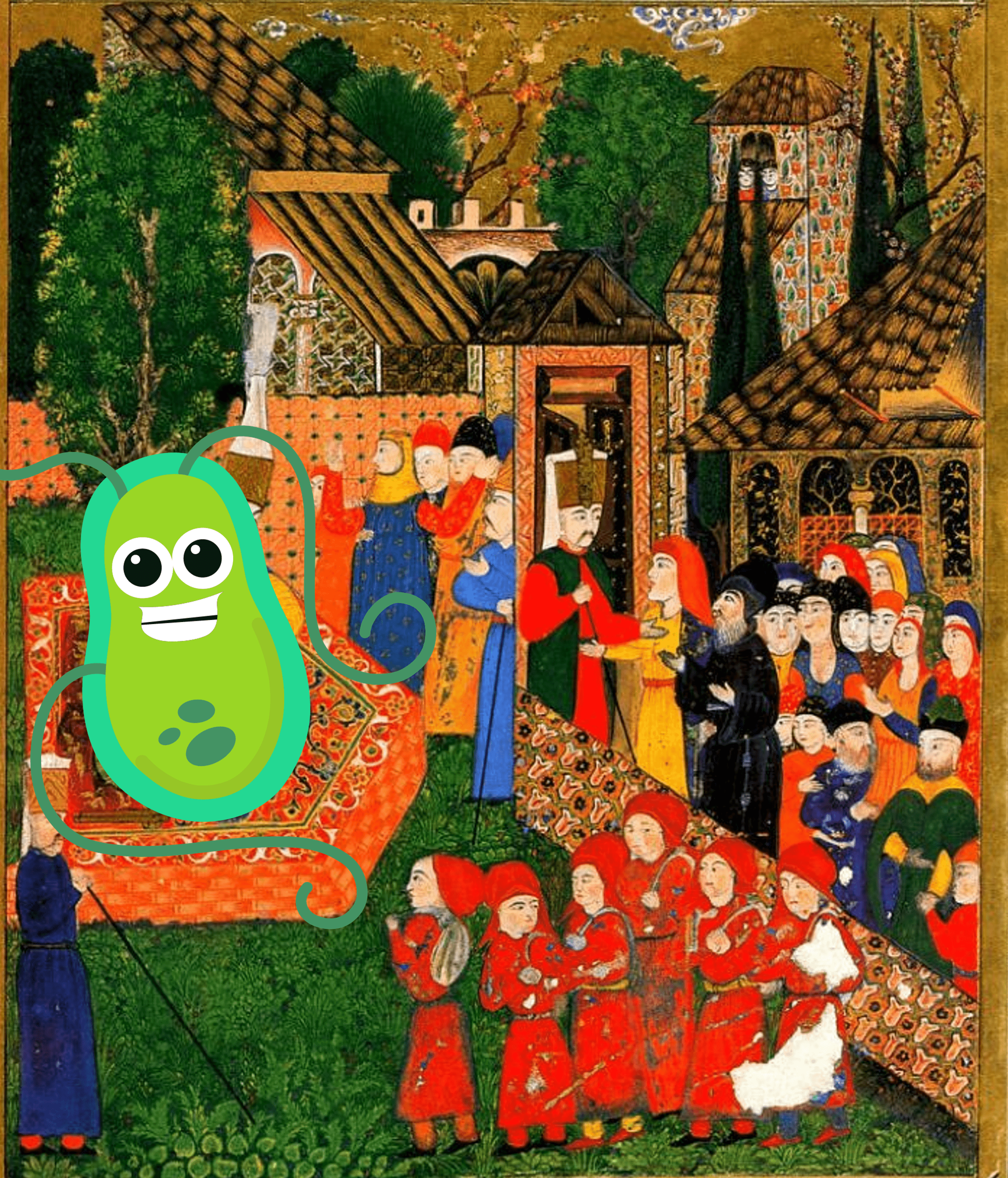
Microbes were absent in the public mind for almost the entirety of human civilization. But things have been changing at a rapid pace in recent times with the recognition that microbes have always been and still are the primary drivers of our functioning ecosystems. So my first idea was to represent the ascension of microbes to that throne through one scientific discovery after another. I thought we could take an Ottoman miniature, like this one,
and simply put a microbial cell into the throne where everyone looks at with awe, hope, and curiosity:
Of course not the clipart above but one that is drawn in the same miniature style, with lots of flair, swag, and mystery – a divine creature, perhaps with a few phages sitting on it, looking kindly at its subjects who admire their grace with all the curiosity and well-deserved attention the subjects could muster. I imagined the audience would include those wearing white laboratory coats, holding standard equipment in microbiology, etc. It is of course not easy to take such an elaborate art style and turn it into what I had in mind, but I thought I could approach Murat Palta, an artist I knew through his modern interpretations of Ottoman miniatures, and see whether he would be willing to work with us on this.
This was one idea. But it wasn’t all ideas I had. I WAS FULL OF IDEAS.
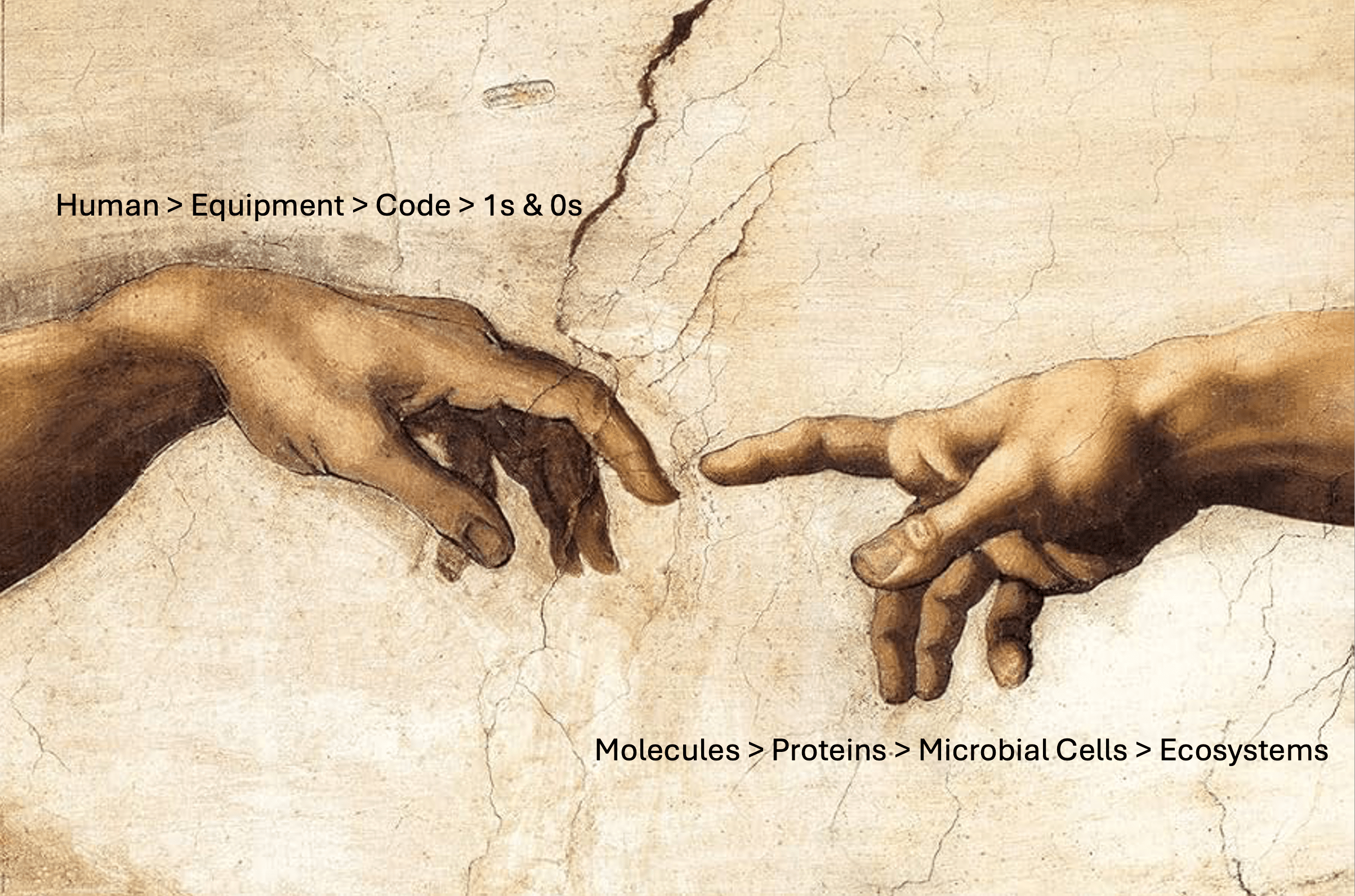
My second and last idea (hehe) was to reinterpret something famous, something everyone was familiar with. I thought -and bear with me here- we could take arguably the most impressive bit of The Creation of Adam (with our sincere apologies to Michelangelo), and redraw it from scratch in a fashion that is technically elaborate but faithful to the original depth of the symbolism, color palette, and drawing style:
In this new drawing the left hand would start as a human arm just like in the original, but quickly turn into fragments of different kinds of equipment we typically use to measure and characterize microbial systems, then to typical laboratory equipment we use to conduct experiments, then to computer code, and finally to 1s and 0s at the fingertips. Meanwhile the right hand would start with molecules at the fingertips, then morph into metabolites, proteins, plasmids, viruses, microbial cells, that finally turn into entire ecosystems at the end.
And this is how I had depleted all the ideas I had about the cover.
On the one hand I was telling myself that these were probably not the worst ideas, but on the other hand I knew for a fact that I was wandering into some very dangerous waters where the line between geeky and cheesy was becoming very very thin. My subconscious self was trying to warn me in my daydreams featuring John Oliver in an episode of Last Week Tonight in which he was reading the ideas I came up with to his audience and at the end he was looking directly at the camera with a poker face to simply say “cool” before moving on to the next topic. So before moving forward with either of these ideas, I decided to consult someone I trust and see if the Jon Oliver that lived in my head was actually onto something. I approached Jessika Füssel, a fellow scientist at the University of Oldenburg who works with Thorsten Dittmar and a close collaborator of our group. I told her what I had in mind.
I’m sure you all found yourself in this situation one way or another: you are telling someone something with excitement, and you see their face start radiating confusion or disapproval, and even though you can’t just stop talking at this point you start feeling bad for them as you can clearly tell that they are doing their absolute best to remain compassionate and engaged while calculating how to tell you what they think without breaking your passion. Well, it was not like that at all with Jessika:
Meren ....: (...) so yeah, I am basically thinking something along
            the lines of an Ottoman miniature, or Michelangelo's
            hands redrawn or somethin’
Jessika ..: Umm. No 😐
Yeah. So that was that. But knowing the scope of this paper through previous conversations about it, she proposed an alternative idea:
How about .. our planet is a home, and microbes are all around it on the outside where they are fixing parts of the house that are falling apart, adding new features to it, or supporting its missing structures, etc. And inside the home there are all kinds of scientists who are looking outside, collecting samples, surveying, and analyzing?”.
I thought about it and simply said to myself, this is it!
The Artist
Having this rough yet intriguing idea at hand, the next challenge was to find the right person who may be interested in working on this.
Not having a lot of connections in Germany, I first approached two of my colleagues who are particularly interested in the art-science interface, Thilo Groß and Antje Boetius, to benefit from their networks in the UK and Germany. I got great advice from both of them, and started writing emails to the artists they had suggested. The clock was ticking, and finding someone who was interested and had time was turning out to be more challenging than I had anticipated in part due to the short deadline for the final submission.
For a few days I was stuck in a cruel pattern: do all the research about a name you were suggested by someone, study their style and previous work, start thinking how they would turn this rough idea into a gem, finally write to them JUST to learn that they are not available, and repeat this cycle with the name they suggest.
The last person I reached out to, who also did not have time to work on this, was also kind enough to advise me to get in touch with another colleague of theirs: Charlotte Hintzmann. I have no expertise in graphics design. But I was immensely impressed by Charlotte’s portfolio which was filled with images of impeccable technique, meaning, and powerful characters. Here is an example that struck me the most and made me think how amazing it would be to have Charlotte take a stab at drawing the characters of modern microbiology:
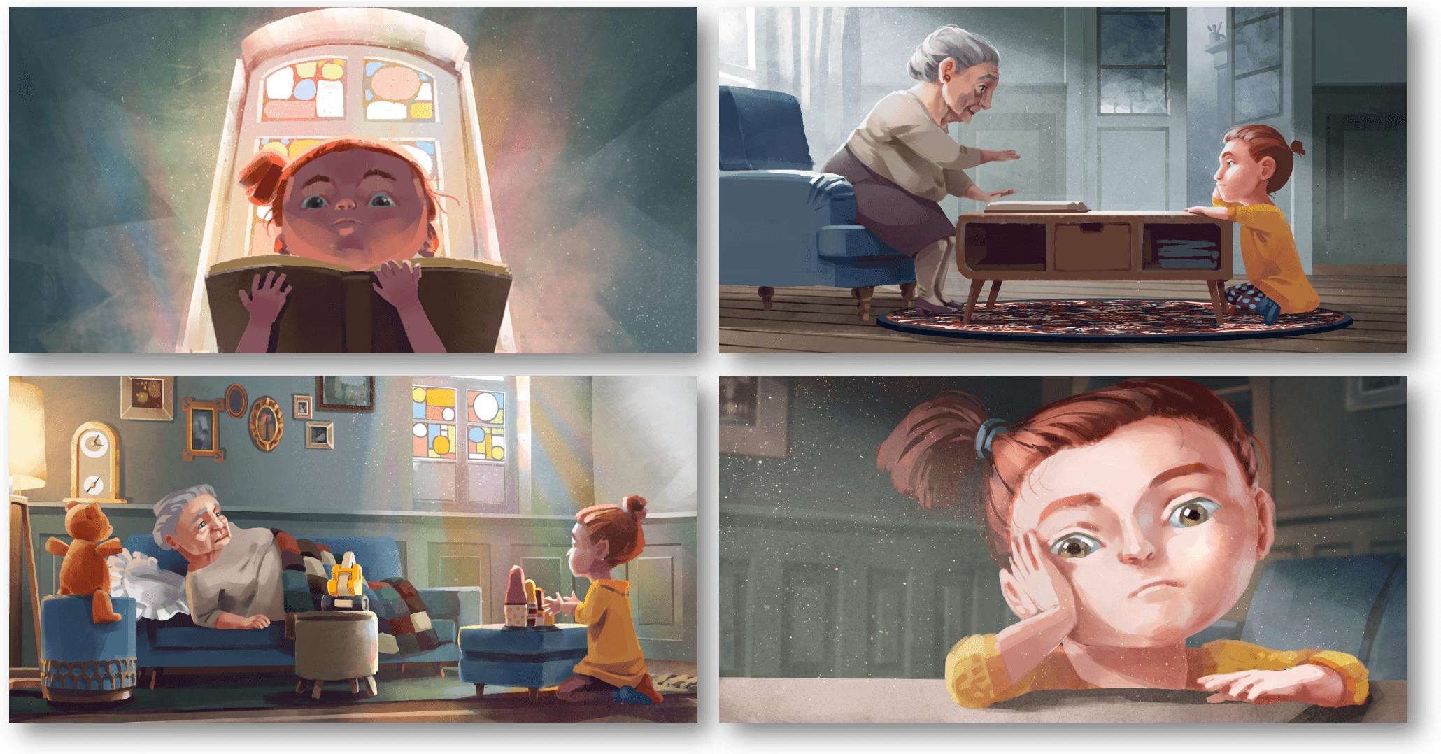
A few still images by Charlotte Hintzmann for the short film The most boring granny in the whole world. See a few more images from this work here.
I wrote to Charlotte one day before I was leaving for the ISME conference, and she quickly responded: “this sounds super interesting, and luckily I’m free at the moment, so I would very much love to work with you on this”. Needless to say, I was extremely happy. But I was also concerned with the fact that we had only a little over 5 days left before the proposed cover had to be submitted. When I mentioned the looming deadline to Charlotte, who was also traveling at the time, she seemed confident that we could pull this off. We were going to jump off this cliff and put our wings along the way.
The Cover
In my initial email to Charlotte, I had described Jessika’s original idea for the cover with slight modifications:
(…) imagine the planet Earth re-interpreted like a house with people inside .. like in Wes Anderson style: in one room there is someone looking outside with a pair of binoculars, in the other there someone sitting in front of a computer screen, in the other room there is someone who is thinking in front of a whiteboard with some formula, in the other one there is a scientist in the lab coat looking through a microscope, in the other one there is someone reaching out of the window to collect some marine or terrestrial samples, etc. The house somewhat resembles the planet on the outside, and it is surrounded by microbes that are creating new features, fixing parts of the house that are falling apart, or supporting its missing structures, etc. The overall message here is “the world is our home, microbes are the architects and wardens of it, and we have been learning so much about them in recent times thanks to advances in microbiology and the dedication of microbiologists” (which includes data scientists, modelers, those who collect samples, those who study microbes in the oceans, in soils, caves, lakes, and in the lab, etc).
Charlotte’s initial reaction to the ‘planet as a house’ idea was a cautious one as it might have turned out visually overcomplicated. She thought we needed a sketch phase of the first draft (planet as a globe) before we proceed to the second phase (planet as a house) to determine not only our color choice but also whether the house idea could work well visually.
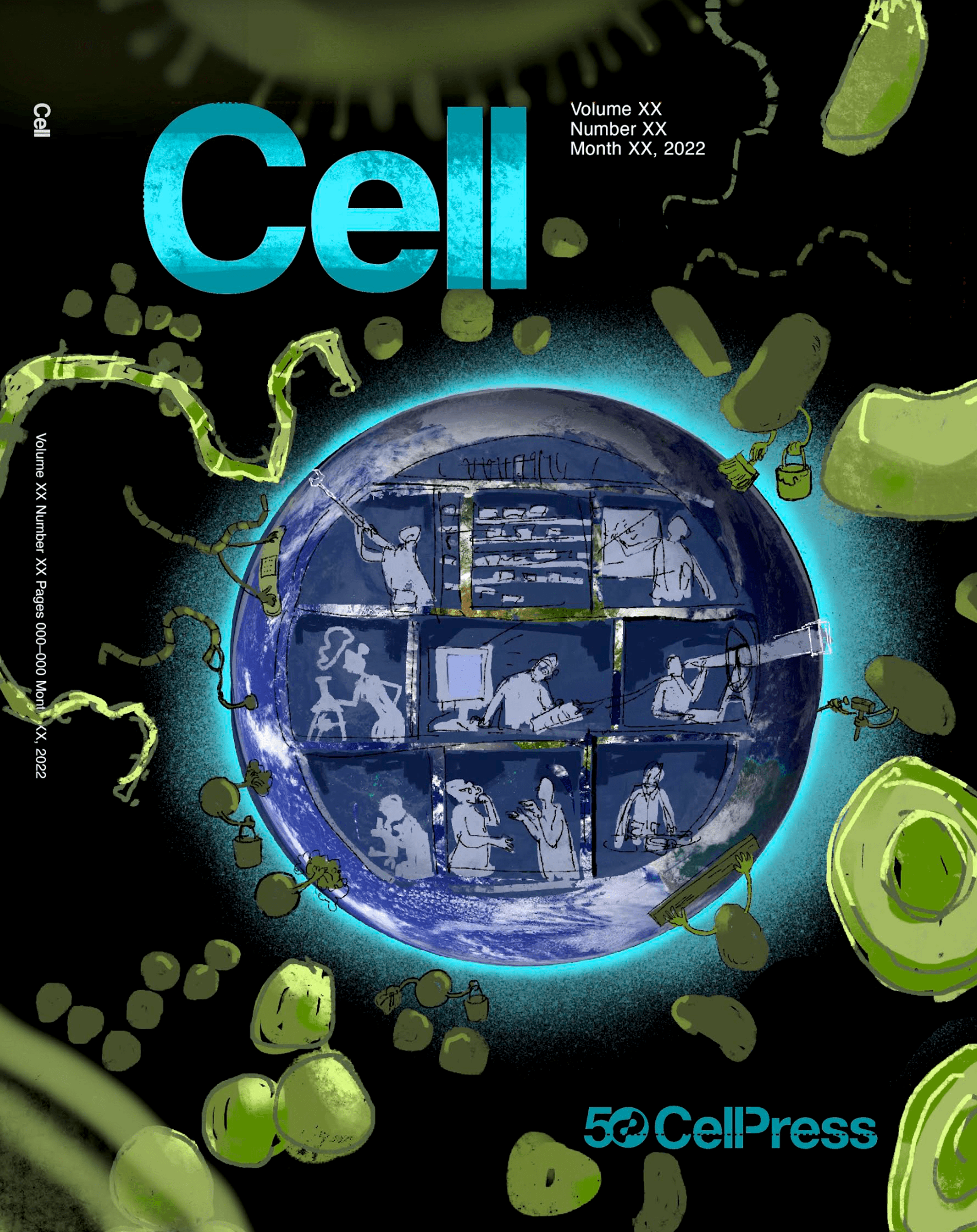
The first sketch from Charlotte came on Tuesday. Just four days before the deadline:
It was a start. There were microbes all around the globe taking care of it in their cute ways, and there were silhouettes of individuals who looked like scientists.
I was immediately concerned that having all the cells in the signature green of cyanobacteria and algae could give the wrong impression that we care only about photosynthetic organisms. They were indeed important, but were they -please don’t cancel me- that important? Charlotte was understanding and mentioned that we could indeed change that color for the next iterations as this was the purpose of the first draft. But to what? What do you even tell an artist who asks you “so what color should microbes be?”. As far as I am concerned, microbes have all the colors of the universe. But Charlotte told me that we could not use all the colors of the universe on a cover :( Because it would risk our cover to come across as cheesy while at the same making it less able to lead the eye through the illustration. In fact, we would better stick mostly with a single color for a cohesive visual image. Luckily, Charlotte suggested the one color for which I have an extremely clear preference for in any circumstance anyway: pink. So that was that.
Apart from the general color scheme, the goal of the next iteration was to test the ‘planet as a house’ idea visually. With an arctic roof, an ocean bottom, and so on. Maybe a bit in the style of the house in Howl’s Moving Castle.
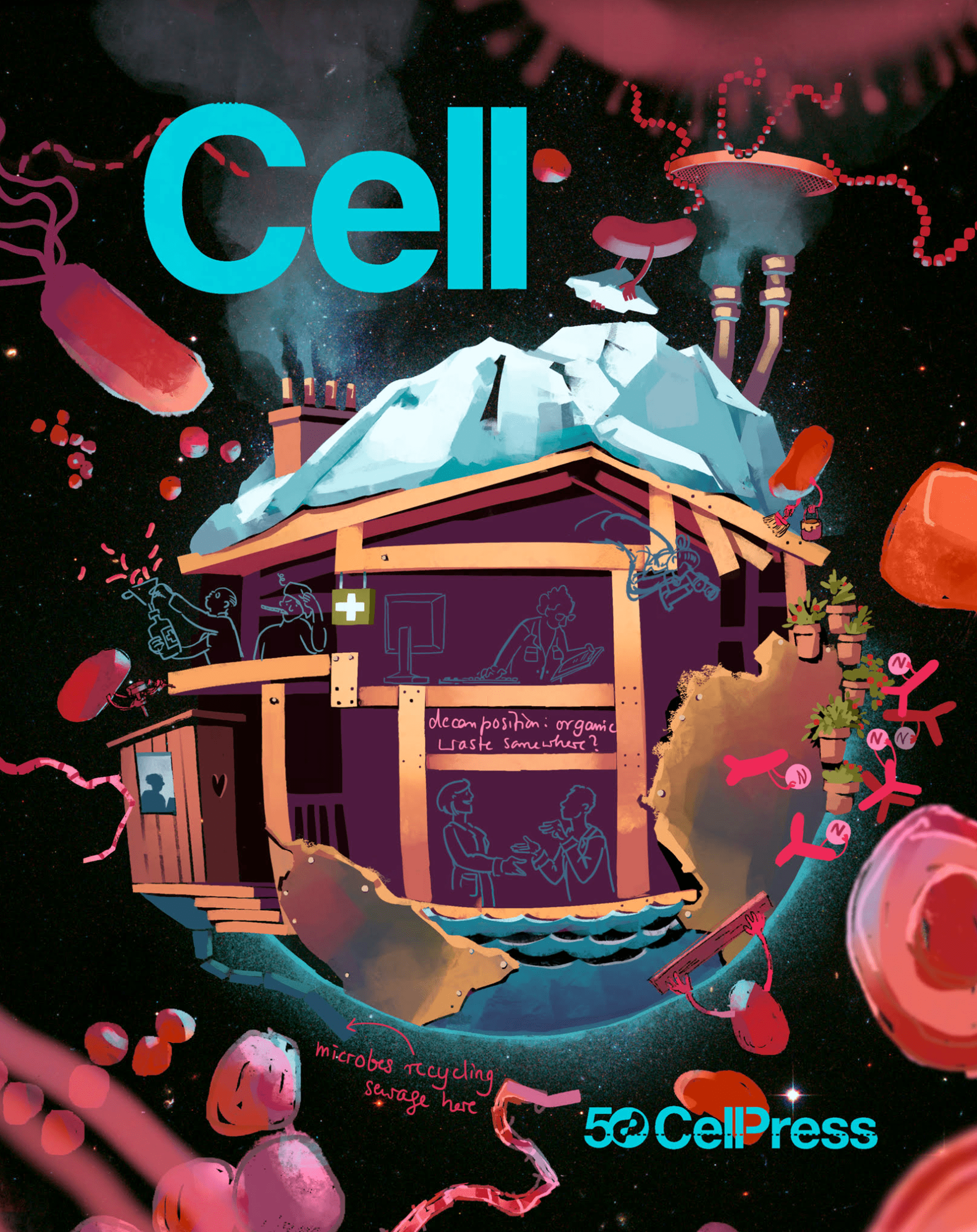
The next iteration came next day:
This was a huge transition to something that was much more similar to the original idea, and it indeed looked like a planet-house where microbes were involved in things that most scientists could immediately associate with actual research themes in microbiology – microbes impacting climate, bioremediation, sewage treatment, recycling of essential nutrients, and being relevant to modern medicine, and so on. But during our zoom meeting we agreed that this was too complicated. Even though the house idea was very apt, it was going to make it very difficult to fit all the rooms I wished to see this image. I also was concerned about ‘microbes doing things for the house’ part of the idea. What was there was not enough, but it was going to be impossible to make it comprehensive enough without making the design extremely complex.
It was clear that we needed to go back to the much-easier-to-read planet as a globe from phase one with rooms inside. I was learning from Charlotte the best practices in graphics design: the feeling that ‘something might not work visually because it’s too complex’ often needed to be tested on paper to see whether there is still a way to make it work. I think the design process here has structural similarities to how good manuscripts in science come together. Being open minded, being modest, and willing to ‘give ideas a shot even when we are not so keen that they will work’ is, in my opinion, our best chance to break paradigms in which we are stuck. You see, trying out the more visually complex interpretation could have worked here, and we may have ended up going with the idea that did not initially sound very promising from a visual perspective. Yes, giving a chance to the unlikely candidate didn’t work this time. But we shall not learn from this experience and continue to try unlikely and difficult things.
I fought, I lost. Now I rest.
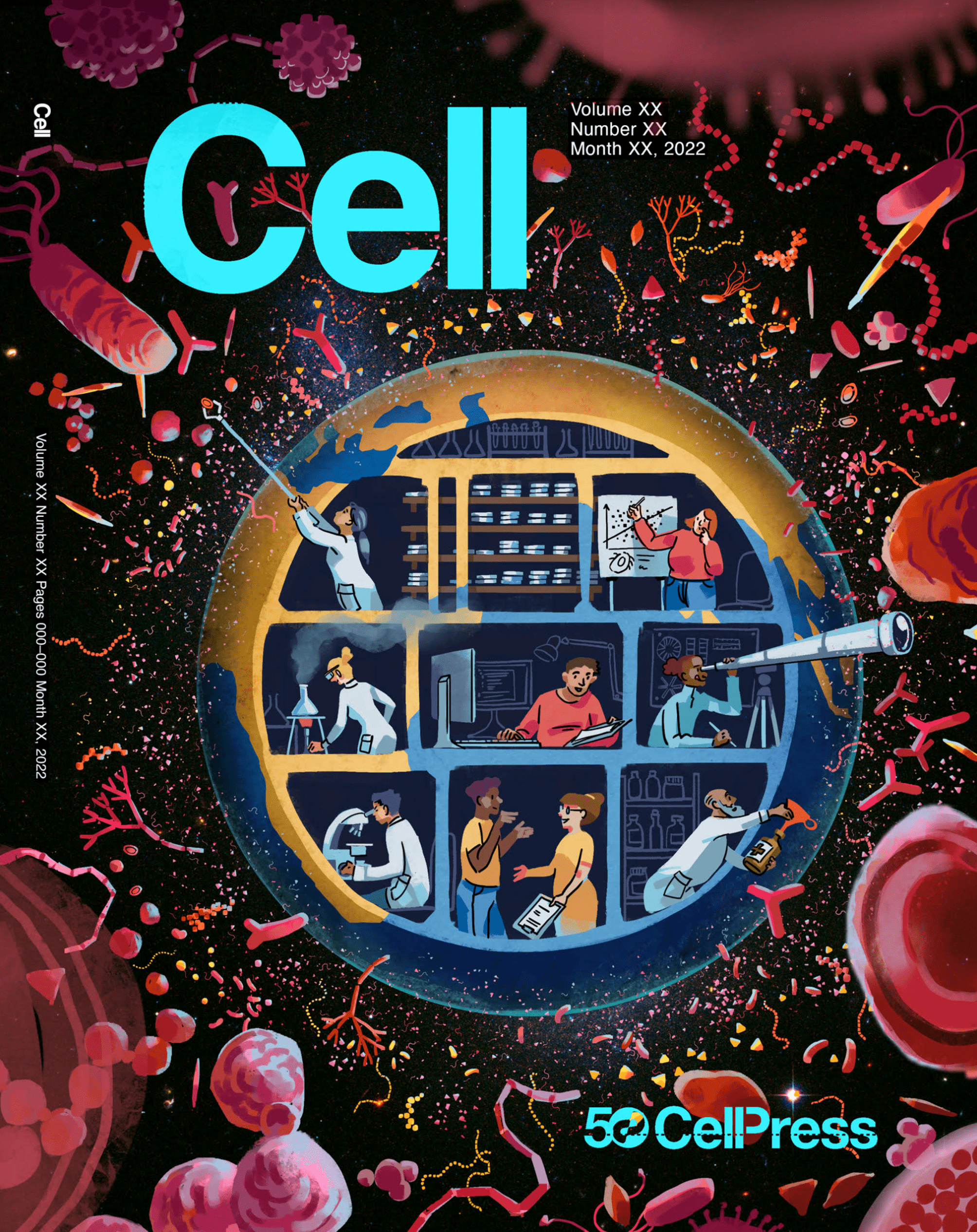
Now the plan was to go back to the original globe to stick with simplicity and to have more room for the diverse community of scientists that has become a part of modern microbiology over the past few decades. And seven minutes past midnight on Thursday, less than 2 days before the deadline, Charlotte sent me the following version:
Now it was crystal clear that her original interpretation was going in the right direction. The characters were so clear that I could promise that I knew a few of them in person. The lab person reaching out to grab a microbe to put them in her petri dish, the medicine person trying to collect some microbes in his medicine bottle, the computer person sitting in front of their two monitors. All were great.
In our next Zoom call we discussed that I thought we needed even more microbes to give the impression that the planet was literally covered by them. Our home was all microbes, after all.
Following these discussions, I received the following version from Charlotte:
The fifth version. Click here to see the differences between this and the previous version.
It was gorgeous, and at this point we had less than 24 hours to submit our cover proposal.
In a sense, we were done. Not only because we didn’t have much time to do more, but also we could simply submit this image as our proposal since it was already very good. This certainly could have been a meaningful point to stop, but should we have stopped?
I learned through my experiences over and over again that the most notable improvements to any work is done at the very last moments prior to calling it final. This has also been true for multiple papers we have written as a group. After we worked on a dataset for ages, spent months painstakingly crafting a draft manuscript from scratch, it was in those last few days before submission that we run into the most interesting insights. New words, paragraphs, even figures materialized, and sometimes led us to rewrite titles or overhaul large sections of our work at the last minute prior to submitting it for review. Thus, stopping before the deadline was never an option for me. But I also learned that living by the principle of you will do your best only after you have done enough to rightfully think that you are done can be very challenging for one’s self as well as for those around one. And it is especially difficult in team endeavors since this notion requires those we work with to also somewhat agree with its premise. In the case of this cover, we could have easily been satisfied with what we had achieved. Yet I knew there were more to do. There always is. Luckily Charlotte was welcoming of additional suggestions and eager to implement any idea she thought to be relevant, practically doable, and that would not ruin the visual language. So we continued discussing some additional points despite that we had less than a day at this point:
-
We decided to move the scientists engaged in a discussion to the top room, which was currently filled with petri dishes, to make space for more people sampling environmental microbes. Perhaps using carboys to sample marine environments.
-
We decided to replace the Bunsen burner image with something that is more commonly used by microbiologists in the lab, like someone working with a pipette.
-
We decided to put a poster that represents the human gastrointestinal tract behind the person who is collecting microbes into a medicinal bottle.
-
The individual rooms looked like floating in the foreground, so we agreed to separate them from one another with brick walls – as if someone opened up the crust of this microbial planet and found all these people working inside.
-
The parallel nature of the perfect circle that revealed the rooms inside the planet to the planet itself was a little too much symmetry. We decided to extend the land at the edge into the rooms to create some lack of symmetry to destroy that parallelism.
-
We could use this opportunity to further dismantle some of the stereotypes that do not represent what is really going on anymore, and agreed to replace the lab scientist with a male figure and the computer scientist with a female figure.
-
Perhaps most importantly, there were no phages anywhere in this image. We couldn’t have given phages their well-deserved representation here since they outnumber microbial cells by a lot in natural habitats, and the purpose of a cover was not to be 100% accurate. But I thought we could put a SINGLE phage somewhere to have a tongue-in-cheek representation of them. Just one phage sitting on the wall of a single cell somewhere to nod to our true overlords.
I was able to propose ideas without hesitation, because Charlotte was a good judge of ideas. For instance, I thought the person with the telescope was a bit too much. But she advised me to keep it for its ‘narrative purpose’ (since it represented our future outlook and searching for life outside of our planet) and ‘compository function’ (since it complemented the person on the top-left corner who was also reaching out). Instead of taking it out, she proposed to make it look less prominent by changing the color of the telescope.
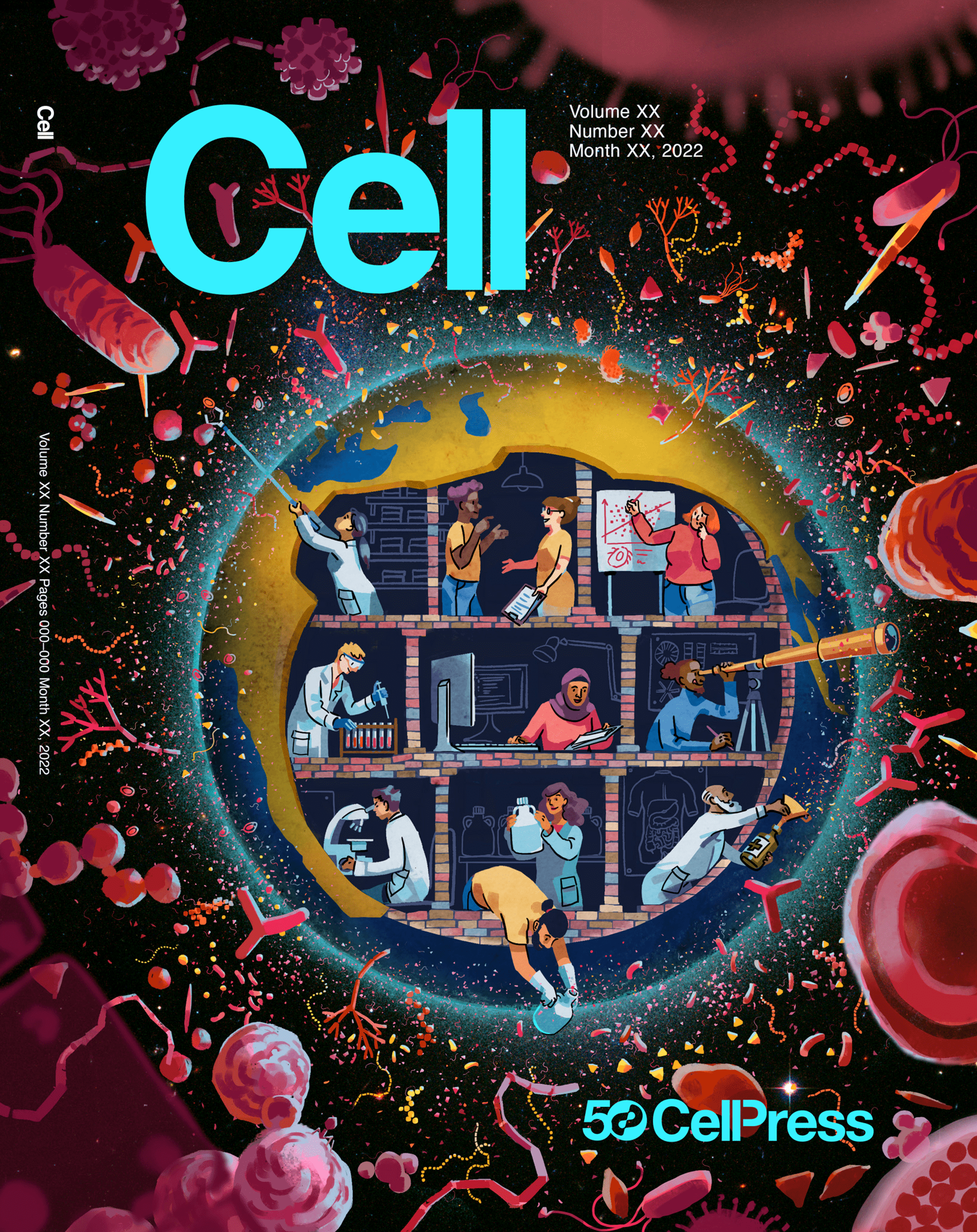
Just a few hours before the submission deadline, I was looking at this beautiful iteration:
The fifth version. Click here to see the differences between this and the previous version.
Just look at that gorgeous phage (if you can’t find it you can always cheat and click here to see the differences between two versions). The beautiful carboys filled with ocean samples. The poster of the GI tract behind the dedicated gastroenterologist. The bricks that are sliding under the crust of Earth.
When you are working with an expert, things they do feel like magic. And as far as I was concerned this was magic.
At this point we only had a few hours. But there was still room for a few more improvements. Just a few more… So we had one more Zoom meeting:
-
The glow of the atmosphere was just a bit too much, so we decided to dim it just a tiny bit.
-
The removal of the colors for petri dishes made it much more difficult to figure out what they are as they almost looked like bookshelves with some books now. We decided to add a few of them in the foreground to give a visual cue to connect that person with cultivation.
-
The person on the right top was a modeler. However, what was shown on the whiteboard looked like a plot that researchers often auto-generate rather than something they would plot manually. And with the little fella in the lower bottom of the white board the entire scene looked more like a representation of “the increasing frequency of ticks in the Northeast USA as a function of increasing temperatures” rather than a modeling effort. We decided to replace that content with a formula to tip our hats to all the modelers that call microbiology their home.
-
Charlotte also thought that adding some shadows to the rooms would reinforce the feeling of depth.
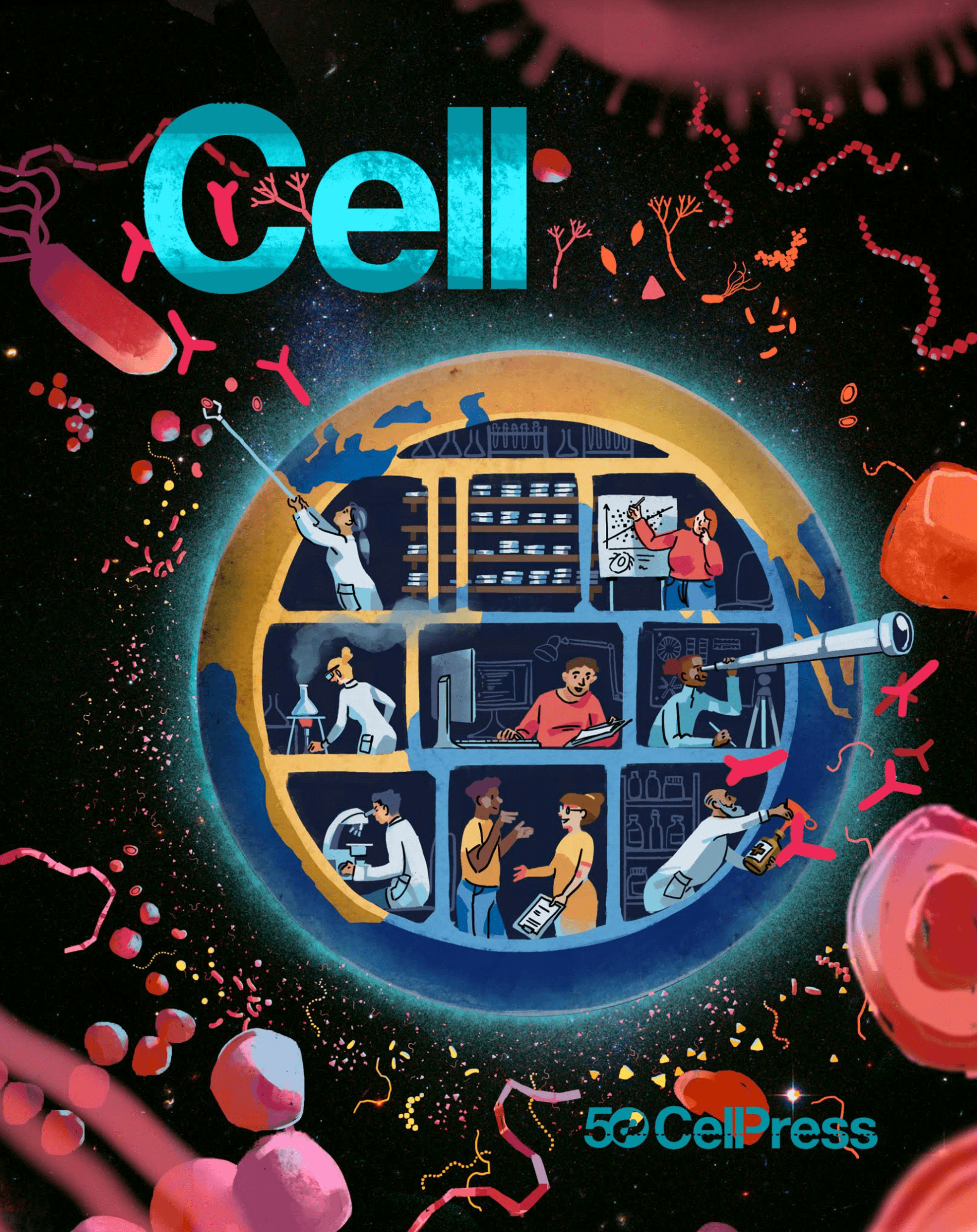
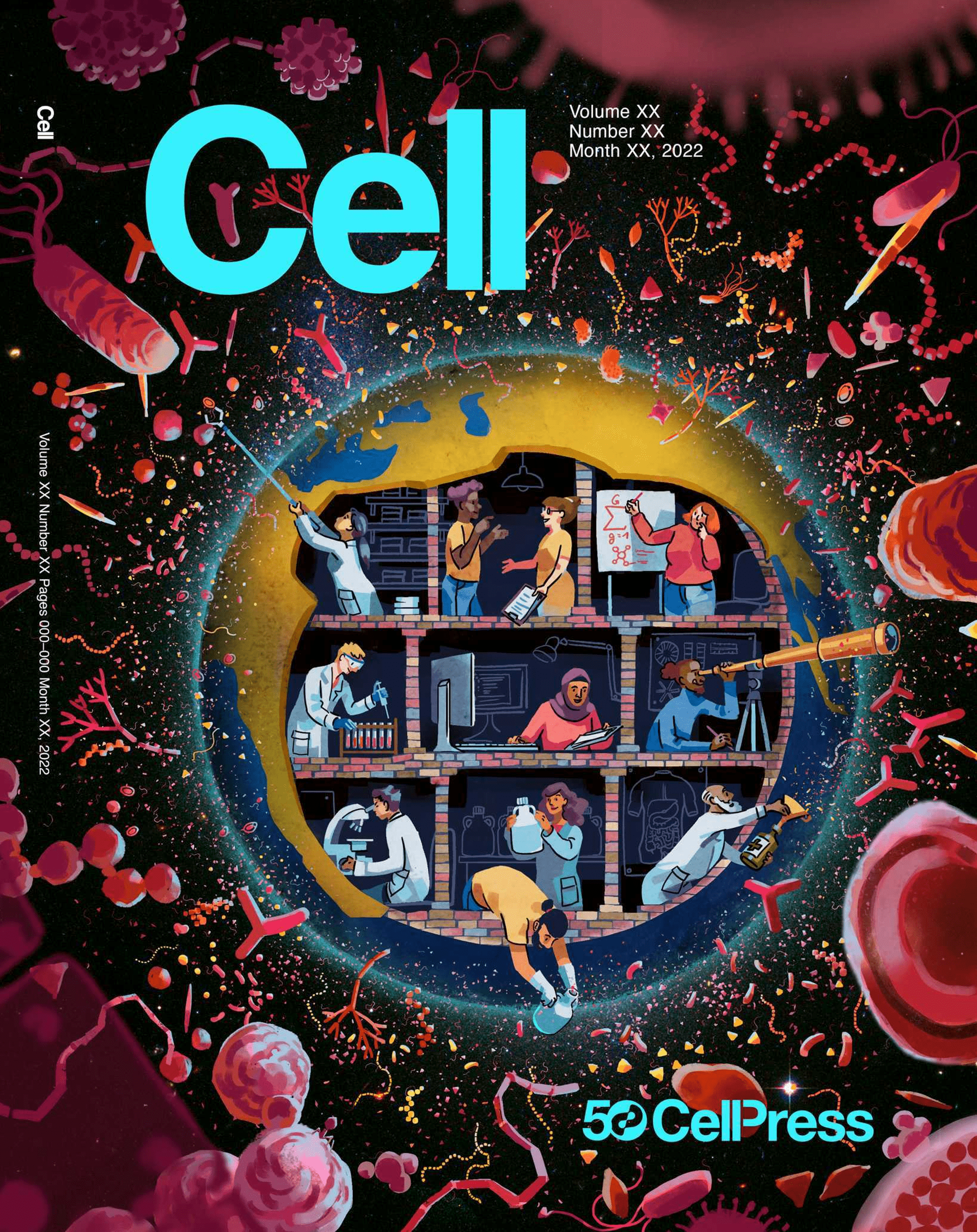
Literally one hour before the deadline, Charlotte sent the following final version:
The final version. Click here to see the differences between this and the previous version.
If you are not familiar with the process (I wasn’t), submitting a cover proposal is quite similar to submitting a paper (at least for this journal). You need to write a cover letter for the work, including a ‘legend’ to communicate what it displays. I found a corner at ISME, and wrote the following in the last hour:
Our proposed cover is a celebration of the modern era of microbiology which brings together molecular biologists, computer scientists, statisticians, modelers, chemists, and many more to understand our microbial planet. People of the increasingly interdisciplinary and diverse microbiology today not only grow microbes in laboratory settings and conduct experiments, but also survey all Earth habitats, generate complex datasets, develop algorithms and models, impact policy through science-driven dialogue, and contemplate our past and future to find solutions for our most pressing needs that span from medicine to agriculture to bioremediation.
We hope this cover, which aims to be inclusive of many disciplines that contribute to contemporary microbiology, reflects our reformed understanding of the architects and the wardens of life and our planet as a result of the past few decades of intense research and discovery.
And I submitted it minutes before the deadline with the comforting feeling that we did our best, and then we did a little more.
One week after the submission, we received an email from one of the production editors of the journal, which was letting us know that our cover submission has been selected to be featured on the September 19th issue of the journal. Today is September 22nd, and I can confirm that it REALLY is there :)
It may have not worked, and it would have been OK. Most things don’t work in life. But apparently this time the javelin was stuck to the ground.
Thanks for reading, and I hope you enjoy our review as well as our cover.
