Chapter IV - Reproducing Kiefl et al, 2022
Table of Contents
- Quick Navigation
- Important information
- Analysis 1: Read recruitment summary (21 genomes)
- Analysis 2: Comparing sequence similarity regimes
- (1) HIMB83 read recruitment
- (2) SAR11 pangenome sequence similarity
- (3) Protein family similarity
- Putting it all together
- Analysis 4: Distributions of environmental parameters
- Analysis 5: $\text{pN}^{(\text{site})}$ and $\text{pS}^{(\text{site})}$ variation across genes and samples
- Analysis 6: Creating the anvi’o structure workflow diagram
- Analysis 7: Comparing AlphaFold to MODELLER
- Download links to the structures
- Calculating MODELLER structures
- Trustworthy MODELLER structures
- Method comparison
- Analysis 8: Predicting ligand-binding sites
- Analysis 9: Genome-wide pN- and pS-weighted RSA and DTL distributions
- Analysis 10: Comparison to BioLiP and DTL cutoff
- Analysis 11: Big linear models
- Analysis 12: Gene-sample pair linear models
- Analysis 13: per-group pN and pS
- Analysis 14: Correlatedness of RSA and DTL
- Analysis 15: pN/pS$^{\text{(gene)}}$ across genes and samples
- Analysis 16: dN/dS$^{\text{(gene)}}$ between HIMB83 and HIMB122
- How similar is HIMB122 to HIMB83?
- Calculating dN/dS$^{\text{(gene)}}$ for 1 gene
- Calculating dN/dS$^{\text{(gene)}}$ for all
- Visualizing
- Analysis 17: Transcript abundance & Metatranscriptomics
- Calculation & accessibility
- Correlation with sample-averaged TA
- Lack of correlation across samples
- Generating Figure SI5
- Analysis 18: Environmental correlations with pN/pS$^{\text{(gene)}}$
- Analysis 19: Glutamine synthetase (GS)
- GS is a dodecamer
- Dodecameric RSA & DTL
- pN/pS$^{\text{(gene)}}$ of GS
- pN/pS$^{\text{(gene)}}$ correlation with nitrates
- Visualizing polymorphism on structure
- DTL and RSA polymorphism distribution across samples
- Sites of interest
- Generating Figure 3
- Why this glutamine synthetase?
- Analysis 20: Genome-wide ns-polymorphism avoidance of low RSA/DTL
Quick Navigation
- Chapter I: The prologue
- Chapter II: Configure your system
- Chapter III: Build the data
- Chapter IV: Analyze the data ← you are here
- Chapter V: Reproduce every number
Important information
Welcome to Chapter IV. In this chapter you’ll find all of the analyses in the paper. If you haven’t completed Chapter III, you won’t be able to reproduce these analyses but you still might find some some useful information in here that got cut from the paper.
Before jumping into an analysis that interests you, its critical you read the information in this section.
Directory
Unless otherwise stated, each analysis can be run independently from the others, so completing analyses in order is not required.
As such, you should feel free to jump around this document, rather than reading it top down. To help you navigate to the analyses you are interested in, here is a directory of all figures and tables in the main text and supplementary information, and clicking any figure/table will redirect you to the analysis where it is produced.
Main figures
Supplementary figures
Supplementary information figures
Supplementary tables
Global R environment (GRE)
How did I organize my analyses? One option would be to create everything in isolation. Each analysis starts from a blank slate, and builds up all of the data it needs for the analysis. This approach would be favored if the analyses are relatively independent of one another, and the associated datasets were small.
The other approach–which is the approach I took–is to create a shared environment where all of the data can be shared. This is a necessary evil when the datasets reach a certain size. For example, many of the analyses require access to the full set of single codon variants (SCVs), which is an 18M row dataset. Loading this dataset for every analysis, and performing the required join operations takes around 30 minutes, which is impractical to do repeatedly. As such, I opted to unify all of the data into one global environment, in a computational workspace I call the Global R environment (GRE).
The GRE is what I used while developing this study, and it is the same environment you will use when performing the analyses in this chapter. The GRE will provides the workspace where you will carry out analyses.
How to build it
Unless you are confident about doing it your own way, you should create the GRE using the following steps.
(1) Open R. You should open it via the command-line:
R
This opens up a R-shell that you can pass R commands to:
R version 3.6.1 (2019-07-05) -- "Action of the Toes"
Copyright (C) 2019 The R Foundation for Statistical Computing
Platform: x86_64-apple-darwin13.4.0 (64-bit)

R is free software and comes with ABSOLUTELY NO WARRANTY.
You are welcome to redistribute it under certain conditions.
Type 'license()' or 'licence()' for distribution details.

  Natural language support but running in an English locale

R is a collaborative project with many contributors.
Type 'contributors()' for more information and
'citation()' on how to cite R or R packages in publications.

Type 'demo()' for some demos, 'help()' for on-line help, or
'help.start()' for an HTML browser interface to help.
Type 'q()' to quit R.

> print('This is R!')
[1] "This is R!"
You can quit at any time with
q()
It will ask if you want to save your workspace. You should respond no by typing n.
(2) Change the directory to ZZ_SCRIPTS.
Now set the working directory to the ZZ_SCRIPTS folder, where all of the project scripts exist. You should do this with the R function setwd():
setwd('ZZ_SCRIPTS')
Did you encounter an error like so?
> setwd('ZZ_SCRIPTS')
Error in setwd("ZZ_SCRIPTS") : cannot change working directory
If so, you’re in the wrong place. Quit out with q(), cd into the root directory of this project, and then try again.
Congrats. You have built the GRE, which is all that’s required to begin running analyses.
Running an analysis
Unless otherwise stated, commands automatically load the data they need into the GRE.
With the GRE built, you can run analyses by issuing R commands. All the required data will be loaded into the GRE. For example, generating Figure S2 is as simple as running the following command:
source('figure_s_env.R')
This produces Figure S2 in YY_PLOTS/FIG_S_ENV/ as a .pdf and .png formatted image.
If you used conda, it’s likely that a graphical window will “pop up”, displaying the plot. If you used Docker, that’s unlikely. In either case, you can always navigate to the output directory YY_PLOTS/FIG_S_ENV/ to see the plots.
To see what’s happening under the hood, you can view the contents of ZZ_SCRIPTS/figure_s_env.R, the R script that we called source() on:
Show/Hide Script
#! /usr/bin/env Rscript

source("utils.R")

args <- list()
args$output <- "../YY_PLOTS/FIG_S_ENV"
args$meta <- "../TARA_metadata.txt"
args$soi <- "../soi"

library(tidyverse)

dir.create(args$output, showWarnings=F, recursive=T)

# -----------------------------------------------------------------------------
# Reading in the data
# -----------------------------------------------------------------------------

soi <- read_tsv(args$soi, col_names = F)

set.seed(4323)
get_pallette <- function(size) {
    colors <- list()
    for (i in 1:size) {
        colors[[i]] <- paste("#", paste(rep(sample(c("3", "4", "5", "6", "7", "8", "9", "A", "B"), 1), 6), collapse=""), sep="")
    }
    colors
}
cbPalette <- get_pallette(10)

df <- read_tsv(args$meta) %>%
    rename(sample_id=`Sample Id`) %>%
    pivot_longer(cols=c(
        `Depth (m)`,
        `Chlorophyll Sensor s`,
        `Temperature (deg C)`,
        `Salinity (PSU)`,
        `Oxygen (umol/kg)`,
        `Nitrates (umol/L)`,
        `PO4 (umol/L)`,
        `SI (umol/L)`
    ))

# -----------------------------------------------------------------------------
# Plot the thing
# -----------------------------------------------------------------------------

g <- ggplot(data = df, aes(x=value)) +
    geom_histogram(aes(fill=name)) +
    facet_wrap(~ name, ncol=3, scales="free", strip.position="bottom") +
    scale_fill_manual(values=cbPalette) +
    labs(
        x="",
        y="Number of Metagenomes"
    ) +
    theme_classic(base_size=12) +
    theme(
        legend.position = "none",
        text=element_text(size=12, family="Helvetica", face="bold"),
        strip.background = element_blank(),
        strip.placement="outside"
    ) +
    scale_y_continuous(limits = c(0,NA), expand = c(0.005, 0))
display(g, file.path(args$output, "meta.png"), width=6.5, height=5, as.png=TRUE)
display(g, file.path(args$output, "meta.pdf"), width=6.5, height=5, as.png=FALSE)
Data is loaded as needed
The above analysis runs very quickly because its data requirements are low. It just needs to load the TARA_metadata.txt file and it’s ready to rock. But if the analysis requires the SCV data, that’s another story. As I mentioned, it takes a long time to load the SCV data.
To avoid loading the SCV table twice, or any other data that takes significant time to load/manipulate, any analysis that requires SCVs will first check whether SCVs have already been loaded. If already present, no time will be wasted loading it a second time. This saves hours and hours of time if you plan on doing many of these analyses.
So the bad news is that loading the complete set of data shared between analyses takes anywhere from 30-60 minutes. But the good news is that this only has to be done once per GRE you build.
All of this logic is carried out by the script ZZ_SCRIPTS/load_data.R, which is ran at the start of each analysis. ZZ_SCRIPTS/load_data.R essentially loads all the data that is used by many analyses.
More about load_data.R
Each analysis will typically start by running ZZ_scripts/load_data.R, which is done with the following command:
source('load_data.R')
At any time, you can run this command from within the R-shell. Afterwards, a wealth of common data is now available in the GRE as different variables
For example, the $\text{pN/pS}^{(\text{gene})}$ data across genes and samples has been loaded into the GRE under the variable name pnps. In Step 14 we calculated $\text{pN/pS}^{(\text{gene})}$ for each gene in each sample, and stored the data in the file 17_PNPS/pNpS.txt. Well, ZZ_SCRIPTS/load_data.R has loaded this data into the GRE under the variable name pnps.
This is useful for you, because you can very quickly query this data using R (e.g. pnps %>% filter(gene_callers_id == 1326)), but it is also useful for all of the downstream analysis scripts which will be ran from within the GRE.
However, not all of the data has been loaded by default. This is because some data takes a very long time to load, like the SCV data. Analyses that require the SCV data first request the SCV data before running ZZ_SCRIPTS/load_data.R by setting the following R-variable to TRUE:
request_scvs <- TRUE
This is fundamentally how data is only loaded if required.
With this in mind, if you want to create the full GRE, you should set the following R-variables and then source ZZ_SCRIPTS/load_data.R:
request_scvs <- TRUE
request_regs <- TRUE
source('load_data.R')
Assuming you haven’t already loaded all the data, this will take around 30 minutes.
Analysis 1: Read recruitment summary (21 genomes)
Most, but not all of the analyses use the GRE. This is one that doesn’t.
In this analysis, we create Table S1, which provides summary-level recruitment information about each of the 21 SAR11 genomes that were used in the read recruitment experiment, including HIMB83.
As a reminder, we used Bowtie2 to recruit reads from each metagenome/metatranscriptome to each of the 21 SAR11 genomes in a competitive manner. The complete mapping information is stored in a series of bam-files present in 04_MAPPING/, and the pertinent information from all samples and all genomes has been summarized into the profile-db in 06_MERGED/. To retrieve recruitment statistics for each genome, we can use the program anvi-summarize.
Command #40
anvi-summarize -p 06_MERGED/SAR11_clade/PROFILE.db \
               -c 03_CONTIGS/SAR11_clade-contigs.db \
               -C GENOMES \
               --init-gene-coverages \
               -o 07_SUMMARY_ALL
‣ Time: 18 min
‣ Storage: 260 Mb
By default, anvi-summarize calculates coverage statistics averaged over bins (in our case each bin is a genome). But with the flag --init-gene-coverages, anvi-summarize takes the extra time to also report per-gene coverage statistics.
When finished, anvi-summarize produces a summary, that offers some extensive reporting with tab-delimited files that you can open in Excel or Python/R. Here is the directory structure:
Quite simply, Table S1 is a copy-paste job of a selection of these files, as well as some sample identifying information. To create the Excel table, run the script ZZ_SCRIPTS/gen_table_rr.py.
Show/Hide Script
#! /usr/bin/env python

import pandas as pd
from pathlib import Path

tables_dir = Path('WW_TABLES')
tables_dir.mkdir(exist_ok=True)

sample_metadata = pd.read_csv("00_SAMPLE_INFO_FULL.txt", sep='\t')
sample_metadata = sample_metadata[[col for col in sample_metadata if "Used_" not in col]]
sample_metadata = sample_metadata[~sample_metadata["sample_id"].isnull()]
ftp_links = pd.read_csv("00_FTP_LINKS", sep='\t', names=["link"])
cov = pd.read_csv("07_SUMMARY_ALL/bins_across_samples/mean_coverage.txt", sep='\t')
q2q3 = pd.read_csv("07_SUMMARY_ALL/bins_across_samples/mean_coverage_Q2Q3.txt", sep='\t')
det = pd.read_csv("07_SUMMARY_ALL/bins_across_samples/detection.txt", sep='\t')
per = pd.read_csv("07_SUMMARY_ALL/bins_across_samples/bins_percent_recruitment.txt", sep='\t')
himb083_genes = pd.read_csv("07_SUMMARY_ALL/bin_by_bin/HIMB083/HIMB083-gene_coverages.txt", sep='\t')

with pd.ExcelWriter(tables_dir/'RR.xlsx') as writer:
    sample_metadata.to_excel(writer, sheet_name='Sample identifiers')
    ftp_links.to_excel(writer, sheet_name='Sample FTP links')
    cov.to_excel(writer, sheet_name='Coverage')
    q2q3.to_excel(writer, sheet_name='Coverage Q2Q3')
    det.to_excel(writer, sheet_name='Detection')
    per.to_excel(writer, sheet_name='% recruitment')
    himb083_genes.to_excel(writer, sheet_name='HIMB083 gene coverages')
Command #41
python ZZ_SCRIPTS/gen_table_rr.py
This creates the table from the paper and plops it into a directory WW_TABLES, which stores all tables from the paper.
Analysis 2: Comparing sequence similarity regimes
This analysis is unavailable for those who did not complete Steps 2 through 4. This is because this analysis queries the BAM files from the read recruitment, which you only have if you completed Steps 2 through 4.
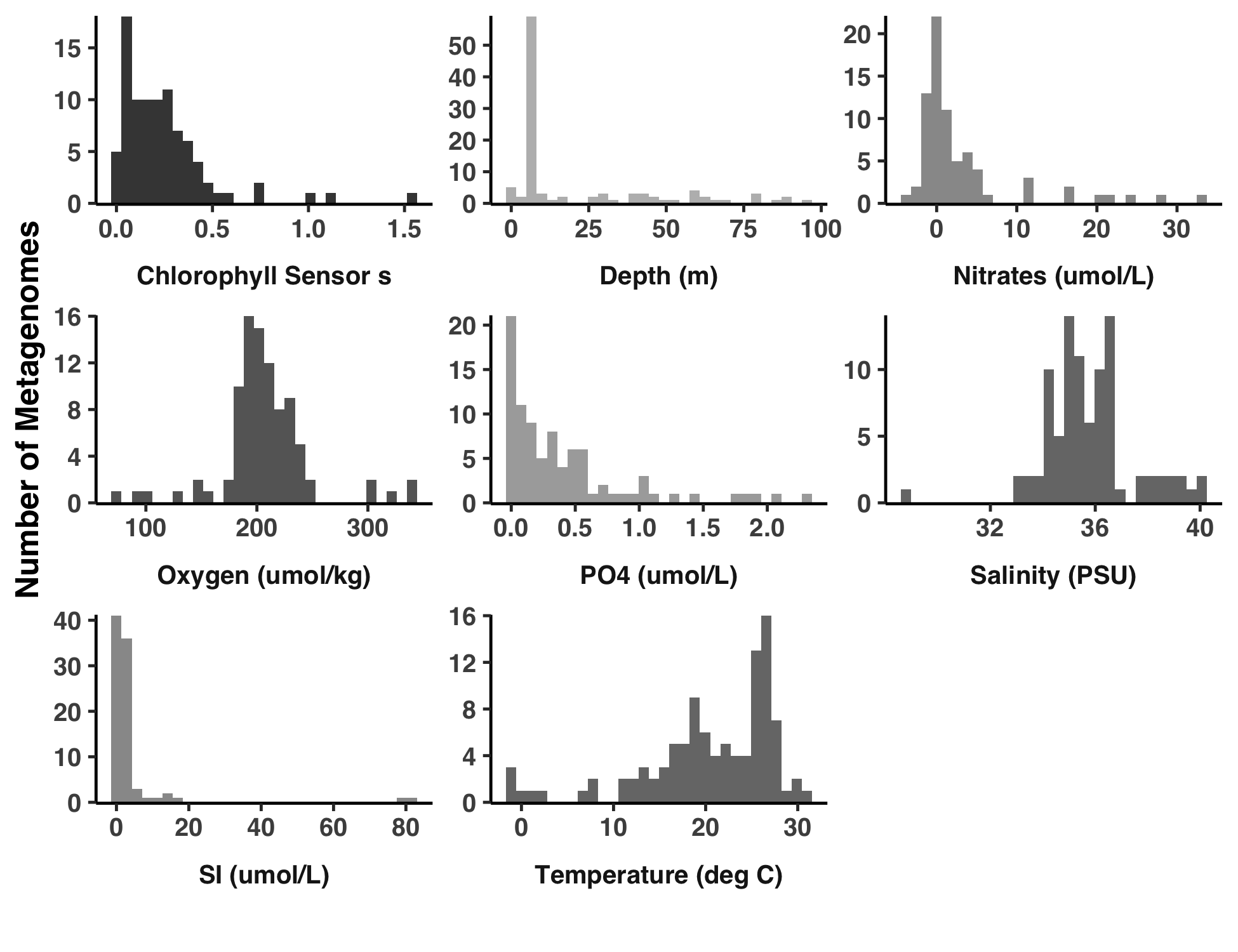
This analysis is a behind-the-scenes of the supplemental information entitled “Regimes of sequence similarity probed by metagenomics, SAR11 cultured geomes, and protein families”, and provides explicit reproducibility steps to create Figure S1. Basically, we need to estimate the percent similarity from read recruitment results, from pangenomic comparisons, and from the Pfams that HIMB83 genes match to. Given the eclectic data sources, this is a rather lengthy process that I’ll break up into 3 parts: (1) read recruitment, (2) pangenome, and (3) Pfam. Each of these steps creates a file 18_PERCENT_ID*.txt that forms the data for each of the 3 histograms in Figure S1.
(1) HIMB83 read recruitment
Here is the relevant description from the supplemental information.
[Percent similarity (PS)] values for each gene were calculated by considering one metagenome at a time. In each metagenome, the reads that aligned to the gene were captured, trimmed (so there were no reads overhanging the gene), and compared to the aligned segment of HIMB83. The PS was calculated by comparing non-gap positions. This was then averaged to yield a PS value for each gene-metagenome pair. To define a single PS value for each gene, PS values were averaged across metagenomes.
Since anvi’o does not store per-read information, this data has to be grabbed from the bam-files themselves. I wrote a program ZZ_SCRIPTS/analysis_gene_percent_id.py to do this.
Show/Hide Script
#! /usr/bin/env python

import numpy as np
import pandas as pd
import argparse
import anvio.dbops as dbops
import anvio.bamops as bamops

ap = argparse.ArgumentParser()

ap.add_argument('--contigs-db', help="Filepath to the contigs db", required=True)
ap.add_argument('--goi', help="Genes of interest (file of gene caller ids)", required=True)
ap.add_argument('--bams', help="File of bampaths. First column is sample name, second column is bam path. Header should be sample_id\tpath", required=True)
ap.add_argument('--output', help="Output text file", required=True)

args = ap.parse_args()

# ---------------------------------------------------

bams = pd.read_csv(args.bams, sep='\t')
bams = dict(zip(bams['sample_id'], bams['path']))

cdb = dbops.ContigsDatabase(args.contigs_db)
gene_calls = cdb.db.get_table_as_dataframe('genes_in_contigs').set_index('gene_callers_id')
gene_calls = gene_calls[gene_calls.index.isin([int(x.strip()) for x in open(args.goi).readlines()])]

d = {sample_id: [] for sample_id in bams.keys()}
i = 0
for sample_id, bam_path in bams.items():
    bam = bamops.BAMFileObject(bam_path)

    j = 0
    for gene_id, row in gene_calls.iterrows():
        print(f"Sample {sample_id} ({i}/{len(bams)}); Gene {gene_id} ({j}/{gene_calls.shape[0]})")

        percent_ids = []
        for read in bam.fetch_and_trim(row['contig'], row['start'], row['stop']):
            read.vectorize()
            percent_ids.append(read.get_percent_id())

        percent_ids = np.array(percent_ids)
        d[sample_id].append(np.mean(percent_ids))

        j += 1
    i += 1

    bam.close()

d['gene_callers_id'] = gene_calls.index.tolist()
pd.DataFrame(d).to_csv(args.output, sep='\t', index=False)
Given a bunch of genes and a bunch of bam files, this script spits out the average percent identity of reads mapping to each gene in each sample. But before it can be ran, we need a list of bam-file paths, which is created with another script, ZZ_SCRIPTS/analysis_gen_mgx_bam_paths.py.
Show/Hide Script
#! /usr/bin/env python

import pandas as pd
from pathlib import Path

bam_dir = Path('04_MAPPING/SAR11_clade')
soi = [sample.strip() for sample in open('soi').readlines()]

bam_paths = dict(
    sample_id = [],
    path = [],
)

for bam_path in bam_dir.glob("*.bam"):
    sample_id = bam_path.stem
    if sample_id not in soi:
        continue
    bam_paths['sample_id'].append(sample_id)
    bam_paths['path'].append(str(bam_path))

pd.DataFrame(bam_paths).to_csv("mgx_bam_paths", sep='\t', index=False)
There is nothing special about this script, it simply creates the following file, which points to each of the metagenomic bam-files corresponding to the samples of interest soi (generated from Step 8).
| sample_id | path |
|---|---|
| IOS_64_05M | 04_MAPPING/SAR11_clade/IOS_64_05M.bam |
| ION_39_25M | 04_MAPPING/SAR11_clade/ION_39_25M.bam |
| IOS_64_65M | 04_MAPPING/SAR11_clade/IOS_64_65M.bam |
| IOS_65_30M | 04_MAPPING/SAR11_clade/IOS_65_30M.bam |
| IOS_65_05M | 04_MAPPING/SAR11_clade/IOS_65_05M.bam |
| ION_36_17M | 04_MAPPING/SAR11_clade/ION_36_17M.bam |
| ANW_142_05M | 04_MAPPING/SAR11_clade/ANW_142_05M.bam |
| RED_32_80M | 04_MAPPING/SAR11_clade/RED_32_80M.bam |
| ASW_78_05M | 04_MAPPING/SAR11_clade/ASW_78_05M.bam |
| (…) | (…) |
Ok, first, generate the file mgx_bam_paths:
Command #42
python ZZ_SCRIPTS/analysis_gen_mgx_bam_paths.py
Then, run ZZ_SCRIPTS/analysis_gene_percent_id.py:
Command #43
python ZZ_SCRIPTS/analysis_gene_percent_id.py --bams mgx_bam_paths \
                                              --contigs-db 03_CONTIGS/SAR11_clade-contigs.db \
                                              --goi goi \
                                              --output 18_PERCENT_ID.txt
‣ Time: 150 min
This creates the file 18_PERCENT_ID.txt which is a table quantifying the average percent identity of reads for each gene in each sample.
Various depictions of this raw data are provided in Table S2, which can be created via the following command.
Command #44
python ZZ_SCRIPTS/table_pid.py
This outputs Table S2 under the filename WW_TABLES/PID.xlsx.
(2) SAR11 pangenome sequence similarity
Next up, the sequence similarity observed between SAR11 orthologs from the pangenome. Here is the relevant section in the supplemental:
[G]ene clusters were calculated for HIMB83 and 20 additional SAR11 isolates using the anvi’o pangenomic workflow. An MSA was built from the sequences of each gene cluster using muscle, and then each non-HIMB83 sequence was compared to the HIMB83 sequence. The PS was determined by calculating the fraction of matches in non-gap positions. Each HIMB83 gene was attributed a single PS value by averaging PS values in each pairwise comparison, weighted by the number of non-gap positions in the pairwise alignment. Gene clusters containing multiple HIMB83 genes were ignored.
First, the IDs for all gene clusters that housed a HIMB83 gene of interest were collected and stored in a file called gcoi (gene clusters of interest), thanks to the work out ZZ_SCRIPTS/get_HIMB83_gene_clusters.py.
Show/Hide Script
#! /usr/bin/env python

import pandas as pd

goi = [int(x.strip()) for x in open('goi').readlines()]
df = pd.read_csv("07_SUMMARY_PAN/SAR11_gene_clusters_summary.txt", sep='\t')

gc = df.loc[(df['genome_name'] == 'HIMB083') & (df['gene_callers_id'].isin(goi)), 'gene_cluster_id']
gc = gc.value_counts()[gc.value_counts() == 1].index.tolist()

with open('gcoi', 'w') as f:
    f.write("\n".join([str(x) for x in gc]))
Command #45
python ZZ_SCRIPTS/get_HIMB83_gene_clusters.py
Then, alignments of the DNA sequences for each gene cluster are created with ZZ_SCRIPTS/get_HIMB83_gene_cluster_alignments.sh, which uses MUSCLE to perform the alignments:
Show/Hide Script
#! /usr/bin/env bash

rm -rf 18_HIMB83_CORE_COMPARED_TO_PANGENOME
mkdir -p 18_HIMB83_CORE_COMPARED_TO_PANGENOME

cat gcoi | while read gc; do
    anvi-get-sequences-for-gene-clusters -p 07_PANGENOME/PANGENOME/SAR11-PAN.db \
                                         -g 07_PANGENOME/SAR11-GENOMES.db \
                                         --report-DNA \
                                         -o 18_HIMB83_CORE_COMPARED_TO_PANGENOME/$gc.fa \
                                         --gene-cluster-id $gc \
                                         --min-num-genomes-gene-cluster-occurs 5
    muscle -in 18_HIMB83_CORE_COMPARED_TO_PANGENOME/$gc.fa -out 18_HIMB83_CORE_COMPARED_TO_PANGENOME/$gc.fa
done
Go ahead and run this (it will take some time).
Command #46
bash ZZ_SCRIPTS/get_HIMB83_gene_cluster_alignments.sh
‣ Time: 100 min
This will populate the directory 18_HIMB83_CORE_COMPARED_TO_PANGENOME/ with a bunch of gene cluster multiple sequence alignments (MSAs), which will be used to calculate percent similarity of HIMB83 genes to all of the other orthologs. The final script for pangenomic comparisons looks at each of the MSAs in 18_HIMB83_CORE_COMPARED_TO_PANGENOME/ and calculates the percent of matches in non-gap regions between the HIMB83 gene and the orthologs. To parse the MSAs, I made use of ProDy in the script ZZ_SCRIPTS/analysis_get_percent_id_from_msa.py.
Show/Hide Script
#! /usr/bin/env python

import pandas as pd

from prody.sequence.msafile import parseMSA
from pathlib import Path

genome_name = 'HIMB083'
msa_paths = Path('18_HIMB83_CORE_COMPARED_TO_PANGENOME/').glob('*.fa')

dd = {
    'gene_callers_id': [],
    'percent_id': [],
}

for path in msa_paths:
    msa = parseMSA(str(path), format='FASTA')

    for i, label in enumerate(msa._labels):
        if genome_name in label:
            ref_id = i
    is_genome_of_interest = [genome_name in defline for defline in msa._labels]
    reference = msa._msa[is_genome_of_interest,:][0]
    ref_label = msa._labels[ref_id]
    ref_gene_id = int(ref_label.split('|')[-1].split(':')[-1])

    labels = [defline for defline in msa._labels if genome_name not in defline]
    sequences = msa._msa[[not x for x in is_genome_of_interest],:]
    sequences = dict(zip(labels, sequences))

    d = {
        'gene_callers_id': [],
        'match': [],
        'mismatch': [],
        'total': [],
    }

    total_nucleotides = 0
    for label, sequence in sequences.items():
        match, mismatch = 0, 0

        for ref, seq in zip(reference, sequence):
            ref, seq = ref.decode('utf-8'), seq.decode('utf-8')

            if ref == '-' or seq == '-':
                # only compare fully aligned nucleotides
                continue

            if ref == seq:
                match += 1
            else:
                mismatch += 1

        d['gene_callers_id'].append(ref_gene_id)
        d['match'].append(match)
        d['mismatch'].append(mismatch)
        d['total'].append(match + mismatch)

        total_nucleotides += match + mismatch

    df = pd.DataFrame(d)
    df['percent_id'] = df['match']/df['total']
    df['weight'] = df['total']/df['total'].sum()

    avg_percent_id = (df['percent_id']*df['weight']).sum() * 100

    dd['gene_callers_id'].append(ref_gene_id)
    dd['percent_id'].append(avg_percent_id)

df = pd.DataFrame(dd)
df.to_csv("18_PERCENT_ID_PANGENOME.txt", sep="\t", index=False)
Give it a run when you’re ready.
Command #47
python ZZ_SCRIPTS/analysis_get_percent_id_from_msa.py
Finally, we get the file 18_PERCENT_ID_PANGENOME.txt which quantifies how similar each HIMB83 gene is to the correspondingorthologs in the SAR11 pangeome.
(3) Protein family similarity
The third and last sequence comparison regime is between HIMB83 genes and genes of the Pfams they match to. Here is the relevant section in the supplemental:
HIMB83 genes were matched to Pfam protein families via the anvi’o program `anvi-run-pfams`. Hits that passed the GA gathering threshold were retained, and the best hit (lowest e-value) for each HIMB83 gene was defined as the associated Pfam. For each HIMB83 gene, the associated Pfam seed sequence MSA was downloaded using the Python package prody and the HIMB83 protein sequence was added to the MSA using muscle. PS values were calculated from the MSAs in a manner identical to that outlined in (b). It is important to note that this comparison used protein sequences, whereas (a) and (b) both used nucleotide sequences.
Because Pfams span much larger evolutionary scales, and simply for convenience, this comparison was done with amino acid sequences rather than nucleotides. Thanks to the ProDy API, I was able to package this process into a single script, ZZ_SCRIPTS/analysis_get_percent_id_from_pfam_msa.py.
Show/Hide Script
#! /usr/bin/env python

from pathlib import Path
from prody.database.pfam import fetchPfamMSA
from prody.sequence.msafile import parseMSA

import numpy as np
import pandas as pd
import argparse
import subprocess
import anvio.utils as utils
import anvio.dbops as dbops

ap = argparse.ArgumentParser()

ap.add_argument('--contigs-db', help="Filepath to the contigs db", required=True)
ap.add_argument('--genome-name', help="e.g. HIMB083", required=True)

args = ap.parse_args()

# --------------------------------------------------------------------------------------

cdb = dbops.ContigsDatabase(args.contigs_db)
functions = cdb.db.get_table_as_dataframe('gene_functions')
cdb.disconnect()

def get_best_pfam(gene_id):
    try:
        return functions.\
            query(f'gene_callers_id == {gene_id} & source == "Pfam"').\
            sort_values(by='e_value').\
            iloc[0, :]\
            ['accession']
    except IndexError:
        return None

# --------------------------------------------------------------------------------------

dd = {
    'gene_callers_id': [],
    'percent_id': [],
}

goi = [int(x.strip()) for x in open("goi").readlines()]
contigs_db = dbops.ContigsSuperclass(args)
for i, gene_id in enumerate(goi):
    print(f"Gene {gene_id} ({i}/{len(goi)})")
    pfam = get_best_pfam(gene_id)
    if not pfam:
        continue

    Path("18_HIMB83_CORE_COMPARED_TO_PFAM").mkdir(exist_ok=True)
    gene_fasta = Path("18_HIMB83_CORE_COMPARED_TO_PFAM") / f"{gene_id}.fa"
    pfam_msa_path = Path('18_HIMB83_CORE_COMPARED_TO_PFAM') / f"{pfam}_msa_for_{gene_id}.fa"
    default_dump_path = Path(f'{pfam}_seed.fasta')

    # Get the Pfam MSA
    try:
        pfam_versionless = ''.join(pfam.split('.')[:-1])
        url = f"https://pfam.xfam.org/family/{pfam_versionless}/alignment/seed/format?format=fasta&alnType=seed&order=t&case=u&gaps=dashes&download=1"
        utils.download_file(url=url, output_file_path=str(default_dump_path), check_certificate=False)
    except:
        print("FAILED")
        continue

    default_dump_path.replace(pfam_msa_path)

    # Get the gene AA sequence
    contigs_db.get_sequences_for_gene_callers_ids( gene_caller_ids_list=[gene_id], output_file_path=str(gene_fasta), report_aa_sequences=True)

    # massage gene into the MSA
    cmdline = f'muscle -profile -in1 {gene_fasta} -in2 {pfam_msa_path} -out {pfam_msa_path}'
    muscle_stdout = subprocess.call(cmdline, shell=True)

    # load the final MSA
    msa = parseMSA(str(pfam_msa_path), format='FASTA')

    for i, label in enumerate(msa._labels):
        if args.genome_name in label:
            ref_id = i
    is_genome_of_interest = [args.genome_name in defline for defline in msa._labels]
    reference = msa._msa[is_genome_of_interest,:][0]

    labels = [defline for defline in msa._labels if args.genome_name not in defline]
    sequences = msa._msa[[not x for x in is_genome_of_interest],:]
    sequences = dict(zip(labels, sequences))

    d = {
        'gene_callers_id': [],
        'match': [],
        'mismatch': [],
        'total': [],
    }

    total_nucleotides = 0
    for label, sequence in sequences.items():
        match, mismatch = 0, 0

        for ref, seq in zip(reference, sequence):
            ref, seq = ref.decode('utf-8'), seq.decode('utf-8')

            if ref == '-' or seq == '-':
                # only compare fully aligned nucleotides
                continue

            if ref == seq:
                match += 1
            else:
                mismatch += 1

        d['gene_callers_id'].append(gene_id)
        d['match'].append(match)
        d['mismatch'].append(mismatch)
        d['total'].append(match + mismatch)

        total_nucleotides += match + mismatch

    df = pd.DataFrame(d)
    df['percent_id'] = df['match']/df['total']
    df['weight'] = df['total']/df['total'].sum()

    avg_percent_id = (df['percent_id']*df['weight']).sum() * 100

    dd['gene_callers_id'].append(gene_id)
    dd['percent_id'].append(avg_percent_id)

df = pd.DataFrame(dd)
df.to_csv("18_PERCENT_ID_PFAM.txt", sep="\t", index=False)
This script downloads the seed sequence MSA of hundreds of Pfams, so an internet connection and some patience is required. Run it like so:
Command #48
python ZZ_SCRIPTS/analysis_get_percent_id_from_pfam_msa.py --contigs-db CONTIGS.db --genome-name HIMB083
‣ Time: 30 min
‣ Internet:: Yes
Putting it all together
At this point, you should have the following 3 files:
18_PERCENT_ID.txt
18_PERCENT_ID_PANGENOME.txt
18_PERCENT_ID_PFAM.txt
Each file holds a distribution of percent similarity scores that can be visualized with the R script ZZ_SCRIPTS/figure_s_ps.R.
Show/Hide Script
#! /usr/bin/env Rscript

source(file.path("utils.R"))

library(tidyverse)

args <- list()
args$reads <- "../18_PERCENT_ID.txt"
args$pfam <- "../18_PERCENT_ID_PFAM.txt"
args$pangenome <- "../18_PERCENT_ID_PANGENOME.txt"
args$output <- "../YY_PLOTS/FIG_S_PS"

dir.create(args$output, showWarnings=F, recursive=T)

# -----------------------------------------------------------------------------
# Reading in the data
# -----------------------------------------------------------------------------

reads <- read_tsv(args$reads) %>%
    pivot_longer(cols=-gene_callers_id) %>%
    group_by(gene_callers_id) %>%
    summarise(reads = mean(value))
pfam <- read_tsv(args$pfam) %>%
    rename(pfam = percent_id)
pan <- read_tsv(args$pangenome) %>%
    rename(pan = percent_id)
df_wide <- reads %>%
    left_join(pfam) %>%
    left_join(pan)
df <- df_wide %>%
    pivot_longer(cols=-gene_callers_id)

# -----------------------------------------------------------------------------
# Make the plot
# -----------------------------------------------------------------------------

g <- ggplot(data = df) +
    geom_histogram(aes(x=value, group=name, fill=name), bins=100, alpha=1.0) +
    scale_fill_manual(
        labels = c("Pangenome gANI", "Pfam", "Metagenomics rANI"),
        values=c("#AAAAAA", "#444444", "#B66B77")
    ) +
    labs(
        x = "Percent similarity (%)",
        y = "Number of genes",
        fill = "Comparison"
    ) +
    scale_y_continuous(limits = c(0,NA), expand = c(0.005, 0)) +
    theme_classic(base_size=12) +
    theme(
        text=element_text(size=12, family="Helvetica", face="bold"),
        legend.position = c(0.3, 0.7)
    )
w <- 5
display(g, file.path(args$output, "Figure_SPS.png"), h=w/2, w=w, as.png=TRUE)

options(pillar.sigfig = 5)
print(df %>% group_by(name) %>% summarise(mean=mean(value, na.rm=TRUE), median=median(value, na.rm=TRUE)))
To run this script, issue the following command from your GRE.
Command #49
source('figure_s_ps.R')
The output image is Figure S1, stored at YY_PLOTS/FIG_S_PS/Figure_SPS.png.
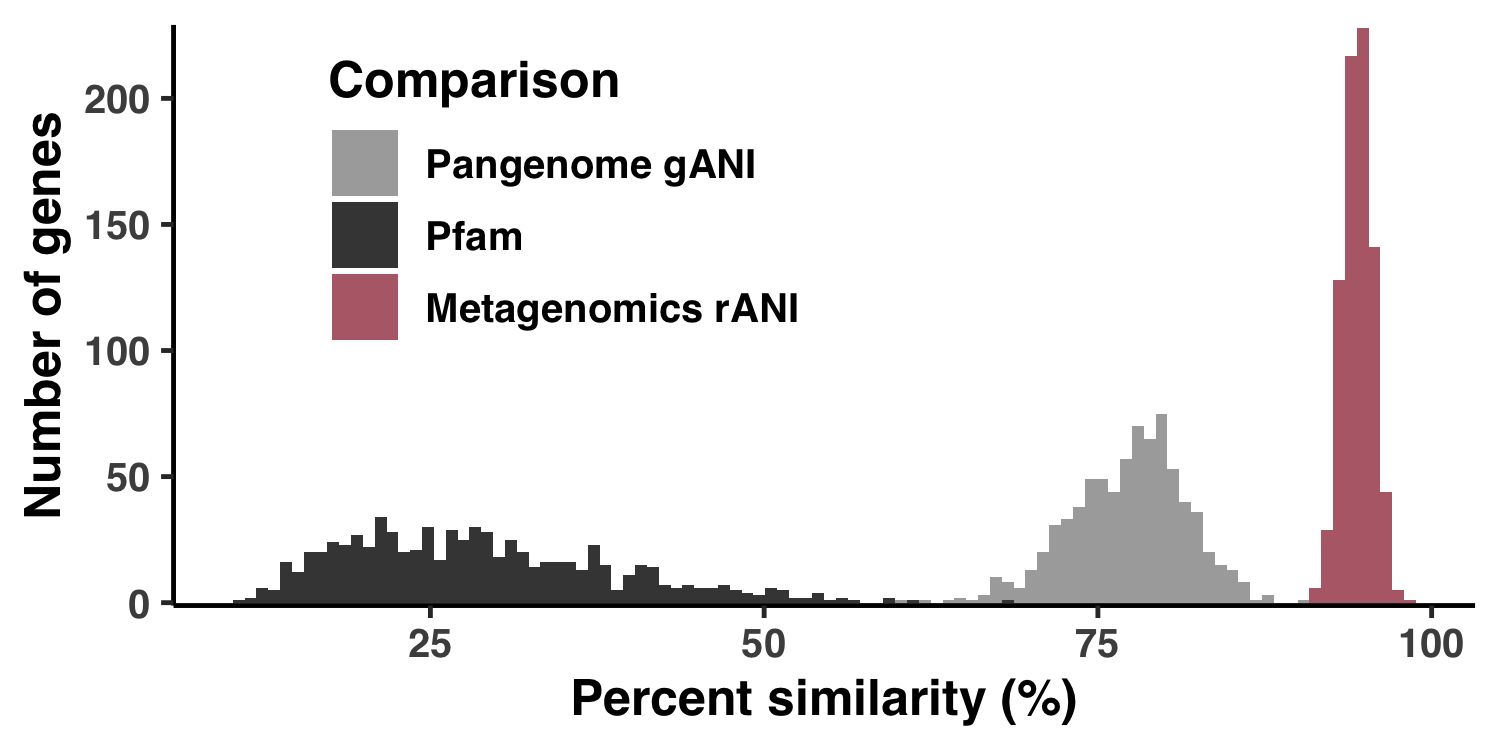
Analysis 4: Distributions of environmental parameters
This is how I created Figure S2.
Show/Hide Script
#! /usr/bin/env Rscript

source("utils.R")

args <- list()
args$output <- "../YY_PLOTS/FIG_S_ENV"
args$meta <- "../TARA_metadata.txt"
args$soi <- "../soi"

library(tidyverse)

dir.create(args$output, showWarnings=F, recursive=T)

# -----------------------------------------------------------------------------
# Reading in the data
# -----------------------------------------------------------------------------

soi <- read_tsv(args$soi, col_names = F)

set.seed(4323)
get_pallette <- function(size) {
    colors <- list()
    for (i in 1:size) {
        colors[[i]] <- paste("#", paste(rep(sample(c("3", "4", "5", "6", "7", "8", "9", "A", "B"), 1), 6), collapse=""), sep="")
    }
    colors
}
cbPalette <- get_pallette(10)

df <- read_tsv(args$meta) %>%
    rename(sample_id=`Sample Id`) %>%
    pivot_longer(cols=c(
        `Depth (m)`,
        `Chlorophyll Sensor s`,
        `Temperature (deg C)`,
        `Salinity (PSU)`,
        `Oxygen (umol/kg)`,
        `Nitrates (umol/L)`,
        `PO4 (umol/L)`,
        `SI (umol/L)`
    ))

# -----------------------------------------------------------------------------
# Plot the thing
# -----------------------------------------------------------------------------

g <- ggplot(data = df, aes(x=value)) +
    geom_histogram(aes(fill=name)) +
    facet_wrap(~ name, ncol=3, scales="free", strip.position="bottom") +
    scale_fill_manual(values=cbPalette) +
    labs(
        x="",
        y="Number of Metagenomes"
    ) +
    theme_classic(base_size=12) +
    theme(
        legend.position = "none",
        text=element_text(size=12, family="Helvetica", face="bold"),
        strip.background = element_blank(),
        strip.placement="outside"
    ) +
    scale_y_continuous(limits = c(0,NA), expand = c(0.005, 0))
display(g, file.path(args$output, "meta.png"), width=6.5, height=5, as.png=TRUE)
Command #52
source('figure_s_env.R')
The output image is YY_PLOTS/FIG_S_ENV/meta.png.
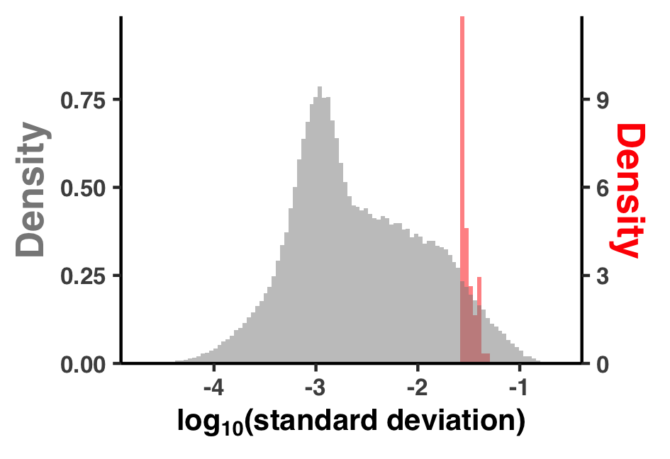
Analysis 5: $\text{pN}^{(\text{site})}$ and $\text{pS}^{(\text{site})}$ variation across genes and samples
I did some summary analyses to describe how per-site pN$^{(\text{site})}$ and pS$^{(\text{site})}$ vary within and between genes and samples. The output of these data are Figure S3 and Table S3.
I created Figure S3 with ZZ_SCRIPTS/figure_s_pn_hist.R:
Show/Hide Script
#! /usr/bin/env Rscript

request_scvs <- TRUE
request_regs <- FALSE
withRestarts(source("load_data.R"), terminate=function() message('load_data.R: data already loaded. Nice.'))

library(tidyverse)
library(latex2exp)

args <- list()
args$output <- "../YY_PLOTS/FIG_S_PN_HIST"

dir.create(args$output, showWarnings=F, recursive=T)

# -----------------------------------------------------------------------------
# Just do it
# -----------------------------------------------------------------------------

col1 <- '#888888'
col2 <- 'red'
coeff <- 12
g <- ggplot() +
    geom_histogram(
        data = scvs %>% group_by(sample_id) %>% summarize(x=sd(pN_popular_consensus, na.rm=T)) %>% mutate(group='group'),
        mapping = aes(x=log10(x), y=..density../coeff, fill=group),
        fill = col2,
        alpha = 0.5,
        bins = 100
    ) +
    geom_histogram(
        data = scvs %>% group_by(unique_pos_identifier) %>% summarize(x=sd(pN_popular_consensus)) %>% mutate(group='group'),
        mapping = aes(x=log10(x), y=..density.., fill=group),
        fill = col1,
        alpha = 0.5,
        bins = 100
    ) +
    theme_classic() +
    theme(
        text=element_text(size=10, family="Helvetica", face="bold"),
        axis.title.y = element_text(color = col1, size=13),
        axis.title.y.right = element_text(color = col2, size=13)
    ) +
    labs(
        y="Density",
        x=TeX("$log_{10}$(standard deviation)", bold=TRUE)
    ) +
    scale_y_continuous(
      name = "Density",
      sec.axis = sec_axis(~.*coeff, name="Density"),
      expand = c(0, 0)
    )
s <- 0.9
display(g, file.path(args$output, "fig.png"), width=s*3.5, height=s*2.4)
It can be ran with the following:
Command #53
source('figure_s_pn_hist.R')
The output image is YY_PLOTS/FIG_S_PN_HIST/fig.png.
Now for Table S3. Quite simply, the table data in Table S3 were calculated by loading up the pN$^{(\text{site})}$ and pS$^{(\text{site})}$ data found in 11_SCVs.txt, making some summary tables, and writing each to different sheet in the Excel table WW_TABLES/PNPS_SUMS.xlsx. Here is the responsible script:
Show/Hide Script
#! /usr/bin/env python

import pandas as pd
from pathlib import Path

tables_dir = Path('WW_TABLES')
tables_dir.mkdir(exist_ok=True)

# ---------------------------------------------------------

df = pd.read_csv("11_SCVs.txt", sep='\t')

per_gene_per_sample = df.\
    groupby(['corresponding_gene_call', 'sample_id'])\
    [['pN_popular_consensus', 'pS_popular_consensus']].\
    mean().\
    reset_index().\
    rename(columns={'pN_popular_consensus':'mean(pN_site)', 'pS_popular_consensus':'mean(pS_site)'})

per_gene = df.\
    groupby(['corresponding_gene_call'])\
    [['pN_popular_consensus', 'pS_popular_consensus']].\
    mean().\
    reset_index().\
    rename(columns={'pN_popular_consensus':'mean(pN_site)', 'pS_popular_consensus':'mean(pS_site)'})

per_sample = df.\
    groupby(['sample_id'])\
    [['pN_popular_consensus', 'pS_popular_consensus']].\
    mean().\
    reset_index().\
    rename(columns={'pN_popular_consensus':'mean(pN_site)', 'pS_popular_consensus':'mean(pS_site)'})

overall = df\
    [['pN_popular_consensus', 'pS_popular_consensus']].\
    mean().\
    reset_index().\
    rename(columns={'index':'rate', 0:'value'})
overall['rate'] = overall['rate'].map({'pN_popular_consensus': 'mean(pN_site)', 'pS_popular_consensus': 'mean(pS_site)'})

with pd.ExcelWriter(tables_dir/'PNPS_SUMS.xlsx') as writer:
    overall.to_excel(writer, sheet_name='Overall average per site rates')
    per_gene_per_sample.to_excel(writer, sheet_name='Averaged each gene-sample pair')
    per_gene.to_excel(writer, sheet_name='Averaged for each gene')
    per_sample.to_excel(writer, sheet_name='Averaged for each sample')
Which can be ran from the command line:
Command #54
python ZZ_SCRIPTS/table_pnps_sums.py
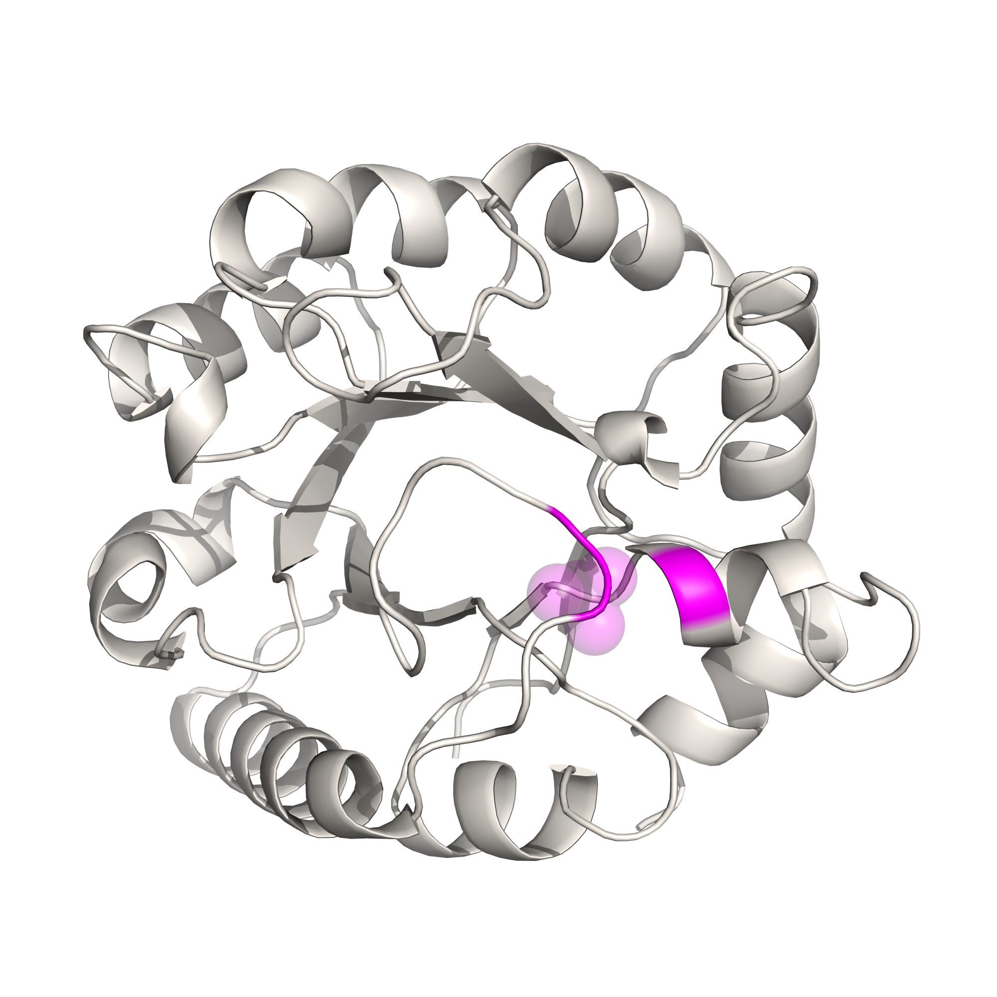
Analysis 6: Creating the anvi’o structure workflow diagram
Since Figure 1 is merely a diagrammatic workflow, there is no real data. Consequently, there is not much value in reproducing this figure. But that didn’t stop me. You can reproduce the protein images by running this clump of PyMOL scripts (.pml extension)
Command #55
pymol -c ZZ_SCRIPTS/figure_1_worker1.pml
pymol -c ZZ_SCRIPTS/figure_1_worker2.pml
pymol -c ZZ_SCRIPTS/figure_1_worker3.pml
pymol -c ZZ_SCRIPTS/figure_1_worker4.pml
pymol -c ZZ_SCRIPTS/figure_1_worker6.pml
This places a bunch of PyMOL-generated images in the folder YY_PLOTS/FIG_1, such as this one.
Analysis 7: Comparing AlphaFold to MODELLER
I started working on this study a few years before the exceedingly recent revolution in structure prediction that has been seeded by AlphaFold and its monumental success seen during the CASP14 structure prediction competition. Back then, I developed a program anvi-gen-structure-database that predicted protein structures using template-based homology modeling with MODELLER.
Template-based homology modeling relies on the existence of a template structure that shares homology with your gene of interest. I wrote a whole thing about it (click here) that you should read if you’re interested. In that post I explain everything there is to know about anvi-gen-structure-database, how it uses MODELLER to predict protein structures, and how you can interactively explore metagenomic sequence variants in the context of predicted protein structures and ligand-binding sites (we’ll briefly get into this specific topic later). But the gist of template-based homology modelling is that it only works if your protein of interest has a homologous protein with an experimentally-resolved structure. The higher the percent similarity between your protein and the template protein, the more accurate the structure prediction will be.
And up until October 2021, all of the analyses in this paper used structures derived from template-based homology modelling. Then DeepMind released the source code for AlphaFold, which does not require templates with solved structures, and outperformed all other methods that came before it. It was then that I realized it would be worthwhile to make the switch, and so I did.
With that in mind, the usage of MODELLER in this study is somewhat historical. Before AlphaFold, I actually wrote an entire pipeline of software encapsulated in the program anvi-gen-structure-database that predicts protein structures en masse, where the user simply provides a contigs-db of interest. Since we have two methods to calculate protein structures, we thought it would be insightful to compare them, which led to the supplemental info entitled, “Comparing structure predictions between AlphaFold and MODELLER”.
In this document I’ll detail (a) how to predict MODELLER structures using anvi-gen-structure-database and (b) how I compared MODELLER structures to AlphaFold structures.
Download links to the structures
If you’re here because you just want access to either the MODELLER structures, the AlphaFold structures, or both, here are the download links:
# MODELLER
curl -L -o 09_STRUCTURES_MOD.tar.gz https://api.figshare.com/v2/file/download/38105496
tar -zxvf 09_STRUCTURES_MOD.tar.gz
rm 09_STRUCTURES_MOD.tar.gz

# AlphaFold
curl -L -o 09_STRUCTURES_AF.tar.gz https://api.figshare.com/v2/file/download/33125294
tar -zxvf 09_STRUCTURES_AF.tar.gz
rm 09_STRUCTURES_AF.tar.gz
Calculating MODELLER structures
Calculating structures with MODELLER using anvi-gen-structure-database is exceedingly easy and in a rather extensive blog post, I go into all of the nitty gritty. The net result is that generating structures for genes within a contigs-db has never been easier. It boils down to just one command, which you should feel free to run with as many threads as you can afford to shell out.
Command #56
anvi-gen-structure-database -c CONTIGS.db -o 09_STRUCTURE_MOD.db -T <NUM_THREADS> --genes-of-interest goi
‣ Time: ~(18/<NUM_THREADS>) hours
‣ Storage: 160 Mb
‣ Internet: Maybe
If you don’t have internet, you’ll need an offline database built ahead of time that you can generate with anvi-setup-pdb-database (which will itself require internet).
Running the above command will produce a structure-db of MODELLER-predicted structures.
Trustworthy MODELLER structures
In Step 11, we defined ‘trustworthy’ AlphaFold structures as those that maintain an average pLDDT score of >80, and we stored the corresponding gene IDs in the file 12_GENES_WITH_GOOD_STRUCTURES.
Similarly, we take certain measures to try and define ‘trustworthy’ when using MODELLER structures that are outlined in the Methods section of the paper:
We discarded any proteins if the best template had a percent similarity of <30%. Unlike more sophisticated homology approaches that make use of multi-domain templates (CITE RaptorX), we used single-domain templates which are convenient and are accurate up to several angstroms, yet can lead to physically inaccurate models when the templates’ domains match to some, but not all of the sequences’ domains. To avoid this, we discarded any templates if the alignment coverage of the protein sequence to the chosen template was <80%. Applying these filters resulted in 408 structures from the 1a.3.V core, which was further refined by requiring that the root mean squared distance (RMSD) between the predicted structure and the most similar template did not exceed 7.5 angstroms, and that the GA341 model score exceeded 0.95. After applying these constraints, we were left with 346 structures in the 1a.3.V that we assumed to be ‘trustworthy’ structures as predicted by MODELLER
In the above command, the 30% template homology and 80% alignment coverage have already been applied (though you can change these default cutoffs with the flags --percent-cutoff and --alignment-fraction-cutoff, respectively), meaning all structures in 09_STRUCTURE_MOD.db satisfy these constraints. To apply the RMSD and GA341 filters, I wrote the script ZZ_SCRIPTS/gen_genes_with_good_structures_modeller.py, which calculates the RMSD between each structure and its ‘best’ template using ProDy, where best template is defined by the template with the highest alignment coverage $\times$ percent similarity score. It also queries the GA341 score produced by MODELLER, and filters any models with scores <0.95.
Show/Hide gen_genes_with_good_structures_modeller.py
#! /usr/bin/env python

import argparse
import anvio.structureops as sops
import anvio.filesnpaths as filesnpaths
import anvio.utils as utils

from prody.proteins.pdbfile import parsePDB
from prody.proteins.compare import matchChains
from prody.measure.transform import calcRMSD
from prody.measure.transform import calcTransformation

ap = argparse.ArgumentParser()
ap.add_argument('-s', '--structure')
args = ap.parse_args()

sdb = sops.StructureDatabase(args.structure)
templates = sdb.db.get_table_as_dataframe('templates')
models = sdb.db.get_table_as_dataframe('models')
goi = set([int(x.strip()) for x in open('goi').readlines()])
templates = templates[templates['corresponding_gene_call'].isin(goi)]

# downsize templates to only include the best template, where best template is defined as
# the template with the highest (alignment coverage * percent similarity = proper percent similarity)
templates = templates.groupby('corresponding_gene_call').apply(lambda df: df[df['proper_percent_similarity'] == df['proper_percent_similarity'].max()])
templates = templates.drop_duplicates(subset=['corresponding_gene_call', 'proper_percent_similarity'])

def get_RMSD(template_path, gene_path):
    x = parsePDB(template_path)
    y = parsePDB(gene_path)

    try:
        matches = matchChains(x, y, seqid=30, overlap=30)
    except:
        matches = None

    if matches is None:
        return matches

    calcTransformation(matches[0][0], matches[0][1]).apply(matches[0][0])
    return calcRMSD(matches[0][0], matches[0][1])

for i, row in templates.iterrows():
    template = row['pdb_id'] + row['chain_id']
    gene_id = row['corresponding_gene_call']

    # export structures
    try:
         template_path = utils.download_protein_structure(protein_code=row['pdb_id'], chain=row['chain_id'], output_path=filesnpaths.get_temp_file_path(), raise_if_fail=True)
    except:
        continue
    gene_path = sdb.export_pdb_content(gene_id, filesnpaths.get_temp_file_path(), ok_if_exists=True)

    templates.loc[i, 'RMSD'] = get_RMSD(template_path, gene_path)

models = models[models['picked_as_best'] == 1]
templates.reset_index(drop=True, inplace=True)
df = templates.merge(models, on='corresponding_gene_call', how='left')
df = df[(df.RMSD <= 7.5) & (df.GA341_score >= 0.95)]

with open('12_GENES_WITH_GOOD_STRUCTURES_MODELLER', 'w') as f:
    for gene_id in df['corresponding_gene_call']:
        f.write(f"{gene_id}\n")
This should take about 5 minutes to complete, and outputs the file 12_GENES_WITH_GOOD_STRUCTURES_MODELLER.
Command #57
python ZZ_SCRIPTS/gen_genes_with_good_structures_modeller.py -s 09_STRUCTURE_MOD.db
‣ Time: 5 min
‣ Internet: Yes
Method comparison
You should now have these 2 files
12_GENES_WITH_GOOD_STRUCTURES
12_GENES_WITH_GOOD_STRUCTURES_MODELLER
which indicate which structure predictions are considered trustworthy by each method. To compare the two methods, I created a summary of alignment and structural metrics. Here is the list of metrics considered.
Alignment metrics. These are calculated by first aligning the structures determined from each method. Obviously, these metrics are only suitable in the subset of protein sequences where a trustworthy structure was determined via both methods.
- RMSD - The root-mean-square deviation of alpha carbon (backbone) atoms. The units are angstroms.
- TM score - The template modeling score. This is a popular global similarity metric that unlike RMSD, is designed specifically for protein structure comparison.
- Contact map MAE - The mean-absolute-error between residue center-of-mass contact maps. This isn’t a widely used metric, just something I made up to de-emphasize RMSD losses introduced by loose linkers between domains. The units are angstroms.
Structure metrics. These are calculated directly from the protein structures and are calculated for each structure.
- mean RSA - The mean relative solvent accessibility.
- $R_g$ - The radius of gyration. The units are angstroms.
- End-to-end distance - This is the Euclidean distance from the N-terminus to the C-terminus. The units are angstroms.
- Fraction of alpha helices - This is the fraction of a gene that corresponded to alpha helices. According to the 8-state secondary structure proposed by DSSP, these correspond to classes G, H, and I.
- Fraction of beta strands - This is the fraction of a gene that corresponded to beta strands. According to the 8-state secondary structure proposed by DSSP, these correspond to classes E and B.
- Fraction of loops/unstructured - This is the fraction of a gene that corresponded to loops or otherwise unclassified residues. According to the 8-state secondary structure proposed by DSSP, these correspond to classes S, T, and C.
AlphaFold metrics. These are specific to AlphaFold.
- mean pLDDT - The mean pLDDT
MODELLER metrics. These are specific to MODELLER.
- template similarity - The mean percent similarity of all templates used for the structure.
For each protein structure, I calculated all of these metrics with the script ZZ_SCRIPTS/comp_struct_preds.py, which takes about 15 minutes to run.
Show/Hide Script
#! /usr/bin/env python

import anvio.utils as utils
import anvio.terminal as terminal
import anvio.structureops as sops
import anvio.filesnpaths as filesnpaths

from prody import confProDy
from prody.measure.measure import calcGyradius, calcDistance
from prody.proteins.pdbfile import parsePDB
from prody.proteins.compare import matchChains
from prody.measure.transform import calcRMSD, calcTransformation

import numpy as np
import pandas as pd
import tmscoring
import matplotlib.pyplot as plt

from pathlib import Path

# -------------------------------------------------------
# Load up the structure databases and auxiliary info
# -------------------------------------------------------

confProDy(verbosity='none')
progress = terminal.Progress()
run = terminal.Run()

db_AF = sops.StructureDatabase('09_STRUCTURE.db')
db_MOD = sops.StructureDatabase('09_STRUCTURE_MOD.db')

plddt = pd.read_csv('09_STRUCTURES_AF/pLDDT_gene.txt', sep='\t').set_index('gene_callers_id')
plddt_residue = pd.read_csv('09_STRUCTURES_AF/pLDDT_residue.txt', sep='\t')

# -------------------------------------------------------
# Get intersection considered trustworthy for both methods
# -------------------------------------------------------

good_AF = set([int(x.strip()) for x in open('12_GENES_WITH_GOOD_STRUCTURES').readlines()])
good_MOD = set([int(x.strip()) for x in open('12_GENES_WITH_GOOD_STRUCTURES_MODELLER').readlines()])
good_intersect = good_AF.intersection(good_MOD)

run.info('Number of trustworthy AlphaFold predictions', len(good_AF))
run.info('Number of trustworthy MODELLER predictions', len(good_MOD))
run.info('Number of shared trustworthy predictions', len(good_intersect))

# -------------------------------------------------------
# Define metrics for assessing ALIGNMENTS
# -------------------------------------------------------

def get_RMSD(path1, path2):
    struct1 = parsePDB(path1)
    struct2 = parsePDB(path2)
    matches = matchChains(struct1, struct2, seqid=30, overlap=30)
    calcTransformation(matches[0][0], matches[0][1]).apply(matches[0][0])
    return calcRMSD(matches[0][0], matches[0][1])

def get_TM_score(path1, path2):
    """Get TM score using tmscoring.

    For whatever reason, there is a bit of an issue with tmscoring. In a rare number of cases, the
    TM score returned depends upon the order of filepaths passed to tmscoring.TMscoring, and by
    trial and error, I have found that taking the max of these values consistently yields the same
    results as the original TM web server https://zhanggroup.org/TM-score/. As such, I return the
    maximum of both values here. See issue: https://github.com/Dapid/tmscoring/issues/6
    """
    aln = tmscoring.TMscoring(path1, path2)
    aln.optimise()
    TM_score = aln.tmscore(**aln.get_current_values())

    aln = tmscoring.TMscoring(path2, path1)
    aln.optimise()
    TM_score_2 = aln.tmscore(**aln.get_current_values())

    return max(TM_score, TM_score_2)

def get_contact_map_mean_absolute_error(gene_id):
    structure_AF = db_AF.get_structure(gene_id)
    contact_map_AF = get_contact_map(structure_AF)
    structure_MOD = db_MOD.get_structure(gene_id)
    contact_map_MOD = get_contact_map(structure_MOD)
    MAE = np.abs(contact_map_MOD - contact_map_AF).sum() / np.product(contact_map_MOD.shape)
    return MAE

def get_contact_map(structure):
    d = {}
    protein_length = len(structure.structure)
    contact_map = np.zeros((protein_length, protein_length))
    for i, residue1 in enumerate(structure.structure):
        if i not in d:
            d[i] = structure.get_residue_center_of_mass(residue1)
        COM1 = d[i]
        for j, residue2 in enumerate(structure.structure):
            if i > j:
                contact_map[i, j] = contact_map[j, i]
            else:
                if j not in d:
                    d[j] = structure.get_residue_center_of_mass(residue2)
                COM2 = d[j]
                contact_map[i, j] = np.sqrt(np.sum((COM1 - COM2)**2))
    return contact_map

# -------------------------------------------------------
# Define metrics for assessing STRUCTURES
# -------------------------------------------------------

def get_Rg(path):
    """Get the radius of gyration"""
    struct = parsePDB(path).select('not hydrogen')
    return calcGyradius(struct)

def get_end_to_end(path):
    """Get the radius of gyration"""
    struct = parsePDB(path).select('not hydrogen')
    nter, cter = struct[0], struct[-1]
    return calcDistance(nter, cter)

def get_mean_RSA(gene_id, db):
    return db.get_residue_info_for_gene(gene_id)['rel_solvent_acc'].mean()

def get_frac_sec_struct(gene_id, db):
    res_info = db.get_residue_info_for_gene(gene_id)
    alpha = res_info['sec_struct'].isin(['G','H','I']).sum()/len(res_info)
    beta = res_info['sec_struct'].isin(['E','B']).sum()/len(res_info)
    loop = res_info['sec_struct'].isin(['S','T','C']).sum()/len(res_info)
    return alpha, beta, loop

def get_length(gene_id, db1, db2):
    try:
        return len(db1.get_structure(gene_id).get_sequence())
    except:
        return len(db2.get_structure(gene_id).get_sequence())

# -------------------------------------------------------
# Run the metrics for each gene
# -------------------------------------------------------

d = dict(
    gene_callers_id = [],
    length = [],
    has_AF = [],
    has_MOD = [],
    RMSD = [],
    TM_score = [],
    contact_MAE = [],
    mean_RSA_AF = [],
    mean_RSA_MOD = [],
    gyradius_AF = [],
    gyradius_MOD = [],
    endtoend_AF = [],
    endtoend_MOD = [],
    frac_alpha_AF = [],
    frac_alpha_MOD = [],
    frac_beta_AF = [],
    frac_beta_MOD = [],
    frac_loop_AF = [],
    frac_loop_MOD = [],
    template_similarity = [],
    mean_pLDDT = [],
    mean_trunc_pLDDT = [],
)

progress.new('Calculating metrics', progress_total_items=len(good_AF.union(good_MOD)))

for gene_id in good_AF.union(good_MOD):
    has_AF = True if gene_id in good_AF else False
    has_MOD = True if gene_id in good_MOD else False

    path_AF = db_AF.export_pdb_content(gene_id, filesnpaths.get_temp_file_path()) if has_AF else np.nan
    # Calculate structure metrics
    mean_RSA_AF = get_mean_RSA(gene_id, db_AF) if has_AF else np.nan
    gyradius_AF = get_Rg(path_AF) if has_AF else np.nan
    endtoend_AF = get_end_to_end(path_AF) if has_AF else np.nan
    frac_alpha_AF, frac_beta_AF, frac_loop_AF = get_frac_sec_struct(gene_id, db_AF) if has_AF else (np.nan, np.nan, np.nan)
    # AF-specific metrics
    mean_pLDDT = plddt.loc[gene_id, 'plddt'] if has_AF else np.nan
    mean_trunc_pLDDT = plddt_residue.loc[plddt_residue['gene_callers_id']==gene_id, 'plddt'][10:-10].mean() if has_AF else np.nan

    path_MOD = db_MOD.export_pdb_content(gene_id, filesnpaths.get_temp_file_path()) if has_MOD else np.nan
    # Calculate structure metrics
    mean_RSA_MOD = get_mean_RSA(gene_id, db_MOD) if has_MOD else np.nan
    gyradius_MOD = get_Rg(path_MOD) if has_MOD else np.nan
    endtoend_MOD = get_end_to_end(path_MOD) if has_MOD else np.nan
    frac_alpha_MOD, frac_beta_MOD, frac_loop_MOD = get_frac_sec_struct(gene_id, db_MOD) if has_MOD else (np.nan, np.nan, np.nan)
    # Calculate MOD-specific metrics
    template_similarity = db_MOD.get_template_info_for_gene(gene_id)['percent_similarity'].mean() if has_MOD else np.nan

    # Calculate alignment metrics
    RMSD = get_RMSD(path_AF, path_MOD) if (has_MOD and has_AF) else np.nan
    TM_score = get_TM_score(path_AF, path_MOD) if (has_MOD and has_AF) else np.nan
    MAE = get_contact_map_mean_absolute_error(gene_id) if (has_MOD and has_AF) else np.nan

    progress.update(f"Gene ID {gene_id}, RMSD {RMSD:.1f}, contact MAE {MAE:.1f}, TM score {TM_score:.2f}")
    progress.increment()

    d['gene_callers_id'].append(gene_id)
    d['length'].append(get_length(gene_id, db_AF, db_MOD))
    d['has_AF'].append(has_AF)
    d['has_MOD'].append(has_MOD)
    d['RMSD'].append(RMSD)
    d['TM_score'].append(TM_score)
    d['contact_MAE'].append(MAE)
    d['mean_RSA_AF'].append(mean_RSA_AF)
    d['mean_RSA_MOD'].append(mean_RSA_MOD)
    d['gyradius_AF'].append(gyradius_AF)
    d['gyradius_MOD'].append(gyradius_MOD)
    d['endtoend_AF'].append(gyradius_AF)
    d['endtoend_MOD'].append(gyradius_MOD)
    d['frac_alpha_AF'].append(frac_alpha_AF)
    d['frac_alpha_MOD'].append(frac_alpha_MOD)
    d['frac_beta_AF'].append(frac_beta_AF)
    d['frac_beta_MOD'].append(frac_beta_MOD)
    d['frac_loop_AF'].append(frac_loop_AF)
    d['frac_loop_MOD'].append(frac_loop_MOD)
    d['template_similarity'].append(template_similarity)
    d['mean_pLDDT'].append(mean_pLDDT)
    d['mean_trunc_pLDDT'].append(mean_trunc_pLDDT)

progress.end()

df = pd.DataFrame(d)
df.to_csv('09_STRUCTURE_comparison.txt', sep='\t', index=False)

tables_dir = Path('WW_TABLES')
tables_dir.mkdir(exist_ok=True)
with pd.ExcelWriter(tables_dir/'STRUCT_COMP.xlsx') as writer:
    df.to_excel(writer, sheet_name='Structure comparison')
Command #58
python ZZ_SCRIPTS/comp_struct_preds.py
‣ Time: 15 min
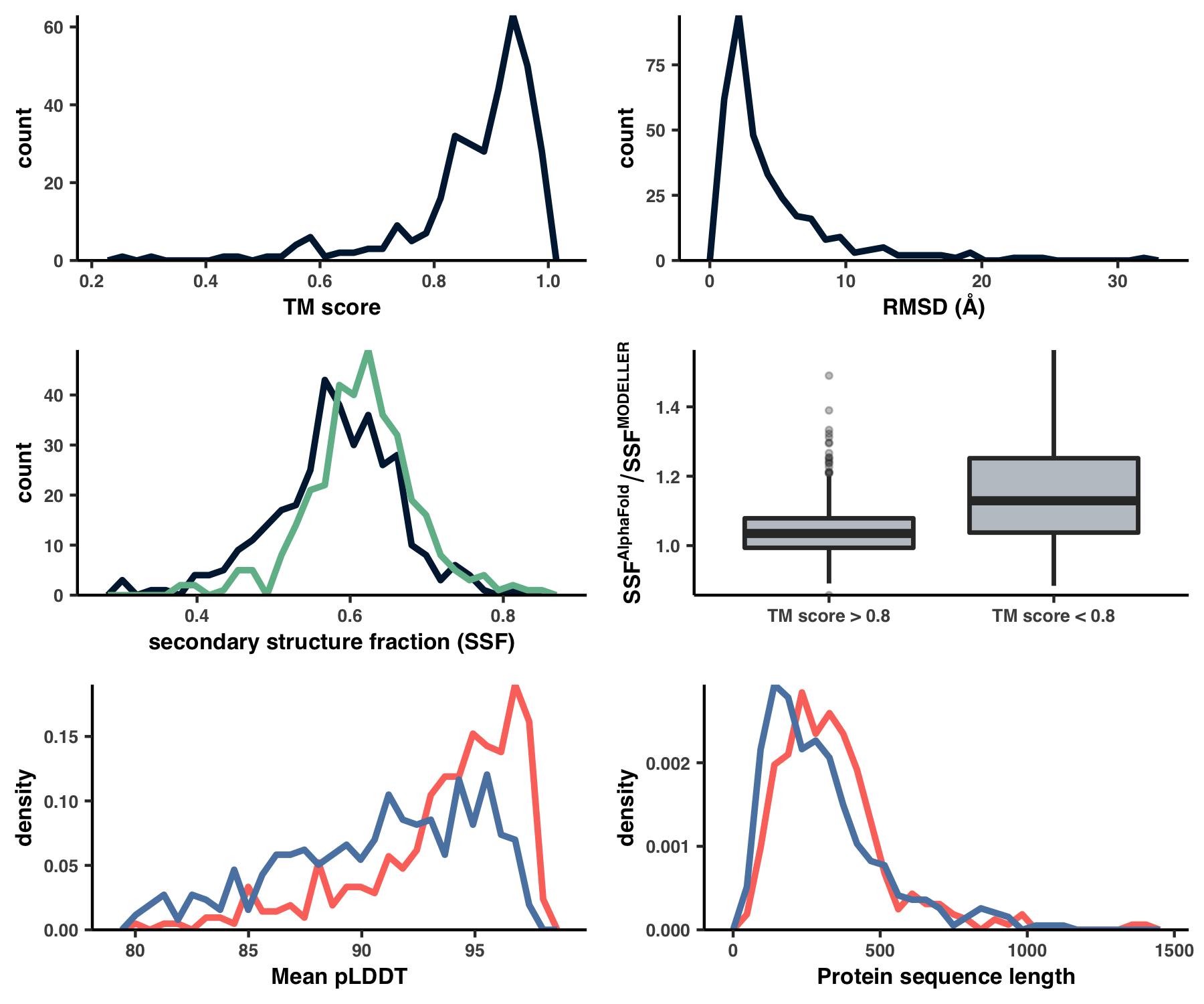
This creates the files 09_STRUCTURE_comparison.txt and WW_TABLES/STRUCT_COMP.xlsx, which are otherwise known as Table S4. Using this table, I created Figure S4 with the script ZZ_SCRIPTS/figure_s_comp.R.
Show/Hide Script
#! /usr/bin/env Rscript

source(file.path("utils.R"))

library(tidyverse)
library(latex2exp)
library(cowplot)

args <- list()
args$input <- "../09_STRUCTURE_comparison.txt"
args$output <- "../YY_PLOTS/FIG_S_COMP"

dir.create(args$output, showWarnings=F, recursive=T)

df <- read_tsv(args$input) %>% mutate(frac_ss_MOD = frac_alpha_MOD + frac_beta_MOD, frac_ss_AF = frac_alpha_AF + frac_beta_AF)

size <- 1.1
#col1 <- '#D7C49E'
#col2 <- '#343148'
col1 <- '#00203F'
col2 <- '#70ba98'
col3 <- '#FC766A'
col4 <- '#5B84B1'

# -----------------------------------------------------------
# Measures of alignment (row 1)
# -----------------------------------------------------------

g1 <- ggplot(df %>% filter(!is.na(TM_score))) +
    geom_freqpoly(aes(TM_score), color=col1, size=size) +
    my_theme(8) +
    scale_y_continuous(expand=c(0,0)) +
    labs(x = 'TM score')

g2 <- ggplot(df %>% filter(!is.na(RMSD))) +
    geom_freqpoly(aes(RMSD), color=col1, size=size) +
    my_theme(8) +
    scale_y_continuous(expand=c(0,0)) +
    labs(x='RMSD (Å)')

# -----------------------------------------------------------
# Structure metric comparisons within intersection (row 2)
# -----------------------------------------------------------

plot_data <- df %>% filter(has_MOD)

g3 <- ggplot(plot_data) +
    geom_freqpoly(aes(x=frac_alpha_MOD+frac_beta_MOD), col=col1, size=size) +
    geom_freqpoly(aes(x=frac_alpha_AF+frac_beta_AF), col=col2, size=size) +
    my_theme(8) +
    scale_y_continuous(expand=c(0,0)) +
    labs(x="secondary structure fraction (SSF)")

g4 <- ggplot(data=df %>% filter(has_MOD, !is.na(TM_score))) +
    geom_boxplot(
        mapping=aes(x=TM_score<0.8, y=frac_ss_AF/frac_ss_MOD), fill=col1, alpha=0.3, size=0.7*size, outlier.size=0.8) +
    scale_x_discrete(labels=c("TM score > 0.8","TM score < 0.8")) +
    my_theme(8) +
    scale_y_continuous(expand=c(0,0)) +
    labs(x='', y=TeX("$SSF^{AlphaFold} / SSF^{MODELLER}$", bold=T))

# -----------------------------------------------------------
# Comparisons between AlphaFold cohorts (row 3)
# -----------------------------------------------------------

g5 <- ggplot() +
    geom_freqpoly(data=df %>% filter(has_MOD), mapping=aes(x=mean_pLDDT, y=..density..), col=col3, size=size) +
    geom_freqpoly(data=df %>% filter(!has_MOD), mapping=aes(x=mean_pLDDT, y=..density..), col=col4, size=size) +
    my_theme(8) +
    scale_y_continuous(expand=c(0,0)) +
    labs(x="Mean pLDDT")

g6 <- ggplot() +
    geom_freqpoly(data=df %>% filter(has_MOD), mapping=aes(x=length, y=..density..), col=col3, size=size) +
    geom_freqpoly(data=df %>% filter(!has_MOD), mapping=aes(x=length, y=..density..), col=col4, size=size) +
    my_theme(8) +
    scale_y_continuous(expand=c(0,0)) +
    labs(x="Protein sequence length")

# -----------------------------------------------------------
# Squish them together
# -----------------------------------------------------------

g <- plot_grid(g1, g2, g3, g4, g5, g6, nrow=3)
display(g, file.path(args$output, "fig.png"), width=6, height=5, as.png=T)
Command #59
source('figure_s_comp.R')
Running this creates Figure S4 under the filename YY_PLOTS/FIG_S_COMP/fig.png:
Analysis 8: Predicting ligand-binding sites
All of the heavy-lifting for binding site prediction has already been accomplished during Step 13. If you’re looking for descriptions, implementation details, and the like, you’re likely to find it over there. But what remains to be done, is creating Table S5. This table summarizes all of the ligand-binding predictions and reproducing it is the subject of this brief Analysis.
ZZ_SCRIPTS/table_lig.py is the script that creates Table S5 under the filename WW_TABLES/LIG.xlsx:
Show/Hide Script
#! /usr/bin/env python

import anvio
import pandas as pd
import anvio.structureops as sops

from pathlib import Path

tables_dir = Path('WW_TABLES')
tables_dir.mkdir(exist_ok=True)

# ------------------------------------------------------------
# Load up all of the dataframes
# ------------------------------------------------------------

sheet1 = pd.read_csv("08_INTERACDOME-binding_frequencies.txt", sep='\t')
sheet2 = pd.read_csv("08_INTERACDOME-domain_hits.txt", sep='\t')
sheet3 = pd.read_csv("08_INTERACDOME-match_state_contributors.txt", sep='\t')
sheet4 = pd.read_csv(Path(anvio.__file__).parent / 'data/misc/Interacdome/representable_interactions.txt', sep='\t', comment='#')

# ------------------------------------------------------------
# Save the excel sheets
# ------------------------------------------------------------

with pd.ExcelWriter(tables_dir/'LIG.xlsx') as writer:
    sheet1.to_excel(writer, sheet_name='Ligand binding frequencies')
    sheet2.to_excel(writer, sheet_name='Domain hits')
    sheet3.to_excel(writer, sheet_name='Match state contributions')
    sheet4.to_excel(writer, sheet_name='Representable interactions')
Rather boringly, this script packages up a bunch of tabular data you already had, and creates an Excel table, where each sheet is a different table. You can run this script like so:
Command #60
python ZZ_SCRIPTS/table_lig.py
Analysis 9: Genome-wide pN- and pS-weighted RSA and DTL distributions
In this analysis, I discuss everything related to how pN and pS distribution relative to RSA and DTL on a genome-wide scale. This means I’ll cover topics related to Figures 2a, 2b, S5, and S6.
Distributions (Figures 2a, 2b)
In Figure 1, we calculated how per-site pN and pS distribute with respect to the variables RSA and DTL. That data looks like this:
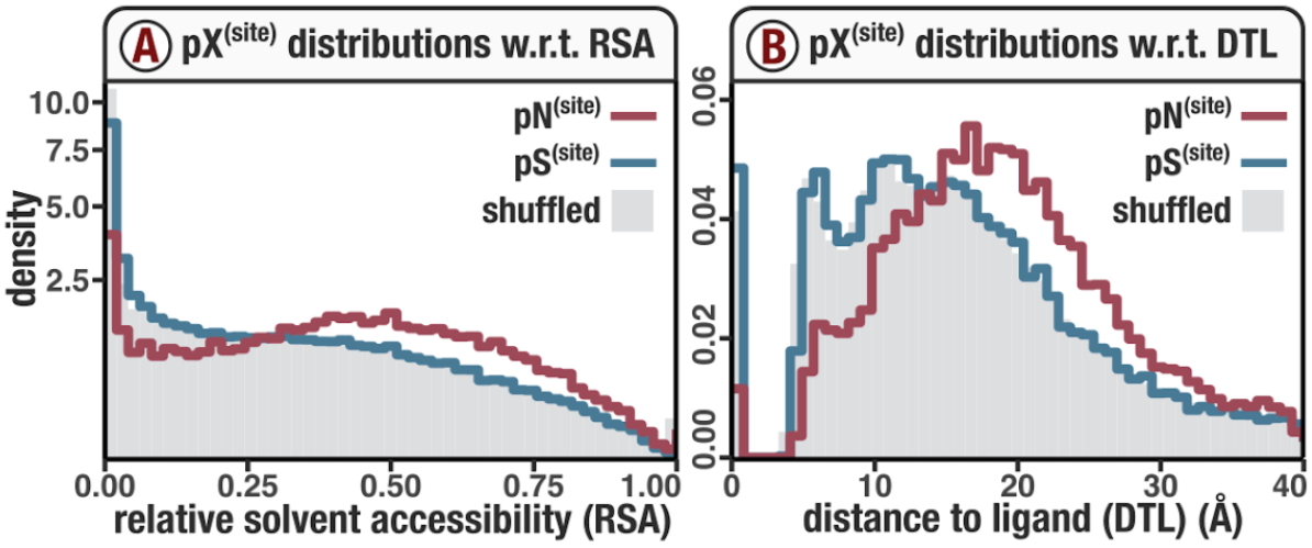
For the purposes of explanation, let’s just focus on RSA (left) and pN (red) for the time being. This is a weighted distribution calculated by weighting each site’s RSA by the pN observed at each sample. Conceptually, this means that for each sample, the RSA of every site contributes to this distribution. The amount that each site contributes is equal to the pN observed at that site in that sample. Similarly, the blue distribution is created by weighting each RSA value by the observed pS at that site in that sample. The grey distributions represent null distributions (see next section).
These histograms are created using the script ZZ_SCRIPTS/figure_2.R. As the name suggests, this creates all of the plots in Figure 2, not just the per-site distributions described. Here is the relevant section of the script:
Show/Hide Script
# -----------------------------------------------------------------------------
# Per site histograms
# -----------------------------------------------------------------------------

make_plot <- function(variable, col_shuffle="#AA99AA", xlim=NA, ylim=NA,
                              sqrty=FALSE, replicates=10, shuffle=T) {
    type <- 'pS_popular_consensus'
    plot_data <- scvs %>%
        select((!!sym(variable)), (!!sym(type))) %>%
        filter(!is.na((!!sym(type))), !is.na((!!sym(variable))))
    count_method <- "density"
    g <- ggplot()
    bin_count <- 50
    type_frac <- c()
    type_var <- c()
    for (i in 1:replicates) {
        shuffle_plot_data <- plot_data %>%
            sample_n(size=plot_data %>% dim() %>% .[[1]], replace=F)
        type_frac <- append(type_frac, shuffle_plot_data[,type] %>% .[[1]])
        type_var <- append(type_var, plot_data[,variable] %>% .[[1]])
        plot_data$shuffled <- shuffle_plot_data %>% .[[2]]
    }
    mean_shuffle <- data.frame(type_frac, type_var)
    g <- g +
        geom_histogram(
            data = mean_shuffle,
            mapping=aes_string(x="type_var", weight="type_frac", y=paste("..", count_method, "..", sep="")),
            origin=0,
            fill=col_shuffle,
            alpha=1.0,
            bins=bin_count
        )
    g <- g +
        stat_bin(
            data = plot_data,
            mapping=aes_string(x=variable, weight=type, y=paste("..", count_method, "..", sep="")),
            geom="step",
            center=0.0,
            color=s_col,
            size=1.0,
            bins=bin_count
        )
    type <- 'pN_popular_consensus'
    plot_data <- scvs %>%
        select((!!sym(variable)), (!!sym(type))) %>%
        filter(!is.na((!!sym(type))), !is.na((!!sym(variable))))
    g <- g +
        stat_bin(
            data = plot_data,
            mapping=aes_string(x=variable, weight=type, y=paste("..", count_method, "..", sep="")),
            geom="step",
            center=0.0,
            color=ns_col,
            size=1.0,
            bins=bin_count
        )
    g <- g +
        labs(y=count_method, x=variable) +
        theme_classic() +
        my_theme(9) +
        scale_x_continuous(limits = xlim, expand = c(0, 0))
    if (sqrty) {
        g <- g + scale_y_continuous(limits = c(NA, ylim), trans='sqrt', expand = c(0.005, 0))
    } else {
        g <- g + scale_y_continuous(limits = c(NA, ylim), expand = c(0.005, 0))
    }
    g
}
N <- 10
shuffle_color <- "#E1E2E4"
DTL_pN <- make_plot(variable='ANY_dist', xlim=c(0,40), ylim=0.0625, sqrty=FALSE, replicates=N, col_shuffle=shuffle_color)
RSA_pN <- make_plot(variable='rel_solvent_acc', xlim=c(0,1.0), ylim=11.0, sqrty=TRUE, replicates=N, col_shuffle=shuffle_color)
plots <- cowplot::align_plots(DTL_pN, RSA_pN, ncol=1, align='v', axis='l')
w <- 2.322
f <- 0.939
display(
    plots[[1]],
    output=file.path(args$output, "DTL_hist.pdf"), width=w, height=0.7*w, as.png=F
)
display(
    plots[[2]],
    output=file.path(args$output, "RSA_hist.pdf"), width=w, height=0.7*w, as.png=F
)
You can generate Figures 2a and 2b (as well as the rest of the plots in Figure 2) from the GRE:
Command #61
source('figure_2.R')
Since this is an aggregation of a rather large amount of data, this will take some time. However, patience is a virtue, and afterwards you can see the resultant plots in YY_PLOTS/FIG_2.
Null distributions (Figure S5)
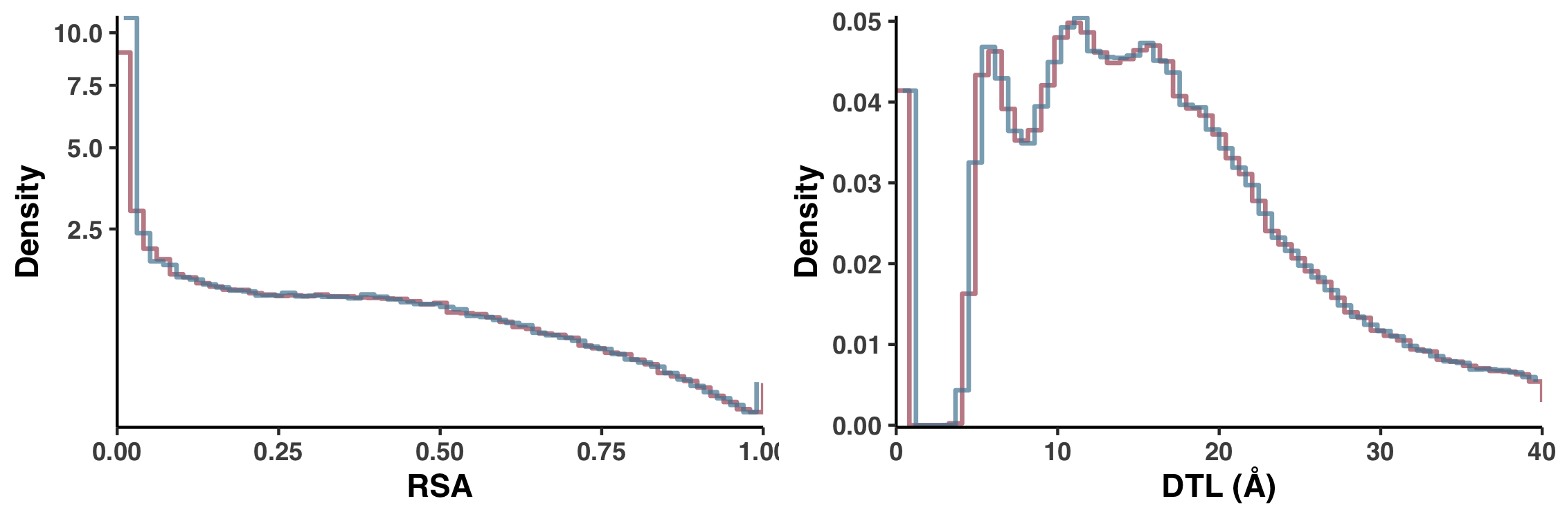
Let’s consider how pN distributes with respect to RSA. One could ask how we would expect pN to distribute with respect to RSA if they were completely uncorrelated, that is, if pN paid no mind to RSA. This is what I call the null distribution. And I calculated the null distribution by shuffling the data, so that the RSA of each site (in each sample) was weighted not by the pN that it deserved, but rather by the pN of a randomly chosen site. And to avoid biases introduced from a single shuffle, we calculated 10 null distributions and the one displayed in Figure 1 is the average of all 10. This is carried out in ZZ_SCRIPTS/figure_2.R.
The null distribution for pS-weighted RSA is created just the same way… Yet you should be asking yourself, why is there only one null distribution displayed in Figure 1a? The reason is purely aesthetic. As it turns out, the null distributions of pS-weighted and pN-weighted RSA are nearly identical, and so increase visual clarity I only displayed one, as is mentioned in the figure caption:
Since the null distribution for pS$^{(site)}$ so closely resembles the null distribution for pN$^{(site)}$, it has been excluded for visual clarity, but can be seen in Figure S5
In Figure S5 I explicitly compare these null distributions to show there’s no sleight of hand. Here is the script that creates Figure S5.
Show/Hide Script
#! /usr/bin/env Rscript

request_scvs <- TRUE
request_regs <- FALSE
withRestarts(source("load_data.R"), terminate=function() message('load_data.R: data already loaded. Nice.'))

library(optparse)
library(tidyverse)
library(cowplot)

args <- list()
args$output <- "../YY_PLOTS/FIG_S_SHUFF_COMP"

# Create directory
dir.create(args$output, showWarnings=F, recursive=T)

# -----------------------------------------------------------------------------
# make the comparison function
# -----------------------------------------------------------------------------

get_plot <- function(variable, xlim=NA, ylim=NA,
                       sqrty=FALSE, replicates=10, shuffle=T) {

    g <- ggplot()
    count_method <- "density"
    bin_count <- 50

    type = 'pN_popular_consensus'
    plot_data <- scvs %>%
        select((!!sym(variable)), (!!sym(type))) %>%
        filter(!is.na((!!sym(type))), !is.na((!!sym(variable))))
    type_frac <- c()
    type_var <- c()
    for (i in 1:replicates) {
        shuffle_plot_data <- plot_data %>%
            sample_n(size=plot_data %>% dim() %>% .[[1]], replace=F)
        type_frac <- append(type_frac, shuffle_plot_data[,type] %>% .[[1]])
        type_var <- append(type_var, plot_data[,variable] %>% .[[1]])
        plot_data$shuffled <- shuffle_plot_data %>% .[[2]]
    }
    mean_shuffle <- data.frame(type_frac, type_var)

    g <- g +
        stat_bin(
            data = mean_shuffle,
            mapping=aes_string(x="type_var", weight="type_frac", y=paste("..", count_method, "..", sep="")),
            geom="step",
            center=0,
            size=0.75,
            color=ns_col,
            bins=bin_count,
            alpha=0.7
        )

    type = 'pS_popular_consensus'
    plot_data <- scvs %>%
        select((!!sym(variable)), (!!sym(type))) %>%
        filter(!is.na((!!sym(type))), !is.na((!!sym(variable))))
    type_frac <- c()
    type_var <- c()
    for (i in 1:replicates) {
        shuffle_plot_data <- plot_data %>%
            sample_n(size=plot_data %>% dim() %>% .[[1]], replace=F)
        type_frac <- append(type_frac, shuffle_plot_data[,type] %>% .[[1]])
        type_var <- append(type_var, plot_data[,variable] %>% .[[1]])
        plot_data$shuffled <- shuffle_plot_data %>% .[[2]]
    }
    mean_shuffle <- data.frame(type_frac, type_var)

    g <- g +
        stat_bin(
            data = mean_shuffle,
            mapping=aes_string(x="type_var", weight="type_frac", y=paste("..", count_method, "..", sep="")),
            geom="step",
            origin=0,
            size=0.75,
            color=s_col,
            bins=bin_count,
            alpha=0.7
        )

    g <- g +
        labs(y=count_method, x=variable) +
        theme_classic() +
        theme(
            text=element_text(size=11, family="Helvetica", face="bold")
        ) +
        scale_x_continuous(limits = xlim, expand = c(0, 0))
    if (sqrty) {
        g <- g + scale_y_continuous(limits = c(NA, ylim), trans='sqrt', expand = c(0.005, 0))
    } else {
        g <- g + scale_y_continuous(limits = c(NA, ylim), expand = c(0.005, 0))
    }
    g
}

N <- 10
DTL <- get_plot(variable='ANY_dist', xlim=c(0,40), sqrty=FALSE, replicates=N) +
    labs(y="Density", x="DTL (Å)")
RSA <- get_plot(variable='rel_solvent_acc', xlim=c(0,1), sqrty=TRUE, replicates=N) +
    labs(y="Density", x="RSA")

# -----------------------------------------------------------------------------
# Put it all together
# -----------------------------------------------------------------------------

display(
    plot_grid(RSA, DTL, ncol=2, align='v'),
    output = file.path(args$output, 'fig.png'),
    w = 7.5,
    h = 2.5
)
Running the following creates Figure S5 under the filename YY_PLOTS/FIG_S_SHUFF_COMP/fig.png:
Command #62
source('figure_s_shuff_comp.R')
‣ Time: ~1 hour
An alternative 1D definition for DTL
Besides our Euclidean distance definition of DTL, we also considered a much more primitive distance metric, which was defined not in 3D space but by the distance in sequence. For example, if a gene had only one ligand-binding residue, which occurred at the fifth residue, then the 25th residue would have a DTL of 20. In Figure S6 we demonstrate how this metric performs.
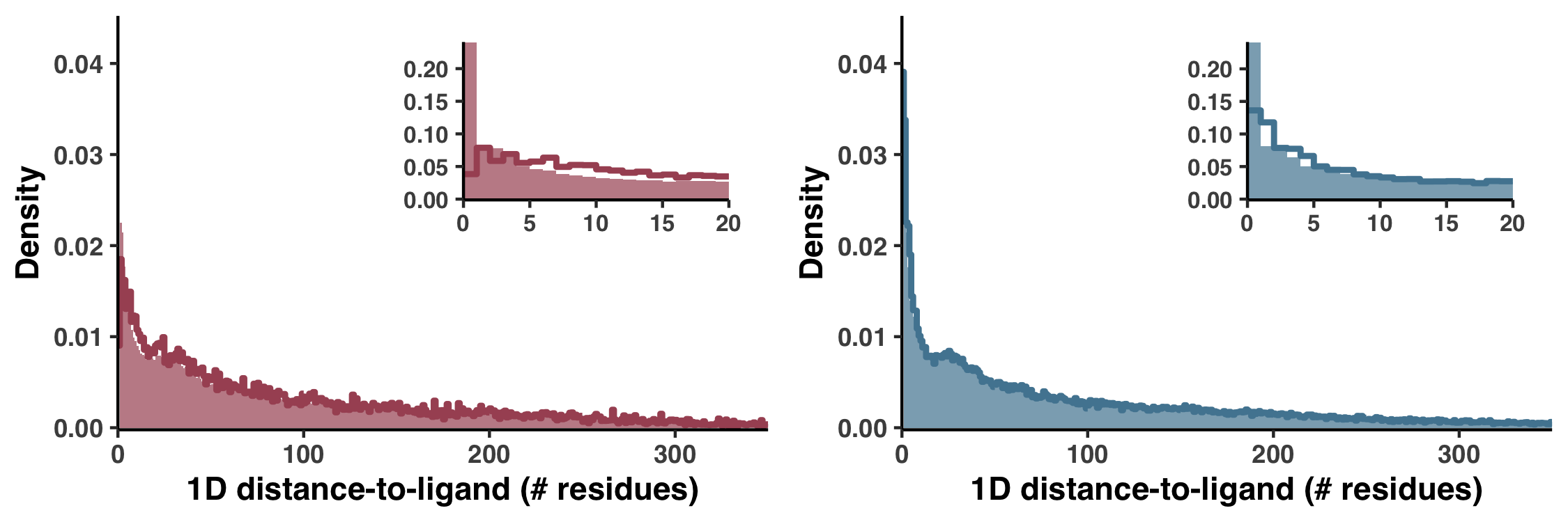
Figure S6 is generated with the script ZZ_SCRIPTS/figure_s_1d_DTL.R
Show/Hide Script
#! /usr/bin/env Rscript

request_scvs <- TRUE
request_regs <- FALSE
withRestarts(source("load_data.R"), terminate=function() message('load_data.R: data already loaded. Nice.'))

library(tidyverse)
library(cowplot)

args <- list()
args$output <- "../YY_PLOTS/FIG_S_1D_DTL"

# Create directory
dir.create(args$output, showWarnings=F, recursive=T)

# -----------------------------------------------------------------------------
# per-site D histograms
# -----------------------------------------------------------------------------

get_D_hist <- function(variable, type, col="#9D082D", col_shuffle="#333333", xlim=NA, ylim=NA,
                       sqrty=FALSE, replicates=10, shuffle=T, shuffle_trace=F) {
    plot_data <- scvs %>%
        select((!!sym(variable)), (!!sym(type))) %>%
        filter(!is.na((!!sym(type))), !is.na((!!sym(variable))))
    count_method <- "density"
    g <- ggplot()
    binwidth <- 1
    type_frac <- c()
    type_var <- c()
    for (i in 1:replicates) {
        shuffle_plot_data <- plot_data %>%
            sample_n(size=plot_data %>% dim() %>% .[[1]], replace=F)
        type_frac <- append(type_frac, shuffle_plot_data[,type] %>% .[[1]])
        type_var <- append(type_var, plot_data[,variable] %>% .[[1]])
        plot_data$shuffled <- shuffle_plot_data %>% .[[2]]
        if (shuffle_trace) {
            g <- g +
                stat_bin(
                    data = plot_data,
                    mapping=aes_string(x=variable, weight="shuffled", y=paste("..", count_method, "..", sep="")),
                    geom="step",
                    origin=0,
                    color=col_shuffle,
                    size=0.3,
                    alpha=0.4,
                    bins=85
                )
        }
    }
    mean_shuffle <- data.frame(type_frac, type_var)
    g <- g +
        geom_histogram(
            data = mean_shuffle,
            mapping=aes_string(x="type_var", weight="type_frac", y=paste("..", count_method, "..", sep="")),
            origin=0,
            fill=col_shuffle,
            alpha=0.7,
            binwidth=binwidth
        )
    g <- g +
        stat_bin(
            data = plot_data,
            mapping=aes_string(x=variable, weight=type, y=paste("..", count_method, "..", sep="")),
            geom="step",
            center=0.0,
            color=col,
            size=1.0,
            binwidth=binwidth
        )
    g <- g +
        labs(y=count_method, x=variable) +
        theme_classic() +
        theme(
            text=element_text(size=11, family="Helvetica", face="bold")
        ) +
        scale_x_continuous(limits = xlim, expand = c(0, 0))
    if (sqrty) {
        g <- g + scale_y_continuous(limits = c(NA, ylim), trans='sqrt', expand = c(0.005, 0))
    } else {
        g <- g + scale_y_continuous(limits = c(NA, ylim), expand = c(0.005, 0))
    }
    g
}

N <- 10
pn_D <- get_D_hist(variable='ANY_D', type='pN_popular_consensus', col=ns_col, col_shuffle=ns_col, xlim=c(0,350), ylim=0.045, sqrty=F, replicates=N) +
    labs(y="Density", x="1D distance-to-ligand (# residues)")
ps_D <- get_D_hist(variable='ANY_D', type='pS_popular_consensus', col=s_col, col_shuffle=s_col, xlim=c(0,350), ylim=0.045, sqrty=F, replicates=N) +
    labs(y="Density", x="1D distance-to-ligand (# residues)")

pn_D_sub <- pn_D +
    scale_x_continuous(limits = c(0,20), expand = c(0, 0)) +
    scale_y_continuous(limits = c(NA, NA), expand = c(0.005, 0)) +
    labs(y="", x="") +
    theme(text=element_text(size=10, family="Helvetica", face="bold"))
ps_D_sub <- ps_D +
    scale_x_continuous(limits = c(0,20), expand = c(0, 0)) +
    scale_y_continuous(limits = c(NA, NA), expand = c(0.005, 0)) +
    labs(y="", x="") +
    theme(text=element_text(size=10, family="Helvetica", face="bold"))

# -----------------------------------------------------------------------------
# Put it all together
# -----------------------------------------------------------------------------

plot1 <- ggdraw(pn_D) +
    draw_plot(pn_D_sub, 0.45, 0.45, 0.5, 0.5)
plot2 <- ggdraw(ps_D) +
    draw_plot(ps_D_sub, 0.45, 0.45, 0.5, 0.5)

display(
    plot_grid(
        plot1, plot2, ncol=2, align='v'),
    output = file.path(args$output, 'fig.pdf'),
    w = 7.5,
    h = 2.5
)
display(
    plot_grid(
        plot1, plot2, ncol=2, align='v'),
    output = file.path(args$output, 'fig.png'),
    w = 7.5,
    h = 2.5
)
which can be ran like so:
Command #63
source('figure_s_1d_DTL.R')
Analysis 10: Comparison to BioLiP and DTL cutoff
As discussed in Proteomic trends in purifying selection are explained by RSA and DTL of the manuscript, missed binding sites leads to instances where we predict a high DTL for sites that are in actuality close to a binding site–a binding site that was not predicted.
We assessed the extent that we may be overestimating DTL due to missed ligand sites by comparing of predicted DTL values in the 1a.3.V core to that found in BioLiP, an extensive database of semi-manually curated ligand-protein complexes. This database is created from experimentally solved structures that have co-complexed with their ligands, and is by no means a complete characterization of ligand binding sites. Nevertheless, these experimentally observed ligands provide an upper bound for how we expect the distribution of DTL, which led to Figure S9.
BioLiP DTL distribution
To get the BioLiP database, we downloaded it directly from the Zhang Group:
Command #64
mkdir 20_BIOLIP
cd 20_BIOLIP
curl -L -O http://zhanglab.ccmb.med.umich.edu/BioLiP/download/BioLiP.tar.bz2
tar -zxvf BioLiP.tar.bz2
cd -
‣ Internet: Yes
This downloads the first version of the database, as it were in 2013. They update this database every once in a while, but even the database from 2013 is plenty big enough for our purposes. Feel free to peruse the data at 20_BIOLIP/BioLiP_2013-03-6.txt.
With knowledge of all the binding sites, I wrote a script that downloads each protein in the database, and loops through each site, calculating its Euclidean distance to the ligands. That script is ZZ_SCRIPTS/biolip_dtl_dist.py:
Show/Hide Script
#! /usr/bin/env python

import anvio.utils as utils
import anvio.terminal as terminal
import anvio.structureops as sops
import anvio.filesnpaths as filesnpaths

import numpy as np
import pandas as pd

from pathlib import Path

progress = terminal.Progress()

TOTAL = 5000

# --------------------------------------------------------------------------------------------------
# define function to calculate DTL
# --------------------------------------------------------------------------------------------------

def get_min_dist_to_lig(structure, lig_positions, var_pos):
    d = {}
    var_res = None

    for lig_pos in lig_positions:
        if structure.pairwise_distances[var_pos, lig_pos] == 0 and var_pos != lig_pos:
            # This distance hasn't been calculated yet. Calculate it
            if var_res is None:
                var_res = structure.get_residue(var_pos)
            lig_res = structure.get_residue(lig_pos)
            structure.pairwise_distances[var_pos, lig_pos] = structure.get_residue_to_residue_distance(var_res, lig_res, 'COM')

        d[lig_pos] = structure.pairwise_distances[var_pos, lig_pos]

    closest = min(d, key = lambda x: d.get(x))
    return closest, d[closest], structure

# --------------------------------------------------------------------------------------------------
# Go through every BioLiP entry and calculate the max DTL
# --------------------------------------------------------------------------------------------------

output = dict(
    pdb_id = [],
    chain_id = [],
    codon_order_in_gene = [],
    dtl = [],
)

biolip = pd.read_csv(Path('20_BIOLIP') / 'BioLiP_2013-03-6.txt', sep='\t', header=None)[[0,1,7,19]].rename(columns={0: 'pdb_id', 1: 'chain_id', 7: 'residues', 19: 'length'})
tmp_file = filesnpaths.get_temp_file_path()

progress.new('Calculating max DTL', progress_total_items = TOTAL)
progress.update('...')

counter = 0
last_pdb = None
for (pdb_id, chain_id), biolip_data in biolip.groupby(['pdb_id', 'chain_id']):
    try:
        if pdb_id == last_pdb:
            # Probe 1 chain from an ID, since due to symmetry we get a lot of repeat measurements
            continue
        else:
            last_pdb = pdb_id

        # Download and load the structure
        utils.download_protein_structure(pdb_id, chain=chain_id, output_path=tmp_file, raise_if_fail=True)
        structure = sops.Structure(tmp_file)
        structure_length = len(biolip_data['length'].iloc[0])
        structure.pairwise_distances = np.zeros((structure_length, structure_length))

        # Get all of the ligand positions
        lig_positions = set()
        for residues in biolip_data['residues']:
            some_lig_positions = set([int(x[1:]) for x in biolip_data.residues.iloc[0].split(' ')])
            lig_positions = lig_positions.union(some_lig_positions)

        # subtract starting residue ID
        offset = structure.structure.get_list()[0].id[1]
        lig_positions = [pos - offset for pos in lig_positions]

        # Calculate the DTL
        for pos in range(structure_length):
            _, dtl, structure = get_min_dist_to_lig(structure, lig_positions, pos)

            # Append results
            output['pdb_id'].append(pdb_id)
            output['chain_id'].append(chain_id)
            output['dtl'].append(dtl)
            output['codon_order_in_gene'].append(pos)

        # Store results
        if counter % 1000 == 0:
            pd.DataFrame(output).to_csv(Path('20_BIOLIP') / 'dtl_dist.txt', sep='\t', index=False)

        counter += 1
        progress.update(f'Iteration {counter} | PDB {pdb_id}{chain_id} | length {structure_length}')
        progress.increment()

        if counter == TOTAL:
            break
    except:
        pass

pd.DataFrame(output).to_csv(Path('20_BIOLIP') / 'dtl_dist.txt', sep='\t', index=False)
Since this script takes such a long time to run, I ended up subsetting the dataset to only 5000 structures. You can modify the variable TOTAL at the top of the script if you want to change this number. When ready, run it:
Command #65
python ZZ_SCRIPTS/biolip_dtl_dist.py
Creating a DTL cutoff
Finally, from within the GRE you can run ZZ_SCRIPTS/figure_s_biolip.R to create Figure S9, which is output to YY_PLOTS/FIG_S_BIOLIP:
Command #66
source('figure_s_biolip.R')
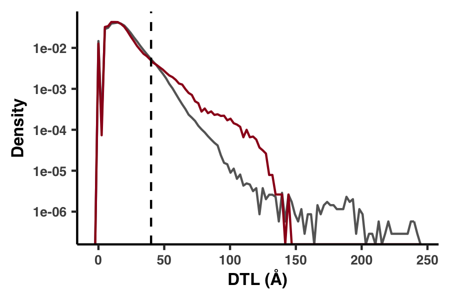
Figure S9 shows that we found the 1a.3.V DTL distribution had a much higher proportion of values >40 Å, suggesting these likely result from incomplete characterization of binding sites (Figure S9). To mitigate the influence of this inevitable error source, we conservatively excluded DTL values >40 Å (8.0% of sites) in all analyses after Figure 2b. This cutoff is shown as the vertical dashed line.
Analysis 11: Big linear models
What percent of variation in per-site polymorphism rates can be explained by RSA and DTL? To answer this question, we created Table S6:
| Name | Model | RSA | DTL | Gene | Sample | Residuals |
|---|---|---|---|---|---|---|
| s #1 | log10(pS(site))~RSA+gene+sample | 0.12 | NA | 4.05 | 1.01 | 94.83 |
| ns #1 | log10(pN(site))~RSA+gene+sample | 11.83 | NA | 10.61 | 6.71 | 70.85 |
| s #2 | log10(pS(site))~DTL+gene+sample | NA | 0.3 | 4.07 | 1 | 94.63 |
| ns #2 | log10(pN(site))~DTL+gene+sample | NA | 6.89 | 12.08 | 7.1 | 73.93 |
| s #3 | log10(pS(site))~RSA+DTL+gene+sample | 0.03 | 0.3 | 4.05 | 1 | 94.62 |
| ns #3 | log10(pN(site))~RSA+DTL+gene+sample | 7.23 | 6.89 | 10.83 | 6.42 | 68.62 |
As a broad summary, this table was constructed by fitting per-site pS and pN (aggregated across genes and samples) to a series of linear models, where the independent variables were one or both of RSA and DTL, as well as the gene the site belongs to and the sample the polymorphism was observed in. Including gene and sample data enabled us to account for inherent gene-to-gene differences, i.e. variance in conservation between genes, and to account for inherent sample-to-sample differences, i.e. different samples harbor different degrees of diversity. After constructing the models, we performed an ANOVA analysis to attribute the fraction of variance in the polymorphism data that can be explained by each of the variables.
The nitty gritty of the implementation was all carried out with the script ZZ_SCRIPTS/analysis_big_linear_models.R.
Show/Hide Script
#! /usr/bin/env Rscript

library(tidyverse)

# ------------------------------------------------------------------------------------
# If any of the linear model don't exist, load the SCV table so they may be calculated
# ------------------------------------------------------------------------------------

get_scvs <- function() {
    genes_w_structure <- read_tsv("../12_GENES_WITH_GOOD_STRUCTURES", col_names=F) %>%
        rename(gene_callers_id=X1) %>%
        .$gene_callers_id
    scvs <- read_tsv("../11_SCVs.txt", col_types = cols(`ANY_dist` = col_double())) %>%
        rename(gene_callers_id = corresponding_gene_call) %>%
        select(
            gene_callers_id,
            sample_id,
            codon_order_in_gene,
            ANY_dist,
            rel_solvent_acc,
            pN_popular_consensus,
            pS_popular_consensus
        ) %>%
        filter(
            gene_callers_id %in% genes_w_structure, # genes that have structure
            ANY_dist < 40 # genes that have at least 1 predicted ligand-binding residue, and residues with <40 DTL
        ) %>%
        group_by(gene_callers_id) %>%
        mutate(ANY_dist = ANY_dist / max(ANY_dist)) %>% # Since DTL values vary from gene-to-gene differences, we normalized DTL for each gene
        ungroup()
    return(scvs)
}

scvs_are_loaded <- F
if (!file.exists("../lm_rsa_gene_sample_pn.RDS") | !file.exists("../lm_rsa_gene_sample_pn.RDS") | !file.exists("../lm_dtl_gene_sample_pn.RDS") | !file.exists("../lm_dtl_gene_sample_pn.RDS") | !file.exists("../lm_rsa_dtl_gene_sample_ps.RDS") | !file.exists("../lm_rsa_dtl_gene_sample_pn.RDS")) {
    if (!scvs_are_loaded) {
        scvs_regression <- get_scvs()
        scvs_are_loaded <- T
    }
}

# ------------------------------------------------------------------------------------
# If any of the linear model don't exist, calculate them
# ------------------------------------------------------------------------------------

if (!file.exists("../lm_rsa_gene_sample_pn.RDS")) {
    lm_rsa_gene_sample_pn <- scvs_regression %>%
        mutate(gene_callers_id = as.factor(gene_callers_id)) %>%
        filter(pN_popular_consensus > 0) %>%
        mutate(log10_pn = log10(pN_popular_consensus)) %>%
        lm(log10_pn ~ rel_solvent_acc + gene_callers_id + sample_id, data = .)
    saveRDS(object=lm_rsa_gene_sample_pn, "../lm_rsa_gene_sample_pn.RDS")
    rm(lm_rsa_gene_sample_pn)
}

if (!file.exists("../lm_rsa_gene_sample_ps.RDS")) {
    lm_rsa_gene_sample_ps <- scvs_regression %>%
        mutate(gene_callers_id = as.factor(gene_callers_id)) %>%
        filter(pS_popular_consensus > 0) %>%
        mutate(log10_ps = log10(pS_popular_consensus)) %>%
        lm(log10_ps ~ rel_solvent_acc + gene_callers_id + sample_id, data = .)
    saveRDS(object=lm_rsa_gene_sample_ps, "../lm_rsa_gene_sample_ps.RDS")
    rm(lm_rsa_gene_sample_ps)
}

if (!file.exists("../lm_dtl_gene_sample_pn.RDS")) {
    lm_dtl_gene_sample_pn <- scvs_regression %>%
        mutate(gene_callers_id = as.factor(gene_callers_id)) %>%
        filter(pN_popular_consensus > 0) %>%
        mutate(log10_pn = log10(pN_popular_consensus)) %>%
        lm(log10_pn ~ ANY_dist + gene_callers_id + sample_id, data = .)
    saveRDS(object=lm_dtl_gene_sample_pn, "../lm_dtl_gene_sample_pn.RDS")
    rm(lm_dtl_gene_sample_pn)
}

if (!file.exists("../lm_dtl_gene_sample_ps.RDS")) {
    lm_dtl_gene_sample_ps <- scvs_regression %>%
        mutate(gene_callers_id = as.factor(gene_callers_id)) %>%
        filter(pS_popular_consensus > 0) %>%
        mutate(log10_ps = log10(pS_popular_consensus)) %>%
        lm(log10_ps ~ ANY_dist + gene_callers_id + sample_id, data = .)
    saveRDS(object=lm_dtl_gene_sample_ps, "../lm_dtl_gene_sample_ps.RDS")
    rm(lm_dtl_gene_sample_ps)
}

if (!file.exists("../lm_rsa_dtl_gene_sample_pn.RDS")) {
    lm_rsa_dtl_gene_sample_pn <- scvs_regression %>%
        mutate(gene_callers_id = as.factor(gene_callers_id)) %>%
        filter(pN_popular_consensus > 0) %>%
        mutate(log10_pn = log10(pN_popular_consensus)) %>%
        lm(log10_pn ~ ANY_dist + rel_solvent_acc + gene_callers_id + sample_id, data = .)
    saveRDS(object=lm_rsa_dtl_gene_sample_pn, "../lm_rsa_dtl_gene_sample_pn.RDS")
    rm(lm_rsa_dtl_gene_sample_pn)
}

if (!file.exists("../lm_rsa_dtl_gene_sample_ps.RDS")) {
    lm_rsa_dtl_gene_sample_ps <- scvs_regression %>%
        mutate(gene_callers_id = as.factor(gene_callers_id)) %>%
        filter(pS_popular_consensus > 0) %>%
        mutate(log10_ps = log10(pS_popular_consensus)) %>%
        lm(log10_ps ~ ANY_dist + rel_solvent_acc + gene_callers_id + sample_id, data = .)
    saveRDS(object=lm_rsa_dtl_gene_sample_ps, "../lm_rsa_dtl_gene_sample_ps.RDS")
    rm(lm_rsa_dtl_gene_sample_ps)
}

rm(scvs_regression)
scvs_are_loaded <- F

# ------------------------------------------------------------------------------------
# Do the analysis
# ------------------------------------------------------------------------------------

lm_rsa_gene_sample_pn <- readRDS("../lm_rsa_gene_sample_pn.RDS")
lm_rsa_gene_sample_ps <- readRDS("../lm_rsa_gene_sample_ps.RDS")
lm_dtl_gene_sample_pn <- readRDS("../lm_dtl_gene_sample_pn.RDS")
lm_dtl_gene_sample_ps <- readRDS("../lm_dtl_gene_sample_ps.RDS")
lm_rsa_dtl_gene_sample_pn <- readRDS("../lm_rsa_dtl_gene_sample_pn.RDS")
lm_rsa_dtl_gene_sample_ps <- readRDS("../lm_rsa_dtl_gene_sample_ps.RDS")

# Anovas

formatted_anova_pn_rsa <- (100*(lm_rsa_gene_sample_pn %>% anova)$"Sum Sq"/sum((lm_rsa_gene_sample_pn %>% anova)$"Sum Sq"))
names(formatted_anova_pn_rsa) <- rownames(lm_rsa_gene_sample_pn %>% anova)

formatted_anova_ps_rsa <- (100*(lm_rsa_gene_sample_ps %>% anova)$"Sum Sq"/sum((lm_rsa_gene_sample_ps %>% anova)$"Sum Sq")) %>% round(2)
names(formatted_anova_ps_rsa) <- rownames(lm_rsa_gene_sample_ps %>% anova)

formatted_anova_pn_dtl <- (100*(lm_dtl_gene_sample_pn %>% anova)$"Sum Sq"/sum((lm_dtl_gene_sample_pn %>% anova)$"Sum Sq"))
names(formatted_anova_pn_dtl) <- rownames(lm_dtl_gene_sample_pn %>% anova)

formatted_anova_ps_dtl <- (100*(lm_dtl_gene_sample_ps %>% anova)$"Sum Sq"/sum((lm_dtl_gene_sample_ps %>% anova)$"Sum Sq"))
names(formatted_anova_ps_dtl) <- rownames(lm_dtl_gene_sample_ps %>% anova)

formatted_anova_pn_rsa_dtl <- (100*(lm_rsa_dtl_gene_sample_pn %>% anova)$"Sum Sq"/sum((lm_rsa_dtl_gene_sample_pn %>% anova)$"Sum Sq"))
names(formatted_anova_pn_rsa_dtl) <- rownames(lm_rsa_dtl_gene_sample_pn %>% anova)

formatted_anova_ps_rsa_dtl <- (100*(lm_rsa_dtl_gene_sample_ps %>% anova)$"Sum Sq"/sum((lm_rsa_dtl_gene_sample_ps %>% anova)$"Sum Sq"))
names(formatted_anova_ps_rsa_dtl) <- rownames(lm_rsa_dtl_gene_sample_ps %>% anova)

# Signifance levels

max_rsa_pval <- max(10^-100,
                    (lm_rsa_gene_sample_ps %>% summary %>% coef)["rel_solvent_acc", "Pr(>|t|)"],
                    (lm_rsa_gene_sample_pn %>% summary %>% coef)["rel_solvent_acc", "Pr(>|t|)"])

max_dtl_pval <- max(10^-100,
                    (lm_dtl_gene_sample_ps %>% summary %>% coef)["ANY_dist", "Pr(>|t|)"],
                    (lm_dtl_gene_sample_pn %>% summary %>% coef)["ANY_dist", "Pr(>|t|)"])

# ------------------------------------------------------------------------------------
# Summarize the RSA results
# ------------------------------------------------------------------------------------

# Percent of per-site <NON-SYNONYMOUS> polymorphism rate variation that can be explained by <RSA>
print(formatted_anova_pn_rsa["rel_solvent_acc"] %>% round(2))

# Percent of per-site <NON-SYNONYMOUS> polymorphism rate variation that can be explained by <RSA>
# after adjusting for gene-to-gene and sample-to-sample differences
print(100*formatted_anova_pn_rsa["rel_solvent_acc"] / (formatted_anova_pn_rsa["rel_solvent_acc"] + formatted_anova_pn_rsa["Residuals"]) %>% round(2))

# Percent of per-site <SYNONYMOUS> polymorphism rate variation that can be explained by <RSA>
print(formatted_anova_ps_rsa["rel_solvent_acc"] %>% round(2))

# Percent of per-site <SYNONYMOUS> polymorphism rate variation that can be explained by <RSA>
# after adjusting for gene-to-gene and sample-to-sample differences
print(100*formatted_anova_ps_rsa["rel_solvent_acc"] / (formatted_anova_ps_rsa["rel_solvent_acc"] + formatted_anova_ps_rsa["Residuals"]) %>% round(2))

# For each 1% increase in <RSA>, per-site <NON-SYNONYMOUS> polymorphism rate <INCREASES> by
print(round(100*(exp((lm_rsa_gene_sample_pn %>% summary %>% coef)["rel_solvent_acc","Estimate"] * 0.01) - 1), 2))

# For each 1% increase in <RSA>, per-site <SYNONYMOUS> polymorphism rate <DECREASES> by
print(round(100*(exp((lm_rsa_gene_sample_ps %>% summary %>% coef)["rel_solvent_acc","Estimate"] * 0.01) - 1), 2))

# both <NON-SYNONYMOUS> and <SYNONYMOUS> findings are signifcant at the following significance
print(format(max_rsa_pval, scientific=TRUE))

# ------------------------------------------------------------------------------------
# Summarize the DTL results
# ------------------------------------------------------------------------------------

# Percent of per-site <NON-SYNONYMOUS> polymorphism rate variation that can be explained by <DTL>
print(formatted_anova_pn_dtl["ANY_dist"] %>% round(2))

# Percent of per-site <NON-SYNONYMOUS> polymorphism rate variation that can be explained by <DTL>
# after adjusting for gene-to-gene and sample-to-sample differences
print(100*formatted_anova_pn_dtl["ANY_dist"] / (formatted_anova_pn_dtl["ANY_dist"] + formatted_anova_pn_dtl["Residuals"]) %>% round(2))

# Percent of per-site <SYNONYMOUS> polymorphism rate variation that can be explained by <DTL>
print(formatted_anova_ps_dtl["ANY_dist"] %>% round(2))

# Percent of per-site <SYNONYMOUS> polymorphism rate variation that can be explained by <DTL>
# after adjusting for gene-to-gene and sample-to-sample differences
print(100*formatted_anova_ps_dtl["ANY_dist"] / (formatted_anova_ps_dtl["ANY_dist"] + formatted_anova_ps_dtl["Residuals"]) %>% round(2))

# For each 1% increase in <DTL>, per-site <NON-SYNONYMOUS> polymorphism rate <INCREASES> by
print(round(100*(exp((lm_dtl_gene_sample_pn %>% summary %>% coef)["ANY_dist","Estimate"] * 0.01) - 1), 2))

# For each 1% increase in <DTL>, per-site <SYNONYMOUS> polymorphism rate <DECREASES> by
print(round(100*(exp((lm_dtl_gene_sample_ps %>% summary %>% coef)["ANY_dist","Estimate"] * 0.01) - 1), 2))

# both <NON-SYNONYMOUS> and <SYNONYMOUS> findings are signifcant at the following significance
print(format(max_dtl_pval, scientific=TRUE))

# ------------------------------------------------------------------------------------
# Summarize the joint DTL-RSA results
# ------------------------------------------------------------------------------------

combined <- sum(formatted_anova_pn_rsa_dtl["ANY_dist"], formatted_anova_pn_rsa_dtl["rel_solvent_acc"])

# Percent of per-site <NON-SYNONYMOUS> polymorphism rate variation that can be explained by <DTL> and <RSA>
print(combined %>% round(2))

# Percent of per-site <NON-SYNONYMOUS> polymorphism rate variation that can be explained by <DTL>
# and <RSA> after adjusting for gene-to-gene and sample-to-sample-differences
print(100*combined / (combined + formatted_anova_pn_rsa_dtl["Residuals"]) %>% round(2))

combined_ps <- sum(formatted_anova_ps_rsa_dtl["ANY_dist"], formatted_anova_ps_rsa_dtl["rel_solvent_acc"])

# Percent of per-site <NON-SYNONYMOUS> polymorphism rate variation that can be explained by <DTL> and <RSA>
print(combined_ps %>% round(2))

# Percent of per-site <NON-SYNONYMOUS> polymorphism rate variation that can be explained by <DTL>
# and <RSA> after adjusting for gene-to-gene and sample-to-sample-differences
print(100*combined_ps / (combined_ps + formatted_anova_ps_rsa_dtl["Residuals"]) %>% round(2))

# ------------------------------------------------------------------------------------
# Create Table MODELS
# ------------------------------------------------------------------------------------

table_models <- data.frame(
    Name = c("s #1", "ns #1", "s #2", "ns #2", "s #3", "ns #3"),
    Model = c("log10(pS(site))~RSA+gene+sample", "log10(pN(site))~RSA+gene+sample", "log10(pS(site))~DTL+gene+sample", "log10(pN(site))~DTL+gene+sample", "log10(pS(site))~RSA+DTL+gene+sample", "log10(pN(site))~RSA+DTL+gene+sample"),
    RSA = c(
        formatted_anova_ps_rsa["rel_solvent_acc"] %>% round(2) %>% .[[1]],
        formatted_anova_pn_rsa["rel_solvent_acc"] %>% round(2) %>% .[[1]],
        formatted_anova_ps_dtl["rel_solvent_acc"] %>% round(2) %>% .[[1]],
        formatted_anova_pn_dtl["rel_solvent_acc"] %>% round(2) %>% .[[1]],
        formatted_anova_ps_rsa_dtl["rel_solvent_acc"] %>% round(2) %>% .[[1]],
        formatted_anova_pn_rsa_dtl["rel_solvent_acc"] %>% round(2) %>% .[[1]]
    ),
    DTL = c(
        formatted_anova_ps_rsa["ANY_dist"] %>% round(2) %>% .[[1]],
        formatted_anova_pn_rsa["ANY_dist"] %>% round(2) %>% .[[1]],
        formatted_anova_ps_dtl["ANY_dist"] %>% round(2) %>% .[[1]],
        formatted_anova_pn_dtl["ANY_dist"] %>% round(2) %>% .[[1]],
        formatted_anova_ps_rsa_dtl["ANY_dist"] %>% round(2) %>% .[[1]],
        formatted_anova_pn_rsa_dtl["ANY_dist"] %>% round(2) %>% .[[1]]
    ),
    Gene = c(
        formatted_anova_ps_rsa["gene_callers_id"] %>% round(2) %>% .[[1]],
        formatted_anova_pn_rsa["gene_callers_id"] %>% round(2) %>% .[[1]],
        formatted_anova_ps_dtl["gene_callers_id"] %>% round(2) %>% .[[1]],
        formatted_anova_pn_dtl["gene_callers_id"] %>% round(2) %>% .[[1]],
        formatted_anova_ps_rsa_dtl["gene_callers_id"] %>% round(2) %>% .[[1]],
        formatted_anova_pn_rsa_dtl["gene_callers_id"] %>% round(2) %>% .[[1]]
    ),
    Sample = c(
        formatted_anova_ps_rsa["sample_id"] %>% round(2) %>% .[[1]],
        formatted_anova_pn_rsa["sample_id"] %>% round(2) %>% .[[1]],
        formatted_anova_ps_dtl["sample_id"] %>% round(2) %>% .[[1]],
        formatted_anova_pn_dtl["sample_id"] %>% round(2) %>% .[[1]],
        formatted_anova_ps_rsa_dtl["sample_id"] %>% round(2) %>% .[[1]],
        formatted_anova_pn_rsa_dtl["sample_id"] %>% round(2) %>% .[[1]]
    ),
    Residuals = c(
        formatted_anova_ps_rsa["Residuals"] %>% round(2) %>% .[[1]],
        formatted_anova_pn_rsa["Residuals"] %>% round(2) %>% .[[1]],
        formatted_anova_ps_dtl["Residuals"] %>% round(2) %>% .[[1]],
        formatted_anova_pn_dtl["Residuals"] %>% round(2) %>% .[[1]],
        formatted_anova_ps_rsa_dtl["Residuals"] %>% round(2) %>% .[[1]],
        formatted_anova_pn_rsa_dtl["Residuals"] %>% round(2) %>% .[[1]]
    )
)

dir.create('../WW_TABLES', showWarnings=F, recursive=T)
write_tsv(table_models, '../WW_TABLES/MODELS.txt')
First of all, this script loads up the SCV table and tidies up the data so its ready to be regressed. Only data from genes with a predicted structure and at least one predicted ligand are kept. Sites with DTL > 40 angstroms are discarded, as discussed in the previous Analysis. Monomorphic sites (pS = 0 for synonymous models and pN = 0 for nonsynonymous models) are also excluded. Finally, since each protein has a characteristic size which scales the range of expected DTL values, we normalized DTL in each protein by the maximum DTL observed.
Once the data has been prepared, the script creates the linear models in Table S6. For example, here is the code that carries out the linear regression for the model ns #3:
if (!file.exists("../lm_rsa_dtl_gene_sample_pn.RDS")) {
    lm_rsa_dtl_gene_sample_pn <- scvs_regression %>%
        mutate(gene_callers_id = as.factor(gene_callers_id)) %>%
        filter(pN_popular_consensus > 0) %>%
        mutate(log10_pn = log10(pN_popular_consensus)) %>%
        lm(log10_pn ~ ANY_dist + rel_solvent_acc + gene_callers_id + sample_id, data = .)
    saveRDS(object=lm_rsa_dtl_gene_sample_pn, "../lm_rsa_dtl_gene_sample_pn.RDS")
    rm(lm_rsa_dtl_gene_sample_pn)
}
If the model doesn’t yet exist, it trains the linear model and saves the results under the filename lm_rsa_dtl_gene_sample_pn.RDS.
Further down the script, the model is loaded and an ANOVA analysis is performed:
lm_rsa_dtl_gene_sample_pn <- readRDS("../lm_rsa_dtl_gene_sample_pn.RDS")

(...)

formatted_anova_pn_rsa_dtl <- (100*(lm_rsa_dtl_gene_sample_pn %>% anova)$"Sum Sq"/sum((lm_rsa_dtl_gene_sample_pn %>% anova)$"Sum Sq"))
names(formatted_anova_pn_rsa_dtl) <- rownames(lm_rsa_dtl_gene_sample_pn %>% anova)
And yet further down is a commented introspection of the ANOVA results:
# ------------------------------------------------------------------------------------
# Summarize the joint DTL-RSA results
# ------------------------------------------------------------------------------------

combined <- sum(formatted_anova_pn_rsa_dtl["ANY_dist"], formatted_anova_pn_rsa_dtl["rel_solvent_acc"])

# Percent of per-site <NON-SYNONYMOUS> polymorphism rate variation that can be explained by <DTL> and <RSA>
print(combined %>% round(2))

# Percent of per-site <NON-SYNONYMOUS> polymorphism rate variation that can be explained by <DTL>
# and <RSA> after adjusting for gene-to-gene and sample-to-sample-differences
print(100*combined / (combined + formatted_anova_pn_rsa_dtl["Residuals"]) %>% round(2))
The same thing is done with all of the other models, and the ANOVA results are compiled into Table S6, which is stored as WW_TABLES/MODELS.txt.
Before this, I used to think of regressions as some basic line fitting routine that takes a fraction of a second. Probably this falsehood stems from the toy examples I learned in basic statistics classes on the subject. But these are pretty big linear models–about 10M datapoints in each. And we didn’t do any parallelization or fancy tricks, so it takes considerable memory and time for this script to complete. As such, this is the one instance where I recommend you close your GRE before running this script, because your computer (especially if its a laptop) will need all of the memory it can get. Instead of running this inside an R-shell, just run it from the command line:
Command #67
cd ZZ_SCRIPTS
Rscript analysis_big_linear_models.R
cd ..
‣ Time: 8 hours
‣ Storage: 10 Gb
After a long wait, you should have the following linear models in your working directory:
lm_dtl_gene_sample_pn.RDS
lm_dtl_gene_sample_ps.RDS
lm_rsa_dtl_gene_sample_pn.RDS
lm_rsa_dtl_gene_sample_ps.RDS
lm_rsa_gene_sample_pn.RDS
lm_rsa_gene_sample_ps.RDS
As well as Table S6 under the filename WW_TABLES/MODELS.txt, which summarizes these models.
Analysis 12: Gene-sample pair linear models
The previous Analysis details the linear models we ran on the per-site polymorphism rate data aggegrated across genes and samples. To complement this analysis, we also created linear models for each gene-sample pair, which resulted in tens of thousands of models. The Pearson coefficients for these models are shown in Figure 1, which we created as a means of visually illustrating that RSA and DTL are rather effective at predicting per-site pN (red), as compared to per-site pS (blue):
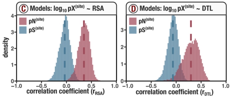
What are these models and how were they created? Let’s dive into that.
Running the models
Since these models are visualized in Figure 2, they are calculated on-the-fly whenever the script ZZ_SCRIPTS/figure_2.R is ran. However, since they may be useful for purposes other than creating Figures 2c and 2d, the actual calculation takes place in ZZ_SCRIPTS/load_data.R, which ZZ_SCRIPTS/figure_2.R calls upon.
Inside ZZ_SCRIPTS/load_data.R you will find the following section of (messy) code which calculates the models:
Show/Hide Script
if (request_regs & !regs_loaded) {
    if (!scvs_loaded) {
        print("SCVs are not loaded. Regression analysis will fail.")
    }
    goi <- read_tsv(args$genes_with_good_structures, col_names=F) %>% pull(X1)
    temp <- scvs %>%
        select(
            gene_callers_id,
            pN_popular_consensus,
            pS_popular_consensus,
            rel_solvent_acc,
            ANY_dist,
            sample_id,
        ) %>%
        filter(
            gene_callers_id %in% goi,
            pN_popular_consensus > 0,
            ANY_dist <= 40
        ) %>%
        mutate(
            log_pN = log10(pN_popular_consensus)
        ) %>%
        group_by(gene_callers_id, sample_id) %>%
        mutate(num_rows = n()) %>%
        ungroup() %>%
        filter(num_rows >= 100)
    # Create the linear regression model (pN ~ RSA + d)
    pn_models <- temp %>%
        group_by(gene_callers_id, sample_id) %>%
        do(model = lm(log_pN ~ rel_solvent_acc + ANY_dist, data = .))
    rsqs<-c();adj_rsqs<-c();b0<-c();b0_err<-c();bRSA<-c();bRSA_err<-c();bDTL<-c();bDTL_err<-c()
    for (i in 1:(pn_models %>% nrow())) {
        model <- summary(pn_models$model[[i]])
        rsqs <- c(rsqs, model$r.squared)
        adj_rsqs <- c(adj_rsqs, model$adj.r.squared)
        b0 <- c(b0, model$coefficients[1,1])
        b0_err <- c(b0_err, model$coefficients[1,2])
        bRSA <- c(bRSA, model$coefficients[2,1])
        bRSA_err <- c(bRSA_err, model$coefficients[2,2])
        bDTL <- c(bDTL, model$coefficients[3,1])
        bDTL_err <- c(bDTL_err, model$coefficients[3,2])
    }
    pn_models$pn_rsq <- rsqs
    pn_models$pn_adj_rsq <- adj_rsqs
    pn_models$pn_b0 <- b0
    pn_models$pn_b0_err <- b0_err
    pn_models$pn_bRSA <- bRSA
    pn_models$pn_bRSA_err <- bRSA_err
    pn_models$pn_bDTL <- bDTL
    pn_models$pn_bDTL_err <- bDTL_err
    # Create the 1D linear regression models (pN ~ RSA, pN ~ d)
    pn_corr <- temp %>%
        group_by(gene_callers_id, sample_id) %>%
        summarise(
            pn_r_rsa = cor(log10(pN_popular_consensus), rel_solvent_acc, use="pairwise.complete.obs", method='pearson'),
            pn_r_dist = cor(log10(pN_popular_consensus), ANY_dist, use="pairwise.complete.obs", method='pearson'),
            pn_rsq_rsa = pn_r_rsa^2,
            pn_rsq_dist = pn_r_dist^2
        ) %>%
        left_join(pn_models, by=c('gene_callers_id', 'sample_id')) %>%
        rename(pn_model_rsa_d = model)
    # Synonymous polymorphism regressions
    temp <- scvs %>%
        select(
            gene_callers_id,
            pN_popular_consensus,
            pS_popular_consensus,
            rel_solvent_acc,
            ANY_dist,
            sample_id,
        ) %>%
        filter(
            gene_callers_id %in% goi,
            pS_popular_consensus > 0,
            ANY_dist <= 40
        ) %>%
        mutate(
            log_pS = log10(pS_popular_consensus)
            #log_pS = (log_pS - mean(log_pS))/sd(log_pS) # This normalization doesn't change the fits
            ) %>%
        group_by(gene_callers_id, sample_id) %>%
        mutate(num_rows = n()) %>%
        ungroup() %>%
        filter(num_rows >= 100)
    # Create the linear regression model (pS ~ RSA + d)
    ps_models <- temp %>%
        group_by(gene_callers_id, sample_id) %>%
        do(model = lm(log_pS ~ rel_solvent_acc + ANY_dist, data = .))
    rsqs<-c();adj_rsqs<-c();b0<-c();b0_err<-c();bRSA<-c();bRSA_err<-c();bDTL<-c();bDTL_err<-c()
    for (i in 1:(ps_models %>% nrow())) {
        model <- summary(ps_models$model[[i]])
        rsqs <- c(rsqs, model$r.squared)
        adj_rsqs <- c(adj_rsqs, model$adj.r.squared)
        b0 <- c(b0, model$coefficients[1,1])
        b0_err <- c(b0_err, model$coefficients[1,2])
        bRSA <- c(bRSA, model$coefficients[2,1])
        bRSA_err <- c(bRSA_err, model$coefficients[2,2])
        bDTL <- c(bDTL, model$coefficients[3,1])
        bDTL_err <- c(bDTL_err, model$coefficients[3,2])
    }
    ps_models$ps_rsq <- rsqs
    ps_models$ps_adj_rsq <- adj_rsqs
    ps_models$ps_b0 <- b0
    ps_models$ps_b0_err <- b0_err
    ps_models$ps_bRSA <- bRSA
    ps_models$ps_bRSA_err <- bRSA_err
    ps_models$ps_bDTL <- bDTL
    ps_models$ps_bDTL_err <- bDTL_err
    # Create the 1D linear regression models (pS ~ RSA, pS ~ d)
    ps_corr <- temp %>%
        group_by(gene_callers_id, sample_id) %>%
        summarise(
            ps_r_rsa = cor(log10(pS_popular_consensus), rel_solvent_acc, use="pairwise.complete.obs", method='pearson'),
            ps_r_dist = cor(log10(pS_popular_consensus), ANY_dist, use="pairwise.complete.obs", method='pearson'),
            ps_rsq_rsa = ps_r_rsa^2,
            ps_rsq_dist = ps_r_dist^2
        ) %>%
        left_join(ps_models, by=c('gene_callers_id', 'sample_id')) %>%
        rename(ps_model_rsa_d = model)
    poly_corr <- left_join(ps_corr, pn_corr, by=c('gene_callers_id', 'sample_id')) %>%
        mutate(pair = paste('(', gene_callers_id, ',', sample_id, ')', sep=''))

    regs_loaded <- TRUE
}
To run this code and get access to the models, my recommendation is to simply source Figure 2, by issuing the following command in your GRE:
source('figure_2.R')
This will create Figures 2c and 2d (as well as the rest of the plots in Figure 2), and plop the results into YY_PLOTS/FIG_2. But more importantly, your GRE will now contain a dataframe called poly_corr, which summarizes the statistics of each model.
If you want to get fancy and run the code without producing the whole of Figure 2, another option is to source ZZ_SCRIPTS/load_data.R after requesting that SCVs are loaded (request_scvs <- TRUE) and the models are calculated (request_regs <- TRUE):
request_scvs <- TRUE
request_regs <- TRUE
withRestarts(source("load_data.R"), terminate=function() message('load_data.R: data already loaded. Nice.'))
This equivalently creates the poly_corr dataframe.
For each gene-sample pair, we fit 6 models, and the statistics of each model are found in the columns of poly_corr.
The first four models are 1D regressions on either RSA or DTL:
\[\log_{10}(\text{pN}^{\text{(site)}}) \sim \text{RSA}\]pn_r_rsais the Pearson correlation coefficient of the modelpn_rsq_rsais the $R^2$
ps_r_rsais the Pearson correlation coefficient of the modelps_rsq_rsais the $R^2$
pn_r_distis the Pearson correlation coefficient of the modelpn_rsq_distis the $R^2$
ps_r_distis the Pearson correlation coefficient of the modelps_rsq_distis the $R^2$
The last two models are 2D regressions on both RSA and DTL:
\[\log_{10}(\text{pN}^{\text{(site)}}) \sim \text{RSA} + \text{DTL}\]pn_rsqis the $R^2$pn_adj_rsqis the adjusted $R^2$pn_b0is the estimate for the constant coefficientpn_b0_erris the error estimate for the constant coefficientpn_bRSAis the estimate for the RSA coefficientpn_bRSA_erris the error estimate for the RSA coefficientpn_bDTLis the estimate for the DTL coefficientpn_bDTL_erris the error estimate for the DTL coefficientpn_model_rsa_dis the model object itself, so you can introspect to your heart’s content
ps_rsqis the $R^2$ps_adj_rsqis the adjusted $R^2$ps_b0is the estimate for the constant coefficientps_b0_erris the error estimate for the constant coefficientps_bRSAis the estimate for the RSA coefficientps_bRSA_erris the error estimate for the RSA coefficientps_bDTLis the estimate for the DTL coefficientps_bDTL_erris the error estimate for the DTL coefficientps_model_rsa_dis the model object itself, so you can introspect to your heart’s content
If you haven’t already done so, create Figures 2c and 2d by running
source('figure_2.R')
Quite simply, the responsible code creates histograms of the columns pn_r_rsa, ps_r_rsa, pn_r_dist, and ps_r_dist:
# -----------------------------------------------------------------------------
# Correlation histograms
# -----------------------------------------------------------------------------

col1 <- ns_col
col2 <- s_col
RSA_pearson <- ggplot(poly_corr) +
    geom_histogram(aes(ps_r_rsa, y=..density..), fill=s_col,  alpha=0.7, bins=100) +
    geom_histogram(aes(pn_r_rsa, y=..density..), fill=ns_col, alpha=0.7, bins=100) +
    geom_vline(xintercept = (poly_corr$ps_r_rsa %>% mean(na.rm=TRUE)), color=s_col,  size=1.0, linetype='dashed') +
    geom_vline(xintercept = (poly_corr$pn_r_rsa %>% mean(na.rm=TRUE)), color=ns_col, size=1.0, linetype='dashed') +
    theme_classic() +
    scale_x_continuous(limits=c(-1,1), expand=c(0,0)) +
    my_theme(9) +
    scale_y_continuous(limits=c(0,NA), expand=c(0,0))
DTL_pearson <- ggplot(poly_corr) +
    geom_histogram(aes(ps_r_dist, y=..density..), fill=s_col,  alpha=0.7, bins=100) +
    geom_histogram(aes(pn_r_dist, y=..density..), fill=ns_col, alpha=0.7, bins=100) +
    geom_vline(xintercept = (poly_corr$ps_r_dist %>% mean(na.rm=TRUE)), color=s_col,  size=1.0, linetype='dashed') +
    geom_vline(xintercept = (poly_corr$pn_r_dist %>% mean(na.rm=TRUE)), color=ns_col, size=1.0, linetype='dashed') +
    theme_classic() +
    scale_x_continuous(limits=c(-1,1), expand=c(0,0)) +
    my_theme(9) +
    scale_y_continuous(limits=c(0,NA), expand=c(0,0))

display(RSA_pearson, output=file.path(args$output, "RSA_pearson.pdf"),  width=f*w, height=w*0.7, as.png=F)
display(DTL_pearson, output=file.path(args$output, "DTL_pearson.pdf"), width=f*w, height=w*0.7, as.png=F)
Similarly, distributions of the 2D regression model parameters can be visualized by running
Command #68
source('figure_s_reg_stats.R')
Yielding Figure SI2 in YY_PLOTS/FIG_S_REG_STATS.
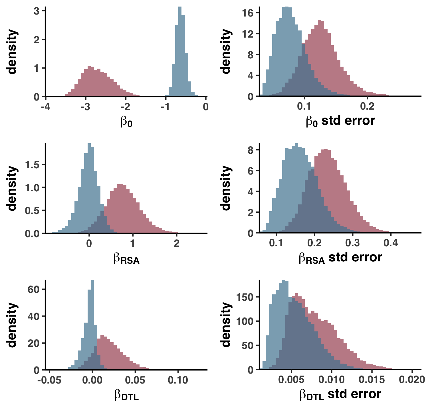
This is essentially histograms of the various columns in poly_corr. See ZZ_SCRIPTS/figure_s_reg_stats.R for details.
If you haven’t noticed, poly_corr is essentially Table S7. To export poly_corr into the tab-delimited file format that is Table S7, run the following from your GRE:
Command #69
source('table_poly_corr.R')
Visualizing gene-sample scatterplots
If you want to visualize polymorphism rates within a specific gene-sample pair, as I did in Figures S7 and S8, you’re in the right place.
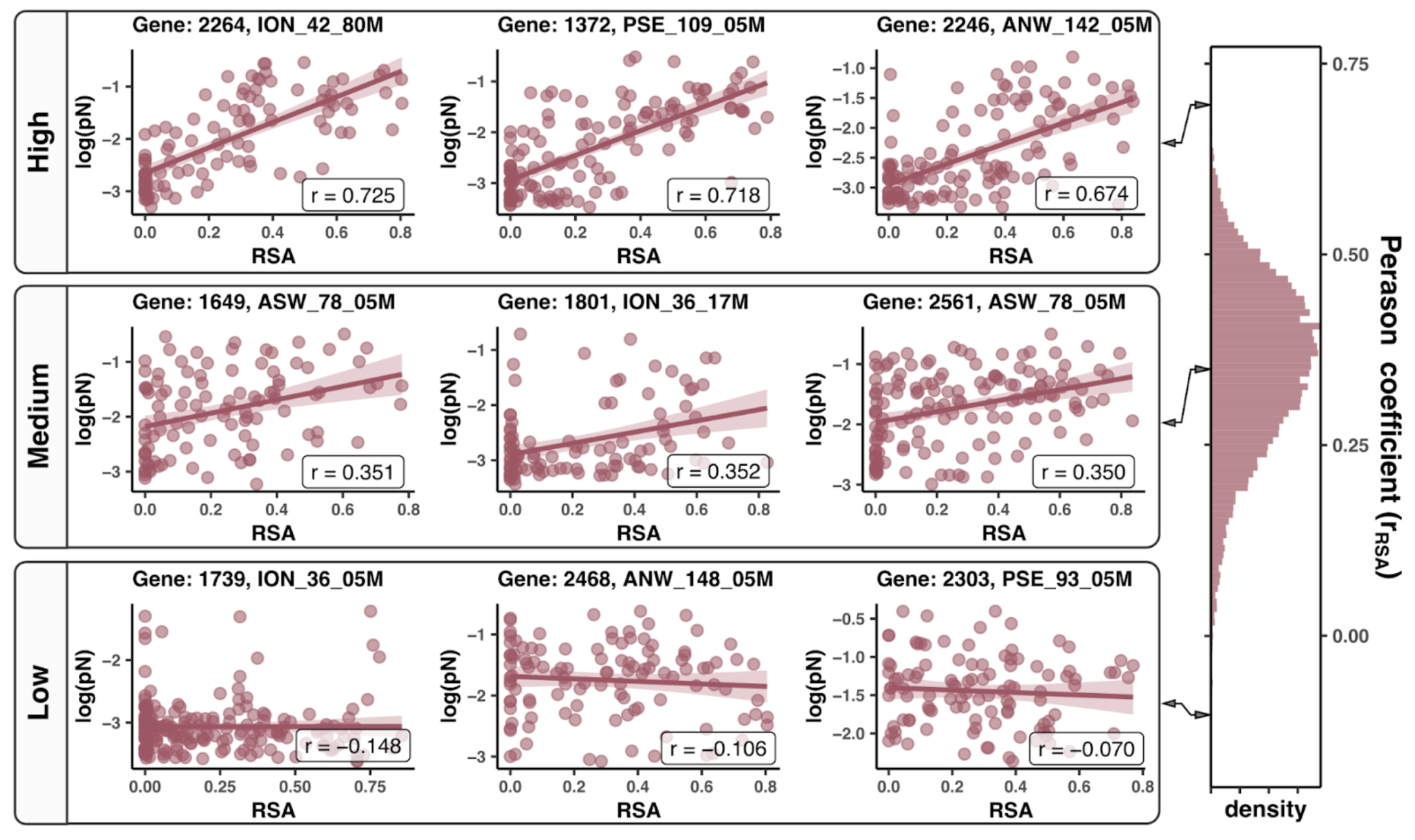

poly_corr summarizes the models that were fit to the polymorphism rate data, but doesn’t contain the polymorphism rate data itself. This information is housed in the SCV table, i.e. the variable scvs.
If scvs is not already in your GRE, load it up (there is no harm in running this command if you’re unsure):
request_scvs <- TRUE
withRestarts(source("load_data.R"), terminate=function() message('load_data.R: data already loaded. Nice.'))
As an example, let’s say you’re interested in Gene ID 2264 in sample ION_42_80M. You could subset the SCV table with the following R code:
df <- scvs %>% filter(gene_callers_id == 2264, sample_id == 'ION_42_80M')
And to access the polymorphism rate data and the RSA and DTL of these sites, you could subset the columns:
# ANY_dist = DTL
# rel_solvent_acc = RSA
df <- df %>% select(codon_order_in_gene, rel_solvent_acc, ANY_dist, pN_popular_consensus, pS_popular_consensus)
Finally, you could make a scatter plot showing the relationship between pN (or pS) and RSA (or DTL):
g <- ggplot(df, aes(rel_solvent_acc, log10(pN_popular_consensus))) + geom_point() + geom_smooth(method='lm')
print(g)
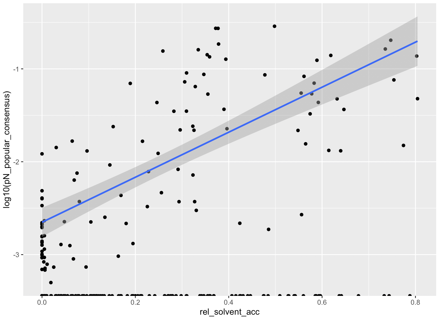
Really, this is no different to how I created the plots in Figures S7 and S8. For the full reproducible scripts, check out ZZ_SCRIPTS/figure_s_examples_RSA.R and ZZ_SCRIPTS/figure_s_examples_DTL.R, and when you’re ready, run the scripts like so:
Command #70
source('figure_s_examples_RSA.R')
source('figure_s_examples_DTL.R')
You can find the resultant plots under YY_PLOTS/FIG_EXAMPLES_RSA and YY_PLOTS/FIG_EXAMPLES_DTL.
Analysis 13: per-group pN and pS
This analysis encompasses everything related to per-group pN and pS values, i.e. the values visualized in the heatmaps of Figure 2e.
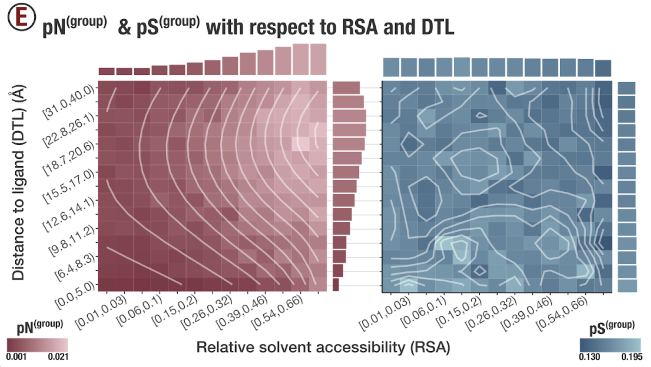
Heatmaps
You calculated the per-group pN and pS values in Step 14 in Chapter III, and you can find the resultant data in 17_PNPS_RSA_AND_DTL.
As a quick aside, the tabular data found in this folder are no more or less than the Excel sheets that comprise Table S8. To produce Table S8, run ZZ_SCRIPTS/table_group.py:
Command #71
python ZZ_SCRIPTS/table_group.py
You can find the result at WW_TABLES/GROUP.xlsx.
Anways. This data can be accessed within the GRE under the variable names pn_group and ps_group. If you don’t have these variables, the quickest way to get them would be
request_scvs <- FALSE
request_regs <- FALSE
withRestarts(source("load_data.R"), terminate=function() message('load_data.R: data already loaded. Nice.'))
Here is what pn_group looks like, for example:
> pn_group
# A tibble: 195 × 9
   DTL_group RSA_group      pn       DTL DTL_range       RSA RSA_range   s_sites ns_sites
       <dbl>     <dbl>   <dbl>     <dbl> <chr>         <dbl> <chr>         <dbl>    <dbl>
 1         0         0 0.00147 -2.22e-16 [0.0,5.0) -2.22e-16 [0.0,0.01)    1487.    4570.
 2         0         1 0.00152 -2.22e-16 [0.0,5.0)  9.95e- 3 [0.01,0.03)    581.    2233.
 3         0         2 0.00124 -2.22e-16 [0.0,5.0)  2.88e- 2 [0.03,0.06)    763.    2729.
 4         0         3 0.00145 -2.22e-16 [0.0,5.0)  5.81e- 2 [0.06,0.1)     713.    2614.
 5         0         4 0.00169 -2.22e-16 [0.0,5.0)  9.82e- 2 [0.1,0.15)     580.    2132.
 6         0         5 0.00154 -2.22e-16 [0.0,5.0)  1.45e- 1 [0.15,0.2)     506.    1816.
 7         0         6 0.00214 -2.22e-16 [0.0,5.0)  2.01e- 1 [0.2,0.26)     421.    1553.
 8         0         7 0.00257 -2.22e-16 [0.0,5.0)  2.62e- 1 [0.26,0.32)    321.    1221.
 9         0         8 0.00292 -2.22e-16 [0.0,5.0)  3.23e- 1 [0.32,0.39)    254.     964.
10         0         9 0.00469 -2.22e-16 [0.0,5.0)  3.90e- 1 [0.39,0.46)    199.     809.
# … with 185 more rows
This is the data used to create the red heatmap in Figure 2e, which is created whenever you run
source('figure_2.R')
and the results are found in YY_PLOTS/FIG_2. If you dig into ZZ_SCRIPTS/figure_2.R, you’ll see that the heatmaps are drawn using the function plot_group_histogram, which can be found in ZZ_SCRIPTS/utils.R:
Show/Hide plot_group_histogram
# -----------------------------------------------------------------------------
# Group pN & pS & pN/pS histograms
# -----------------------------------------------------------------------------

plot_group_histogram <- function(dataframe, name, scaling, bins=15, smooth=T) {
    name_for_color <- strsplit(name, "_") %>% .[[1]] %>% .[[1]]
    low_c <- low_cs[[name_for_color]]
    high_c <- high_cs[[name_for_color]]
    if (smooth) {
        dataframe$smooth <- smooth_it(dataframe, name=name, scaling=scaling)
    }
    RSA_labels <- as.character(dataframe$RSA_range %>% unique())
    RSA_labels[c(TRUE,FALSE)] <- ""
    names(RSA_labels) <- as.character(dataframe$RSA_group %>% unique())
    DTL_labels <- as.character(dataframe$DTL_range %>% unique())
    DTL_labels[c(FALSE,TRUE)] <- ""
    names(DTL_labels) <- as.character(dataframe$DTL_group %>% unique())
    g <- ggplot(data = dataframe) +
        geom_tile(aes_string(x="RSA_group", y="DTL_group", fill=name)) +
        labs(
            x="RSA",
            y="d [Å]"
        ) +
        theme_classic(base_size=12) +
        scale_fill_gradient(
            guide=guide_colorbar(ticks=FALSE),
            low=low_c,
            high=high_c,
            limits=c(min(dataframe[[name]]), max(dataframe[[name]])),
            breaks=c(min(dataframe[[name]]), max(dataframe[[name]])),
            labels=c(round(min(dataframe[[name]]), 3), round(max(dataframe[[name]]), 3))
        ) +
        theme(
            text=element_text(size=18, family="Helvetica", face="bold"),
            legend.position="bottom",
            legend.key.width = unit(1, 'cm'),
            legend.text=element_text(size=14),
            axis.text.x = element_text(size=16, angle=30, hjust=1),
            axis.text.y = element_text(size=16, angle=30, hjust=1)
        ) +
        scale_y_continuous(expand=c(0,0), breaks = seq(min(dataframe$DTL_group),max(dataframe$DTL_group), length.out = length(DTL_labels)), labels=DTL_labels) +
        scale_x_continuous(expand=c(0,0), breaks = seq(min(dataframe$RSA_group),max(dataframe$RSA_group), length.out = length(RSA_labels)), labels=RSA_labels)
    if (smooth) {
        g <- g + geom_contour(
            aes(x=RSA_group, y=DTL_group, z=smooth),
            bins = bins,
            size=1.0,
            alpha=0.5,
            color='white'
        )
    }
    g
}
Linear fits
At the time pn_group and ps_group are loaded into the GRE (ZZ_SCRIPTS/load_data.R), linear models with respect to RSA_group and DTL_group are fit to the data. If you want the pleasure of running these models yourself, run the following code:
ps_group_model <- ps_group %>%
    lm(ps ~ RSA_group + DTL_group, data = .)
pn_group_model <- pn_group %>%
    lm(pn ~ RSA_group + DTL_group, data = .)
However, this code has already been run, so you already have ps_group_model and pn_group_model in your GRE.
It is with these linear models that Figure SI3 is constructed. To create Figure SI3, run
Command #72
source('figure_s_group_fits.R')
This outputs the componenets of the following figure into YY_PLOTS/FIG_S_GROUP_FITS.
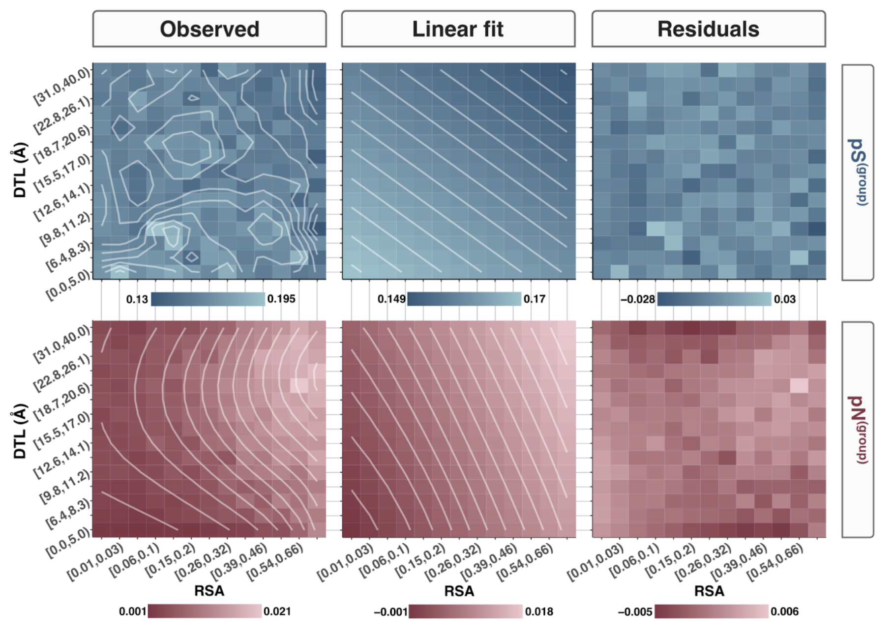
Bin number sensitivity
How sensitive are these findings to bin size? So far we have dealt with the RSA and DTL domains being split into 15 segments each, totaling 15x15=225 total groups. How arbitrary is this choice?
I addressed this by repeating the fits in the previous section for various group numbers, and the results are shown in Figure SI4.
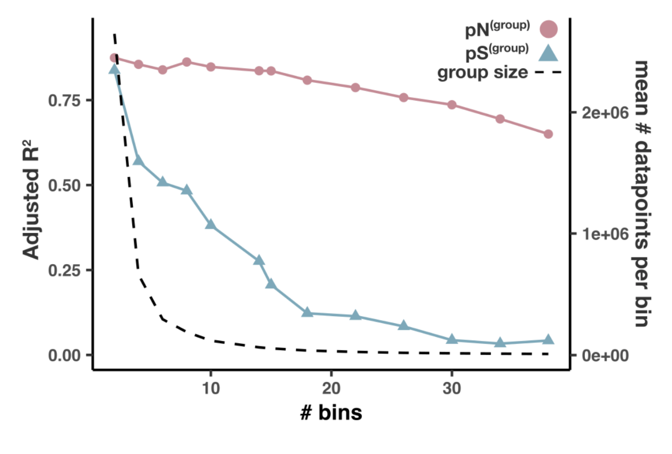
To reproduce this analysis, you’ll need to calculate per-group pN and pS for various bin numbers. In Step 14 we utilized the script ZZ_SCRIPTS/analysis_pnps_d_and_rsa.py to calculate per-group pN and pS for a bin number of 15 (what I mean by this is RSA and DTL are each split into 15 segments), and we can repeat that process for several bin numbers using the following bash command.
Command #73
for bin_number in 2 4 6 8 10 14 18 22 26 30 34 38; do
    python ZZ_SCRIPTS/analysis_pnps_d_and_rsa.py -b $bin_number \
                                                 -o 17_PNPS_RSA_AND_DTL
done
‣ Time: 30 min per bin
This will take around 30 minutes per loop, and will store all of the results in 17_PNPS_RSA_AND_DTL.
When the script finally finishes, you should have the following files in 17_PNPS_RSA_AND_DTL:
counts_10.txt counts_26.txt counts_8.txt  pN_22.txt     pN_6.txt      pNpS_2.txt    pNpS_4.txt    pS_18.txt     pS_38.txt
counts_14.txt counts_30.txt pN_10.txt     pN_26.txt     pN_8.txt      pNpS_22.txt   pNpS_6.txt    pS_2.txt      pS_4.txt
counts_15.txt counts_34.txt pN_14.txt     pN_30.txt     pNpS_10.txt   pNpS_26.txt   pNpS_8.txt    pS_22.txt     pS_6.txt
counts_18.txt counts_38.txt pN_15.txt     pN_34.txt     pNpS_14.txt   pNpS_30.txt   pS_10.txt     pS_26.txt     pS_8.txt
counts_2.txt  counts_4.txt  pN_18.txt     pN_38.txt     pNpS_15.txt   pNpS_34.txt   pS_14.txt     pS_30.txt
counts_22.txt counts_6.txt  pN_2.txt      pN_4.txt      pNpS_18.txt   pNpS_38.txt   pS_15.txt     pS_34.txt
To reproduce the figure, run
Command #74
source('figure_s_bin_effect.R')
And to check out the code, dig into ZZ_SCRIPTS/figure_s_bin_effect.R.
Analysis 14: Correlatedness of RSA and DTL
A necessary concern when fitting linear models to multiple variables, is understanding how correlated the variables are with each other. Statistical interpretations are most straightforward if the variables are independent from one another, however in practice observation variables are rarely independent, and so we must deal in the realm of multicollinearity.
Since many of the above analyses regress polymorphism rates against RSA and DTL, I did my due diligence in verifying that RSA and DTL are not crazy-correlated to each other. The result is shown in Figure SI1.
Running the analysis is simple from your GRE:
Command #75
source('figure_s_multicolin.R')
Which results in Figure SI1, stored under the filename YY_PLOTS/FIG_S_MULTICOLIN/RSA_vs_dist.png
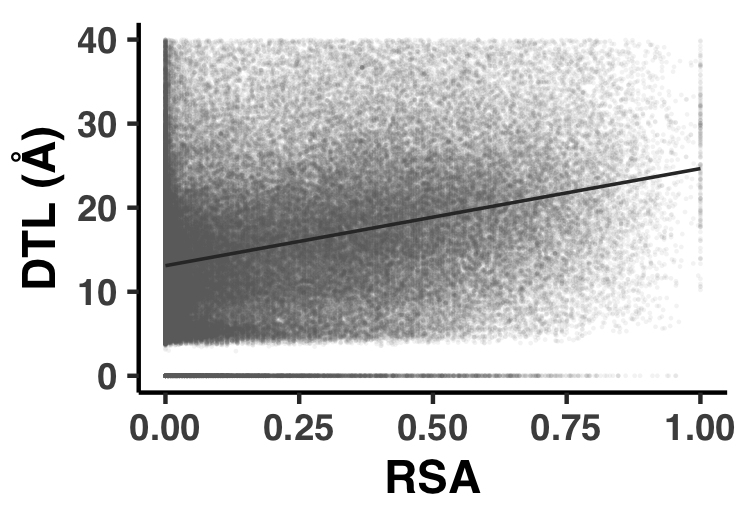
Analysis 15: pN/pS$^{\text{(gene)}}$ across genes and samples
Since pN/pS$^{\text{(gene)}}$ is such a central metric for the study, it is used in a lot of places. However in this specific Analysis I’ll provide the steps to reproduce the general statistics about the pN/pS$^{\text{(gene)}}$ values observed, which come in the form of Table S9, Figure S11, and Figure S12.
Throughout the manuscript, pN/pS$^{\text{(gene)}}$ is used as a proxy for the strength of purifying selection strength acting on a gene in a sample. A description and mathematical definition of pN/pS$^{\text{(gene)}}$ is found in the Methods section, and the reproducible implementation has already been provided in Step 14.
As a reminder, pN/pS$^{\text{(gene)}}$ values, which you already calculated, are found in the file 17_PNPS/pNpS.txt.
This data, along with pN$^{\text{(gene)}}$ and pS$^{\text{(gene)}}$, are presented as Table S9, which is created with ZZ_SCRIPTS/. Nothing fancy is happening here, the data you already have is just being fluffed up into a nice little Excel table.
When ready, run the following and Table S9 will be output to the filename WW_TABLES/GENE_PNPS.xlsx:
Command #76
python ZZ_SCRIPTS/table_gene_pnps.py
From within the GRE, pN/pS$^{\text{(gene)}}$ data for each sample and gene is stored as the R-variable pnps, which you more than likely already have in your GRE. If you don’t, you could always run the following (however I hope I’ve made it clear that any figures/tables that need pnps will load it automatically):
request_scvs <- FALSE
request_regs <- FALSE
withRestarts(source("load_data.R"), terminate=function() message('load_data.R: data already loaded. Nice.'))
The real power of pN/pS$^{\text{(gene)}}$ is that values can be calculated across samples, effectively allowing one to track selection strength of a gene across samples. Because of this added dimension of fun, pN/pS$^{\text{(gene)}}$ is distributed across genes and samples. Understanding the variance in pN/pS$^{\text{(gene)}}$ across these two dimensions was the intention of Figure S11, which you can reproduce with ZZ_SCRIPTS/figure_s_pnps_bw.R.
Show/Hide Script
#! /usr/bin/env Rscript

request_scvs <- FALSE
request_regs <- FALSE
withRestarts(source("load_data.R"), terminate=function() message('load_data.R: data already loaded. Nice.'))

library(tidyverse)

args <- list()
args$output <- "../YY_PLOTS/FIG_S_PNPS_BW"

dir.create(args$output, showWarnings=F, recursive=T)

# -----------------------------------------------------------------------------
# Just do it
# -----------------------------------------------------------------------------

my_anova <- pnps %>% mutate(gene_callers_id = as.factor(gene_callers_id)) %>% lm(pnps ~ gene_callers_id + sample_id, data = .) %>% anova()
gene_explained <- my_anova$`Sum Sq`[1] / sum(my_anova$`Sum Sq`) * 100
sample_explained <- my_anova$`Sum Sq`[2] / sum(my_anova$`Sum Sq`) * 100
print(my_anova)
print(gene_explained)
print(sample_explained)

col1 <- '#888888'
col2 <- 'red'
coeff <- 1.2
g <- ggplot() +
    geom_histogram(
        data = pnps %>% group_by(sample_id) %>% summarize(x=sd(pnps, na.rm=T)) %>% mutate(group='group'),
        mapping = aes(x=x, y=..density../coeff, fill=group),
        fill = col2,
        alpha = 0.5,
        bins = 100
    ) +
    geom_histogram(
        data = pnps %>% group_by(gene_callers_id) %>% summarize(x=sd(pnps)) %>% mutate(group='group'),
        mapping = aes(x=x, y=..density.., fill=group),
        fill = col1,
        alpha = 0.5,
        bins = 100
    ) +
    theme_classic() +
    theme(
        text=element_text(size=10, family="Helvetica", face="bold"),
        axis.title.y = element_text(color = col1, size=13),
        axis.title.y.right = element_text(color = col2, size=13)
    ) +
    annotate(
        "rect",
        xmin=0.07,
        xmax=0.13,
        ymin=75,
        ymax=135,
        alpha=0.2
    ) +
    annotate(
        "text",
        x=0.1,
        y=105,
        label=paste("% variance (ANOVA):\nsamples: ", round(sample_explained, 1), "%\ngenes: ", round(gene_explained, 1), "%", sep=''),
        size=2,
        family="Helvetica",
    ) +
    labs(
        y="Density",
        x="Standard deviation"
    ) +
    scale_y_continuous(
      name = "Density",
      sec.axis = sec_axis(~.*coeff, name="Density"),
      expand = c(0, 0)
    )
s <- 0.9
display(g, file.path(args$output, "fig.png"), width=s*3.5, height=s*2.4)
display(g, file.path(args$output, "fig.pdf"), width=s*3.5, height=s*2.4)
The real statistics behind this figure is an ANOVA analysis, illustrating that a lot more variance in pN/pS$^{\text{(gene)}}$ is observed between genes, meaning that genes exhibit a lot of diversity in their pN/pS$^{\text{(gene)}}$. ‘A lot’ in this sense is relative to the variance in pN/pS$^{\text{(gene)}}$ observed within the same gene across samples. This is what I’ve tried to convey with Figure S11, which you can replicate via the GRE:
Command #77
source('figure_s_pnps_bw.R')
This plops Figure S11 in the directory YY_PLOTS/FIG_S_PNPS_BW.
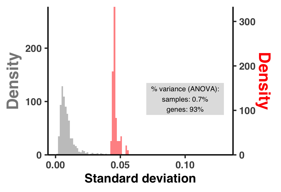
Relatedly, Figure S12 represents the spread of variance in pN/pS$^{\text{(gene)}}$ more directly in the form of a few histograms, which is created with ZZ_SCRIPTS/figure_s_g_pnps_hist.R. Run it in the GRE with:
Command #78
source('figure_s_g_pnps_hist.R')
This plops Figure S12 in the directory YY_PLOTS/FIG_S_G_PNPS_HIST.
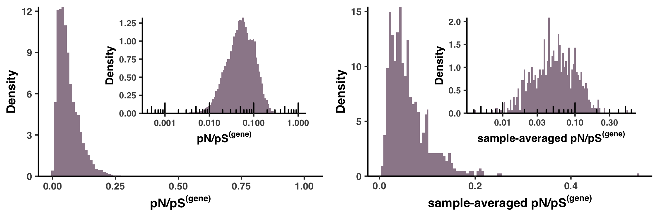
Analysis 16: dN/dS$^{\text{(gene)}}$ between HIMB83 and HIMB122
This section requires you to first complete Auxiliary Step 1, please complete that before continuing.
In this section we calculate the dN/dS$^{\text{(gene)}}$ of homologous genes shared between HIMB83 and HIMB122, a related SAR11 genome. In the paper, the rationale for doing this was to validate our approach of pN/pS$^{\text{(gene)}}$ by averaging across samples and comparing the sample-averaged pN/pS$^{\text{(gene)}}$ values to dN/dS$^{\text{(gene)}}$ between HIMB83 and HIMB122, with the expectation that these should be qualitatively similar to one another given the evolutionary relatedness of HIMB122 to HIMB83.
How similar is HIMB122 to HIMB83?
First, let’s determine how similar HIMB122 is to HIMB83. Here is a genome content comparison between HIMB83 and HIMB122
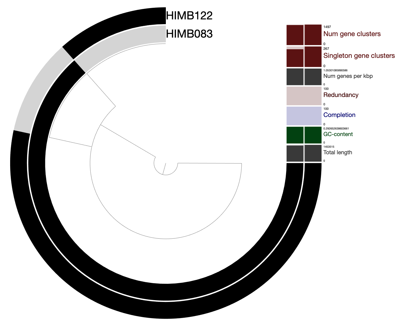
You are a few seconds away from playing with this data yourself:
anvi-display-pan -p 07_PANGENOME_COMP_TO_HIMB122/PANGENOME/SAR11-PAN.db -g 07_PANGENOME_COMP_TO_HIMB122/SAR11-GENOMES.db
Clearly there is a lot of overlapping gene content. We consider HIMB122 to share a homolog with HIMB83 based on the clustering results of this pangenome. If two genes are clustered into the same gene cluster, they are considered homologs. For example, here is a randomly chosen gene cluster, where we can see the corresponding protein sequences of the two genes:
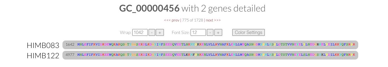 On a nucleotide level, we can assess the overall similarity between HIMB122 and HIMB83 using average nucleotide identity (ANI) calculated by pyANI using anvi-compute-genome-similarity.
Command #79
anvi-compute-genome-similarity -e 07_EXTERNAL_GENOMES_COMP_TO_HIMB122.txt \
                               -p 07_PANGENOME_COMP_TO_HIMB122/PANGENOME/SAR11-PAN.db \
                               --program pyANI \
                               --num-threads 6 \
                               -o 07_ANI_HIMB122
Looking at the output 07_ANI_HIMB122/ANIb_percentage_identity.txt, we can see that the genome ANI of HIMB122 to HIMB83 is 82.6%. Note that this only considers aligned segments of the genome. If the full sequences are considered this value drops to 63.7% similarity (07_ANI_HIMB122/ANIb_full_percentage_identity.txt), however since we are interested in calculating dN/dS$^{\text{(gene)}}$ between homologs, it is the former metric that is more relevant.
Calculating dN/dS$^{\text{(gene)}}$ for 1 gene
To calculate dN/dS$^{\text{(gene)}}$, I opted to use PAML’s yn00 program, which utilizes the Yang and Nielson (2000) counting-based method for dN/dS. While dN/dS is a parameter that is estimated during the process of maximum-likelihood phylogenetic tree estimation, and while such estimates are typically considered higher accuracy and offer greater flexibility than counting-based methods since one can calculate branch-specific dN/dS values, in this simple pairwise case between HIMB83 and HIMB122 I did not see the necessity of such complexity.
First I will walk through the steps required for calculating dN/dS using yn00 for one homologous pair, and then I present the script that calculates them for all homologs shared between HIMB83 and HIMB122.
For the example I will use gene cluster GC_00000017, which has the HIMB83 gene with ID 2003. This happens to be ribosomal protein L35 (PF01632), which I found out by opening up functions.txt and searching for gene 1324.
As a first step, I need the nucleotide and amino acid sequences for each homolog. For this, I use the program anvi-get-sequences-for-gene-clusters:
anvi-get-sequences-for-gene-clusters -p 07_PANGENOME_COMP_TO_HIMB122/PANGENOME/SAR11-PAN.db \
                                     -g 07_PANGENOME_COMP_TO_HIMB122/SAR11-GENOMES.db \
                                     --gene-cluster-id GC_00000017 \
                                     --max-num-genes-from-each-genome 1 \
                                     -o GC_00000017.aln.faa
anvi-get-sequences-for-gene-clusters -p 07_PANGENOME_COMP_TO_HIMB122/PANGENOME/SAR11-PAN.db \
                                     -g 07_PANGENOME_COMP_TO_HIMB122/SAR11-GENOMES.db \
                                     --gene-cluster-id GC_00000017 \
                                     --max-num-genes-from-each-genome 1 \
                                     -o GC_00000017.fna \
                                     --report-DNA
The FASTA deflines of these files look something like this
>00000001|gene_cluster:GC_00000017|genome_name:HIMB122|gene_callers_id:4577
ACTGC....
>00000000|gene_cluster:GC_00000017|genome_name:HIMB083|gene_callers_id:2003
ACTGC....
which PAML insists on truncating without warning, so we have to modify the deflines with the script ZZ_SCRIPTS/rename_for_paml.py.
Show/Hide rename_for_paml.py
#! /usr/bin/env python

import argparse
import shutil
import anvio.fastalib as u

ap = argparse.ArgumentParser()
ap.add_argument("--fasta", "-f", required=True)
args = ap.parse_args()

output = u.FastaOutput(args.fasta + ".temp")
fasta = u.SequenceSource(args.fasta)

while next(fasta):
    defline = fasta.id.split('|')[2].split(':')[-1]
    output.write_id(defline)
    output.write_seq(fasta.seq, split = False)

fasta.close()
output.close()

shutil.move(args.fasta + '.temp', args.fasta)
python ZZ_SCRIPTS/rename_for_paml.py -f GC_00000017.fna
python ZZ_SCRIPTS/rename_for_paml.py -f GC_00000017.aln.faa
You probably have noticed that the amino acid FASTA is labeled with aln in its name, that’s because anvi-get-sequences-for-gene-clusters reports amino acid alignments of the protein sequence (i.e. there potentially exists gap characters so that the sequences align even if they are of different lengths). However, this alignment does not yet exist for the nucleotide sequence. To create this alignment, we use a program ZZ_SCRIPTS/pal2nal.pl, which has been floating around the internet since this 2006 paper that converts protein alignments to codon alignments.
ZZ_SCRIPTS/pal2nal.pl GC_00000017.aln.faa GC_00000017.fna -output paml -nogap > GC_00000017.aln.fna
Using this ancient relic, we can create the codon alignment GC_00000017.aln.fna that PAML (yn00) so desires.
   2    204
HIMB083
ATGCCAAAACTAAAAACAAAAAGCTCAGCAAAAAAAAGATTTAAAATATCTGCTAAGGGT
AAAGTTATTTCTGCTCAGGCAGGTAAGAGACATGGTATGATTAAAAGAACGAATTCACAA
ATAAGAAAACTAAGAGGCACCACAACATTGTCTAAACAAGATGGAAAAATTGTTAAGTCA
TACATGCCTTACAGTTTAAGAGGT
HIMB122
ATGCCAAAATTAAAAACAAAAAGCTCTGCAAAAAAAAGATTTAAAATATCAGCTAAGGGT
AAAGTTATATCTGCTCAAGCAGGTAAAAGACACGGTATGATTAAACGAACGAATTCACAA
ATTAGAAAATTAAGAGGCACTACAACTTTGTCTAAACAAGATGGCAAAATTGTTAAATCA
TACATGCCTTACAGTTTAAGAGGG
Nevertheless, the final thing we need to do is make a control file that specifies how yn00 should be run. Basically, this is where you provide inputs, outputs, and any parameters to tune yn00’s behavior. This is the vanilla file we want:
seqfile = GC_00000017.aln.fna * sequence data file name
outfile = GC_00000017_output * main result file
verbose = 0 * 1: detailed output (list sequences), 0: concise output
icode = 0 * 0:universal code; 1:mammalian mt; 2-10:see below
weighting = 0 * weighting pathways between codons (0/1)?
commonf3x4 = 0 * use one set of codon freqs for all pairs (0/1)?
Create this file, name it GC_00000017.ctl and then run yn00 with yn00 GC_00000017.ctl. Things should finish nearly instantly, and the newly created GC_00000017_output file should now exist in your directory. It is a difficult file to parse, however the dN/dS value we are after can be parsed with the following command.
echo $(grep 'omega' GC_00000017_output -A 2 | tail -n 1 | awk '{print $7}')
Which yields the answer 0.00000. Ok so this was a bit underwhelming, because in retrospect these homologs have 0 amino acid substitutions relative to one another, so by definition dN = 0. Regardless, hopefully this has illustrated the workflow that is about to occur.
If you followed this exercise, make sure you clean up all of the files you made with the following commands:
rm GC_00000017.aln.faa GC_00000017.aln.fna GC_00000017.ctl GC_00000017.fna GC_00000017_output
Calculating dN/dS$^{\text{(gene)}}$ for all
That is quite a bit of tedium to calculate dN/dS for one homologous pair, so I wrote a script that can calculate dN/dS for all of them called ZZ_SCRIPTS/calculate_dnds.sh
Show/Hide Script
#! /usr/bin/env bash

GOI_GCOI=$1
PAN=$2
STORAGE=$3
OUTPUT=$4

rm -rf $OUTPUT
mkdir $OUTPUT
cd $OUTPUT

cat ../$GOI_GCOI | while read g gcoi; do

    mkdir -p $g
    cd $g

    echo $gcoi

    # Get the protein alignment
    anvi-get-sequences-for-gene-clusters -p ../../$PAN -g ../../$STORAGE -o $gcoi.aln.faa --gene-cluster-id $gcoi --max-num-genes-from-each-genome 1

    FILE=$gcoi.aln.faa
    if [ -f $FILE ]; then
        # Get the unaligned nucleotie sequences
        anvi-get-sequences-for-gene-clusters -p ../../$PAN -g ../../$STORAGE -o $gcoi.fna --gene-cluster-id $gcoi --max-num-genes-from-each-genome 1 --report-DNA

        # Rename the FASTA deflines so PAML likes them
        python ../../ZZ_SCRIPTS/rename_for_paml.py -f $gcoi.fna
        python ../../ZZ_SCRIPTS/rename_for_paml.py -f $gcoi.aln.faa

        # Create a codon alignment from the protein alignment
        ../../ZZ_SCRIPTS/pal2nal.pl $gcoi.aln.faa $gcoi.fna -output paml -nogap > $gcoi.aln.fna

        # Create the control file that yn00 wants
        python ../../ZZ_SCRIPTS/_gen_yn00_ctl_file.py -a $gcoi.aln.fna --codeml-output ${gcoi}_output --output $gcoi.ctl

        # Run yn00
        yn00 $gcoi.ctl

        # Parse the yn00 output to yield dN/dS (omega)
        omega=$(grep 'omega' ${gcoi}_output -A 2 | tail -n 1 | awk '{print $7}')
    else
        omega=""
    fi

    echo -e "$g\t$omega" >> ../dnds.txt
    cd ..

done
This script does exactly what we just did manually, except it wraps it up into a loop thats iterated for each homologous pair. It takes as input a file you generated earlier in this analysis, goi_gcoi_COMP_TO_HIMB122, which corresponds each gene cluster to the gene ID of HIMB83. The script should be ran like so:
Command #80
bash ZZ_SCRIPTS/calculate_dnds.sh goi_gcoi_COMP_TO_HIMB122 \
                                  07_PANGENOME_COMP_TO_HIMB122/PANGENOME/SAR11-PAN.db \
                                  07_PANGENOME_COMP_TO_HIMB122/SAR11-GENOMES.db \
                                  19_DNDS_HIMB122
‣ Time: 3 hours
‣ Storage: 30 Mb
For many genes, you may see the following error message coming from anvi’o:
Config Error: Bad news: the combination of your filters resulted in zero gene clusters :/
              These are the filtesr anvi'o used: --min-num-genomes-gene-cluster-occurs 0,
              --max-num-genomes-gene-cluster-occurs 2, --min-num-genes-from-each-genome 0,
              --max-num-genes-from-each-genome 1, --min-functional-homogeneity-index
              -1.000000, --max-functional-homogeneity-index 1.000000, --min-geometric-
              homogeneity-index -1.000000, --max-geometric-homogeneity-index 1.000000, --min-
              combined-homogeneity-index -1.000000, and --max-combined-homogeneity-index
              1.000000. None of your 1 gene clusters in your 2 genomes that were included this
              analysis matched to this combination (please note that number of genomes may be
              smaller than the actual number of genomes in the original pan genome if other
              filters were applied to the gene clusters dictionary prior).
This is actually desired behavior. We have set the parameter --max-num-genes-from-each-genome 1 in anvi-get-sequences-for-gene-clusters in order to prevent circumstances where one gene cluster had multiple genes from a single genome. In such a scenario, we opt to ignore the cluster altogether, since it is ambiguous which homolog should be used for the comparison.
This will take some time to run, but when it has finished the directory 19_DNDS_HIMB122 will be populated with all of the alignment information of each homologous comparison. But most important is the file 19_DNDS_HIMB122/dnds.txt, which holds all of the dN/dS$^{\text{(gene)}}$ for each HIMB83 gene with respect to the homologous HIMB122 gene.
To wrap up 19_DNDS_HIMB122/dnds.txt into a cute little supplementary table (Table S12), run the following command from your GRE:
Command #81
source('table_dnds.R')
Which creates Table S12 under the filename WW_TABLES/DNDS.txt.
Visualizing
To summarize the results, I created a scatter plot between sample-averaged pN/pS and dN/dS which ended up being Figure S10.
Show/Hide Script
#! /usr/bin/env Rscript

request_scvs <- FALSE
request_regs <- FALSE
withRestarts(source("load_data.R"), terminate=function() message('load_data.R: data already loaded. Nice.'))

library(latex2exp)
library(optparse)
library(tidyverse)
library(cowplot)

args <- list()
args$output <- "../YY_PLOTS/FIG_S_DNDS"

# Create directory
dir.create(args$output, showWarnings=F, recursive=T)

# -----------------------------------------------------------------------------
# Load and merge dN/dS data with pN/pS
# -----------------------------------------------------------------------------

# pN/pS exists, but needs to be sample-averaged
pnps_sample_averaged <- pnps %>%
    group_by(gene_callers_id) %>%
    summarize(pnps = mean(pnps, na.rm=T))

# Load up dN/dS
dnds <- read_tsv("../19_DNDS_HIMB122/dnds.txt", col_names=F) %>%
    rename(gene_callers_id=X1, dnds=X2) %>%
    filter(!is.na(dnds))

# Merge them together
df <- full_join(pnps_sample_averaged, dnds) %>%
    mutate(log_pnps = log10(pnps), log_dnds = log10(dnds))

# -----------------------------------------------------------------------------
# Make some plots
# -----------------------------------------------------------------------------

g1 <- ggplot(data=df) +
    geom_histogram(aes(dnds)) +
    scale_y_continuous(expand=c(0,0))
display(g1, file.path(args$output, "dnds_histogram.png"), width=3.2, height=2.8)

overlap <- df %>% filter(!is.na(pnps), !is.na(dnds))
R2 <- overlap %>% lm(pnps ~ dnds, data=.) %>% summary() %>% .$r.squared %>% round(2)
g2 <- ggplot(data=overlap, aes(log_dnds, log_pnps)) +
    geom_abline(slope=1, size=1.25, alpha=0.7) +
    geom_text_repel(aes(label=gene_callers_id), alpha=0.8, nudge_x=0.4) +
    annotate('text', label=paste("R² =", R2), x=-3.7, y=-0.7, size=3, bold=T) +
    my_theme(8) +
    labs(x=TeX("$\\log_{10}$ dN/dS$^{(gene)}$", bold=T), y=TeX("$\\log_{10}$ sample-averaged pN/pS$^{(gene)}$", bold=T))
display(g2, file.path(args$output, "dnds_vs_pnps.png"), width=3.2, height=2.8)
Running the following yields Figure S10 under the filename YY_PLOTS/FIG_S_DNDS/dnds_vs_pnps.png
Command #82
source('figure_s_dnds.R')
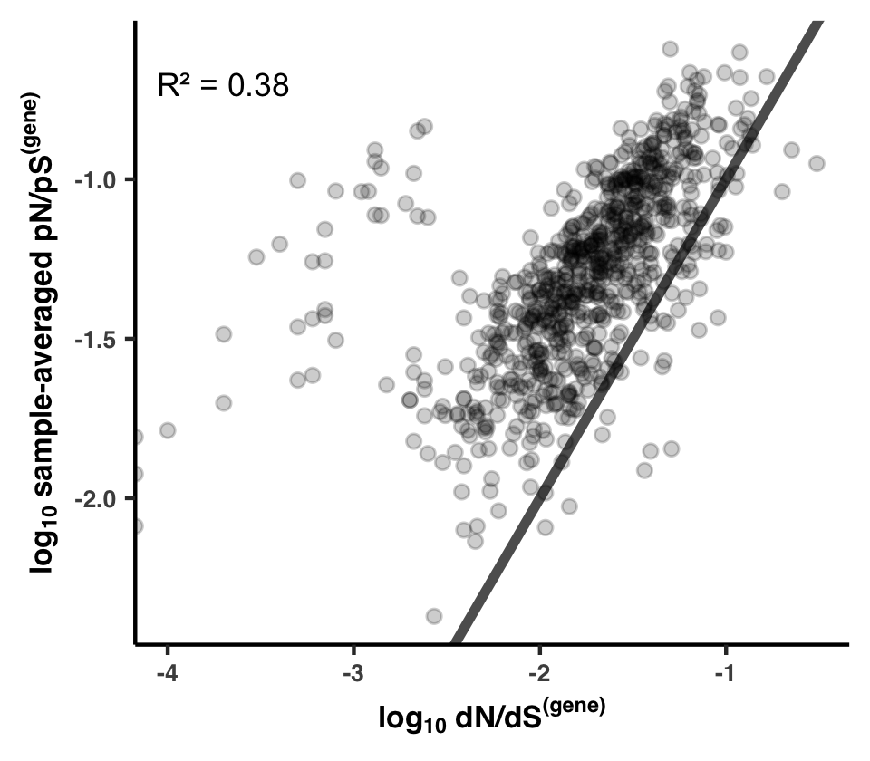
Since it is much more common for slightly negative polymorphisms to drift to observable frequencies than it is for them to fixate, it is expected that in the majority of cases sample-averaged pN/pS exceeds dN/dS, and it is indeed what we see (most genes are above the black line $y = x$). Interestingly, there are a select number of genes that have quite high rates of polymorphim, despite dN/dS being very low. I think there is probably an interesting story involving all of the genes with high polymorphism rates but low substitution rates (left side of plot).
Analysis 17: Transcript abundance & Metatranscriptomics
Something that in my opinion remains undersold in the main text is the fact that we used accompanying metatranscriptome datasets to compare transcript abundance to selection strength as measured with pN/pS$^{\text{(gene)}}$. This is an important evolutionary analysis, since it has been widely documented that transcription/expression levels strongly dictate the evolutionary conservancy of genes. If you are interested in that subject, I suggest you read the Supplementary Information file, as the text there explains what we did quite well. That resulted in the multi-panel Figure SI5, which is the topic of this Analysis.
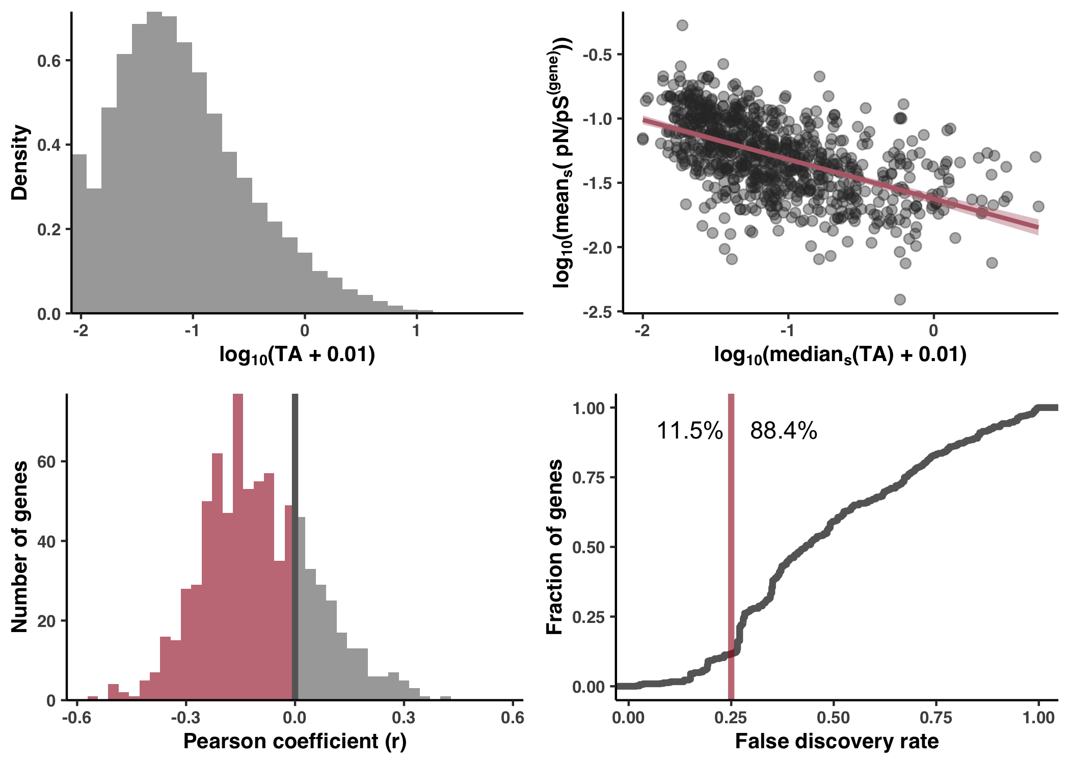
Calculation & accessibility
As a reminder, the read recruitment procedure included a number of metatranscriptomes. And of the 74 samples of interest determined in Step 8, 50 had accompanying metatranscriptomes. For these 50 samples, we used the read recruitment results of the metatranscriptomes to establish a transcript abundance (TA) measure for each gene (see Methods).
Taken from the Methods section, here is the definition for TA:
\[\text{TA} = \frac{C^{\text{(MT)}}}{D^{\text{(MT)}}} / \frac{C^{\text{(MG)}}}{D^{\text{(MG)}}}\]Where $C^{\text{(MT)}}$ is the coverage of the gene in the metatranscriptome, $D^{\text{(MT)}}$ is the sequencing depth (total number of reads) of the metatranscriptome, $C^{\text{(MG)}}$ is the coverage of the gene in the metagenome, and $D^{\text{(MT)}}$ is the sequencing depth (total number of reads) of the metagenome.
The calculation of TA for each gene in each relevant sample is done at the bottom of ZZ_SCRIPTS/load_data.R, and is shown below. I’ve added comments to try and be as explanatory as possible.
Show/Hide TA Calculation
# -----------------------------------------------------------------------------
# Transcript abundance analysis
# -----------------------------------------------------------------------------

# Let's define our metagenomes and metatranscriptomes of interest. Here, `soi` refers to the
# metagenomes that have corresponding metatranscriptomes `soi_MT`. There are 58 total
# metatranscriptomes and 50 of them match to the 74 samples we're studying HIMB083 within. As such,
# both `soi` and `soi_MT` are of length 50.
soi <- read_tsv("../soi", col_names=FALSE)$X1
soi_MT <- paste(soi, "_MT", sep="")
soi_MT <- soi_MT[soi_MT %in% colnames(gene_cov)]
soi <- soi_MT %>% substr(1, nchar(.) - 3)

# Now let's load the coverage table, since we'll be making use of the gene coverages in both
# metagenomes and metatranscriptomes to define transcript abundance (see Methods section entitled
# "Calculating transcript abundance (TA)").
goi <- read_tsv("../goi", col_names=F)$X1 # only care about the 799 core
gene_cov <- read_tsv(args$summary) %>% filter(gene_callers_id %in% goi)

# Now let's calculate the coverage for metatranscriptomes and metagenomes, storing them in separate
# tibbles. For convenience, I'm going to cast them into a long format with the 3 columns:
# 'gene_caller_id', 'sample_id', and 'MG/MT_coverage'
MT_COV <- gene_cov %>% select(gene_callers_id, soi_MT) %>% pivot_longer(cols=soi_MT, names_to='sample_id', values_to='MT_coverage')
MG_COV <- gene_cov %>% select(gene_callers_id, soi) %>% pivot_longer(cols=soi, names_to='sample_id', values_to='MG_coverage')

# Okay, so our estimation of transcript abundance (TA) is calculated according to the equation
# TA = [Cov(MT)/Depth(MT)] / [Cov(MG)/Depth(MG)]. Depth here is the number of reads in the sample,
# which is already stored in ../07_SEQUENCE_DEPTH. Let's load up the depth data and append it as
# columns to MT_COV and MG_COV
SEQ_DEPTH <- read_tsv("../07_SEQUENCE_DEPTH")
MT_COV_DEPTH <- MT_COV %>% left_join(SEQ_DEPTH) %>% rename(MT_depth=num_reads)
MG_COV_DEPTH <- MG_COV %>% left_join(SEQ_DEPTH) %>% rename(MG_depth=num_reads)

# Now we have Cov(MT), Depth(MT), Cov(MG), and Depth(MG). But the problem is they belong in two
# separate tables, MT_COV_DEPTH and MG_COV_DEPTH. Let's merge these together.
COV_DEPTH <- left_join(
    MG_COV_DEPTH,
    MT_COV_DEPTH %>% mutate(sample_id = substr(sample_id, 1, nchar(.$sample_id)-3)),
    by = c('gene_callers_id', 'sample_id')
)

# Finally, we can calculate TA = [Cov(MT)/Depth(MT)] / [Cov(MG)/Depth(MG)] and merge it with the
# pN/pS(gene) data.
eps <- 0.01
TA <- COV_DEPTH %>%
    left_join(pnps %>% select(gene_callers_id, sample_id, pnps)) %>%
    mutate(
        TA = (MT_coverage/MT_depth) / (MG_coverage/MG_depth),
        log_TA = log10(TA + eps),
        log_pnps = log10(pnps)
    )
TA_sample_averaged <- TA %>%
    group_by(gene_callers_id) %>%
    summarise(
        TA_mean = mean(TA, na.rm=T),
        TA_median = median(TA, na.rm=T),
        pnps_mean = mean(pnps, na.rm=T),
        pnps_median = median(pnps, na.rm=T),
    ) %>%
    mutate(
        log_TA_mean = log10(TA_mean + eps),
        log_TA_median = log10(TA_median + eps),
        log_pnps_mean = log10(pnps_mean),
        log_pnps_median = log10(pnps_median),
    )

# Finally, we perform a bunch of correlation tests testing for signal between a given gene's TA and
# pN/pS(gene) across samples.
TA_sample_corr <- TA %>%
  nest(data = -gene_callers_id) %>%
  mutate(cor = map(data, ~cor.test(.x$log_TA, .x$log_pnps, method="pearson", alternative="less"))) %>%
  mutate(tidied = map(cor, tidy)) %>%
  unnest(tidied) %>%
  mutate(
    significant = p.value <= 0.05,
    negative = estimate < 0,
    R2 = estimate^2
  )
TA_sample_corr$fdr <- p.adjust(TA_sample_corr$p.value, method="fdr")
TA_sample_corr$fdr_10 <- TA_sample_corr$fdr <= 0.10
TA_sample_corr$fdr_20 <- TA_sample_corr$fdr <= 0.20
TA_sample_corr$fdr_25 <- TA_sample_corr$fdr <= 0.25
This code creates the tables TA, TA_sample_averaged, and TA_sample_corr, which you can access from within your GRE.
Table S12 provides a view of TA values and how they relate to pN/pS$^{\text{(gene)}}$ on a per-gene, per-sample basis, and can be generated via
Command #83
source('table_ta.R')
It is output to WW_TABLES/TA.txt.
Correlation with sample-averaged TA
There exists a TA for each gene in each relevant sample. The distribution of log-transformed TA values is shown in Figure SI5a. To see the extent that inter-gene differences in TA could explain inter-gene differences in pN/pS$^{\text{(gene)}}$, I averaged the TA and pN/pS$^{\text{(gene)}}$ values of each gene across samples, yielding a sample-averaged TA and pN/pS$^{\text{(gene)}}$ value for each gene. The scatterplot between these values is shown in Figure SI5b. Actually, since there is so much variance in TA across samples, I opted to use the median rather than the average.
Both the histogram and the scatterplot are generated with the following snippet from ZZ_SCRIPTS/figure_s_exp.R:
Show/Hide Snippet
# --------------------------------------------------------------------------
# Sample-averaged analysis
# --------------------------------------------------------------------------

# Inverse correlation between normalized transcription level and pn/ps averaged across metagenomes
print(lm(log_pnps_mean ~ log_TA_median, data=TA_sample_averaged) %>% summary() %>% .$r.squared %>% sqrt()) # r
print(lm(log_pnps_mean ~ log_TA_median, data=TA_sample_averaged) %>% summary() %>% .$r.squared) # R2
print(lm(log_pnps_mean ~ log_TA_median, data=TA_sample_averaged) %>% summary() %>% .$coefficients) # coefficients
g1 <- ggplot(TA_sample_averaged, aes(x=log_TA_median, y=log_pnps_mean)) +
    geom_point(alpha=0.4, size=2, color="#333333") +
    theme_classic() +
    stat_smooth(method="lm", color="#B66B77", fill="#B66B77") +
    labs(
        x=TeX("$log_{10}(median_s($TA) + $0.01)$", bold=T),
        y=TeX("$log_{10}(mean_s($ pN/pS$^{(gene)}))$", bold=TRUE)
    ) +
    my_theme(10)
w <- 2.9
display(g1, output=file.path(args$output, "inverse_power_law.pdf"), width=w, height=w*0.8, as.png=F)

g2 <- ggplot(data=TA) +
    geom_histogram(aes(x=log_TA, y=..density..), fill="#666666", alpha=0.6) +
    labs(
        x=TeX("$log_{10}$(TA + $0.01$)", bold=T),
        y="Density"
    ) +
    theme(legend.position="none") +
    my_theme(10) +
    scale_y_continuous(expand=c(0,NA)) +
    scale_x_continuous(expand=c(0,NA))
display(g2, output=file.path(args$output, "histogram.pdf"), width=w, height=w*0.8, as.png=F)
Impressively, a clear negative correlation is observed between these quantities. See Supplementary Information for the scientific explanation.
Lack of correlation across samples
In a complementary analysis, I correlated TA with pN/pS$^{\text{(gene)}}$ across samples for individual genes to see whether inter-sample variance of pN/pS$^{\text{(gene)}}$ could be explained by measured TA. Taking a histogram of the resultant Pearson coefficients (Figure SI5c), you can see that more negative correlations exist than positive correlations, which fit our expectation, however the effect was very slight and statistically weak. Allowing for a very generous false discovery rate (FDR) of 25%, only 11% of the genes passed the test for significance (Figure SI5d).
The code snippet responsible for Figures SI5c and SI5d is shown here:
Show/Hide Snippet
# --------------------------------------------------------------------------
# Per gene correlations
# --------------------------------------------------------------------------

text_df <- data.frame(
    x=c(0.15, 0.38),
    y=0.92,
    label=paste(round(c(TA_sample_corr %>% filter(fdr_25 == TRUE) %>% nrow(), TA_sample_corr %>% filter(fdr_25 == FALSE) %>% nrow()) / nrow(TA_sample_corr) * 100, 1), '%', sep="")
)
breaks <- -20:20/35
g3 <- ggplot(data=TA_sample_corr) +
    geom_histogram(aes(x=estimate, fill=negative), breaks=breaks, alpha=0.6) +
    theme_classic(base_size=20) +
    geom_vline(aes(xintercept=0), color='#666666', size=1.4) +
    labs(
        x="Pearson coefficient (r)",
        y="Number of genes"
    ) +
    scale_fill_manual(values=c("#666666", off_color)) +
    scale_y_continuous(expand=c(0,NA)) +
    my_theme(10) +
    theme(legend.position="none")
display(g3, file.path(args$output, "per_gene_expression_corr.pdf"), width=7, height=5)

g4 <- ggplot(data=TA_sample_corr) +
    stat_ecdf(aes(x=fdr), geom='step', size=1.5, color="#666666") +
    geom_vline(aes(xintercept=0.25), color=off_color, size=1.4, alpha=0.6) +
    geom_text(data=text_df, aes(x=x, y=y, label=label), size=4) +
    labs(
        x="False discovery rate",
        y="Fraction of genes"
    ) +
    scale_fill_manual(values=c()) +
    theme(legend.position="none") +
    my_theme(10)
display(g4, file.path(args$output, "per_gene_fdr.pdf"), width=7, height=5)

print("Percentage of genes with negative correlations:")
print(TA_sample_corr %>% filter(estimate < 0) %>% nrow() / (TA_sample_corr %>% filter(estimate < 0) %>% nrow() + TA_sample_corr %>% filter(estimate >= 0) %>% nrow()) * 100)
print("Percentage of genes passing 25% FDR")
print(TA_sample_corr %>% filter(fdr_25 == TRUE) %>% nrow() / (TA_sample_corr %>% filter(fdr_25 == FALSE) %>% nrow() + TA_sample_corr %>% filter(fdr_25 == TRUE) %>% nrow()) * 100)

g <- plot_grid(g2, g1, g3, g4, ncol=2)
display(g, file.path(args$output, "fig.png"), width=7, height=5, as.png=T)
display(g, file.path(args$output, "fig.pdf"), width=7, height=5, as.png=T)
Generating Figure SI5
To generate Figure SI5, run the following from your GRE.
Command #84
source('figure_s_exp.R')
Results are in YY_PLOTS/FIG_S_EXP.
Analysis 18: Environmental correlations with pN/pS$^{\text{(gene)}}$
One of the most exciting things that pN/pS$^{\text{(gene)}}$ enables is the tracking of selection strength of a single gene across samples. Thanks to the diverse geographical sampling in this study, each sample has a host of measured enviornmental parameters that the calculated pN/pS$^{\text{(gene)}}$ can be compared against.
To expose the totality of this data, I correlated each measured environmental variable with each gene’s pN/pS$^{\text{(gene)}}$, which resulted in Table S10. You can create this table from within the GRE:
Command #85
source('table_env_corr.R')
This creates Table S10 under the filename WW_TABLES/ENV_CORR.txt. If you follow the crumb trail of table_env_corr.R into load_data.R, you can find the responsible code:
Show/Hide Code
# Gene to environment correlations
env_corr <- pnps %>%
    group_by(gene_callers_id) %>%
    summarise(
        cor_nitrates=cor(pnps, nitrates, use="pairwise.complete.obs", method='pearson'),
        cor_chlorophyll=cor(pnps, `Chlorophyll Sensor s`, use="pairwise.complete.obs", method='pearson'),
        cor_temperature=cor(pnps, `temperature`, use="pairwise.complete.obs", method='pearson'),
        cor_salinity=cor(pnps, `Salinity (PSU)`, use="pairwise.complete.obs", method='pearson'),
        cor_phosphate=cor(pnps, `PO4 (umol/L)`, use="pairwise.complete.obs", method='pearson'),
        cor_silicon=cor(pnps, `SI (umol/L)`, use="pairwise.complete.obs", method='pearson'),
        cor_depth=cor(pnps, `Depth (m)`, use="pairwise.complete.obs", method='pearson'),
        cor_oxygen=cor(pnps, `Oxygen (umol/kg)`, use="pairwise.complete.obs", method='pearson'),
        pnps=mean(pnps, na.rm=TRUE)
    ) %>%
    left_join(fns %>% select(gene_callers_id, function_COG20_CATEGORY, function_COG20_FUNCTION, function_Pfam, function_KOfam, accession_Pfam))
Essentially, Table S10 is created from the GRE R-variable env_corr, which is quite a useful table if you want to search for potentially interesting genes. For example, suppose you want the genes with pN/pS$^{\text{(gene)}}$ values that most strongly anti-correlate with sample temperature. This means, or at least suggests, that temperature and/or its co-variables strongly affects the selection strength acting on these genes–specifically that increased temperature leads to increased selection strength. Finding the top 10 genes meeting this criteria, along with their functions from several annotation sources, is this easy.
env_corr %>%
    arrange(cor_temperature) %>%
    select(
        gene_callers_id,
        cor_temperature,
        function_COG20_FUNCTION,
        function_Pfam,
        function_KOfam
    )
Which yields this.
# A tibble: 799 × 5
   gene_callers_id cor_temperature function_COG20_FUNCT… function_Pfam
             <dbl>           <dbl> <chr>                 <chr>
 1            1962        -0.75071 Cold shock protein, … 'Cold-shock' DNA…
 2            1309        -0.74748 Glycine/D-amino acid… FAD dependent ox…
 3            1589        -0.72689 Tripartite-type tric… Tripartite trica…
 4            1552        -0.71155 Bacterial nucleoid D… Bacterial DNA-bi…
 5            1825        -0.65728 ABC-type transport s… Bacterial extrac…
 6            2687        -0.63746 Ribosomal protein S4… Ribosomal protei…
 7            1316        -0.61160 (p)ppGpp synthase/hy… ACT domain;HD do…
 8            1832        -0.61039 Regulator of proteas… SPFH domain / Ba…
 9            1278        -0.61003 Ribosomal protein S5… Ribosomal protei…
10            1855        -0.60929 Geranylgeranyl pyrop… Polyprenyl synth…
# … with 789 more rows, and 1 more variable: function_KOfam <chr>
Analysis 19: Glutamine synthetase (GS)
This rather lengthy Analysis details everything to do with the case study involving glutamine synthetase (GS). In essence, this means anything to do with Figure 3 is covered here.
GS is a dodecamer
Proteins do not always function as individual monomers–in fact it is probably the minority of cases, and GS is no exception. GS forms a homo-dodecamer, meaning that 12 identical GS protein chains assemble to form a complex. For example, 1FPY and 1F52 are both crystal structures of a Salmonella typhimurium GS, which shares 61% amino acid similarity to the HIMB083 GS. In the 1FPY structure, phosphinothricin (which blocks glutamate binding) and ADP are bound in the active site, providing a visual proxy for where the glutamate is supposed to bind.
Figure 3a is an image of 1FPY, and can be generated using PyMOL. If you don’t know, PyMOL is an analysis and visualization software for molecules. It is a staple in the protein world and it has a scripting language, which is great for reproducibility. Go ahead and run the script ZZ_SCRIPTS/structure_2602_1FPY.pml:
Show/Hide PyMOL Script
bg_color white

fetch 1fpy
hide everything, 1fpy

sel prot_sel, 1fpy and not (resn ADP or resn PPQ or resn MN)
sel adp_sel, 1fpy and (resn ADP)
sel glu_sel, 1fpy and (resn PPQ)

create prot, prot_sel
create adp, adp_sel
create glu, glu_sel

sel chainA_sel, prot and chain A
sel chainB_sel, prot and chain B
sel chainC_sel, prot and chain C
sel chainD_sel, prot and chain D
sel chainE_sel, prot and chain E
sel chainF_sel, prot and chain F
sel chainG_sel, prot and chain G
sel chainH_sel, prot and chain H
sel chainI_sel, prot and chain I
sel chainJ_sel, prot and chain J
sel chainK_sel, prot and chain K
sel chainL_sel, prot and chain L

create chainA, chainA_sel
create chainB, chainB_sel
create chainC, chainC_sel
create chainD, chainD_sel
create chainE, chainE_sel
create chainF, chainF_sel
create chainG, chainG_sel
create chainH, chainH_sel
create chainI, chainI_sel
create chainJ, chainJ_sel
create chainK, chainK_sel
create chainL, chainL_sel

show surface, chainA
show surface, chainB
show surface, chainC
show surface, chainD
show surface, chainE
show surface, chainF
show surface, chainG
show surface, chainH
show surface, chainI
show surface, chainJ
show surface, chainK
show surface, chainL
show spheres, glu
show spheres, adp

color magenta, glu
color magenta, adp

set_color color_prot1, [0.78, 0.90, 0.96]
set_color color_prot2, [0.90, 0.96, 0.78]

set surface_color, color_prot2, chain A
set surface_color, color_prot1, chain B
set surface_color, color_prot2, chain C
set surface_color, color_prot1, chain D
set surface_color, color_prot2, chain E
set surface_color, color_prot1, chain F
set surface_color, color_prot1, chain G
set surface_color, color_prot2, chain H
set surface_color, color_prot1, chain I
set surface_color, color_prot2, chain J
set surface_color, color_prot1, chain K
set surface_color, color_prot2, chain L

rebuild

if not os.path.exists("YY_PLOTS"): os.makedirs("YY_PLOTS")
if not os.path.exists("YY_PLOTS/FIG_2"): os.makedirs("YY_PLOTS/FIG_2")
cd YY_PLOTS/FIG_2

set ray_trace_mode, 0
set antialias, 2
set ray_opaque_background, off

set_view (\
     0.331930995,    0.940376520,    0.074255198,\
     0.943143487,   -0.329394072,   -0.044496641,\
    -0.017384375,    0.084803127,   -0.996246159,\
     0.000000000,    0.000000000, -473.991119385,\
   -47.470947266,   -0.205673218,  -47.983573914,\
   384.120666504,  563.861694336,  -20.000000000 )
rotate z, 13

ray 1000, 1000
png 1fpy_1.png

turn x, 90
ray 1000, 1000
png 1fpy_2.png

cd ../..
Command #86
pymol -c ZZ_SCRIPTS/structure_2602_1FPY.pml
If you want to visualize 1FPY interactively in the PyMOL interface, remove the -c. However, if you’re using Docker, it will be very difficult to convince Docker to render PyMOL’s graphical interface. My suggestion is to download PyMOL on your local computer.
Dodecameric RSA & DTL
When dealing with the structure of GS, we make the following point in the text:
Since the native quaternary structure of GS is a dodecameric complex (12 monomers), our monomeric estimates of RSA and DTL are unrepresentative of the active state of GS. We addressed this by aligning 12 copies of the predicted structure to a solved dodecameric complex of GS in Salmonella typhimurium (PDB ID 1FPY), which HIMB83 GS shares 61% amino acid similarity with (Figure 3a). From this stitched quaternary structure we recalculated RSA and DTL, and as expected, this yielded lower average RSA and DTL estimates due to the presence of adjacent monomers (0.17 versus 0.24 for RSA and 17.8Å versus 21.2Å for DTL).
To summarize, monomeric estimates of RSA and DTL misrepresent the selective pressures experienced by individual residues, since the functional form of GS is a dodecameric complex. So RSA and DTL should really be calculated for the dodecamer.
To recalculate RSA and DTL for the dodecamer, we need the dodecamer complex, which we have for Salmonella, but not for HIMB083. One option would be to use AlphaFold-Multimer, which can predict complexes. However, since the Salmonella tryphimurium GS shares such a high amino acid similarity, I opted to do something simpler: predict the monomeric GS with AlphaFold, then align 12 copies of the monomer to 1F52 structure. Well, due to symmetry its actually overkill to align 12 copies–its only actually necessary to focus on one protein in the complex, and its 3 nearest neighbors:
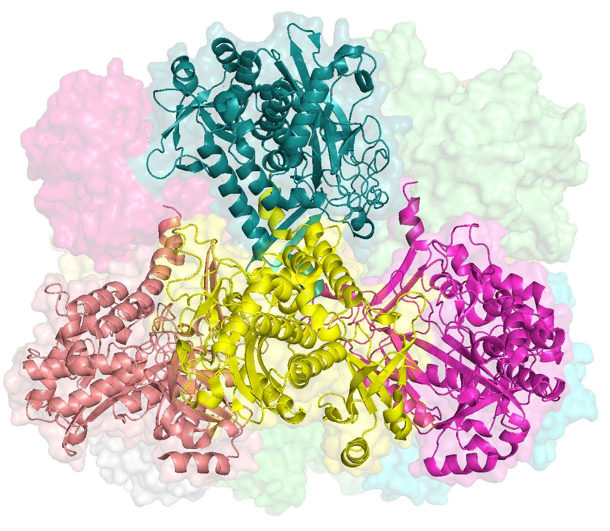
So in the above screen, the protein of focus is colored in yellow. To create this complex, I wrote the PyMOL script, ZZ_SCRIPTS/GS_neighor_complex.pml:
# Fetch the dimer of the closest sequence match (61% identify)
fetch 1f52

# Load in the AlphaFold (AF) predicted structure for GS four times
load 09_STRUCTURES_AF/predictions/2602.pdb, 2602_C, partial=1
load 09_STRUCTURES_AF/predictions/2602.pdb, 2602_D, partial=1
load 09_STRUCTURES_AF/predictions/2602.pdb, 2602_E, partial=1
load 09_STRUCTURES_AF/predictions/2602.pdb, 2602_J, partial=1

# Align each copy of the AF structure to each chain of 1f52
align 2602_C, 1f52 and chain C
align 2602_D, 1f52 and chain D
align 2602_E, 1f52 and chain E
align 2602_J, 1f52 and chain J

# Rename all of the chains
sele 2602_C
alter sele, chain='A'
sele 2602_D
alter sele, chain='B'
sele 2602_E
alter sele, chain='C'
sele 2602_J
alter sele, chain='D'

# Save the neighbor complex
sele 2602_C | 2602_D | 2602_E | 2602_J
save 21_GS_COMPLEX/neighbor_complex.pdb, sele
When ready, run the following from the command-line:
Command #87
mkdir -p 21_GS_COMPLEX
pymol -c ZZ_SCRIPTS/GS_neighor_complex.pml
When done, you can open up the resulting complex with pymol 21_GS_COMPLEX/neighbor_complex.pdb:
If you’re using Docker, it will be very difficult to convince Docker to render PyMOL’s graphical interface. My suggestion is to download PyMOL on your local computer for any investigations that involve interactively visualizing with PyMOL.
From this pseudo-complex, I calculated the RSA and DTL of the central protein using two scripts, ZZ_SCRIPTS/GS_complex_DTL.py and ZZ_SCRIPTS/GS_complex_RSA.py. Check them out if you wish:
Show/Hide DTL Script
#! /usr/bin/env python

import pandas as pd
import argparse
import anvio.dbops as dbops
import anvio.terminal as terminal
import anvio.structureops as sops

from pathlib import Path
from anvio.tables.miscdata import TableForAminoAcidAdditionalData

stdout = terminal.Run()

# ----------------------------------------------------------------------------------
# This function calculates the minimum distance of a position in chain B to a ligand-binding
# position by considering all 4 chains (pos chain B -> lig_pos chain B), (pos chain B -> lig_pos
# chain A), (pos chain B -> lig_pos chain C), and (pos chain B -> lig_pos chain D)
# ----------------------------------------------------------------------------------

def get_min_dist_to_lig(chain_A, chain_B, chain_C, chain_D, lig_positions, pos):
    d = {}
    for lig_pos in lig_positions:
        d_BA = chain_B.calc_COM_dist(chain_B.get_residue(pos), chain_A.get_residue(lig_pos))
        d_BB = chain_B.calc_COM_dist(chain_B.get_residue(pos), chain_B.get_residue(lig_pos))
        d_BC = chain_B.calc_COM_dist(chain_B.get_residue(pos), chain_C.get_residue(lig_pos))
        d_BD = chain_B.calc_COM_dist(chain_B.get_residue(pos), chain_D.get_residue(lig_pos))
        d[lig_pos] = min([d_BA, d_BB, d_BC, d_BD])

    closest = min(d, key = lambda x: d.get(x))
    return closest, d[closest]

# ----------------------------------------------------------------------------------
# Determine the ligand-binding residues
# ----------------------------------------------------------------------------------

min_bind_freq = 0.5
amino_acid_additional_data = TableForAminoAcidAdditionalData(argparse.Namespace(contigs_db='CONTIGS.db'))
lig_df = amino_acid_additional_data.get_gene_dataframe(2602, group_name='InteracDome')
lig_df = lig_df.reset_index(drop=True).set_index('codon_order_in_gene')
lig_df = lig_df[lig_df['LIG_GLU'].notnull()]
lig_df = lig_df[lig_df['LIG_GLU'] >= min_bind_freq]
lig_df = lig_df[['LIG_GLU']]
lig_positions = lig_df.index.values

# ----------------------------------------------------------------------------------
# Load up chains within the complex
# ----------------------------------------------------------------------------------

complex_path = str(Path('21_GS_COMPLEX/neighbor_complex.pdb'))

chain_A = sops.Structure(complex_path)
chain_A._load_pdb_file(complex_path, chain_index=0)

chain_B = sops.Structure(complex_path)
chain_B._load_pdb_file(complex_path, chain_index=1)

chain_C = sops.Structure(complex_path)
chain_C._load_pdb_file(complex_path, chain_index=2)

chain_D = sops.Structure(complex_path)
chain_D._load_pdb_file(complex_path, chain_index=3)

# ----------------------------------------------------------------------------------
# Calculate the complex DTL (what is far from a ligand-binding residue in the monomer
# may actually be close if the distance to another chain is considered)
# ----------------------------------------------------------------------------------

d = {
    'codon_order_in_gene': [],
    'DTL': [],
}
for codon_order_in_gene in range(len(chain_A.get_sequence())):
    _, DTL = get_min_dist_to_lig(chain_A, chain_B, chain_C, chain_D, lig_positions, codon_order_in_gene)
    d['codon_order_in_gene'].append(codon_order_in_gene)
    d['DTL'].append(DTL)
dtl = pd.DataFrame(d)

# ----------------------------------------------------------------------------------
# Write
# ----------------------------------------------------------------------------------

output = Path('21_GS_COMPLEX') / 'complex_DTL.txt'
dtl.to_csv(output, sep='\t', index=False)
Show/Hide RSA Script
#! /usr/bin/env python

import numpy as np
from anvio.terminal import Run
from anvio.structureops import DSSPClass

from pathlib import Path

stdout = Run()
dssp = DSSPClass()

# Run DSSP on the complex structure and the AlphaFold monomer structure.
GS_complex = dssp.run(str(Path('21_GS_COMPLEX/neighbor_complex.pdb')))
GS_monomer = dssp.run(str(Path('09_STRUCTURES_AF/predictions/2602.pdb')))

# Split the complex into chain A and chain B
GS_length = GS_monomer.shape[0]
GS_chain_A = GS_complex.iloc[:GS_length].reset_index()
GS_chain_B = GS_complex.iloc[GS_length:2*GS_length].reset_index()
GS_chain_C = GS_complex.iloc[2*GS_length:3*GS_length].reset_index()
GS_chain_D = GS_complex.iloc[3*GS_length:].reset_index()

GS_complex_RSA = GS_chain_B['rel_solvent_acc']
stdout.info('Mean RSA of monomers in complex', GS_complex_RSA.mean())
stdout.info('Mean RSA of monomers out of complex', GS_monomer['rel_solvent_acc'].mean())

output = GS_complex_RSA.\
    to_frame().\
    reset_index().\
    rename(columns={'index': 'codon_order_in_gene', 'rel_solvent_acc': 'RSA'})
output.to_csv(Path('21_GS_COMPLEX/complex_RSA.txt'), sep='\t', index=False)
Run them with
Command #88
python ZZ_SCRIPTS/GS_complex_DTL.py
python ZZ_SCRIPTS/GS_complex_RSA.py
Afterwards, you’ll have the files 21_GS_COMPLEX/complex_RSA.txt:
| codon_order_in_gene | RSA |
|---|---|
| 0 | 0.5133928571428571 |
| 1 | 0.36774193548387096 |
| 2 | 0.05426356589147287 |
| 3 | 0.3333333333333333 |
| 4 | 0.37435897435897436 |
| 5 | 0.0 |
| 6 | 0.24378109452736318 |
| 7 | 0.5211864406779662 |
| 8 | 0.17083333333333334 |
| (…) | (…) |
and 21_GS_COMPLEX/complex_DTL.txt:
| codon_order_in_gene | DTL |
|---|---|
| 0 | 31.344873780070404 |
| 1 | 32.18030518803351 |
| 2 | 28.055919972000027 |
| 3 | 31.572194235333864 |
| 4 | 32.67016401084904 |
| 5 | 26.203425021876164 |
| 6 | 27.16896602862751 |
| 7 | 33.79731076619324 |
| 8 | 28.473864016483063 |
| (…) | (…) |
When the SCV data is loaded into the GRE, these values are appended as columns with the following code snippet found in ZZ_SCRIPTS/load_data.R:
# -----------------------------------------------------------------------------
# Add glutamine synthetase dodecameric DTL and RSA estimates
# -----------------------------------------------------------------------------

complex_RSA <- read_tsv('../21_GS_COMPLEX/complex_RSA.txt') %>%
    rename(complex_RSA=RSA)
complex_DTL <- read_tsv('../21_GS_COMPLEX/complex_DTL.txt') %>%
    rename(complex_DTL=DTL)
complex_GS <- left_join(complex_RSA, complex_DTL) %>%
    mutate(gene_callers_id = 2602)
scvs <- scvs %>% left_join(complex_GS, by=c("codon_order_in_gene", "gene_callers_id"))
As a result of this, you could access these data and their associations with polymorphism rates with a command such as this:
scvs %>% filter(gene_callers_id==2602) %>% select(codon_order_in_gene, sample_id, pN_popular_consensus, pS_popular_consensus, complex_RSA, complex_DTL)
pN/pS$^{\text{(gene)}}$ of GS
Compared to other genes, GS has a very low sample-averaged pN/pS$^{\text{(gene)}}$ value. Yet even still, there is almost 3-fold variation in pN/pS$^{\text{(gene)}}$ observed between samples. This information comes strictly from the pN/pS$^{\text{(gene)}}$ data you calculated, which is represented in the GRE with the R-variable pnps. These observations are illustrated in Figure 3b, which was produced with the script ZZ_SCRIPTS/figure_3.R. Here is the relevant code:
# -----------------------------------------------------------------------------
# Glutamine synthetase pN/pS versus all others
# -----------------------------------------------------------------------------

g_pnps_sub <- ggplot() +
    geom_histogram(data=pnps %>% filter(gene_callers_id==2602), aes(x=pnps, y=..count..), bins=30, fill=GS_color, alpha=1.) +
    scale_y_continuous(expand = c(0,NA)) +
    labs(
        x=TeX("pN/pS$^{(gene)}$", bold=T),
        y="Number of samples"
    ) +
    my_theme(7) +
    theme(
        axis.text.x = element_text(size=6)
    ) +
    scale_y_continuous(breaks = scales::pretty_breaks(n = 5), expand=c(0, NA))
plot_data <- pnps %>% group_by(gene_callers_id) %>% summarise(pnps=mean(pnps, na.rm=T))
g_pnps <- ggplot() +
    geom_histogram(data = plot_data, aes(x=pnps, y=..count..), bins=100, fill="#666666", alpha=0.85) +
    labs(
        x=TeX("sample-averaged pN/pS$^{(gene)}$", bold=T),
        y="Number of genes"
    ) +
    scale_x_continuous(breaks = scales::pretty_breaks(n = 10), limits=c(0, 0.30)) +
    scale_y_continuous(expand = c(0,NA)) +
    geom_vline(xintercept=plot_data %>% filter(gene_callers_id == 2602) %>% pull(pnps), col=GS_color, size=0.8) +
    my_theme(8)
plot2 <- ggdraw(g_pnps) +
    draw_plot(g_pnps_sub, 0.45, 0.3, 0.50, 0.6)

aligned <- align_plots(plot1, plot2, align='h')
display(aligned[[1]], file.path(args$output, "GS_corr.pdf"), width=2.3, height=1.9)
display(aligned[[2]], file.path(args$output, "GS_pnps.pdf"), width=2.3, height=1.9)
pN/pS$^{\text{(gene)}}$ correlation with nitrates
As was mentioned in Analysis 18, env_corr is an R-variable in the GRE that is supremely useful for identifying which genes’ pN/pS$^{\text{(gene)}}$ values correlate with which environmental parameters. GS has Gene ID 2602, so one can easily probe which environmental parameters GS correlates with:
> env_corr %>% filter(gene_callers_id == 2602) %>% t()
                        [,1]
gene_callers_id         "2602"
cor_nitrates            "0.3384655"
cor_chlorophyll         "0.006176131"
cor_temperature         "-0.1363972"
cor_salinity            "-0.2188335"
cor_phosphate           "0.4125989"
cor_silicon             "0.03814715"
cor_depth               "0.01050676"
cor_oxygen              "0.04476064"
pnps                    "0.02049047"
function_COG20_CATEGORY "RNA processing and modification"
function_COG20_FUNCTION "Glutamine synthetase (GlnA) (PDB:1F1H)"
function_Pfam           "Glutamine synthetase, catalytic domain;Glutamine synthetase, beta-Grasp domain"
function_KOfam          "glutamine synthetase [EC:6.3.1.2]"
accession_Pfam          "PF00120.25;PF03951.20"
The degree to which GS correlates with nitrates is depicted in Figure 3c, which is created in ZZ_SCRIPTS/figure_3.R. Here is the relevant code:
# -----------------------------------------------------------------------------
# Glutamine synthetase pN/pS versus nitrates
# -----------------------------------------------------------------------------

GS_color <- "#A1C6B9"

g_corr_sub <- ggplot(pnps %>% filter(gene_callers_id==2602), aes(pnps, nitrates)) +
    geom_point(alpha=0.8, size=0.8, color=GS_color) +
    geom_smooth(method='lm', color='#666666', fill=GS_color, size=0.6) +
    labs(x=TeX("pN/pS$^{(gene)}$", bold=T), y="Nitrates (A.U.)") +
    my_theme(7) +
    theme(axis.text.x = element_text(size=6)) +
    scale_y_continuous()
g_corr <- ggplot(env_corr, aes(cor_nitrates)) +
    geom_histogram(alpha=0.7, size=1.5, bins=100) +
    geom_vline(
        xintercept = env_corr %>% filter(gene_callers_id==2602) %>% pull(cor_nitrates),
        color = GS_color,
        size = 0.8
    ) +
    scale_x_continuous(limits=c(NA,1.3)) +
    scale_y_continuous(expand=c(0,0)) +
    labs(x=TeX("Nitrates correlation ($\\rho_{N}$)", bold=T), y="Number of genes") +
    my_theme(8)
plot1 <- ggdraw(g_corr) +
    draw_plot(g_corr_sub, 0.525, 0.30, 0.465, 0.65)
Visualizing polymorphism on structure
In Figure 3d, I colored the surface of the HIMB083 GS monomer according to the sample-averaged s- and ns-polymorphism rates, for several different camera orientations. Although I only show a single monomer (for visual clarity), I also show the 3 ligands (pink) from the complex that lie closest to the monomer. If you take your time looking at this figure, you’ll see how dramatically ns-polymorphism avoids all 3 of these binding regions.
Reproducing Figure 3d affords an opportunity to see how anvi’o structure can work in conjunction with PyMOL. I’ll give you a brief lesson on the workflow, then I’ll show you how to reproduce Figure 3d.
A brief lesson
First, open the anvi’o structure interactive interface.
anvi-display-structure -c CONTIGS.db -p PROFILE.db -s 09_STRUCTURE.db --gene-caller-ids 2602 --SCVs-only --samples-of-interest soi
You’ll be presented with this pimply mess.
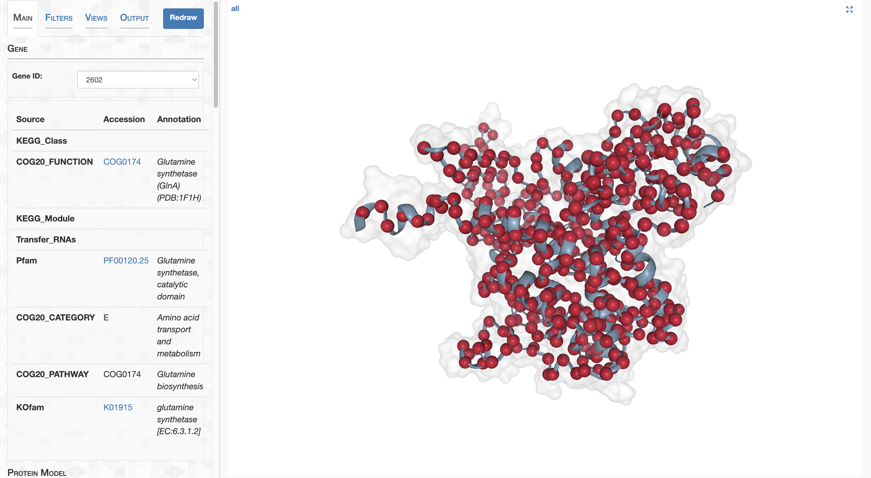
We can remove the red spheres by setting the sphere size to a very small size.
This is my fault, but don’t set the sphere size to exactly 0, or else I will punch you in the throat.
Next up, let’s make the surface less transparent, and color the surface dynamically according to log-transformed pN$^{\text{(site)}}$. Site the lower bound to -4 and the upper bound to -1, so that the color spectrum spans 3 orders of magnitude.
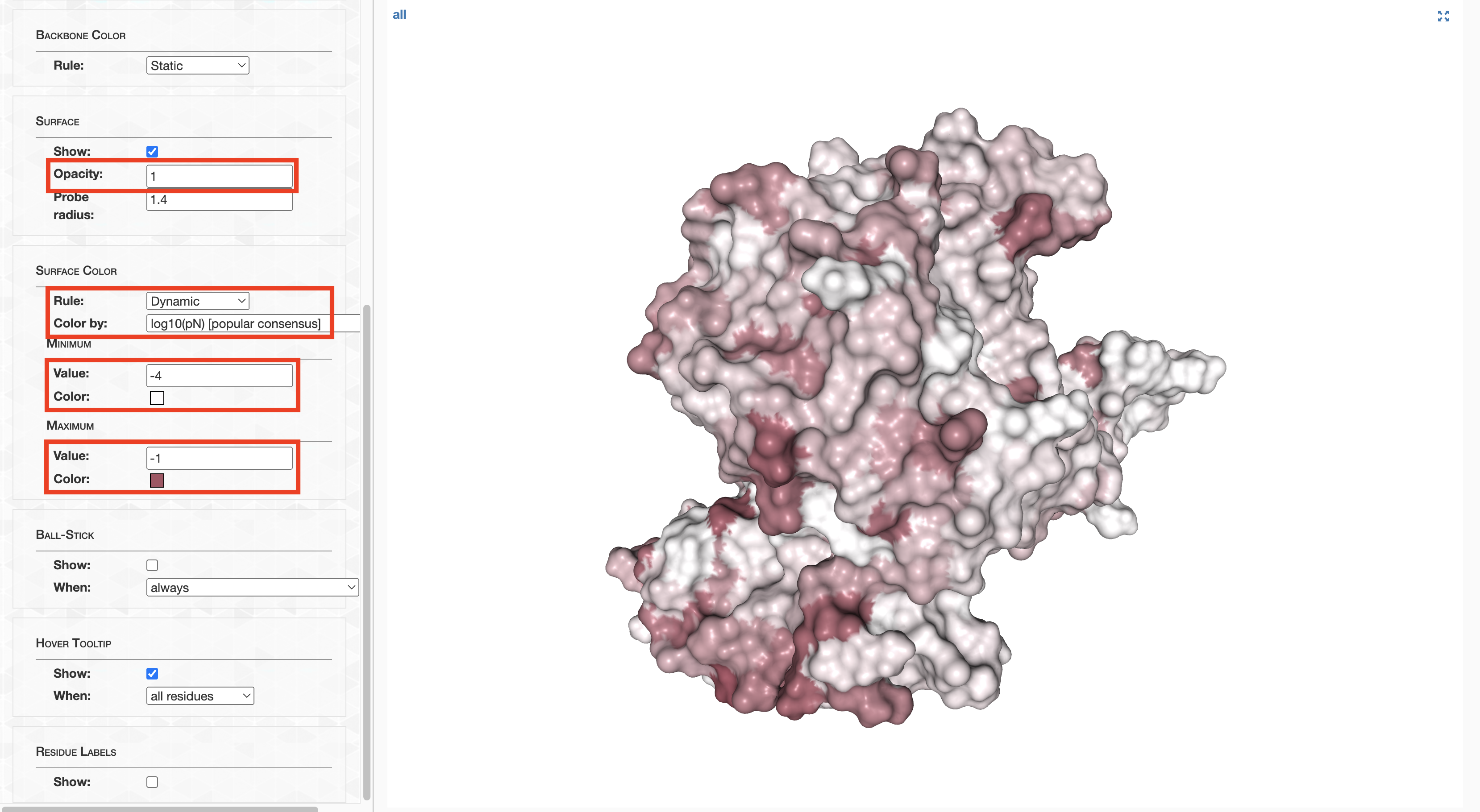
The result is pretty decent. If you wanted, you could take a screenshot of the resultant protein and pop it into your results section. But anvi’o structure is really not where you should be producing publication-quality figures. For this PyMOL is far superior. It is for this reason I developed an option to Export to PyMOL, which can be accessed in the Output tab.
If you’re using Docker, it will be very difficult to convince Docker to render PyMOL’s graphical interface. My suggestion is to download PyMOL on your local computer for any investigations that involve interactively visualizing with PyMOL.
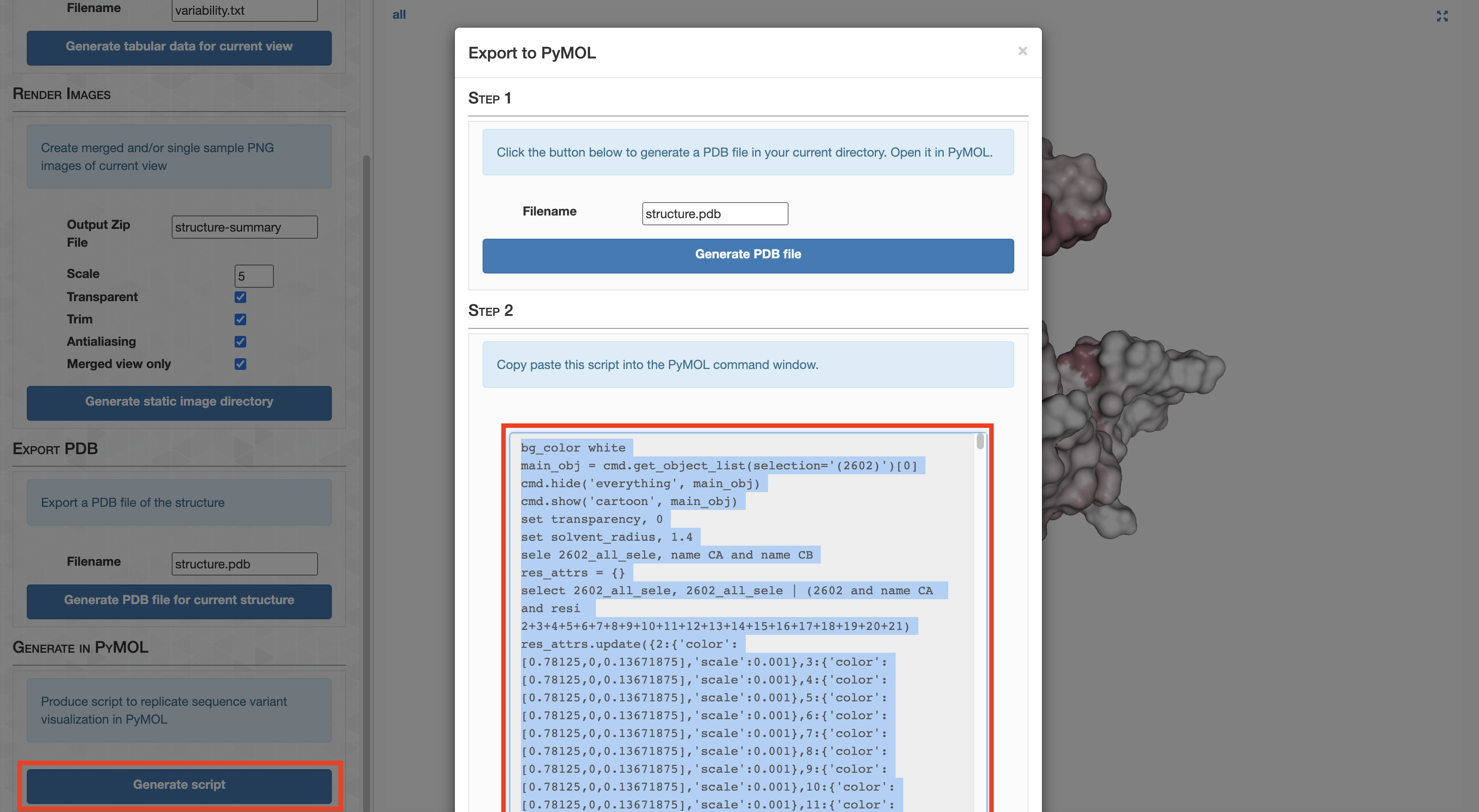
This creates a PyMOL script shown in the screenshot above that will (somewhat) faithfully reproduce the current anvi’o structure view in PyMOL, so that you can create more refined and beautiful figures, or to undertake more sophisticated analyses that are better suited for PyMOL.
As an example, copy-paste the script produced by anvi’o structure into a file named example.pml. Save the file in your working directory.
Now open PyMOL from your working directory:
pymol
Load in the GS structure.
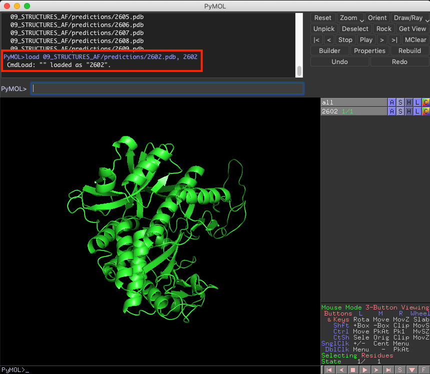
At this point, you need to run the example.pml from within PyMOL, which can be done by typing @example.pml into the console.
After some time, you should see a visualization that is relatively similar to the one you created in anvi’o structure.
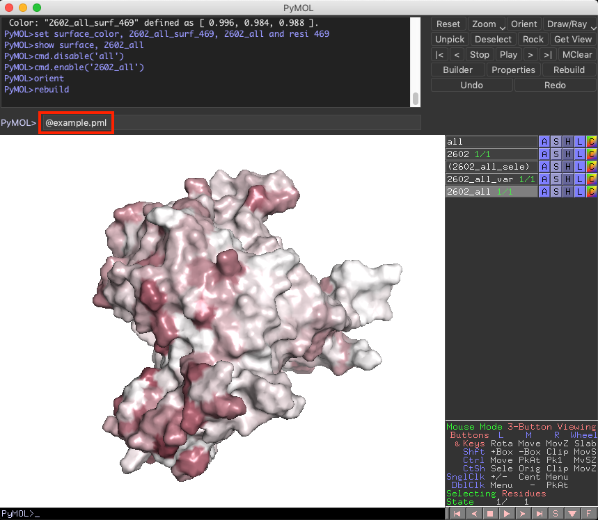
To make it a bit prettier, type ray into the console (https://pymolwiki.org/index.php/Ray).
Reproducing Figure 3d
Ok, so that’s in essence how I created Figure 3d. I hope its helpful for your own workflows. What I’m going to show now is exactly how to reproduce the protein images seen in Figure 3d, using PyMOL scripts I wrote that are heavily based on the example I outlined above. One script, ZZ_SCRIPTS/structure_2602_pN.pml, creates the ns-polymorphism images, and the other, ZZ_SCRIPTS/structure_2602_pS.pml, creates the s-polymorphism images. Each script essentially runs the script generated by anvi’o structure, then does a photoshoot from 4 different angles.
Running these scripts is as easy as
Command #89
pymol -c ZZ_SCRIPTS/structure_2602_pN.pml
pymol -c ZZ_SCRIPTS/structure_2602_pS.pml
These scripts will take a few minutes to run, because they produce high quality images, which will eventually be dumped into YY_PLOTS/FIG_3:
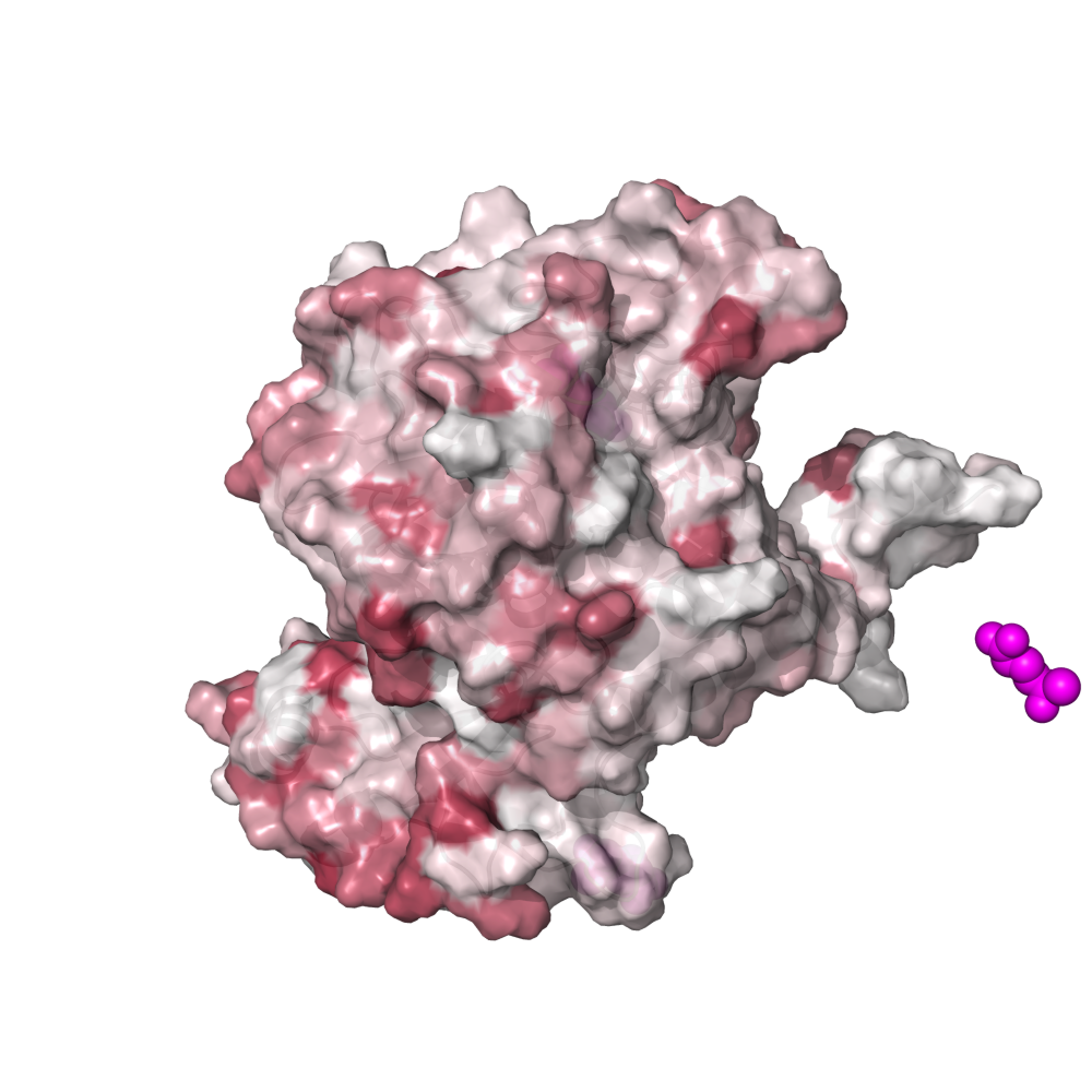
DTL and RSA polymorphism distribution across samples
Each site of GS exhibits s- and ns-polymorphism rates that vary from sample-to-sample; in some samples a site may have a high rate of ns-polymorphism, whereas in others it may have a low rate. We were particularly interested in whether the spatial distribution of s- and ns-polymorphism with respect to RSA and DTL varied from sample to sample, and whether or not any differences in samples could be associated with the pN/pS$^{\text{(gene)}}$ observed in that sample. Our investigation into this ultimately led to Figures 3e and 3f.
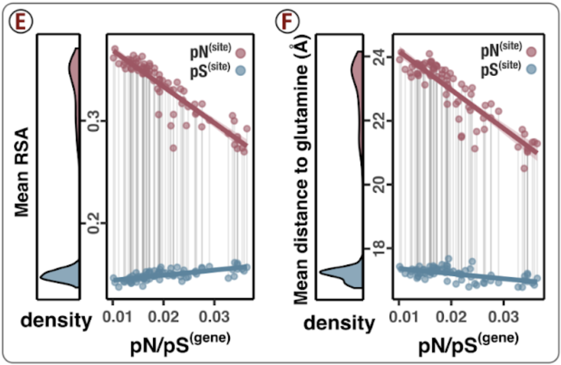
So what’s going on with the scatter plots of Figures 3e and 3f? To paint the picture, consider just 3f for a moment. Each pair of red and blue datapoints, which I’ve connected by vertical lines, represent a single sample. The x-axis shows the sample’s calculated pN/pS, and y-axis is the average distance that polymorphism distributed from the active active site. This average distance is actually a weighted average, and is calculated by averaging the (dodecameric) DTL of each residue, except instead of each residue contributing equal weight, it instead contributes a weight in proportion with its ns-polymorphism rate (red) or s-polymorphism rate (blue). This means if a site has a pN$^{\text{(site)}}$ of 0, it’s DTL does not contribute to the average DTL of ns-polymorphism. The scatter plot is calculated identically for 3e, except it is a weighted average of (dodecameric) RSA rather than DTL.
Though it is not the prettiest of functions, I wrote a rather general-purpose function that will create a scatter plot of the s/ns-polymorphism-weighted average of $Y$ of with respect to $X$ for a specific gene of interest. The calculation I’ve described fits perfectly into this mold, where $Y$ is either (dodecameric) DTL or (dodecameric) RSA and $X$ is pN/pS$^{\text{(gene)}}$. That function can be found in ZZ_SCRIPTS/utils.R and you should feel free to experiment with it. For example, here is a plot of mean RSA of s/ns-polymorphism with respect to sampling temperature for Gene ID 1326.
g <- get_dist_to_lig(gene=1326, lig=NA, variable='temperature', not_DTL='rel_solvent_acc')
print(g)
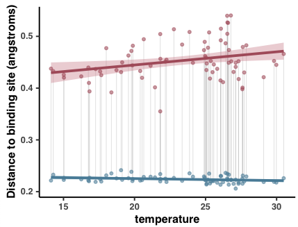
(The y-axis is mislabeled). Admittedly its not the most exciting plot you’ve ever seen, but I hope it illustrates that the world is your oyster.
Back to the problem at hand, Figures 3e and 3f can be generated by calling the function in different ways:
main_DTL <- get_dist_to_lig(gene=2602, lig="", variable="pnps", not_DTL="complex_DTL") +
    labs(y = "Mean distance to glutamine (Å)", x=TeX("pN/pS$^{(gene)}$", bold=T))
main_RSA <- get_dist_to_lig(gene=2602, lig="", variable="pnps", not_DTL="complex_RSA") +
    labs(y = "Mean RSA", x=TeX("pN/pS$^{(gene)}$", bold=T))
To generate these plots, feel free to run
source('figure_3.R')
The output will be in YY_PLOTS/FIG_3.
Sites of interest
Figure 3g illustrates which sites exhibit minor (non-dominant) amino acid alleles that co-vary with pN/pS$^{\text{(gene)}}$. It is these sites that play a dominant role in shifting the spatial distribution of ns-polymorphism, which was our rationale for the analysis.
The caption explains things rather well, so I’ll skip jump to the code, which looks like this.
Show/Hide Code
# Getting the raw aa data
gs_aa <- saavs %>%
    filter(gene_callers_id == 2602) %>%
    filter(codon_order_in_gene != max(codon_order_in_gene)) # Filter the stop codon
val <- c()
for (i in 1:nrow(gs_aa)) {
    most_freq <- gs_aa[i, "most_freq"][[1]]
    val[[i]] <- gs_aa[i, most_freq][[1]]
}
gs_aa$dominant_freq <- val
gs_aa$minor_freq <- 1 - gs_aa$dominant_freq

# We perform a bunch of linear models between the summed frequency of the minor alleles versus
# pN/pS(gene).
gs_aa_corr <- gs_aa %>%
    nest(data = -codon_order_in_gene) %>%
    mutate(cor = map(data, ~lm(minor_freq~pnps, data=.))) %>%
    mutate(tidied = map(cor, tidy)) %>%
    unnest(tidied) %>%
    filter(term == 'pnps') %>%
    rename(slope=estimate, slope_err=std.error) %>%
    mutate(codon_number = codon_order_in_gene + 1) %>%
    left_join(complex_GS)

# What is the mean DTL of pN?
mean_dtl_pn_site <- scvs %>%
    filter(gene_callers_id == 2602) %>%
    group_by(sample_id) %>%
    mutate(pN_weighted_DTL = pN_popular_consensus/sum(pN_popular_consensus, na.rm=T)*complex_DTL) %>%
    summarise(mean_pN_DTL=sum(pN_weighted_DTL, na.rm=T)) %>%
    pull(mean_pN_DTL) %>%
    mean()
gs_aa_corr <- gs_aa_corr %>% mutate(low_DTL = complex_DTL < mean_dtl_pn_site)

cutoff <- 10
g <- ggplot(data=gs_aa_corr, aes(codon_number, slope)) +
    geom_col(width=2.8, aes(fill=low_DTL)) +
    scale_fill_manual(values=c("#888888", "darkred")) +
    geom_text_repel(
        data=gs_aa_corr %>% filter(slope > cutoff),
        aes(codon_number, slope, label=codon_number),
        fontface="bold",
        color='#333333',
        family="Helvetica",
        nudge_y = 0.010,
        segment.alpha = 0.5,
        arrow = arrow(length = unit(0.02, 'npc')),
        size=2.4
    ) +
    geom_hline(yintercept=cutoff, linetype='dashed', color='#751E0D') +
    my_theme(9) +
    theme(axis.text.x = element_text(angle = 45), axis.line.x=element_blank(), legend.position="none")
g <- shift_axis(g) +
    labs(x="Residue number", y="Score (A.U.)")
display(g, file.path(args$output, "contribution_score.pdf"), w=8, h=1.)


for (codon in gs_aa_corr %>% filter(low_DTL, slope >= cutoff) %>% pull(codon_number)) {
    g <- get_allele_trajectory(gene=2602, residue_no=codon, variable='pnps', num_aas='set') +
        labs(x=TeX("pN/pS$^{(GS)}$", bold=T))
    display(g, file.path(args$output, paste("score_", codon, ".pdf", sep='')), w=7.6/6.1, h=1.2)
}
This snippet is taken from ZZ_SCRIPTS/figure_3.R
Generating Figure 3
If you haven’t done so already, run the following from within your GRE to produce the plots from Figure 3.
Command #90
source('figure_3.R')
This will output the Figures 3b, 3c, 3e, 3f, and 3g into YY_PLOTS/FIG_3. What’s missing in that list is Figures 3a and 3d, which are absent because they contain images of proteins which are generated with PyMOL, not R. If you missed those, see the above analyses, which detail how those can be reproduced.
Why this glutamine synthetase?
During the review process it was noted that there are several glutamine synthetases, and one (gene #1736) has pN/pS values that correlate with nitrate concentrations more strongly than does gene #2602 (the one the case study is about). While gene #1736 no doubt would have been a candidate while we were exploring the data for a case study, we ignored genes that exhibited high coverage variation, since this has the potential to be caused by several nonidealities, both biological and non-biological in nature (for more info on this subject see here). Unfortunately, gene #1736 had high coverage variation and so was discarded.
This is how we calculated the coefficient of variation of nucleotide coverage for genes #1736 and #2602 during the review process:
import pandas as pd
from anvio.auxiliarydataops import AuxiliaryDataForSplitCoverages as aux

aux_data = aux(db_path='AUXILIARY-DATA.db', db_hash='none', ignore_hash=True)

soi = [x.strip() for x in open("soi").readlines()]

gene_1736 = pd.DataFrame(aux_data.get("HIMB083_Contig_0001_split_00023"))
gene_1736 = gene_1736.iloc[17572:19042, :][soi].reset_index(drop=True)

mu_1736 = gene_1736.mean(axis=0)
sd_1736 = gene_1736.std(axis=0)
coeff_1736 = sd_1736 / mu_1736

gene_2602 = pd.DataFrame(aux_data.get("HIMB083_Contig_0001_split_00065"))
gene_2602 = gene_2602.iloc[15472:16879, :][soi].reset_index(drop=True)

mu_2602 = gene_2602.mean(axis=0)
sd_2602 = gene_2602.std(axis=0)
coeff_2602 = sd_2602 / mu_2602

print(f"mean coeff. variation for gene #1736: {coeff_1736.mean():.3f}")
print(f"mean coeff. variation for gene #2602: {coeff_2602.mean():.3f}")
This yields
mean coeff. variation for gene #1736: 0.608
mean coeff. variation for gene #2602: 0.300
Analysis 20: Genome-wide ns-polymorphism avoidance of low RSA/DTL
This is a genome-wide trend
Figures 3e and 3f are interesting because they illustrate that changes in selection strength lead to changes in the spatial distribution of ns-polymorphism towards high RSA and high DTL sites.
Is this a cherry-picked result? After all, my choice to use GS was not because it had a bad story. And not every gene I looked at had such a clear signal. So an important question I set out to answer was, “is this a genome-wide trend, or is it specific to GS?”. My investigation into this subject matter led to Figures 4a, 4b, 4c, 4d, SI6, and Table S13.
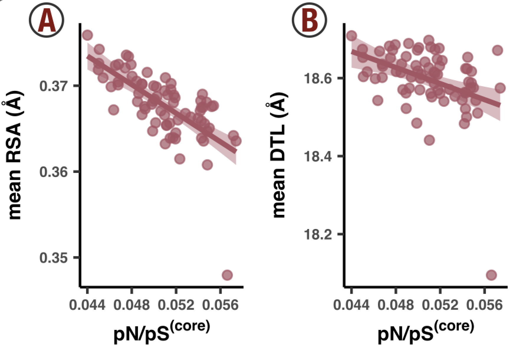
Figures 4a and 4b are essentially replicas of Figures 3e and 3f, except the data is coming from all sites of all genes, rather than just GS. Correspondingly, the x-axis has been changed to pN/pS$^{\text{(core)}}$, which quantifies the overall purifying selection strength across all of the 1a.3.V core genes, not just GS.
From the Methods section, pN$^{\text{(core)}}$ and pS$^{\text{(core)}}$ can be expressed as weighted averages of pN$^{\text{(site)}}$ and pS$^{\text{(site)}}$. And pN/pS$^{\text{(core)}}$ = pN$^{\text{(core)}}$/pS$^{\text{(core)}}$. This calculation is performed in ZZ_SCRIPTS/load_data.R with the following code:
genome_pnps <- scvs %>%
    group_by(sample_id) %>%
    summarise(
        pn = sum(nN_popular_consensus*pN_popular_consensus, na.rm=T)/sum(nN_popular_consensus, na.rm=T),
        ps = sum(nN_popular_consensus*pS_popular_consensus, na.rm=T)/sum(nN_popular_consensus, na.rm=T),
        genome_pnps=pn/ps
    ) %>%
    select(sample_id, genome_pnps)
scvs <- scvs %>%
    left_join(genome_pnps)
It’s rather elegant. Each sample ends up with a pN/pS$^{\text{(core)}}$ value, which is added to the SCVs table as the column genome_pnps. With this data attached to the SCV table, it is now a straight shot to Figures 4a and 4b. The calculation and plotting is dealt with in ZZ_SCRIPTS/figure_4.R:
Show/Hide Script
#! /usr/bin/env Rscript

source(file.path("utils.R"))

request_scvs <- TRUE
request_regs <- FALSE
withRestarts(source("load_data.R"), terminate=function() message('load_data.R: data already loaded. Nice.'))

library(tidyverse)
library(latex2exp)
library(cowplot)

args <- list()
args$output <- "../YY_PLOTS/FIG_4"

dir.create(args$output, showWarnings=F, recursive=T)

# -----------------------------------------------------------------------------
# Analysis
# -----------------------------------------------------------------------------

temp <- scvs %>%
    filter(
        !is.na(pN_popular_consensus),
        ANY_dist <= 40
    ) %>%
    group_by(sample_id) %>%
    mutate(
        pS_weighted_DTL = pS_popular_consensus/sum(pS_popular_consensus)*ANY_dist,
        pN_weighted_DTL = pN_popular_consensus/sum(pN_popular_consensus)*ANY_dist,
        pS_weighted_RSA = pS_popular_consensus/sum(pS_popular_consensus)*rel_solvent_acc,
        pN_weighted_RSA = pN_popular_consensus/sum(pN_popular_consensus)*rel_solvent_acc,
        rarity_weighted_DTL = syn_codon_rarity/sum(syn_codon_rarity)*ANY_dist,
        rarity_weighted_RSA = syn_codon_rarity/sum(syn_codon_rarity)*rel_solvent_acc
    ) %>%
    summarise(
        mean_pS_DTL=sum(pS_weighted_DTL),
        mean_pN_DTL=sum(pN_weighted_DTL),
        mean_pS_RSA=sum(pS_weighted_RSA),
        mean_pN_RSA=sum(pN_weighted_RSA),
        mean_rarity_DTL=sum(rarity_weighted_DTL),
        mean_rarity_RSA=sum(rarity_weighted_RSA),
        pnps=mean(genome_pnps),
        temperature=mean(temperature)
    )
all_stats <- scvs %>%
    filter(ANY_dist < 40, !is.na(pN_popular_consensus)) %>%
    group_by(sample_id) %>%
    summarise(
        syn_codon_rarity=mean(syn_codon_rarity),
        GC_fraction=mean(GC_fraction),
    ) %>%
    left_join(temp)

# -----------------------------------------------------------------------------
# pX distribution
# -----------------------------------------------------------------------------

g1 <- ggplot(data=all_stats) +
    geom_point(aes(x=pnps, y=mean_pN_DTL), color=ns_col, fill=ns_col, alpha=0.7) +
    geom_smooth(aes(x=pnps, y=mean_pN_DTL), color=ns_col, method='lm', fill=ns_col) +
    labs(x=TeX('pN/pS$^{(core)}$', bold=T), y='mean DTL (Å)') +
    my_theme(8)
g2 <- ggplot(data=all_stats) +
    geom_point(aes(x=pnps, y=mean_pS_DTL), color=s_col, fill=s_col, alpha=0.7) +
    geom_smooth(aes(x=pnps, y=mean_pS_DTL), color=s_col, method='lm', fill=s_col) +
    labs(x=TeX('pN/pS$^{(core)}$', bold=T), y='mean DTL (Å)') +
    my_theme(8)
g3 <- ggplot(data=all_stats) +
    geom_point(aes(x=pnps, y=mean_pN_RSA), color=ns_col, fill=ns_col, alpha=0.7) +
    geom_smooth(aes(x=pnps, y=mean_pN_RSA), color=ns_col, method='lm', fill=ns_col) +
    labs(x=TeX('pN/pS$^{(core)}$', bold=T), y='mean RSA (Å)') +
    my_theme(8)
g4 <- ggplot(data=all_stats) +
    geom_point(aes(x=pnps, y=mean_pS_RSA), color=s_col, fill=s_col, alpha=0.7) +
    geom_smooth(aes(x=pnps, y=mean_pS_RSA), color=s_col, method='lm', fill=s_col) +
    labs(x=TeX('pN/pS$^{(core)}$', bold=T), y='mean RSA (Å)') +
    my_theme(8)
display(
    plot_grid(
        g3, g1, g4, g2,
        ncol=4, align='v'
    ),
    output = file.path(args$output, 'ABCD.pdf'),
    as.png = T,
    w = 6,
    h = 2
)

# -----------------------------------------------------------------------------
# Rarity sample-to-sample figures
# -----------------------------------------------------------------------------

pN_cutoff <- 0.0005

# This is for codon rarity vs pnps
plot_data <- scvs %>%
    filter(pN_popular_consensus < pN_cutoff) %>%
    group_by(sample_id) %>%
    summarise(
        syn_codon_rarity=mean(syn_codon_rarity),
        pnps=mean(genome_pnps)
    )
g_rare_all <- ggplot(plot_data, aes(pnps, syn_codon_rarity)) +
    geom_point(color='#333333', fill='#333333', alpha=0.7) +
    geom_smooth(color='#333333', fill='#333333', method='lm') +
    labs(
        x = TeX("pN/pS$^{(core)}$", bold=T),
        y = "Codon rarity"
    ) +
    my_theme(8)

# This is for rarity-weighted RSA
plot_data <- scvs %>%
    filter(
        pN_popular_consensus < pN_cutoff,
        !is.na(rel_solvent_acc) # Filter out any genes without structures
    ) %>%
    group_by(sample_id) %>%
    mutate(
        rarity_weighted_RSA = syn_codon_rarity/sum(syn_codon_rarity)*rel_solvent_acc
    ) %>%
    summarise(
        mean_rarity_RSA=sum(rarity_weighted_RSA),
        pnps=mean(genome_pnps)
    )
g_rare_rsa_all <- ggplot(plot_data, aes(pnps, mean_rarity_RSA)) +
    geom_point(color='#333333', fill='#333333', alpha=0.7) +
    geom_smooth(color='#333333', fill='#333333', method='lm') +
    labs(
        x = TeX("pN/pS$^{(core)}$", bold=T),
        y = "Rarity-weighted RSA"
    ) +
    my_theme(8)

# This is for rarity-weighted DTL
plot_data <- scvs %>%
    filter(
        pN_popular_consensus < pN_cutoff,
        ANY_dist < 40 # Filter out any genes without ligand predictions and any residues >40 DTL
    ) %>%
    group_by(sample_id) %>%
    mutate(
        rarity_weighted_DTL = syn_codon_rarity/sum(syn_codon_rarity)*ANY_dist
    ) %>%
    summarise(
        mean_rarity_DTL=sum(rarity_weighted_DTL),
        pnps=mean(genome_pnps)
    )
g_rare_dtl_all <- ggplot(plot_data, aes(pnps, mean_rarity_DTL)) +
    geom_point(color='#333333', fill='#333333', alpha=0.7) +
    geom_smooth(color='#333333', fill='#333333', method='lm') +
    labs(
        x = TeX("pN/pS$^{(core)}$", bold=T),
        y = "Rarity-weighted DTL (A)"
    ) +
    my_theme(8)

display(
    plot_grid(
        g_rare_all, g_rare_rsa_all, g_rare_dtl_all,
        ncol=3, align='v'
    ),
    output = file.path(args$output, 'DEF.pdf'),
    w = 6,
    h = 2.2
)
If you want to generate Figures 4a, 4b, 4c, and 4d (and all of Figure 4 for that matter), run the following.
Command #91
source('figure_4.R')
Robustness of results
Figures 4a and 4b show that the trends seen in the GS case study are a general feature of the genome. How robust are these results? One way to test this would be to remove some genes and recalculate whether a negative correlation is observed. If the removal of a few genes is enough to destroy the negative correlation, then a minority of genes are contributing a majority of the signal.
Well, I tested this directly using a boostrapping method. Essentially, I repeatedly ran a linear regression on the data in Figures 4a and 4b, except instead of each of the 799 genes contributing once, I randomly picked 799 genes (with replacement). This effectively means that some genes would contribute multiple times, at the cost of some other genes not contributing at all. For each model I calculated the Pearson coefficient, and constructed a histogram (Figure SI6).
Because this is such a slow process, the histograms are constructed from just 200 experiments, which required me to run it overnight. If you want to increase/decrease the number of experiments, modify 200 found in ZZ_SCRIPTS/figure_s_gnm_rob.R. Then when ready, run
Command #92
source('figure_s_gnm_rob.R')
‣ Time: ~10 hours
This will output Figure SI6 into the directory YY_PLOTS/FIG_S_GNM_ROB. It will also output a file genome_robust.txt, which can be wrapped into Table S13 via
Command #93
python ZZ_SCRIPTS/table_rob.py
The table will be written to WW_TABLES/ROB.xlsx.