A reproducible workflow for Henoch et al, 2026


Table of Contents
- Study description and Introduction
- Setting up the stage
- Visualizing the Undatipelagibacter pangenome graph
- Combining the pangenome graph tables into one
- Functional distributions plots and VR/BR comparisons
- Metrics of the pangenome graph
- Position-wise sequence comparisons around the highly divergent Skp gene
- Diving into the Skp rabbit hole
- Phylogenomics of Undatipelagibacter
- Recovery and phylogenetics of Skp Genes
- Testing the phylogenetic congruence between Skp genes and Undatipelagibacter genomes
- Analyzing gene-level signatures of the Skp-operon divergence and a within-population test for staggered recombination.
- Testing recombination events across the contiguous Skp locus at nucleotide, sub-gene resolution
- Testing the existence (or lack thereof) the epistatic co-selection signal centered on Skp
- Connecting two divergence valleys: do Skp and SurA co-evolve beyond the genome?
- Closing notes
Summary
The purpose of this reproducible bioinformatics workflow is to give access to ad-hoc analyses and Python code that underpin our findings in the study, “Synteny-aware microbial pangenomes reveal blueprints of genomic variation” by Henoch et al:
[PAPER WILL BE HERE ONCE THE BIORXIV PRE-PRINT IS OUT]
Here is a list of links for quick access to the raw and intermediate data used in our manuscript:
- FASTA files for 29 Undatipelagibacter genomes.
- Anvi’o contigs databases, as annotated digital microbe files, for Undatipelagibacter.
- The Undatipelagibacter pangenome: genome-storage-db and pan-db.
- The Undatipelagibacter pangenome-graph: pan-graph-db. You can visualize this pangenome graph interactively at https://merenlab.org/upg-interactive/.
If you have any questions, notice an issue, and/or are unable to find an important piece of information here, please feel free to leave a comment down below, send an e-mail to us, or get in touch with us through Discord:

Study description and Introduction
Our study implements a computational workflow to study gene-centric pangenome graphs interactively and applies it to 29 circular isolates from Undatipelagibacter to demonstrate that,
- Synteny-aware pangenome graphs preserve chromosomal context that conventional pangenomes discard, revealing an intricate landscape of variable regions alternating with backbone stretches across genomes,
- Variable regions are functionally specialized and coherent units that are distinct from the genomic backbone, rather than random assortments of genes,
- Genomic variability is distributed as a structured continuum rather than a binary partition of hypervariable islands and a static backbone, as evidenced by graph-derived metrics such as the “Composite Variability Score” we have implemented,
- Variable regions differ from one another in scale, structural topology, functional identity, and evolutionary character, clustering into distinguishable organizational patterns that likely reflect distinct evolutionary mechanisms,
- Fine-grained, position-specific sequence divergence gradients can be detected within otherwise conserved operons (exemplified by a volcano-shaped amino acid identity pattern centered on the Skp), and
- Deeply conserved variable regions with consistent functional signatures and genomic contexts are shared across genera within the Pelagibacterales, pointing to ancestral hotspots of variation maintained over deep evolutionary timescales.
Our reproducible bioinfromatics workflow picks up from another document related to this study, which explains how to generate pangenome graphs using the same set of genomes. Therefore the output of the reproducible tutorial becomes the input of our reproducible bioinformatics workflow.
The sections below produce the analyses behind,
- The top panel of Figure 1, which visualizes the pangenome graph, is produced in the section visualizing the Undatipelagibacter pangenome graph section,
- The Sankey diagram at the bottom of Figure 1 is produced across the combining the pangenome graph tables and summary statistics sections,
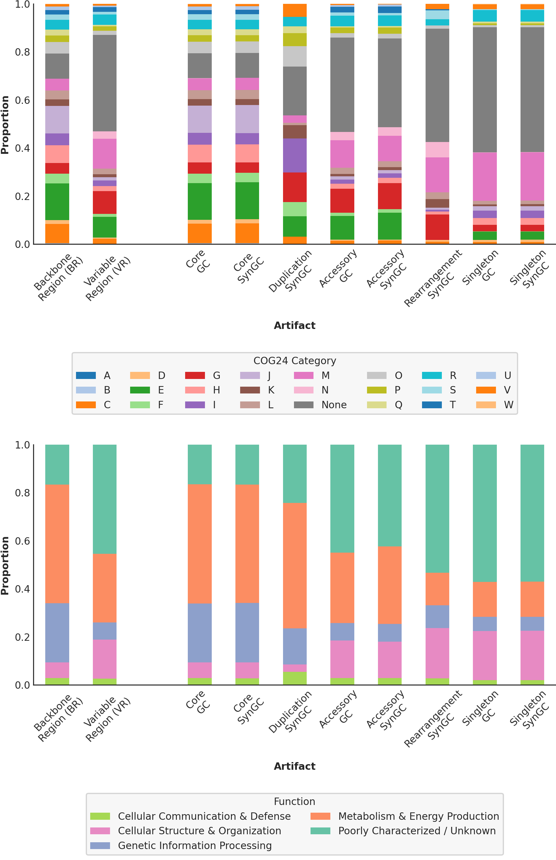
- Figure 2, which visualizes the functional distributions of variable regions, and its associated supplementary panel are produced in the functional distributions plots and VR/BR comparisons section,
- Figure 4, which visualizes the graph-derived metrics and Composite Variability Score, is produced in the metrics section, and
- Figure 5, which visualizes position-wise sequence similarity patterns, is produced in the position-wise comparisons section.
- Figure 6, which visualizes Skp vs SurA co-evolution along with position-wise sequence similarity patterns, is reproduced in the section called Connecting two divergence valleys: do Skp and SurA co-evolve beyond the genome?.
- This document also includes scripts and commands that will reproduce Supplementary Figures 6, 7, 8, and 9.
Setting up the stage
Reproduce our study requires a few simple steps to set things up, which will not take more than a few minutes.
This reproducible workflow assumes that you have access to a conda enviornment for the development version of anvi’o (anvio-dev), which you can install via https://anvio.org/install/.
In addition to anvio-dev, the reproducible workflow requires a second conda environment, since some of the tools used below (such as holoviews) are not native to the anvio environment. To keep the two environments separate (so that the anvi’o stack stays intact and isolated from the analysis stack that is only used for downstream plotting and statistics), please run the following commands to generate a second conda enviornment. Running these commands will not take more than a minute on a laptop computer:
# make sure you are not in the anvi'o environment:
conda deactivate

# create a new environment for the reproducible workflow
conda create -y -n henoch_et_al_2026 -c conda-forge -c bioconda \
        python=3.10 \
        holoviews matplotlib seaborn pandas numpy scipy biopython scikit-learn tqdm
At this stage, when you run conda env list on your terminal, you should see an output that includes at least the following two items:
anvio-dev                /[some path to]/miniconda3/envs/anvio-dev
henoch_et_al_2026        /[some path to]/miniconda3/envs/henoch_et_al_2026
If that is the case, you are ready to clone the repository of our ad-hoc scripts. For this, you can simply run the following command, which will generate a new directory in your home folder:
# go to your home directory:
cd ~

# clone the repostiory:
git clone https://github.com/merenlab/Henoch_et_al_2026_pangenome_graphs.git

# change your work directory to the scripts directory:
cd Henoch_et_al_2026_pangenome_graphs
At this stage, your working directory structure should look like this:
.
├── README.md
├── 00_SCRIPTS
│   ├── create_all_combined.py
│   ├── export_sura_gene_aa_seqs.py
│   ├── functional_distribution_clustering.py
│   ├── metrics_clustering.py
│   ├── similarity_per_position.py
│   ├── skp_genome_phylogenetic_congruence.py
│   ├── skp_operon_coselection.py
│   ├── skp_operon_export_locus_map.py
│   ├── skp_operon_recombination_breakpoints.py
│   ├── skp_operon_recombination.py
│   ├── skp_sura_genome_tree_congruence.py
│   └── summary_statistics.py
├── 01_DATA
│   └── 00_README.txt
└── 02_RESULTS
    ├── 00_README.txt
    ├── SKP-PHYLOGENETICS
    │   └── UNDATIPELAGIBACTER_SKP_GENES_AA.newick
    ├── SURA-PHYLOGENETICS
    │   └── UNDATIPELAGIBACTER_SURA_GENES_AA.newick
    └── UNDATIPELAGIBACTER-PHYLOGENOMICS
        └── UNDATIPELAGIBACTER-ALPHASCGs.newick
If that is the case, we are good.
The final step of setting up the stage is to download the files that represent the Undatipelagibacter pangenome graph and associated files from our reproducible tutorial. For this, please simply copy-paste these commands into your terminal (while still in the same directory):
curl -L https://cloud.uol.de/public.php/dav/files/TN2bxBCbAS5DRDJ -o 01_DATA/UNDATIPELAGIBACTER-GENOMES.db
curl -L https://cloud.uol.de/public.php/dav/files/ctRp8xRWwaPSnp5 -o 01_DATA/UNDATIPELAGIBACTER-PAN.db
curl -L https://cloud.uol.de/public.php/dav/files/8eZZYqNrAdXF4TA -o 01_DATA/UNDATIPELAGIBACTER-PAN-GRAPH.db
curl -L https://cloud.uol.de/public.php/dav/files/8snz92oDqJeARDK -o 01_DATA/UNDATIPELAGIBACTER-PAN-GRAPH-SUMMARY.tar.gz
tar -xzf 01_DATA/UNDATIPELAGIBACTER-PAN-GRAPH-SUMMARY.tar.gz -C 01_DATA/ && rm 01_DATA/UNDATIPELAGIBACTER-PAN-GRAPH-SUMMARY.tar.gz

# migrate all DB files in case anvi'o had any database updates in between
# in between. first activate anvio-dev,
conda activate anvio-dev

# migrate all
anvi-migrate 01_DATA/*db --migrate-quickly

# deactivate anvio-dev
conda deactivate
At this stage, your working directory structure should look like this:
.
├── README.md
├── 00_SCRIPTS
│   ├── create_all_combined.py
│   ├── export_sura_gene_aa_seqs.py
│   ├── functional_distribution_clustering.py
│   ├── metrics_clustering.py
│   ├── similarity_per_position.py
│   ├── skp_genome_phylogenetic_congruence.py
│   ├── skp_operon_coselection.py
│   ├── skp_operon_export_locus_map.py
│   ├── skp_operon_recombination_breakpoints.py
│   ├── skp_operon_recombination.py
│   ├── skp_sura_genome_tree_congruence.py
│   └── summary_statistics.py
├── 01_DATA
│   ├── 00_README.txt
│   ├── UNDATIPELAGIBACTER-GENOMES.db
│   ├── UNDATIPELAGIBACTER-PAN-GRAPH.db
│   ├── UNDATIPELAGIBACTER-PAN.db
│   └── UNDATIPELAGIBACTER-PAN-GRAPH-SUMMARY
│       ├── GENESxSYNGCs.txt
│       ├── GENOMES_DIST_MAT.txt
│       ├── GENOMES_DIST.newick
│       ├── REGIONS.txt
│       ├── SYNGCs.txt
│       └── misc_data_items
│           └── default.txt
└── 02_RESULTS
    ├── 00_README.txt
    ├── SKP-PHYLOGENETICS
    │   └── UNDATIPELAGIBACTER_SKP_GENES_AA.newick
    ├── SURA-PHYLOGENETICS
    │   └── UNDATIPELAGIBACTER_SURA_GENES_AA.newick
    └── UNDATIPELAGIBACTER-PHYLOGENOMICS
        └── UNDATIPELAGIBACTER-ALPHASCGs.newick
If that is the case, you are ready.
Visualizing the Undatipelagibacter pangenome graph
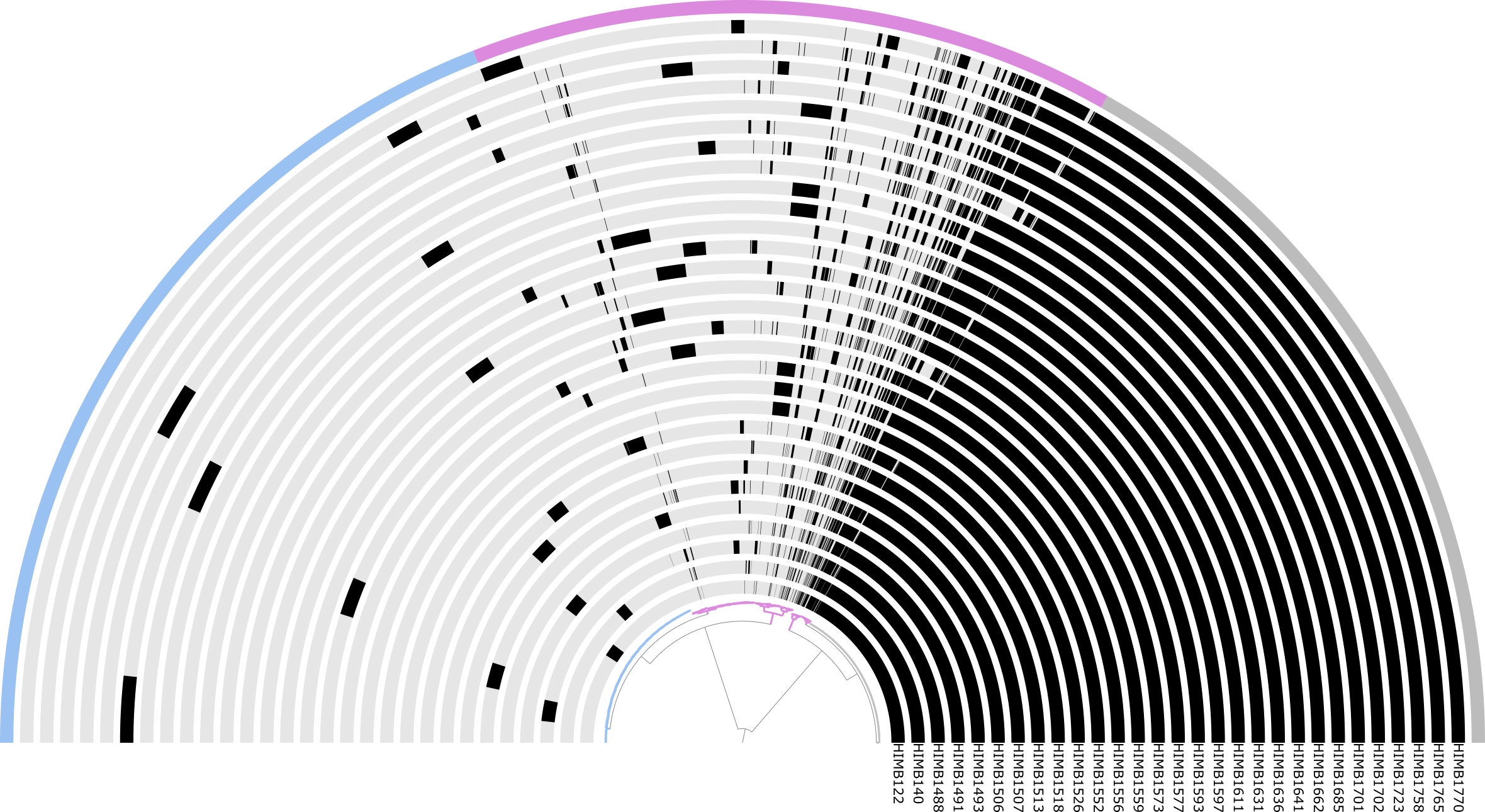
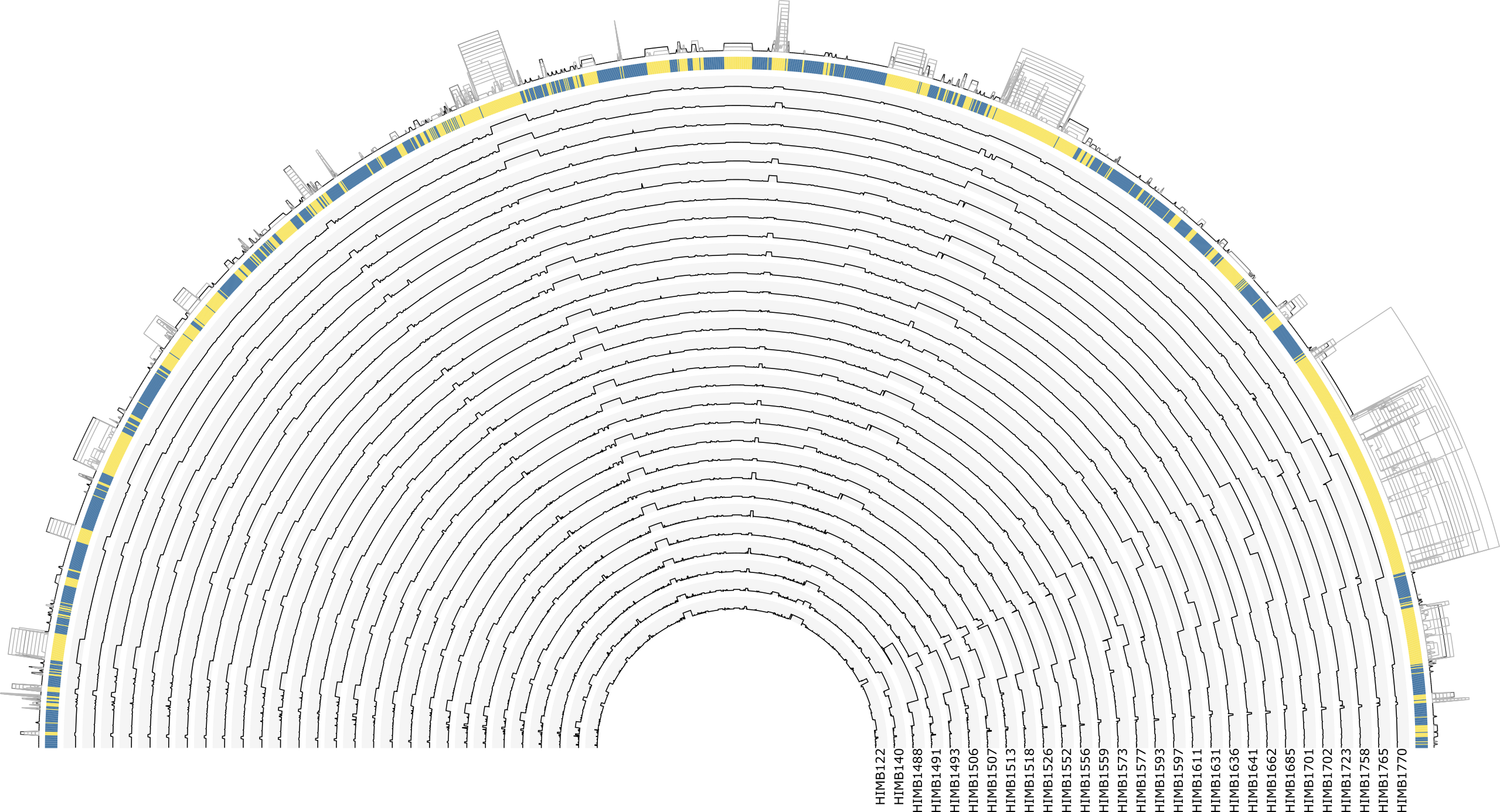
Our reproducicble tutorial here already details of how UNDATIPELAGIBACTER-PAN.db (an anvi’o pan-db artifact) and UNDATIPELAGIBACTER-PAN-GRAPH.db (an anvi’o pan-graph-db artifact) are generated from FASTA files. What constitutes the left-upper and right-upper figures of the paper’s Figure 1 are also the recommended starting point for exploring the data:
You can also visualize the pangenome and pangenome graph by activating anvio-dev:
conda activate anvio-dev
And running the folowing command to visalize the pan-db in your 01_DATA directory,
anvi-display-pan -g 01_DATA/UNDATIPELAGIBACTER-GENOMES.db \
                 -p 01_DATA/UNDATIPELAGIBACTER-PAN.db
which will give you an interactive display for that shows you the ‘pangenome’ part of the Figure 1,
The Undatipelagibacter pangenome
And you can run teh following command to visalize the pan-graph-db in your 01_DATA directory,
anvi-display-pan-graph -g 01_DATA/UNDATIPELAGIBACTER-GENOMES.db \
                       -p 01_DATA/UNDATIPELAGIBACTER-PAN-GRAPH.db
which will give you an interactive display for that shows you the ‘pangenome graph’ part of the Figure 1,
The Undatipelagibacter pangenome graph
Using the interactive display you can zoom into any variable region, and inspect individual SynGCs together with their functional annotations, and the genomes that contribute to them.
Backbone SynGCs are colored in blue and variable regions in yellow by default, while the different SynGC types (core, duplication, rearrangement, accessory, singleton, and tRNA/rRNA) carry their own node colors that you can change through the interface. All regions are labeled and enable you to jump directly to specific variable regions of interest (e.g. VR #32, #90, #22, or #180, the four highest-CVS regions in the paper), and the stored states reproduce the exact view used in the figures. From any node, you can pull up the underlying genes, their amino acid sequences, and the functional annotations across all contributing genomes, which is how we drilled into individual VRs throughout the paper.
Similarly the tutorial can be used to generate pangenome graphs from the other Pelagibacterales datasets, that build Figure 3.
Combining the pangenome graph tables into one
For most of the commands below, we will stay in the conda environment henoch_et_al_2026. Let’s switch to it now:
conda deactivate
conda activate henoch_et_al_2026
For easier downstream analysis we first need to combine two of the pangenome graph tables them together. These tables are not combined from that get go to keep the data as atomary as possible and joining them will create a lot of repetetive information, but this is harmless and makes the analysis a lot easier. The GENESxSYNGCs.txt includes information at the gene level and SYNGCs.txt at the synteny gene cluster level. By joining them together we get access to all the synteny gene cluster information per gene. The following command generates the joined all_combined.txt file.
python3 00_SCRIPTS/create_all_combined.py \
        -g 01_DATA/UNDATIPELAGIBACTER-PAN-GRAPH-SUMMARY/GENESxSYNGCs.txt \
        -s 01_DATA/UNDATIPELAGIBACTER-PAN-GRAPH-SUMMARY/SYNGCs.txt \
        -d 02_RESULTS/
At the same step we also join our definition of simplified COG24 groups to the dataset. In case you want to review our definitions, there is a cog_functional_groups.txt that includes the same information as the following table.
| COG24_CATEGORY_ACC | definition | functional_group | |
| 0 | A | RNA processing and modification | Genetic Information Processing |
| 1 | B | Chromatin structure and dynamics | Genetic Information Processing |
| 2 | J | Translation, ribosomal structure and biogenesis | Genetic Information Processing |
| 3 | K | Transcription | Genetic Information Processing |
| 4 | L | Replication, recombination and repair | Genetic Information Processing |
| 5 | D | Cell cycle control, cell division, chromosome partitioning | Genetic Information Processing |
| 6 | O | Posttranslational modification, protein turnover, chaperones | Genetic Information Processing |
| 7 | M | Cell wall/membrane/envelope biogenesis | Cellular Structure & Organization |
| 8 | N | Cell motility | Cellular Structure & Organization |
| 9 | Z | Cytoskeleton | Cellular Structure & Organization |
| 10 | W | Extracellular structures | Cellular Structure & Organization |
| 11 | U | Intracellular trafficking, secretion, and vesicular transport | Cellular Structure & Organization |
| 12 | Y | Nuclear structure | Cellular Structure & Organization |
| 13 | C | Energy production and conversion | Metabolism & Energy Production |
| 14 | E | Amino acid transport and metabolism | Metabolism & Energy Production |
| 15 | F | Nucleotide transport and metabolism | Metabolism & Energy Production |
| 16 | G | Carbohydrate transport and metabolism | Metabolism & Energy Production |
| 17 | H | Coenzyme transport and metabolism | Metabolism & Energy Production |
| 18 | I | Lipid transport and metabolism | Metabolism & Energy Production |
| 19 | P | Inorganic ion transport and metabolism | Metabolism & Energy Production |
| 20 | Q | Secondary metabolites biosynthesis, transport and catabolism | Metabolism & Energy Production |
| 21 | T | Signal transduction mechanisms | Cellular Communication & Defense |
| 22 | V | Defense mechanisms | Cellular Communication & Defense |
| 23 | X | Mobilome: prophages, transposons | Cellular Communication & Defense |
| 24 | R | General function prediction only | Poorly Characterized / Unknown |
| 25 | S | Function unknown | Poorly Characterized / Unknown |
| 26 | None | Function unknown | Poorly Characterized / Unknown |
The resulting all_combined.txt contains the merged information from two of the three summary files together with some extra columns, including the type of the original gene cluster that became a synteny gene cluster and the COG24 group definition, both of which we use later. A snippet of the table looks something like this:
| genome_name | gene_caller_id | source_gene_cluster_id | node_id | region_id | region_type | KEGG_Class_ACC | KEGG_BRITE_ACC | KEGG_Module_ACC | KOfam_ACC | COG24_PATHWAY_ACC | COG24_FUNCTION_ACC | COG24_CATEGORY_ACC | COG24_FUNCTION | node_type | node_x | node_y | genome_count | gene_cluster_type | definition | functional_group | |
| 0 | HIMB122 | 363 | GC_00000001 | GC_00000001_1 | 65 | backbone | None | ko00001 | None | K03704 | None | COG1278 | K | Cold shock protein, CspA family (CspC) (PDB:1C9O) | duplication | 723 | 0 | 29 | core | Transcription | Genetic Information Processing |
| 1 | HIMB140 | 355 | GC_00000001 | GC_00000001_1 | 65 | backbone | None | ko00001 | None | K03704 | None | COG1278 | K | Cold shock protein, CspA family (CspC) (PDB:1C9O) | duplication | 723 | 0 | 29 | core | Transcription | Genetic Information Processing |
| 2 | HIMB1488 | 386 | GC_00000001 | GC_00000001_1 | 65 | backbone | None | ko00001 | None | K03704 | None | COG1278 | K | Cold shock protein, CspA family (CspC) (PDB:1C9O) | duplication | 723 | 0 | 29 | core | Transcription | Genetic Information Processing |
| 3 | HIMB1491 | 353 | GC_00000001 | GC_00000001_1 | 65 | backbone | None | ko00001 | None | K03704 | None | COG1278 | K | Cold shock protein, CspA family (CspC) (PDB:1C9O) | duplication | 723 | 0 | 29 | core | Transcription | Genetic Information Processing |
| 4 | HIMB1493 | 332 | GC_00000001 | GC_00000001_1 | 65 | backbone | None | ko00001 | None | K03704 | None | COG1278 | K | Cold shock protein, CspA family (CspC) (PDB:1C9O) | duplication | 723 | 0 | 29 | core | Transcription | Genetic Information Processing |
| (…) | (…) | (…) | (…) | (…) | (…) | (…) | (…) | (…) | (…) | (…) | (…) | (…) | (…) | (…) | (…) | (…) | (…) | (…) | (…) | (…) | (…) |
Calculating summary statistics on the combined table
With the all_combined.txt file in place we can now generate the summary statistics for the pangenome graph. A dedicated script handles this, and you can run it with the following command once the files are in the right places.
python3 00_SCRIPTS/summary_statistics.py \
        -c 02_RESULTS/all_combined.txt \
        -d 02_RESULTS/ \
        -pw 9.69 \
        -ph 6.27
This will generate four summary tables for you. First the synteny_gene_clusters_summary.txt file includes information about the different synteny gene cluster types (node_type). We want to make sure to see a nice 100% in the last two columns to make sure that no gene call was left out.
| node_type | num_syn_cluster | num_gene_calls | percent_syn_cluster | percent_gene_calls | |
| 0 | accessory | 855 | 6330 | 22.0816 | 14.3991 |
| 1 | core | 1186 | 34394 | 30.6302 | 78.2375 |
| 2 | duplication | 107 | 1065 | 2.76343 | 2.4226 |
| 3 | rearrangement | 350 | 798 | 9.03926 | 1.81525 |
| 4 | singleton | 1374 | 1374 | 35.4855 | 3.1255 |
| Total | 3872 | 43961 | 100 | 100 |
Similar to the synteny_gene_clusters_summary.txt file we have the second summary table the gene_clusters_summary.txt that includes information about the different gene cluster types (gene_cluster_type) that created the synteny gene clusters. And again we check for 100% in the last two columns to make sure everything is in place.
| gene_cluster_type | num_gene_cluster | num_gene_calls | percent_gene_cluster | percent_gene_calls | |
| 0 | accessory | 1016 | 7182 | 28.1909 | 16.3372 |
| 1 | core | 1212 | 35401 | 33.6293 | 80.5282 |
| 2 | singleton | 1376 | 1378 | 38.1798 | 3.1346 |
| Total | 3604 | 43961 | 100 | 100 |
And you probably guessed it, we have a third similar table regions_summary.txt that includes the same information but based on the pangenome graphs regions.
| region_type | num_gene_calls | num_regions | num_syn_cluster | percent_syn_cluster | percent_gene_calls | percent_regions | |
| 0 | backbone | 35090 | 163 | 1210 | 31.25 | 79.8208 | 48.9489 |
| 1 | variable | 8871 | 170 | 2662 | 68.75 | 20.1792 | 51.0511 |
| Total | 43961 | 333 | 3872 | 100 | 100 | 100 |
The final summary table conversion_summary combines the information of all three other files and shows the conversion from gene cluster to synteny gene cluster to region and the number of gene calls per these conversion.
| gene_cluster_type | node_type | region_type | num_syn_cluster | num_gene_cluster | num_gene_calls | percent_gene_cluster | percent_syn_cluster | percent_gene_calls | conversion_factor | |
| 0 | accessory | accessory | variable | 855 | 855 | 6330 | 23.7236 | 22.0816 | 14.3991 | 1 |
| 1 | accessory | duplication | variable | 52 | 18 | 170 | 0.499445 | 1.34298 | 0.386706 | 2.88889 |
| 2 | accessory | rearrangement | variable | 342 | 143 | 682 | 3.96781 | 8.83264 | 1.55138 | 2.39161 |
| 3 | core | core | backbone | 1183 | 1183 | 34307 | 32.8246 | 30.5527 | 78.0396 | 1 |
| 4 | core | core | variable | 3 | 3 | 87 | 0.0832408 | 0.0774793 | 0.197903 | 1 |
| 5 | core | duplication | Both | 37 | 15 | 506 | 0.416204 | 0.955579 | 1.15102 | 2.46667 |
| 6 | core | duplication | backbone | 12 | 6 | 348 | 0.166482 | 0.309917 | 0.791611 | 2 |
| 7 | core | duplication | variable | 2 | 1 | 37 | 0.0277469 | 0.0516529 | 0.0841655 | 2 |
| 8 | core | rearrangement | variable | 8 | 4 | 116 | 0.110988 | 0.206612 | 0.26387 | 2 |
| 9 | singleton | duplication | variable | 4 | 2 | 4 | 0.0554939 | 0.103306 | 0.00909897 | 2 |
| 10 | singleton | singleton | variable | 1374 | 1374 | 1374 | 38.1243 | 35.4855 | 3.1255 | 1 |
| Total | 3872 | 3604 | 43961 | 100 | 100 | 100 | 1.07436 |
The script also generated a figure conversion_summary_sankey.png to visualize this exact information as a nice sankey diagram. This figure is the second part of the paper’s Figure 1.
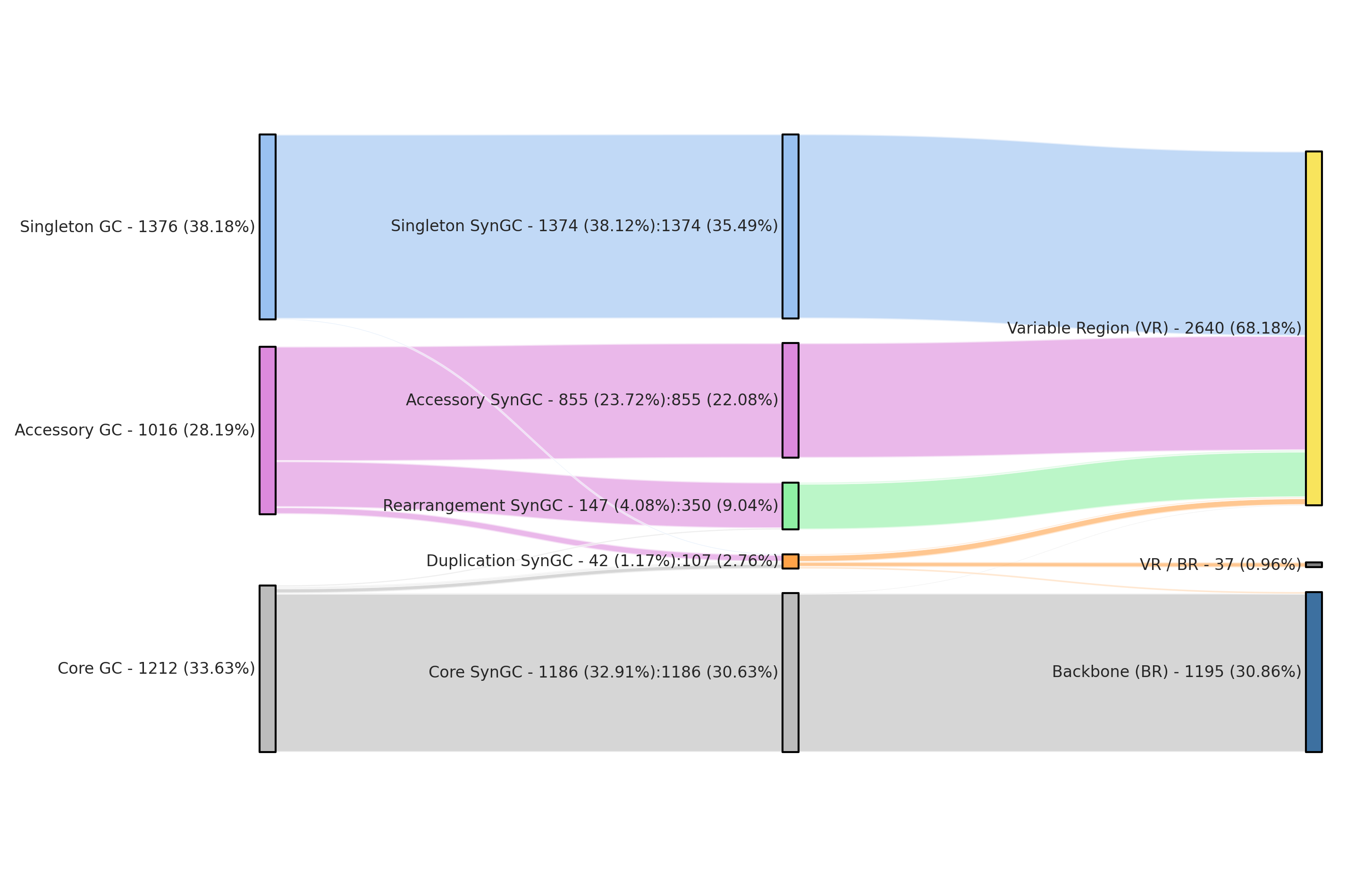
Unedited sankey plot output
Functional distributions plots and VR/BR comparisons
The Figure 2 of the paper shows the functional distributions patterns of the pangenome graph’s variable regions. The following script generates these patterns, creates a dendrogram based on the patterns and calculates the Hellinger distance violin plots based on 10,000 subsampling runs.
Under the hood, the script does three things in sequence. (1) for every variable region it counts the genes that fall into each of the five simplified COG24 functional groups defined earlier and normalizes them into a proportion vector, which is what you see as the stacked bar plot in the middle column of Figure 2. (2) it clusters these per-region proportion vectors with Ward linkage on Euclidean distances and draws the dendrogram on the left; cutting that dendrogram at the height shown in the figure creates the eight functional clusters that we discussed in the paper. (3) for each VR the script computes the Hellinger distance between its functional proportion vector and the proportion vector of the full backbone, which gives the black dot on the right-hand side of the figure. To assess whether that observed distance is unusual, the script draws 10,000 random samples of backbone genes matched in size to the VR and computes the Hellinger distance between those. The resulting null distribution is plotted as the gray violin behind the dot, and a dot falling outside its own violin indicates a VR whose functional composition differs significantly from what you would expect by simply subsampling the backbone.
python3 00_SCRIPTS/functional_distribution_clustering.py \
        -c 02_RESULTS/all_combined.txt \
        -d 02_RESULTS/ \
        -pw 6.27 \
        -ph 9.69 \
        -r 01_DATA/UNDATIPELAGIBACTER-PAN-GRAPH-SUMMARY/REGIONS.txt
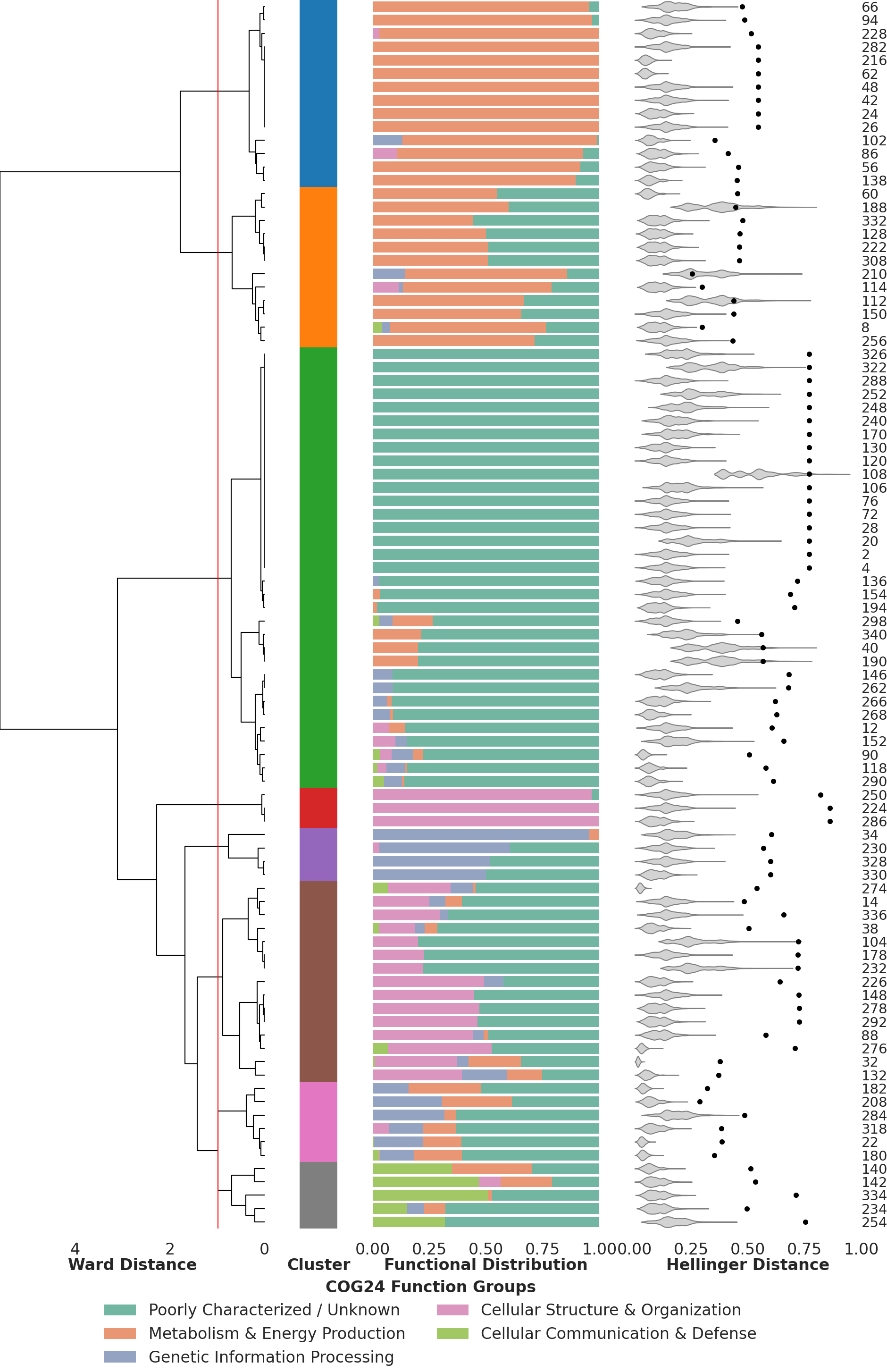
Clustering of VRs based on their functional profile
At the same time the script generates the related supplementary figure, showing the difference in distribution patterns between the backbone and variable regions, as well as the different pangenome graph artifacts. This is a useful sanity check that confirms the broad functional divergence between backbone and variable regions.
Metrics of the pangenome graph
The following command generates the results we used in the third chapter and especially all figures related to the pangenome graph metrics.
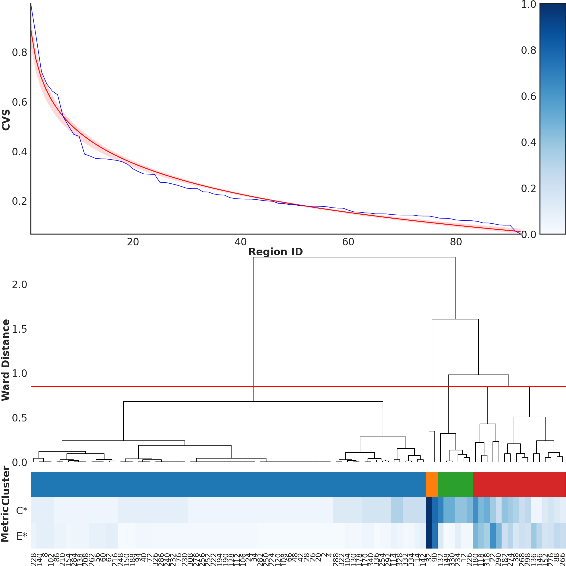
The script reads the per-region Complexity, Expansion, Diversity, Weight and Composite Variability Score values directly from the REGIONS.txt summary table. These values are computed inside anvi-pan-genome-graph according to the mathematical definitions given in the next subsection. From this table the script produces two complementary outputs. (1) it sorts all variable regions by their CVS and plots the ranked curve shown in the upper-right of Figure 4, together with a log curve to see whether the CVS values follow a log like decrease. (2) it clusters variable regions by Complexity and Expansion using Ward linkage and cuts the resulting dendrogram into four groups, which correspond to the four topological categories shown at the bottom of Figure 4 (‘high complexity / high expansion’, ‘high complexity / low expansion’, ‘medium / medium’, and ‘low / low’).
python3 00_SCRIPTS/metrics_clustering.py \
        -c 02_RESULTS/all_combined.txt \
        -d 02_RESULTS/ \
        -pw 6.27 \
        -ph 6.27 \
        -r 01_DATA/UNDATIPELAGIBACTER-PAN-GRAPH-SUMMARY/REGIONS.txt
The script includes, among other calculations, the calculation of the Pearson Correlation Coefficient (r), that we used to test a linear relationship between Complexity and Expansion. The test output will be directly printed in the terminal you used to run the script and will look like this.
n(VR) = 170

Descriptive stats (VR only):
        complexity_mm_scaled  expansion_mm_scaled
mean                0.090374             0.068984
median              0.045455             0.022727
std                 0.158464             0.132202
min                 0.000000             0.011364
max                 1.000000             1.000000

Spearman rho = +0.527  (p = 1.6e-13)
Pearson  r   = +0.679  (p = 2.61e-24)
Bootstrap 95% CI for rho: [+0.386, +0.644]

--- OLS regression (VR only) ---
========================================================================================
                           coef    std err          t      P>|t|      [0.025      0.975]
----------------------------------------------------------------------------------------
Intercept                0.0178      0.009      2.069      0.040       0.001       0.035
complexity_mm_scaled     0.5664      0.047     11.984      0.000       0.473       0.660
========================================================================================
R-squared = 0.461
The script will print the upper part of the paper’s Figure 4. The lower part was generated from the visualized pangenome graph (and it will take a relatively long time to run, so beware).
Complexity, expansion, weight, and diversity
This subsection gives the formal definitions of the four metrics we use, along with the supporting notation. You can safely skip ahead if you only want to run the pipeline; the math is here so that anyone who wants to reimplement them can do so directly from the equations.
-
Let $\mathbb{G} = {g_1, g_2, \ldots, g_G}$ be the set of genomes in the dataset and $G = |\mathbb{G}|$ its cardinality.
-
Let $\mathbb{H} = {h_1, h_2, \ldots, h_H}$ be the set of genomes in which the VR is present and $H = |\mathbb{H}|$ its cardinality.
-
Let $\mathbb{K} = {k_1, k_2, \ldots, k_K}$ be the set of distinct synteny gene clusters in the VR and $K = |\mathbb{K}|$ its cardinality.
-
Let $\mathbb{P} = {p_1, p_2, \ldots, p_P}$ be the set of unique synteny pathways in the VR, ordered such that $|f(p_1)| \leq |f(p_2)| \leq \cdots \leq |f(p_P)|$, where $f(p_i) \subseteq \mathbb{G}$ is the set of genomes in which pathway $p_i$ occurs.
-
Let $e_i = |h(g_i)|$ be the number of genes contributed by genome $g_i \in \mathbb{G}$.
-
Let $n_i = |t(k_i)|$ be the number of supporting genomes $t(k_i) \subseteq \mathbb{G}$ containing gene cluster $k_i \in \mathbb{K}$.
Complexity (C): “How many distinct structural realizations (“paths”) occur from the supporting genome?” Answered by estimating the number of events leading to the degree of variation visible in the region. Unique pathways inside the VR are visited in order by the amount of genomes backing it, starting with the ones that are less well represented within the dataset. Every visit of a pathway that includes at least one genome not already seen before with this method, counts as one additional degree of complexity, until the breadth of genomic contribution includes every genome of the dataset. Afterwards we subtract one from the result to set e.g. backbone regions with just a single straight pathway to zero.
\[\begin{align} &X_0 = \emptyset,\quad Y = 0\\ &\text{for } i = 1, 2, \ldots, P:\\ &\quad \text{if}\ f(p_i) \not\subseteq X_{i-1}:\\ &\qquad Y \leftarrow Y + 1,\quad X_i = X_{i-1} \cup f(p_i)\\ &\quad \text{else}:\\ &\qquad X_i = X_{i-1} \end{align}\]The result $Y$ is decreased by one to compensate for the fact that a single pathway is always present and then divided by the datasets number of genomes, to weight how high the region can score. Less genomes are less possible pathways.
\[\begin{align} C = \frac{(Y - 1)}{G} \end{align}\]Expansion (E): “How much gene content can be inserted in this variable region?” Answered by calculating the maximum number of newly introduced genes by a single genome in the region.
\[\begin{align} E = \max(e_1, e_2, \ldots, e_G) \end{align}\]Diversity (D): “How heterogeneous is the gene content across supporting genomes?” Answered by describing the overall unevenness of synteny gene cluster prevalence. It first calculates the prevalence proportion mi of every synteny gene cluster in the region and then the reversed population variance, therefore VRs splitting in equal SynGC sizes, in terms of genome contributions, score higher. Reverse population variance is calculated by calculating the maximum possible variance first and subtracting the actual VRs population variance from it.
\[\begin{align} m_i = \frac{n_i}{G}, \quad \bar{m} = \frac{1}{K} \sum_{i=1}^{K} m_i, \quad \bar{v} = \frac{1}{2} \left( \frac{1}{G} + \frac{G}{G} \right) \end{align}\] \[\begin{align} D = \frac{1}{2} \left( \left( \frac{1}{G} - \bar{v} \right)^2 + \left( \frac{G}{G} - \bar{v} \right)^2 \right) - \frac{1}{K} \sum_{i=1}^{K} (m_i - \bar{m})^2 \end{align}\]Weight (W): “How high is the variable region’s impact?” Answered by describing the potential significance of a given VR within the genomic landscape through the fraction of $H$ and $G$.
\[\begin{align} W = \frac{H}{G} \end{align}\]Composite Variability Score (CVS) “How special is the variable region?” Answered by calculating the degree of genomic variation inside a given VR. We use the geometric mean to balance four different terms, requiring higher scores in all metrics to reach a high CVS score.
\[\begin{align} CVS = (C' D' E' W')^{\frac{1}{4}} \end{align}\]For the calculation of the CVS, all terms are normalized according to min-max normalization.
\[\begin{align} Z_{\min} = \min(Z), \quad Z_{\max} = \max(Z) \end{align}\] \[\begin{align} Z' = \frac{(Z - Z_{\min})}{(Z_{\max} - Z_{\min})} \end{align}\]Position-wise sequence comparisons around the highly divergent Skp gene
The volcano-shaped sequence similarity profile around region #148 in Figure 5 is one of the most interesting findings of our paper because it shows that what looks like a single highly variable gene at the pangenome graph level (the Skp gene, which split into twelve distinct SynGCs) is actually the middle of a sequence similarity gradient. To regenerate the data for this we need to drop down to the underlying amino acid sequences and align them column-by-column across all 29 genomes.
We split this analysis into two runs of the same script because of an intermediate step that needs anvi’o programs. The first execution with the --preprocess flag scans all_combined.txt for the user-supplied region IDs (here 147 148 149 150 151, which covers the envelope biogenesis operon and a few extra SynGCs on either side) and writes out a list of the conventional gene cluster IDs that those regions correspond to. Anvi’o’s gene cluster export program expects GC IDs rather than SynGC or region IDs, so this preprocessing step is what bridges the pangenome graph world back into the conventional pangenome world.
python3 00_SCRIPTS/similarity_per_position.py \
        -c 02_RESULTS/all_combined.txt \
        -d 02_RESULTS/ \
        -f 147 148 149 150 151 \
        --preprocess
Running anvi-get-sequences-for-gene-clusters we can then export these gene clusters from the genomes-storage-db and pan-db. The --split-output-per-gene-cluster flag produces one FASTA file per gene cluster, each containing the amino acid sequences of every contributing genome aligned within that cluster.
This command requires us to leave the conda environment for henoch_et_al_2026 and activate anvio-dev temporarly:
# deactivate henoch_et_al_2026 and activate anvio-dev
conda deactivate
conda activate anvio-dev

# get the sequences of interest
anvi-get-sequences-for-gene-clusters -p 01_DATA/UNDATIPELAGIBACTER-PAN.db \
                                     -g 01_DATA/UNDATIPELAGIBACTER-GENOMES.db \
                                     --gene-cluster-ids-file 02_RESULTS/gene_clusters.txt \
                                     --split-output-per-gene-cluster \
                                     -O 02_RESULTS/

# deactivate anvio-dev and activate henoch_et_al_2026
conda deactivate
conda activate henoch_et_al_2026
A second execution of the script without the --preprocess flag reads these per-cluster FASTA files back in and computes the average pairwise amino acid identity (AAI) at each column of the alignment, using BioPython’s pairwise comparison routines. The script then orders the SynGCs along the genomic axis and concatenates their per-position AAI values into the single curve plotted in Figure 5. Positions in conserved SynGCs end up at the high end of the curve (~97% on average for the flanking operons), positions in the Skp gene drop to the floor (~40%), and positions in the genes neighboring Skp within the same operon take intermediate values, producing the characteristic volcano pattern.
python3 00_SCRIPTS/similarity_per_position.py -c 02_RESULTS/all_combined.txt \
                                              -d 02_RESULTS/ \
                                              -pw 6.27 \
                                              -ph 3.23 \
                                              -f 147 148 149 150 151
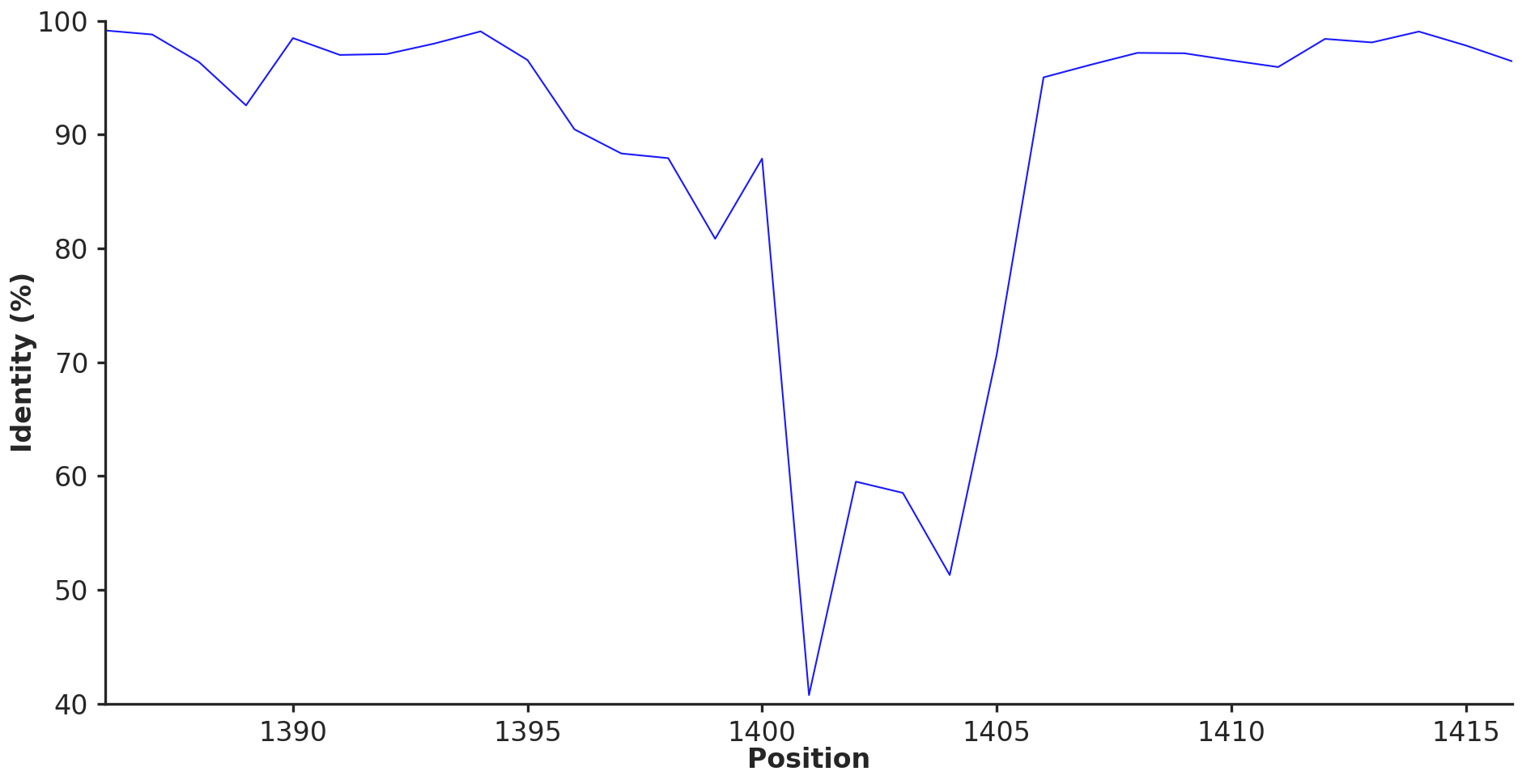
The amino acid seuqence identity across graph nodes around Skp
The same procedure can in principle be applied to any other variable region of interest by simply changing the -f argument to the desired region IDs, which makes this a generic recipe for inspecting fine-grained sequence variation within and around any region the pangenome graph flags as variable.
The prediction of the protein structures in the upper-part of Figure 5 was carried out on an high performance computing cluster with Colabfold and are not part of this reproducible workflow. In case you want to still reproduce these structures, all amino acid sequences for the genes in region #148 are included in 02_RESULTS/position_1401_aa.fa and instructions on how to run Colabfold can be found here.
An onine, ready-to-use version of Colabfold is also available here.
Diving into the Skp rabbit hole
The observation below compelled us to investigate what maintains the extremely high variability of the Skp gene and divergence gradient around it by considering the envelope biogenesis operon that encodes skip, as well as the genes flank this operon:
The envelope biogenesis operon and its surroundings.
To gain deeper insights into the evolutionary forces and mechanisms that maintain what we see here, we formally tested recombination rates in this region as well as the signal for epistatic co-selection with immediate partners of Skp (such as BamA and LptD), as well as those genes that generally encoded functions related to cell envelope but encoded elsewhere in the genome. These analyses required us to perform phylogenomics and phylogenetic anlayses the Undatipelagibacter genomes and each gene in the operons shown above, and the following sections will walk you though our reproducible bioinformatics workflow.
Phylogenomics of Undatipelagibacter
To calculate a high-resolution tree for Undatipelagibacter, we used the same 165 alphaproteobacterial single-copy core genes used in Freel et al. in the study titled “New SAR11 isolate genomes and global marine metagenomes resolve ecologically relevant units within the Pelagibacterales”, following the reproducible workflow here.
Our workflow below download and unpack anvi’o contigs-db files for Undatipelagibacter, download the hmm-source for 165 alphaproteobacterial SCGs, annotate Undatipelagibacter contigs-db files with them, extract a superalignmet of SCGs, and compute a tree.
We downloaded the Undatipelagibacter contigs-db files used in our study into our work directory using the following command:
# make sure you are in the right directory
cd ~/Henoch_et_al_2026_pangenome_graphs

# Download the contigs-db files (which are actualy coming from the
# tutorial section of this reproducible workflow at
# https://merenlab.org/tutorials/undatipelagibacter-pangenome-graph/
curl -l https://cloud.uol.de/public.php/dav/files/7bRpYznDNBedSRk \
     -o 01_DATA/CONTIGS-DBs.tar.gz
Next, we unpacked the data file and placed it in a location that follows the structure of our work directory:
# unpack under 01_DATA
tar -zxvf 01_DATA/CONTIGS-DBs.tar.gz -C 01_DATA

# give it a more descriptive name
mv 01_DATA/CONTIGS-DBs 01_DATA/UNDATIPELAGIBACTER-CONTIGS-DBs

# remove the archive file
rm -rf 01_DATA/UNDATIPELAGIBACTER-CONTIGS-DBs.tar.gz

# activate the anvio-dev environment
conda deactivate
conda activate anvio-dev

# migrate the contigs-db files to the latest version
# of anvi'o
anvi-migrate 01_DATA/UNDATIPELAGIBACTER-CONTIGS-DBs/*db \
             --migrate-quickly

# generate an external-genomes file for quick access
anvi-script-gen-genomes-file --input-dir 01_DATA/UNDATIPELAGIBACTER-CONTIGS-DBs/ \
                             -o 01_DATA/UNDATIPELAGIBACTER-CONTIGS-DBs.txt
Next, we downloaded the alphaproteobacterial SCGs used to calculate the global tree described in Freel et al. (2016):
# Download the hmm-source
curl https://merenlab.org/data/sar11-phylogenomics/files/Alphaproteobacterial_SCGs.tar.gz \
     -o 01_DATA/Alphaproteobacterial_SCGs.tar.gz

# unpack it into the 01_DATA directory
tar -zxvf 01_DATA/Alphaproteobacterial_SCGs.tar.gz -C 01_DATA

# give it a better name
mv 01_DATA/Alphaproteobacterial_SCGs 01_DATA/ALPHAPROTEOBACTERIAL_SCGs

# get rid of the archive
rm -rf 01_DATA/Alphaproteobacterial_SCGs.tar.gz
Next, we ran the anvi’o the hmm-source on all Undatipelagibacter contigs-db files to identify alphaproteobacterial SCGs in them, which took about 2 seconds per genome:
for genome in 01_DATA/UNDATIPELAGIBACTER-CONTIGS-DBs/*db
do
    anvi-run-hmms -c $genome \
                  -H 01_DATA/ALPHAPROTEOBACTERIAL_SCGs \
                  --num-threads 8
done
Having the ALPHAPROTEOBACTERIAL_SCGs as an HMM source (here is making sure using one of the genomes as an example),
anvi-db-info 01_DATA/UNDATIPELAGIBACTER-CONTIGS-DBs/HIMB122.db

DB Info (no touch)
===============================================
Database Path ................................: 01_DATA/UNDATIPELAGIBACTER-CONTIGS-DBs/HIMB122.db
description ..................................: [Not found, but it's OK]
db_type ......................................: contigs (variant: unknown)
version ......................................: 25


(...)

AVAILABLE HMM SOURCES
===============================================
* 'ALPHAPROTEOBACTERIAL_SCGs' (165 models with 165 hits)
* 'Archaea_76' (76 models with 32 hits)
* 'Bacteria_71' (71 models with 70 hits)
* 'Protista_83' (83 models with 3 hits)
* 'Ribosomal_RNA_16S' (3 models with 1 hit)
* 'Ribosomal_RNA_18S' (1 model with 0 hits)
* 'Transfer_RNAs' (68 models with 30 hits)
We next generated a super-alignment for each genome where 165 genes are aligned and concatenated across all genomes (which took about 20 seconds):
# create a directory in 02_RESULTS to store phylogenomics
# related data
mkdir 02_RESULTS/UNDATIPELAGIBACTER-PHYLOGENOMICS/

anvi-get-sequences-for-hmm-hits --external-genomes 01_DATA/UNDATIPELAGIBACTER-CONTIGS-DBs.txt \
                                -o 02_RESULTS/UNDATIPELAGIBACTER-PHYLOGENOMICS/UNDATIPELAGIBACTER-ALPHASCGs-AA-RAW.fa \
                                --hmm-source ALPHAPROTEOBACTERIAL_SCGs \
                                --return-best-hit \
                                --get-aa-sequences \
                                --concatenate
Trimmed columns with excessive gaps:
trimal -in  02_RESULTS/UNDATIPELAGIBACTER-PHYLOGENOMICS/UNDATIPELAGIBACTER-ALPHASCGs-AA-RAW.fa \
       -out 02_RESULTS/UNDATIPELAGIBACTER-PHYLOGENOMICS/UNDATIPELAGIBACTER-ALPHASCGs-AA.fa \
       -gt 0.50
And ran IQTREE to calculate the final tree for genomes:
While working on our manuscript, we re-ran the reproducible workflow you are reading many many times. And it became clear to us that in some cases the phylogenomics analysis of the Undatipelagibacter genomes will yiled ever slightly different trees (most likely as a by product of the maximum likelihood calculations – when the starting trees chance, the final output after so many iterations also change in tiny amounts). Slight changes in the initial genome trees will give you slightly different numbers after thousands of permutations in downstream analyses on this page, especially Skp co-selection tests below. Please note that none of the trees we came up with changed any of our conclusions or significance scores since the differences were quite minmal. Why this note, then? Well, this note is here in case you want to have byte-perfect reproduction of our results. If that is the case, please skip to the next section without running the IQ-TREE analysis below. You already have the genome tree that gave us the outputs you have on this page and in our manuscript in your git clone. If you continue with the IQ-TREE analysis here nothing will change. The following commands will simply overwrite the tree file, and the rest will use your copy rather than the original file.
iqtree -s 02_RESULTS/UNDATIPELAGIBACTER-PHYLOGENOMICS//UNDATIPELAGIBACTER-ALPHASCGs-AA.fa \
       -m LG+F+R10 \
       -T 10 \
       -ntmax 25 \
       --alrt 1000 \
       -B 1000
Once this is over, we renamed the resulting tree file to a more meaningful name, UNDATIPELAGIBACTER-ALPHASCGs.newick,
mv 02_RESULTS/UNDATIPELAGIBACTER-PHYLOGENOMICS/UNDATIPELAGIBACTER-ALPHASCGs-AA.fa.treefile \
   02_RESULTS/UNDATIPELAGIBACTER-PHYLOGENOMICS/UNDATIPELAGIBACTER-ALPHASCGs.newick
The contents of which looked like this:
(HIMB1597:0.0000223763,((((((((((HIMB1770:0.0000224095,HIMB1493:0.0000010069)77.3/97:0.0000222991,
HIMB1518:0.0000215109)100/100:0.0190601071,((((((HIMB1636:0.0000000000,HIMB1526:0.0000000000):0.0000000000,
HIMB1552:0.0000000000):0.0000010069,HIMB1641:0.0000010069)78.8/96:0.0000217393,(HIMB1556:0.0000010069,
HIMB1702:0.0000010069)77.5/95:0.0000218372)100/100:0.0129613967,HIMB1662:0.0118990338)100/100:0.0042673028,
HIMB1723:0.0196013815)100/100:0.0024892878)97.6/98:0.0012401690,HIMB1507:0.0179007591)100/100:0.0018750656,
(HIMB1513:0.0196954887,HIMB1573:0.0208457841)100/88:0.0048378315)39.5/35:0.0007825449,(((HIMB140:0.0207519481,
(HIMB1758:0.0001366421,HIMB1611:0.0002025385)100/100:0.0189204500)92.9/82:0.0017767438,(HIMB1577:0.0000010069,
HIMB1631:0.0000010069)100/100:0.0172580891)71.2/60:0.0011601578,HIMB122:0.0209247152)72.3/32:0.0010367221)100/91:0.0021742263,
(((HIMB1506:0.0180084954,HIMB1488:0.0138845770)100/100:0.0092145862,HIMB1701:0.0288550375)83.6/90:0.0017391483,
HIMB1765:0.0242998974)99.7/99:0.0023063614)100/100:0.0045360204,HIMB1593:0.0162610490)100/100:0.0023453705,
HIMB1491:0.0163187769)26.2/66:0.0021571721,HIMB1685:0.0160545714)100/100:0.0201109324,HIMB1559:0.0000445912);
Recovery and phylogenetics of Skp Genes
To recover Skp gene sequences, we used the anvi’o interactive interface for pangenome graphs.
anvi-display-pan-graph -p 01_DATA/UNDATIPELAGIBACTER-PAN-GRAPH.db -g 01_DATA/UNDATIPELAGIBACTER-GENOMES.db
Once the display showed up, we zoomed into the Skp region:
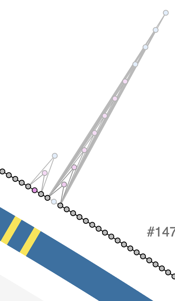
The Skp region
Pressing Alt on the keyboard, we selected all Skp genes in a bin:
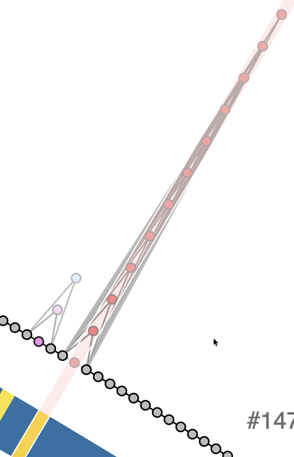
The Skp region selected into a bin
From the bins panel, we clicked on the ‘Nodes’ column of the Skp bin, and downloaded the FASTA file using the relevant section in the dialog window:
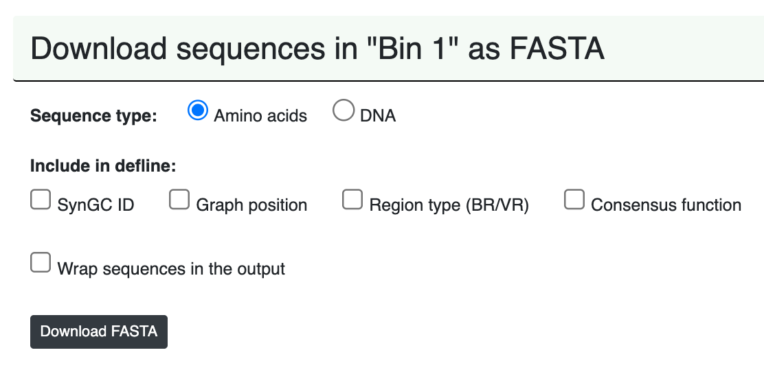
Downloading the amino acid sequnces for all Skp genes
We moved the downloaded file UNDATIPELAGIBACTER_Bin_1_GENES_AA.fa to a better location:
mv ~/Downloads/UNDATIPELAGIBACTER_Bin_1_GENES_AA.fa \
   01_DATA/UNDATIPELAGIBACTER_SKP_GENES_AA_UNALIGNED.fa
Since the deflines of sequences include gene caller ids, and we only need genome names to be able to compare the phylogeny of the Skp genes to the phylogenomics of the Undatipelagibacter genomes, we fixed the deflines using the following awk one-liner:
awk '/^>/{sub(/_[0-9]+$/, "")}1' 01_DATA/UNDATIPELAGIBACTER_SKP_GENES_AA_UNALIGNED.fa > tmp \
    && mv tmp 01_DATA/UNDATIPELAGIBACTER_SKP_GENES_AA_UNALIGNED.fa
We created a directory to store Skp phylogeny-related output files:
mkdir 02_RESULTS/SKP-PHYLOGENETICS
We then aligned these sequences using muscle,
muscle -in 01_DATA/UNDATIPELAGIBACTER_SKP_GENES_AA_UNALIGNED.fa \
       -out 02_RESULTS/SKP-PHYLOGENETICS/UNDATIPELAGIBACTER_SKP_GENES_AA_RAW.fa
Trimmed excessive gaps,
trimal -in 02_RESULTS/SKP-PHYLOGENETICS/UNDATIPELAGIBACTER_SKP_GENES_AA_RAW.fa \
       -out 02_RESULTS/SKP-PHYLOGENETICS/UNDATIPELAGIBACTER_SKP_GENES_AA.fa \
       -gt 0.50
Ran IQTREE the same way before:
The same story here, but for the Skp tree. If you have read the previous warning, you can move on. Otherwise, here is the full story: while working on our manuscript, we re-ran the reproducible workflow you are reading many many times. And it became clear to us that in some cases the phylogenetic analysis of the Skp genes will yiled ever slightly different trees. Slight changes in the initial genome trees will give you slightly different numbers after thousands of permutations in downstream analyses on this page, especially Skp co-selection tests below. These chances don’t change anything in our conclusions or results, but if you want to have byte-perfect reproduction of our findings, please skip to the next section without running the IQ-TREE analysis below. You already have the gene tree that gave us the outputs you have on this page and in our manuscript in your git clone. If you continue with the IQ-TREE analysis here, it is fine too. The following commands will simply overwrite the tree file you already have, and the rest will use your copy rather than the original file.
iqtree -s 02_RESULTS/SKP-PHYLOGENETICS/UNDATIPELAGIBACTER_SKP_GENES_AA.fa \
       -m LG+F+R10 \
       -T 10 \
       -ntmax 25 \
       --alrt 1000 \
       -B 1000
And finally renamed the resulting tree file to a more meaningful name, UNDATIPELAGIBACTER_SKP_GENES_AA.newick,
mv 02_RESULTS/SKP-PHYLOGENETICS/UNDATIPELAGIBACTER_SKP_GENES_AA.fa.treefile \
   02_RESULTS/SKP-PHYLOGENETICS/UNDATIPELAGIBACTER_SKP_GENES_AA.newick
The contents of which looked like this:
(HIMB1701:1.1326036100,(((((((HIMB1593:0.8440687974,((HIMB1559:0.0000009947,HIMB1597:0.0000009947)99.9/100:0.5075530029,
HIMB1685:0.4322609089)89.5/91:0.1793674488)74/61:0.0604480327,HIMB1491:0.7283119215)72.9/64:0.0809153224,
HIMB1765:0.6819726624)99.6/100:0.5708229496,(HIMB1577:0.0000009947,HIMB1631:0.0000009947)100/100:0.6940641477)
84.7/65:0.1220357814,(HIMB1723:1.1427802668,((((((HIMB1526:0.0000000000,HIMB1636:0.0000000000):0.0000000000,
HIMB1556:0.0000000000):0.0000000000,HIMB1641:0.0000000000):0.0000000000,HIMB1702:0.0000000000):0.0000009947,
HIMB1552:0.0000009947)92.4/99:0.1120543874,HIMB1662:0.0669078561)99.3/100:0.7530830943)88.5/75:0.2934209924)
1.5/31:0.0500581324,HIMB1507:1.1411752748)74.3/51:0.0772569627,((HIMB1573:1.1078217239,((HIMB1493:0.0000000000,
HIMB1770:0.0000000000):0.0000009947,HIMB1518:0.0000009947)100/100:1.0263878720)1.7/26:0.1530953996,(HIMB1488:0.3343931678,
HIMB1506:0.4578569414)99.9/100:0.6944285056)78.4/30:0.1517070031)64.5/27:0.0990607948,((HIMB1611:0.0000009947,
HIMB1758:0.0000009947)100/100:1.1246136160,(HIMB140:0.5375660781,HIMB1513:0.3438026003)96.4/97:0.3479016466)31.6/42:0.0626461251);
Testing the phylogenetic congruence between Skp genes and Undatipelagibacter genomes
Using the data generated in the previous two steps, we implemented a Phython script (skp_genome_phylogenetic_congruence.py, available to you under the scripts directory) to test whether Skp divergence mirrors genome ancestry, and if yes, to what extent by asking the following questions:
-
Are genome-wide and Skp patristic distances congruent?
-
Do per-branch Skp substitutions scale with genome-wide divergence?
Both questions are answered by running the script the following way,
python 00_SCRIPTS/skp_genome_phylogenetic_congruence.py
will produces the terminal output below with statistics,
SKP vs GENOME PHYLOGENETIC CONGRUENCE
===============================================
Genome tree ..................................: 02_RESULTS/UNDATIPELAGIBACTER-PHYLOGENOMICS/UNDATIPELAGIBACTER-ALPHASCGs.newick
Skp gene tree ................................: 02_RESULTS/SKP-PHYLOGENETICS/UNDATIPELAGIBACTER_SKP_GENES_AA.newick
Skp alignment ................................: 02_RESULTS/SKP-PHYLOGENETICS/UNDATIPELAGIBACTER_SKP_GENES_AA.fa
Genomes in analysis ..........................: 29

Genome-wide vs Skp patristic distances
===============================================
Pearson r ....................................: 0.804
Spearman r ...................................: 0.419
Mantel p (49,999 permutations) ...............: 0.0000

Per-branch Skp substitutions vs genome branch length
===============================================
Spearman r ...................................: 0.928
Pearson r ....................................: 0.870

FIGURES
===============================================
PDF ..........................................: 02_RESULTS/skp_genome_phylogenetic_congruence.pdf
PNG ..........................................: 02_RESULTS/skp_genome_phylogenetic_congruence.png
and generate the following output figure:
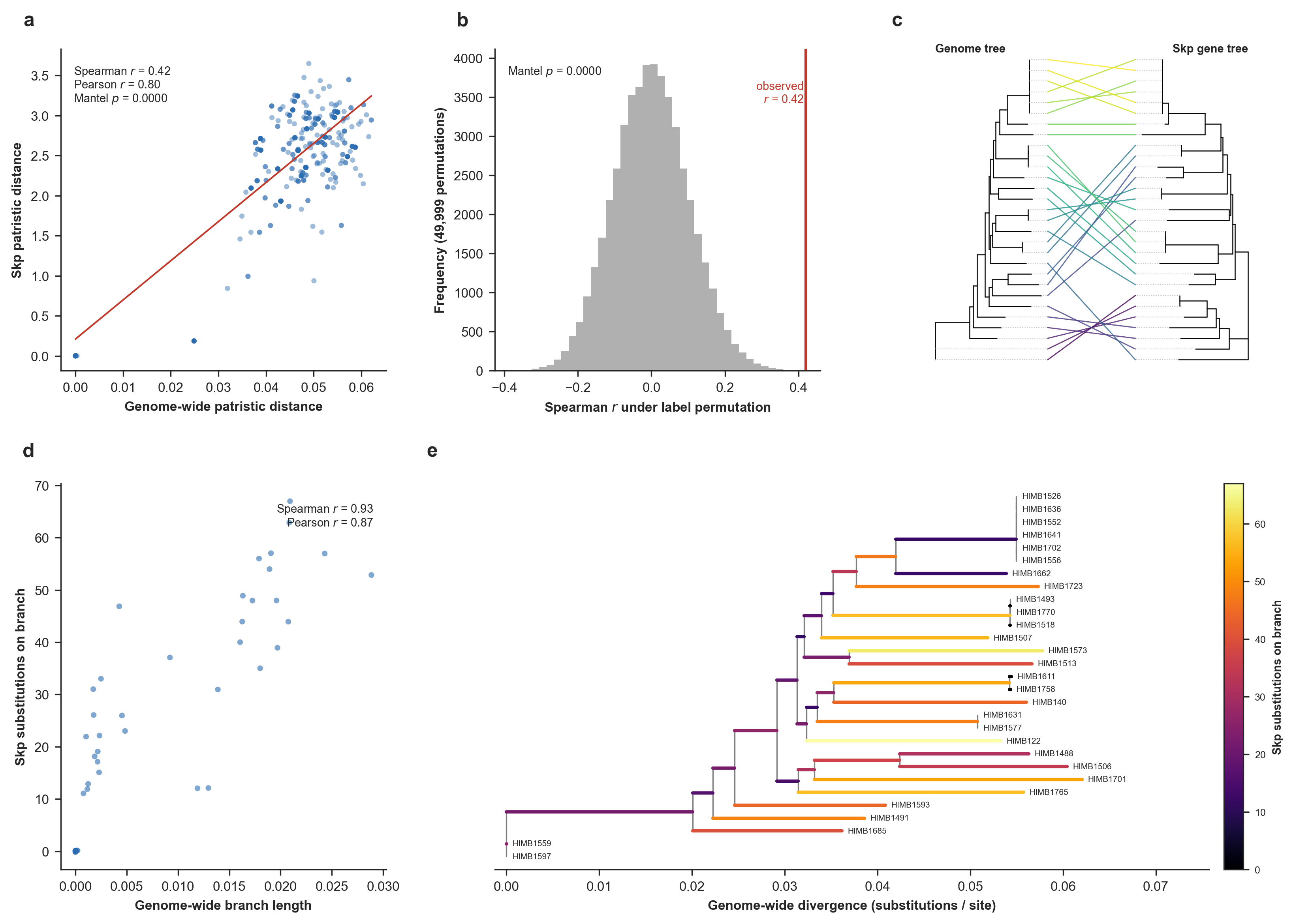
Skp divergence versus the genome phylogeny. The top row addresses whether genome-wide and Skp pairwise distances agree, and the bottom row addresses whether per-branch Skp substitutions scale with genome-wide divergence. (a) Pairwise patristic distance on the genome tree versus on the Skp gene tree, with a least-squares guide line. (b) Mantel permutation test. (c) Tanglegram of the genome tree (left) and the Skp gene tree (right). (d) Skp amino-acid substitutions inferred on each branch of the genome tree by Fitch parsimony, versus that branch’s genome-wide length (substitutions/site). (e) The genome tree with each branch colored by its inferred number of Skp substitutions (Supplementary Figure 8 in the manuscript).
Overall, this result shows that Skp divergence tracks genome ancestry to a large degree, and even though Skp is quite variable across the Undatipelagibacter (down to 25% amino-acid identity), it does accumulate substitutions on each lineage in proportion to that lineage’s genome-wide divergence given the phylogenomic tree for Undatipelagibacter genomes (Spearman r = 0.90), and its pairwise divergences correlate significantly with genome-wide distances (Mantel p = 1e-4).
Both tests support vertical signal in Skp, and the stronger, metric-robust evidence is per-branch: the number of Skp substitutions mapped onto each genome-tree branch scales tightly with the genome-wide divergence within the branch (Spearman r = 0.90, Pearson r = 0.87, highly concordant results that indicate this is not an artifact of a few long branches). The pairwise distance test between the two trees corroborates this with a significant but moderate monotonic correlation (Spearman ρ = 0.42, Mantel p = 1e-4; Pearson r = 0.80). The gap between the two distance metrics reflects the clade’s structure: genome-wide distances are strongly bimodal (as we have a tight cluster of near-identical genomes plus a band of divergent pairs (see Panel e)), so both trees agree confidently on deep splits while concording only weakly on the fine ordering among the divergent majority. But the vertical signal for Skp appears to be real and strongest at deeper divergences, rather than a uniform tight tracking of every pairwise relationship.
More eloquent and likely more up-to-date description of what this shows is in the manuscript.
Analyzing gene-level signatures of the Skp-operon divergence and a within-population test for staggered recombination.
The purpose of this analysis was to shed light on whether the volcano-shaped divergence pattern in the envelope biogenesis operon (that contained the Skp gene) was a result of staggered recombination, or by gradual in-place divergence.
For this, we needed to export a slighlty larger genomic context that exceeded the envelope biogenesis operon itself. Thus, we exported the genomic loci between the TrpD gene (SynGC GC_00000545_1; graph order 1392) to DnaE (SynGC GC_00001037_1; graph order 1409) using the anvi’o program anvi-export-pan-subgraph first to get a contigs-db file that contains the sequence between these two nodes from each genome. Running this script this way,
anvi-export-pan-subgraph -p 01_DATA/UNDATIPELAGIBACTER-PAN-GRAPH.db \
                         -e 01_DATA/UNDATIPELAGIBACTER-CONTIGS-DBs.txt \
                         --graph-nodes GC_00000545_1,GC_00001037_1 \
                         -o 02_RESULTS/UNDATIPELAGIBACTER-SKP-EXTENDED-LOCI
will generate the following terminal output,
Pan Graph DB ................................................: Initialized: 01_DATA/UNDATIPELAGIBACTER-PAN-GRAPH.db (v. 21)
Pangenome graph database .....................: UNDATIPELAGIBACTER
Pan graph database ...........................: 01_DATA/UNDATIPELAGIBACTER-PAN-GRAPH.db
Nodes to export ..............................: GC_00000545_1, GC_00001037_1
Gene caller ids ..............................: Kept as they are to match the source contigs databases
Loci .........................................:
    - 746 to 763 (17 genes) for HIMB122
    - 747 to 764 (17 genes) for HIMB140
    - 775 to 792 (17 genes) for HIMB1488
    - 766 to 783 (17 genes) for HIMB1491
    - 717 to 734 (17 genes) for HIMB1493
    - 791 to 808 (17 genes) for HIMB1506
    - 740 to 757 (17 genes) for HIMB1507
    - 747 to 764 (17 genes) for HIMB1513
    - 718 to 735 (17 genes) for HIMB1518
    - 731 to 748 (17 genes) for HIMB1526
    - 731 to 748 (17 genes) for HIMB1552
    - 764 to 781 (17 genes) for HIMB1556
    - 810 to 827 (17 genes) for HIMB1559
    - 787 to 804 (17 genes) for HIMB1573
    - 722 to 739 (17 genes) for HIMB1577
    - 731 to 748 (17 genes) for HIMB1593
    - 799 to 816 (17 genes) for HIMB1597
    - 772 to 789 (17 genes) for HIMB1611
    - 723 to 740 (17 genes) for HIMB1631
    - 720 to 737 (17 genes) for HIMB1636
    - 728 to 745 (17 genes) for HIMB1641
    - 710 to 727 (17 genes) for HIMB1662
    - 746 to 763 (17 genes) for HIMB1685
    - 748 to 765 (17 genes) for HIMB1701
    - 740 to 757 (17 genes) for HIMB1702
    - 754 to 771 (17 genes) for HIMB1723
    - 769 to 786 (17 genes) for HIMB1758
    - 715 to 732 (17 genes) for HIMB1765
    - 730 to 747 (17 genes) for HIMB1770

✓ export_pan_subgraph.py took 0:00:07.875367
and a bunch of ouptput files files (i.e., contigs-dbs and FASTA files for each locus) under the directory 02_RESULTS/UNDATIPELAGIBACTER-SKP-EXTENDED-LOCI.
Then, we used the program anvi-get-sequences-for-gene-calls the following way,
for contigs_db in 02_RESULTS/UNDATIPELAGIBACTER-SKP-EXTENDED-LOCI/*db
do
    name=$(basename $contigs_db .db)
    anvi-get-sequences-for-gene-calls -c 02_RESULTS/UNDATIPELAGIBACTER-SKP-EXTENDED-LOCI/$name.db \
                                      -o 02_RESULTS/UNDATIPELAGIBACTER-SKP-EXTENDED-LOCI/$name-locus-genes.fa \
                                      --defline '{contigs_db_project_name}_{gene_caller_id}'
done
Which exported individual gene sequences from the contigs-db files for downstream analyses of dN/dS calculations and more.
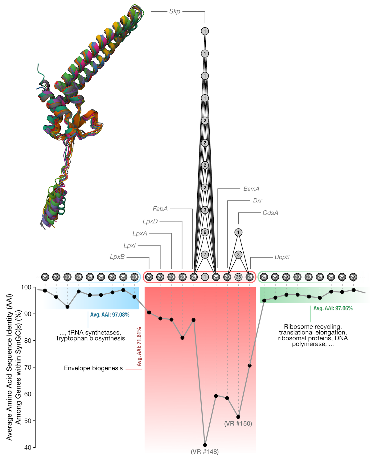
Here, we generated a simpler representation of the genes in the loci we exported above in the context of the graph to make it easier to develop scripts that can track the order of indivdiual genes and their annotations for visualization purposes. Running it the following way,
python 00_SCRIPTS/skp_operon_export_locus_map.py
generated this terminal output,
EXPORTING THE SKP OPERON LOCUS MAP
===============================================
Source table .................................: 01_DATA/UNDATIPELAGIBACTER-PAN-GRAPH-SUMMARY/SYNGCs.txt
Anchor nodes .................................: GC_00000545_1 .. GC_00001037_1
Synteny coordinate range .....................: 1392 .. 1409
Synteny positions in locus ...................: 18
Synteny gene clusters (rows) .................: 31
Variable positions ...........................: 1401 (Skp), 1404 (CdsA)

OUTPUT
===============================================
Locus map ....................................: 01_DATA/SKP_LOCUS_MAP.txt

* Wrote 31 rows across 18 synteny positions to the locus map. This is the file
  skp_operon_recombination.py will read as SKP_LOCUS_MAP.
and the content of this file looked like this:
synteny_position |
syngc_node |
gene_cluster_id |
region_type |
num_genomes |
gene |
|---|---|---|---|---|---|
| 1392 | GC_00000545_1 | GC_00000545 | backbone | 29 | TrpD |
| 1393 | GC_00001094_1 | GC_00001094 | backbone | 29 | TrpC |
| 1394 | GC_00000509_1 | GC_00000509 | backbone | 29 | LexA |
| 1395 | GC_00000679_1 | GC_00000679 | backbone | 29 | GlnS |
| 1396 | GC_00000577_1 | GC_00000577 | backbone | 29 | LpxB |
| 1397 | GC_00000598_1 | GC_00000598 | backbone | 29 | LpxI |
| 1398 | GC_00001138_1 | GC_00001138 | backbone | 29 | LpxA |
| 1399 | GC_00000668_1 | GC_00000668 | backbone | 29 | LpxD |
| 1400 | GC_00001015_1 | GC_00001015 | backbone | 29 | FabA |
| 1401 | GC_00001473_1 | GC_00001473 | variable | 7 | Skp |
| 1401 | GC_00001565_1 | GC_00001565 | variable | 6 | Skp |
| 1401 | GC_00001767_1 | GC_00001767 | variable | 3 | Skp |
| 1401 | GC_00001956_1 | GC_00001956 | variable | 2 | Skp |
| 1401 | GC_00002031_1 | GC_00002031 | variable | 2 | Skp |
| 1401 | GC_00002096_1 | GC_00002096 | variable | 2 | Skp |
| 1401 | GC_00002140_1 | GC_00002140 | variable | 2 | Skp |
| 1401 | GC_00002436_1 | GC_00002436 | variable | 1 | Skp |
| 1401 | GC_00003046_1 | GC_00003046 | variable | 1 | Skp |
| 1401 | GC_00003063_1 | GC_00003063 | variable | 1 | Skp |
| 1401 | GC_00003530_1 | GC_00003530 | variable | 1 | Skp |
| 1401 | GC_00003553_1 | GC_00003553 | variable | 1 | Skp |
| 1402 | GC_00000909_1 | GC_00000909 | backbone | 29 | BamA |
| 1403 | GC_00000933_1 | GC_00000933 | backbone | 29 | Dxr |
| 1404 | GC_00001286_1 | GC_00001286 | variable | 25 | CdsA |
| 1404 | GC_00001760_1 | GC_00001760 | variable | 3 | CdsA |
| 1404 | GC_00003583_1 | GC_00003583 | variable | 1 | CdsA |
| 1405 | GC_00000734_1 | GC_00000734 | backbone | 29 | UppS |
| 1406 | GC_00001005_1 | GC_00001005 | backbone | 29 | Frr |
| 1407 | GC_00000888_1 | GC_00000888 | backbone | 29 | Tsf |
| 1408 | GC_00000746_1 | GC_00000746 | backbone | 29 | RpsB |
| 1409 | GC_00001037_1 | GC_00001037 | backbone | 29 | DnaE |
Then, we went all the way back to our original goal here, and implemented a Python script (skp_operon_recombination.py; available to you in your 00_SCRIPTS directory), that codon-aligns every gene across the locus exporded above and computes (1) position by position the mean and full per-pair distribution of amino-acid identity (and its bimodality), (2) synonymous versus nonsynonymous divergence, and (3) the identity of each consensus alleles to the codon identity in each genome to test whether the volcano-shaped divergence pattern reflects ‘a population-wide mixture of alleles consistent with staggered recombination’ or forms ‘a uniform gradual divergence’ pattern.
Running the script the following way,
python 00_SCRIPTS/skp_operon_recombination.py
will generate the following output in the terminal,
IS THE SKP OPERON VALLEY RECOMBINATION OR GRADUAL DIVERGENCE?
===============================================
Locus directory ..............................: 02_RESULTS/UNDATIPELAGIBACTER-SKP-EXTENDED-LOCI
Genome tree ..................................: 02_RESULTS/UNDATIPELAGIBACTER-PHYLOGENOMICS/UNDATIPELAGIBACTER-ALPHASCGs.newick
Genomes in analysis ..........................: 29
Synteny positions in locus ...................: 18
Operon (LpxB..UppS) ..........................: LpxB, LpxI, LpxA, LpxD, FabA, Skp, BamA, Dxr, CdsA, UppS

WHAT THE LOCUS LOOKS LIKE
===============================================
Mean AAI, flank genes ........................: 97.0%
Mean AAI, operon genes .......................: 71.5%
Mean AAI, Skp ................................: 39.7%

DISCRIMINATING SIGNATURES (recombination vs. gradual divergence)
===============================================
Genes with bimodal pairwise identity .........: LpxB, LpxI, LpxA, Skp, BamA, Dxr, CdsA, UppS
Mean pS (synonymous), flanks vs Skp ..........: 0.245 vs 0.515
Mean pN (non-synonymous), flanks vs Skp ......: 0.015 vs 0.363
Mean dN/dS (where estimable), flanks vs Skp ..: 0.059 vs 0.561
Mean identity to consensus, flanks vs Skp ....: 98.1% vs 54.6%

PER-GENE PROFILE (AAI, pN, pS, dN/dS, bimodality)
===============================================

* gene region AAI% pN pS dN/dS bimodality

* TrpD flank 97.1 0.013 0.140 0.089 0.498
* TrpC flank 98.0 0.009 0.118 0.093 0.408
* LexA flank 99.1 0.004 0.170 0.026 0.317
* GlnS flank 96.5 0.016 0.172 0.087 0.357
* LpxB OPERON 90.5 0.049 0.278 0.113 0.907
* LpxI OPERON 88.4 0.061 0.284 0.132 0.926
* LpxA OPERON 87.9 0.066 0.375 0.104 0.869
* LpxD OPERON 80.9 0.110 0.435 0.169 0.342
* FabA OPERON 88.2 0.079 0.562 0.076 0.377
* Skp OPERON 39.7 0.363 0.515 0.561 0.896
* BamA OPERON 59.4 0.254 0.592 0.246 0.902
* Dxr OPERON 58.7 0.253 0.557 0.285 0.898
* CdsA OPERON 51.0 0.307 0.549 0.387 0.721
* UppS OPERON 70.7 0.179 0.552 0.194 0.808
* Frr flank 95.0 0.031 0.493 0.038 0.371
* Tsf flank 96.1 0.020 0.339 0.045 0.322
* RpsB flank 97.2 0.016 0.335 0.035 0.251
* DnaE flank 97.2 0.013 0.193 0.060 0.493

FIGURES
===============================================
PDF ..........................................: 02_RESULTS/skp_operon_recombination.pdf
PNG ..........................................: 02_RESULTS/skp_operon_recombination.png

OBSERVATIONS TO REMEMBER
===============================================
* (a) The volcano. Mean pairwise amino-acid identity (AAI) forms a smooth valley,
  from 97% across the flanks to 40% at Skp (operon mean 72%). On its own this
  averaged profile cannot tell staggered recombination from gradual in-place
  divergence; panels (b) to (e) look below the average.

* (b) Per-pair profiles. At Skp the individual genome pairs span a wide range of
  identities (25% to 100%; pair-to-pair spread 16% vs 1% across the flanks), so
  the smooth average is assembled from very different pairs rather than from
  uniformly intermediate ones.

* (c) Per-gene bimodality. Among the locus genes, genes LpxB, LpxI, LpxA, Skp,
  BamA, Dxr, CdsA, UppS show a bimodal pairwise-identity distribution (Sarle's
  coefficient above 0.56), with Skp at 0.90. Bimodality (pairs splitting into a
  high-identity 'native' group and a low-identity 'imported' group rather than
  forming one intermediate cluster) is the split expected under recombination.

* (d) Synonymous vs non-synonymous. Into the valley pN rises from 0.015 at the
  flanks to 0.363 at Skp, while pS goes from 0.245 to 0.515 (dN/dS at Skp 0.56).
  pS rises into the valley alongside pN, consistent with a divergent DNA tract
  imported wholesale.

* (e) Per-genome mosaic. Identity to the per-gene consensus falls from 98% at the
  flanks to 55% at Skp, and at the operon center it varies widely from genome to
  genome (spread 10%). Whether those divergent alleles form contiguous, genome-
  specific blocks with staggered boundaries (the signature of a recombination
  mosaic) is read from the heatmap.
and create the following figure that describe the analysis results here:
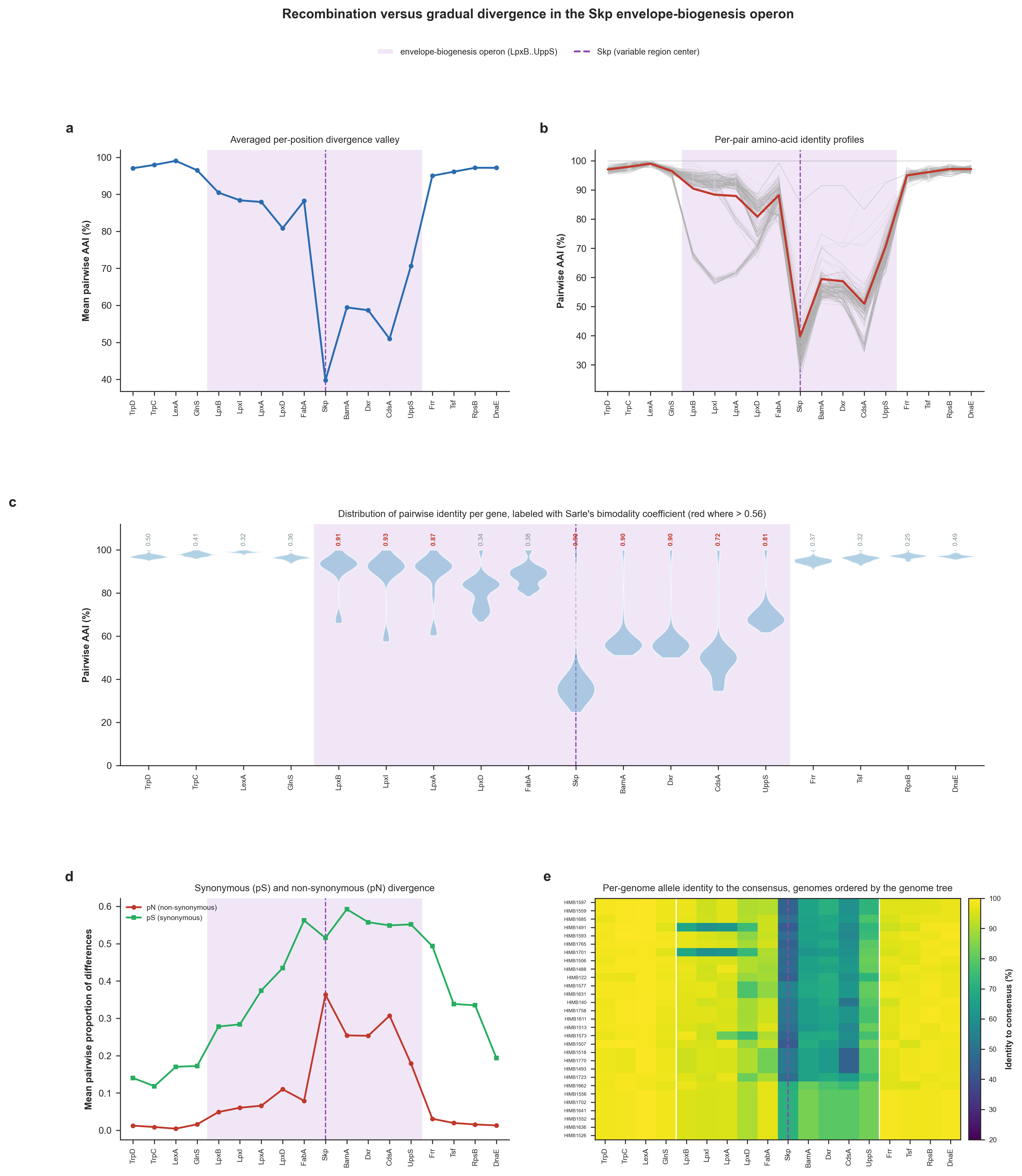
Gene-level signatures of the Skp-operon divergence valley and a within-population test for staggered recombination. In every panel the operon that encodes Skp is shaded and theSkp gene is marked with a dashed line. (a) Mean pairwise amino-acid identity (AAI) at each gene. (b) The same profile drawn for each individual genome pair with the mean overlaid. (c) Distribution of the 406 pairwise AAI values at each gene; red numbers indicate when Sarle’s bimodality coefficient exceeds 5/9. (d) Mean pairwise proportion of nonsynonymous differences per gene (Nei-Gojobori). (e) Heatmap of each genome’s allele identity to the per-gene consensus sequence where genomes are ordered by the genome phylogeny (Supplementary Figure 6 in the manuscript).
Testing recombination events across the contiguous Skp locus at nucleotide, sub-gene resolution
We implemented a Python script (skp_operon_recombination_breakpoints.py; also available to you in your 00_SCRIPTS directory) to perform position-aware recombination tests to quantify whether or not homologous recombination has shaped the locus. The script generates uses a sliding-window DNA identity profile across alignments, generates a four-gamete incompatibility landscape, calculates a pairwise homoplasy index (PHI, Φw) permutation test, and performs an incompatibility-versus-distance analysis.
Running the script the following way (which will take a few minutes),
python 00_SCRIPTS/skp_operon_recombination_breakpoints.py
will generate the following terminal output,
FORMAL RECOMBINATION TESTS ACROSS THE SKP OPERON
===============================================
Whole-locus alignment ........................: reusing cache: 02_RESULTS/UNDATIPELAGIBACTER_SKP_LOCUS_ALIGNED.fa
Locus directory ..............................: 02_RESULTS/UNDATIPELAGIBACTER-SKP-EXTENDED-LOCI
Genomes in analysis ..........................: 29
Whole-locus alignment length .................: 19,304 columns
Informative biallelic sites ..................: 3,169

RECOMBINATION SIGNAL
===============================================
Mean incompatibility (4-gamete), all sites ...: 0.358
Operon informative sites .....................: 2091 (3943..13516 aln cols)
Flank informative sites ......................: 1078
PHI (whole locus), observed vs null mean .....: 0.3357 vs 0.3576
PHI p-value (9,999 permutations) .............: 0.0001
PHI within operon (statistic, p) .............: 0.3626, p = 0.0001
PHI within flanks (statistic, p) .............: 0.2841, p = 0.0001

* Some theory to keep in mind when interpreting results: low PHI & small p sugests
  that nearby sites are more compatible than chance, which suggests
  recombination. High PHI or a non-significant p do not necessarily prove the
  absence of recombination, especially with few informative sites. The
  incompatibility-vs-distance data also important: a rising trend is the
  hallmark of recombination, while a flat line suggests clonal divergence. Also
  keep in mind that this is all contemporary wisdom, not fact.

FIGURES
===============================================
PDF ..........................................: 02_RESULTS/skp_operon_recombination_breakpoints.pdf
PNG ..........................................: 02_RESULTS/skp_operon_recombination_breakpoints.png
Cached alignment .............................: 02_RESULTS/UNDATIPELAGIBACTER_SKP_LOCUS_ALIGNED.fa

OBSERVATIONS TO REMEMBER
===============================================
* (a) Divergence profile. Mean pairwise nucleotide identity dips from 94.5% across
  the flanks to 76.2% over the operon, with the floor of the valley (57.2%)
  falling within the operon span (a smooth, sub-gene divergence valley rather
  than a sharp gene-boundary step).

* (b) Where conflict concentrates. Mean 4-gamete incompatibility per site is 0.36
  over the operon vs 0.28 across the flanks: genealogical conflict concentrates
  over the operon, where recombination has shuffled site histories.

* (c) PHI test. Across the whole locus the observed PHI (0.336) is lower than the
  permutation null mean (0.358; p = 0.0001): nearby sites are more compatible
  than chance, the signature of recombination. Run separately, the operon (PHI =
  0.363, p = 0.0001) and the flanks (PHI = 0.284, p = 0.0001) show the signal is
  not confined to one part of the locus.

* (d) Incompatibility vs. distance. Mean incompatibility rises from 0.37 between
  the closest site pairs to 0.24 between the farthest (trend r = -0.88). A
  rising trend is the hallmark of recombination shuffling genealogies along the
  locus; a flat line would indicate clonal divergence.
And will generate the figure below for the Skp-encoding operon and its broader flanking genomic context:
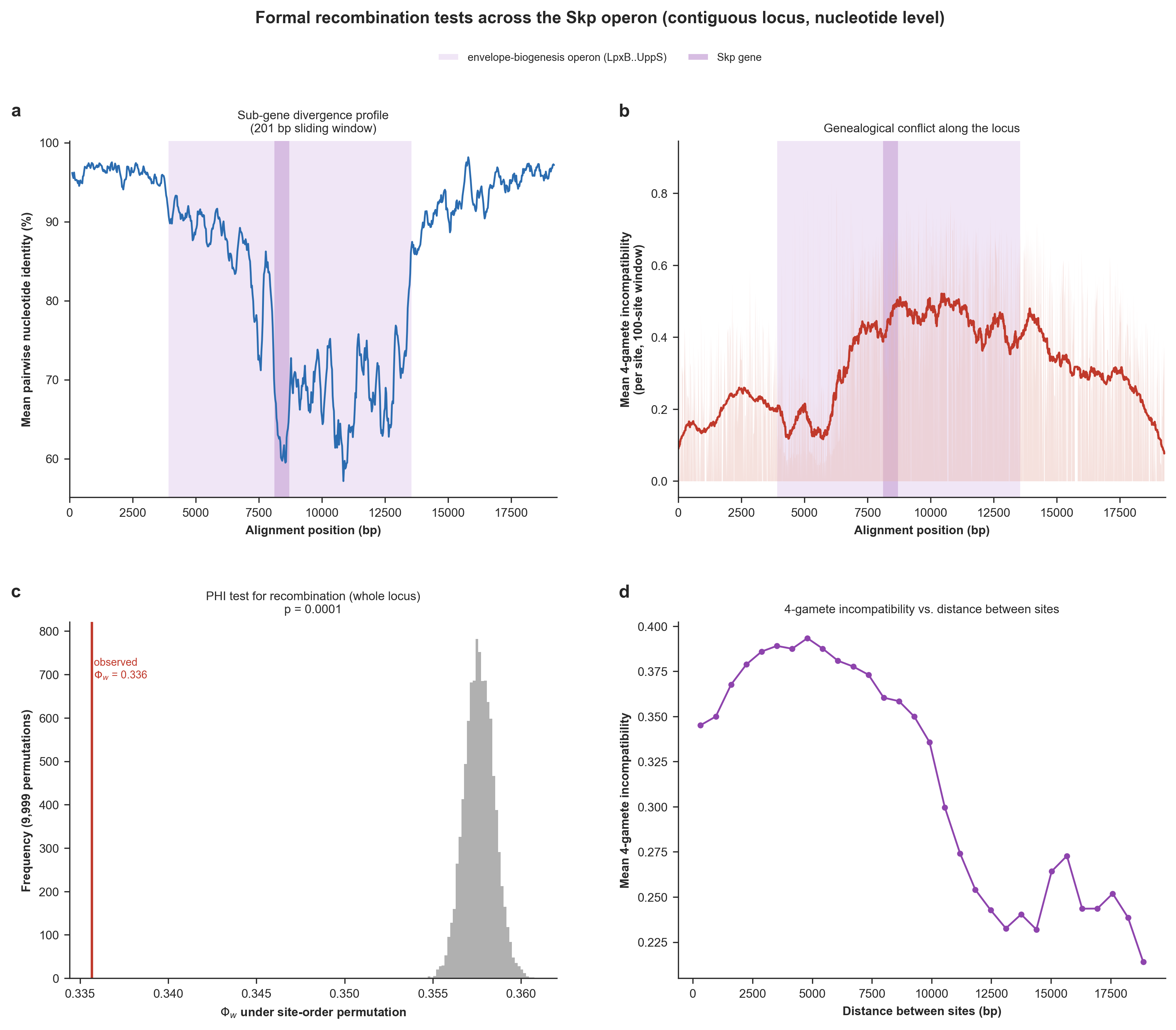
Formal recombination tests across the contiguous Skp locus at nucleotide, sub-gene resolution. (a) Mean pairwise nucleotide identity in a 200-bp sliding window along the locus, resolving the divergence valley within and across genes. (b) Genealogical-conflict landscape: for each informative site, the mean 4-gamete incompatibility with its neighboring sites, positioned along the locus. (c) The pairwise homoplasy index (PHI / Φw) test for recombination. The histogram is the null distribution of Φw under 9,999 random permutations of site order; the red line is the observed value. (d) Mean 4-gamete incompatibility between pairs of informative sites as a function of the distance separating them. (Supplementary Figure 7 in the manuscript).
Testing the existence (or lack thereof) the epistatic co-selection signal centered on Skp
This analysis required us to work with every single single-copy core gene in the Undatipelagibacter pangenome, so we first used the program anvi-summarize to generate the necessary files to be able to recover gene sequences for each gene cluster in the pangenome:
# summarize the pangenome
anvi-summarize -p 01_DATA/UNDATIPELAGIBACTER-PAN.db -g 01_DATA/UNDATIPELAGIBACTER-GENOMES.db -o 02_RESULTS/UNDATIPELAGIBACTER-PAN-SUMMARY

# decompress the key summary file
gzip -d 02_RESULTS/UNDATIPELAGIBACTER-PAN-SUMMARY/UNDATIPELAGIBACTER_gene_clusters_summary.txt.gz
Then, we implemented yet another Python script (skp_operon_coselection.py – also available to you in your 00_SCRIPTS directory) to finally test the other side of the medallion: whether the Skp divergence can be explained by epistatic co-selection. The script maps substitutions in each gene onto the genome phylogeny we generated previously, and quantifies (while controlling for genome-wide divergence rate) the dN/dS selection gradient across the operon, the rate-independent co-divergence of each gene with Skp (both within the operon and, genome-wide, across all core single-copy genes), and the enrichment of Skp’s co-divergence partners for cell-envelope functions, to test whether the valley is shaped by epistatic co-selection centered on Skp.
Running the script the following way (which will take a loooong time to generate genome-wide null values),
python 00_SCRIPTS/skp_operon_coselection.py
will produce the following output in the terminal,
IS THE SKP OPERON VALLEY SHAPED BY CO-SELECTION CENTERED ON SKP?
===============================================
Locus directory ..............................: 02_RESULTS/UNDATIPELAGIBACTER-SKP-EXTENDED-LOCI
Genome tree ..................................: 02_RESULTS/UNDATIPELAGIBACTER-PHYLOGENOMICS/UNDATIPELAGIBACTER-ALPHASCGs.newick
Genomes in analysis ..........................: 29
Synteny positions in locus ...................: 18

BUILDING THE GENOME-WIDE NULL
===============================================
No cached genome-wide null was found, so the partial co-divergence with Skp will
now be computed for every core single-copy gene. This aligns hundreds of gene
clusters and is the slow step (a few minutes); the result is cached to
'02_RESULTS/UNDATIPELAGIBACTER_SKP_GENOMEWIDE_CODIVERGENCE_NULL.txt' and reused
on later runs.


SELECTION GRADIENT AND CO-DIVERGENCE WITH SKP
===============================================
Mean dN/dS, flanks vs operon vs Skp ..........: 0.059 vs 0.227 vs 0.561
Mean co-divergence with Skp, flanks vs operon : 0.216 vs 0.538
  (operon genes co-diverge with Skp beyond rate; flanks should not) :

* gene region dN/dS co-divergence-with-Skp (partial)

* TrpD flank 0.089 +0.364
* TrpC flank 0.093 +0.027
* LexA flank 0.026 -0.108
* GlnS flank 0.087 +0.284
* LpxB OPERON 0.113 +0.339
* LpxI OPERON 0.132 +0.175
* LpxA OPERON 0.104 +0.359
* LpxD OPERON 0.169 +0.524
* FabA OPERON 0.076 +0.627
* Skp OPERON 0.561 +1.000 <- Skp itself
* BamA OPERON 0.246 +0.744
* Dxr OPERON 0.285 +0.744
* CdsA OPERON 0.387 +0.644
* UppS OPERON 0.194 +0.684
* Frr flank 0.038 +0.257
* Tsf flank 0.045 +0.246
* RpsB flank 0.035 +0.148
* DnaE flank 0.060 +0.511
Operon vs flank co-divergence with Skp (Mann-Whitney, greater) : U = 63, p = 0.0039

GENOME-WIDE: ARE SKP'S PARTNERS THE CELL ENVELOPE?
===============================================
Core single-copy genes in null ...............: 924
Envelope genes in null (COG cat. M) ..........: 66 / 924 (7.1%)
Envelope fraction in top decile ..............: 15.2% (vs 7.1% overall)
Envelope enrichment in top decile (hypergeometric) : p = 3.49e-03
Envelope vs other co-divergence (Mann-Whitney) : p = 4.67e-08
Envelope vs rate-matched peers (Wilcoxon) ....: median 60th pct, p = 1.92e-03
LptD .........................................: partial co-divergence +0.640, 80th percentile vs rate-matched peers
BamA .........................................: partial co-divergence +0.716, 87th percentile vs rate-matched peers

* Top 10 genome-wide Skp co-divergence partners:
    - GC_00000720 partial +0.76 (no COG annotation)
    - GC_00000741 partial +0.74 Pyridoxal 5'-phosphate homeostasis protein YggS, UPF000
    - GC_00000933 partial +0.73 1-deoxy-D-xylulose 5-phosphate reductoisomerase (Dxr) (
    - GC_00000533 partial +0.67 Chromosome segregation protein Spo0J, contains ParB-lik
    - GC_00000914 partial +0.67 Cell division protein FtsI, peptidoglycan transpeptidas [envelope]
    - GC_00000943 partial +0.66 Outer membrane protein assembly factor BamD, BamD/ComL [envelope]
    - GC_00000574 partial +0.66 Lipopolysaccharide export LptBFGC system, permease prot [envelope]
    - GC_00000734 partial +0.65 Undecaprenyl pyrophosphate synthase (UppS) (PDB:1X07)
    - GC_00000824 partial +0.65 Preprotein translocase subunit SecB (SecB) (PDB:1OZB)
    - GC_00001048 partial +0.64 Molecular chaperone GrpE (heat shock protein HSP-70) (G

FIGURES
===============================================
PDF ..........................................: 02_RESULTS/skp_operon_coselection.pdf
PNG ..........................................: 02_RESULTS/skp_operon_coselection.png

OBSERVATIONS TO REMEMBER
===============================================
* (a) Selection gradient. dN/dS is low and flat across the flanks (mean 0.06) and
  peaks at Skp (0.56), with intermediate values across its operon neighbors
  (operon mean 0.23). Every locus gene stays below 1, i.e. relaxed/diversifying
  constraint rather than classical positive selection (shows a selection-
  intensity gradient centered on Skp).

* (b) Co-divergence with Skp. Operon genes co-diverge with Skp far more than the
  flanking genes (mean 0.54 vs 0.22; Mann-Whitney p = 3.9e-03), beyond the
  shared rate effect.

* (c) Co-varying block. Co-divergence is higher within the operon (mean +0.48)
  than between operon and flank genes (mean +0.27): the operon forms a coherent,
  positively co-varying block rather than a distance-decaying pattern, as
  expected if the genes share a selective regime.

* (d) The two signals agree. Across genes, co-divergence with Skp and dN/dS track
  each other (Spearman rho = +0.76): the genes that follow Skp most closely are
  also under the most relaxed/diversifying selection (Skp at upper right, flanks
  at lower left).

* (e) Functional identity. Genome-wide, envelope-biogenesis genes (COG category M)
  co-diverge with Skp more than the rest of the core genome (Mann-Whitney p =
  4.7e-08) and are enriched among Skp's top-decile partners (15.2% vs 7.1%
  overall; hypergeometric p = 3.5e-03). Skp's outer-membrane clients LptD and
  BamA sit among the envelope genes.

* (f) Rate control. Each envelope gene's percentile vs the non-envelope genes
  closest to it in substitution count sits above the 50th percentile (median
  60th; Wilcoxon p = 1.9e-03), as do LptD and BamA (80th and 87th percentiles)
  (so the envelope signal is NOT a by-product of evolutionary rate).
and create the following figure that summarize the results here:
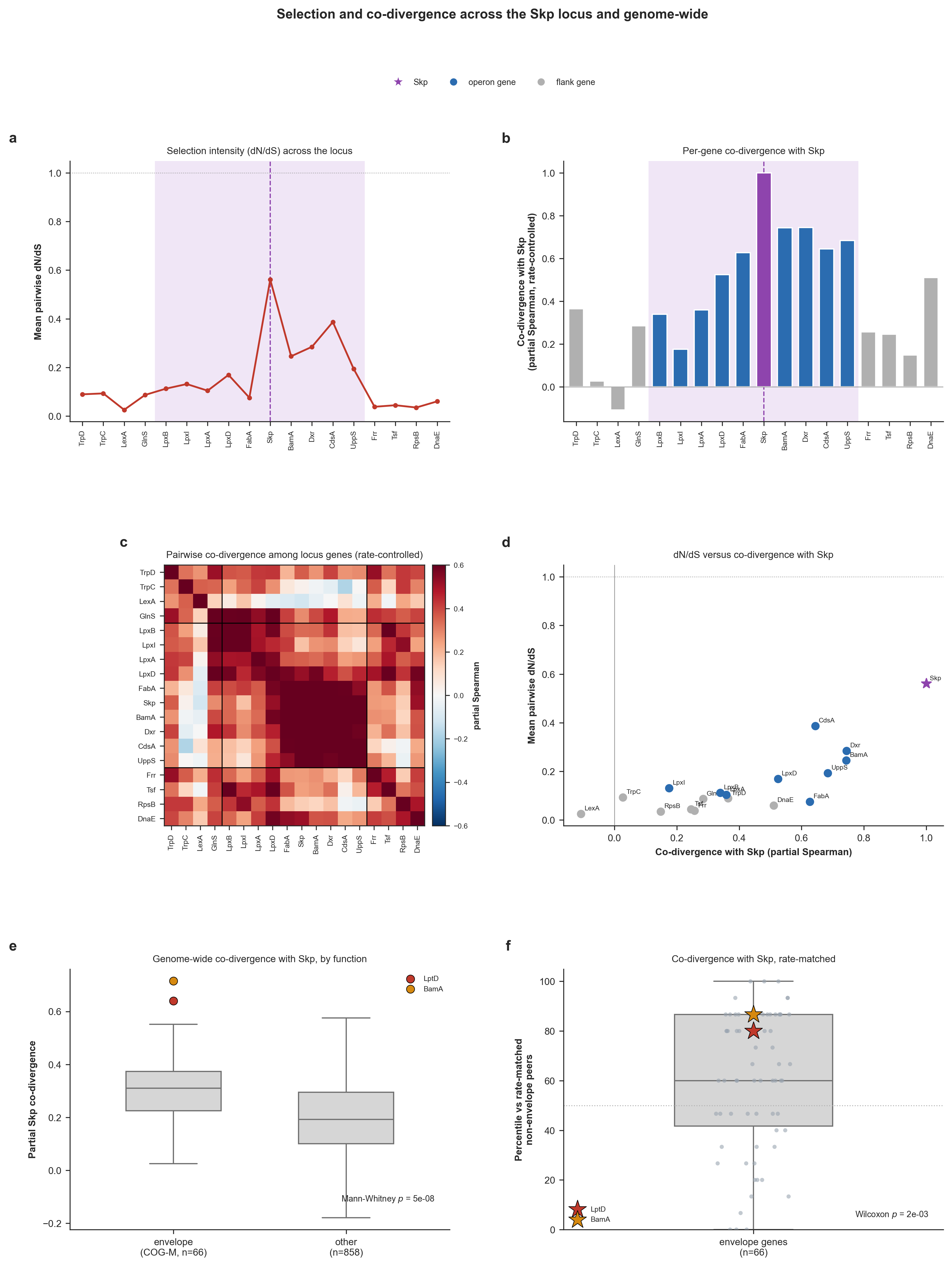
Selection and co-divergence across the Skp locus and genome-wide. Operon-internal analyses (a-d) use the per-gene codon alignments of all locus genes with amino-acid substitutions mapped onto each branch of the genome tree by Fitch parsimony, and the genome-wide analyses (e-f) apply the same test to all single-copy core genes. Throughout, ‘co-divergence with Skp’ indicates the partial Spearman correlation between the per-branch substitutions of a given gene and Skp, while controlling for genome-wide branch length. In a-d the operon is shaded and Skp is marked. (a) Mean pairwise dN/dS (Nei-Gojobori) at each locus gene. (b) Each gene’s rate-controlled co-divergence with Skp. (c) Pairwise co-divergence among all locus genes. (d) dN/dS versus co-divergence with Skp, one point per gene. (e) Genome-wide partial co-divergence with Skp for envelope-biogenesis genes (COG category M; n = 66) versus all other single-copy core genes (n = 858), with Skp’s outer-membrane clients LptD and BamA overlaid. (f) Each envelope gene’s percentile rank for co-divergence with Skp among the non-envelope genes closest to it in substitution count. (Supplementary Figure 9 in the manuscript).
Connecting two divergence valleys: do Skp and SurA co-evolve beyond the genome?
The co-selection analysis above points a genome-wide process around the cell envelope. But we also wanted to REALLY establish some direct insights into this co-divergence patterns around cell envelope related genes so far we gleaned through summary statistics. Somewhere else in the pangenome graph, between GC_00001256_1 (LptF) and GC_00000656_1 (Gmk), we found another volcano-shaped divergence gradient with very low Expansion and very high Complexity value on the graph, just like the region that encoded Skp.
The floor of this second divergence valley was the periplasmic chaperone SurA (synteny position 1762 in the graph). The very interesting thing is that Skp and SurA are two parallel periplasmic chaperone pathways that escort outer-membrane proteins from the Sec translocon to the BamA assembly machine, so SurA is the natural gene to which we can ask a much sharper question: is the co-evolutionary signal between Skp and SurA stronger than the signal between either of them and the genome phylogeny? Because if the answer to that qeustion turns out to be a clear yes, then we would be able to confirm that the shared selective regime on the chaperone pathway encoded by two functionally analogous/linked genes such as Skp and SurA that are encoded so far apart in each genome gene trees track each other beyond their shared ancestory dictates.
Rather than clicking through the interactive interface, this time we recovered all the genes for SurA with a small Python script (export_sura_gene_aa_seqs.py; available to you in your 00_SCRIPTS directory) that reads the anvi-summarize outout and reports a FASTA file of amino acids (the script also reproduces the Skp FASTA byte-for-byte when pointed at the Skp position, but instead of retrospectively changing our workflow, we decided to leave it the way we did it with the interactive interface (because it is arguably more fun to do it that way)). Running this script the following way,
python 00_SCRIPTS/export_sura_gene_aa_seqs.py
generated 01_DATA/UNDATIPELAGIBACTER_SURA_GENES_AA_UNALIGNED.fa (one sequence per genome with the genome name as the defline, in the exact format of 01_DATA/UNDATIPELAGIBACTER_SKP_GENES_AA_UNALIGNED.fa) with the following terminal output for SurA:
SurA
===============================================
Synteny position .............................: 1,762
Gene clusters at position ....................: 10 (GC_00001413, GC_00001571, GC_00001708, GC_00001888, GC_00001921, GC_00002223, GC_00002883, GC_00002942, GC_00003139, GC_00003473)
Genomes recovered ............................: 29
Output FASTA .................................: 01_DATA/UNDATIPELAGIBACTER_SURA_GENES_AA_UNALIGNED.fa
We then put the SurA file through the same muscle -> trimal -> IQ-TREE pipeline we used for Skp:
mkdir -p 02_RESULTS/SURA-PHYLOGENETICS

# align
muscle -in 01_DATA/UNDATIPELAGIBACTER_SURA_GENES_AA_UNALIGNED.fa \
       -out 02_RESULTS/SURA-PHYLOGENETICS/UNDATIPELAGIBACTER_SURA_GENES_AA_RAW.fa

# trim excessive gaps
trimal -in 02_RESULTS/SURA-PHYLOGENETICS/UNDATIPELAGIBACTER_SURA_GENES_AA_RAW.fa \
       -out 02_RESULTS/SURA-PHYLOGENETICS/UNDATIPELAGIBACTER_SURA_GENES_AA.fa \
       -gt 0.50

# compute the gene tree
iqtree -s 02_RESULTS/SURA-PHYLOGENETICS/UNDATIPELAGIBACTER_SURA_GENES_AA.fa \
       -m LG+F+R10 \
       -T 10 \
       -ntmax 25 \
       --alrt 1000 \
       -B 1000

# rename the tree to a meaningful name
mv 02_RESULTS/SURA-PHYLOGENETICS/UNDATIPELAGIBACTER_SURA_GENES_AA.fa.treefile \
   02_RESULTS/SURA-PHYLOGENETICS/UNDATIPELAGIBACTER_SURA_GENES_AA.newick
As with the genome and Skp trees, re-running IQ-TREE here can yield ever so slightly different SurA trees from one run to the next (a by-product of the maximum-likelihood search), with correspondingly tiny changes in the numbers below; none of them alter the conclusion. For byte-perfect reproduction of our results, use the .newick file already in your git clone rather than re-running IQ-TREE.
Finally, we implemented a Python script (skp_sura_genome_tree_congruence.py; available to you in your 00_SCRIPTS directory) that compares the Skp gene tree, the SurA gene tree and the Undatipelagibacter genome tree against one another. For each of the three pairwise relationships (Skp-SurA, Skp-genome, SurA-genome) it runs the same two complementary tests used earlier for Skp vs. the genome: (1) a Mantel permutation test on the trees’ pairwise patristic distances, and (2) the rate-controlled per-branch co-divergence (mapping each gene’s amino-acid substitutions onto every branch of the genome tree by Fitch parsimony, then taking the Spearman correlation between genes).
It then runs the two “beyond the genome” tests that actually answer the question: a partial Mantel test of Skp vs SurA holding the genome distance matrix fixed, and the partial Spearman of the Skp and SurA per-branch substitutions controlling for genome-wide branch length. For the visualization, every tree is first re-rooted de novo at its midpoint and only then are its internal nodes rotated to untangle the tanglegrams (since rooting and rotation change only the drawing, never the statistic, since distances and substitution counts are invariant to such trickery). Running this script the following way,
python 00_SCRIPTS/skp_sura_genome_tree_congruence.py
produces the following terminal output,
Skp vs SurA vs GENOME TREE CONGRUENCE
===============================================
Genome tree ..................................: 02_RESULTS/UNDATIPELAGIBACTER-PHYLOGENOMICS/UNDATIPELAGIBACTER-ALPHASCGs.newick
Skp gene tree ................................: 02_RESULTS/SKP-PHYLOGENETICS/UNDATIPELAGIBACTER_SKP_GENES_AA.newick
SurA gene tree ...............................: 02_RESULTS/SURA-PHYLOGENETICS/UNDATIPELAGIBACTER_SURA_GENES_AA.newick
Genomes in analysis ..........................: 29

PAIRWISE CONGRUENCE (patristic distances, Mantel)
===============================================
Skp vs SurA ..................................: Spearman r = 0.703, Pearson r = 0.904, Mantel p = 0.0000
Skp vs genome ................................: Spearman r = 0.419, Pearson r = 0.804, Mantel p = 0.0000
SurA vs genome ...............................: Spearman r = 0.420, Pearson r = 0.797, Mantel p = 0.0001
Skp vs SurA | genome (partial Mantel) ........: partial r = 0.655, p = 0.0000

PER-BRANCH CO-DIVERGENCE (genome tree, Fitch)
===============================================
Skp vs SurA substitutions ....................: Spearman r = 0.968
Skp vs genome branch length ..................: Spearman r = 0.891
SurA vs genome branch length .................: Spearman r = 0.883
Skp vs SurA | genome rate (partial) ..........: partial r = 0.781

IS THE Skp-SurA SIGNAL STRONGER THAN EITHER GENE vs THE GENOME?
===============================================
* Patristic: Skp-SurA (0.70) vs Skp-genome (0.42) and SurA-genome (0.42).
* Per-branch: Skp-SurA (0.97) vs Skp-genome (0.89) and SurA-genome (0.88).
* Beyond the genome, Skp and SurA still co-vary: partial Mantel r = 0.65 (p = 0.0000); per-branch partial r = 0.78.

FIGURES
===============================================
PDF ..........................................: 02_RESULTS/skp_sura_genome_tree_congruence.pdf
PNG ..........................................: 02_RESULTS/skp_sura_genome_tree_congruence.png
and the following figure:
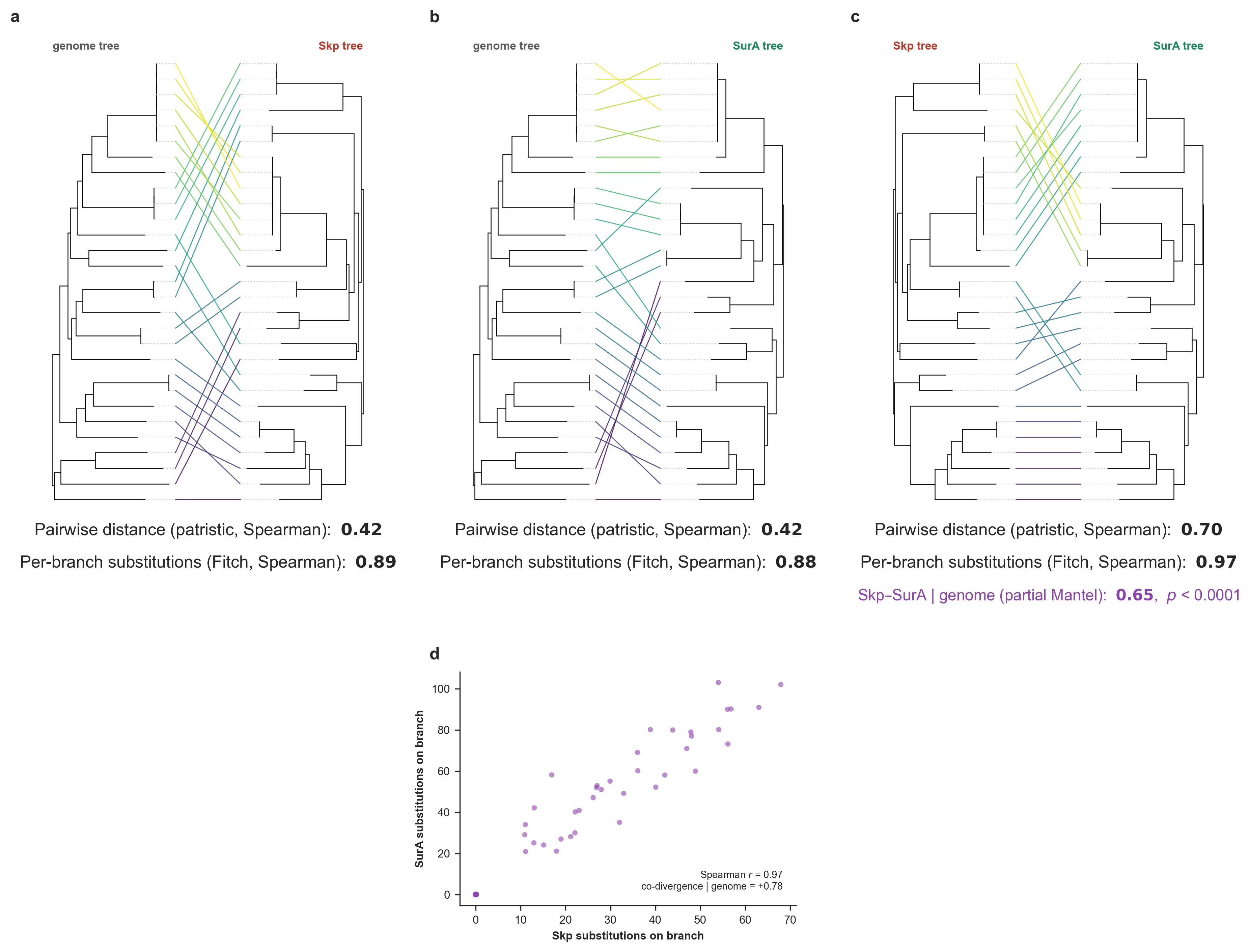
Skp, SurA, and genome co-evolution. (a-c) Pairwise tanglegrams between the three trees, each re-rooted de novo at its midpoint and then rotated to untangle: (a) genome vs Skp, (b) genome vs SurA, (c) Skp vs SurA. Under each tanglegram printed the pair’s congruence as the patristic-distance (Mantel) and per-branch (Fitch) Spearman correlations (the partial Mantel correlation of Skp and SurA with the genome distance matrix held fixed (with its permutation p-value) is shown as an additional metric under the Skp vs SurA tree). (d) Per-branch SurA vs Skp amino-acid substitutions inferred on every branch of the genome tree by Fitch parsimony, annotated with the Spearman correlation and the rate-controlled partial correlation (co-divergence with the genome rate removed).
But instead of putting this in the manuscript as another Supplementary Figure, we polished it in Inkscape to turn it into a main figure so we can explicitly show the trees in the context of the within-SynGC AAI divergence across all genes to better appreciate the congruence, which ended up looking like this:
We were still working this one at the time of writing these lines, so this may not be the very final version.
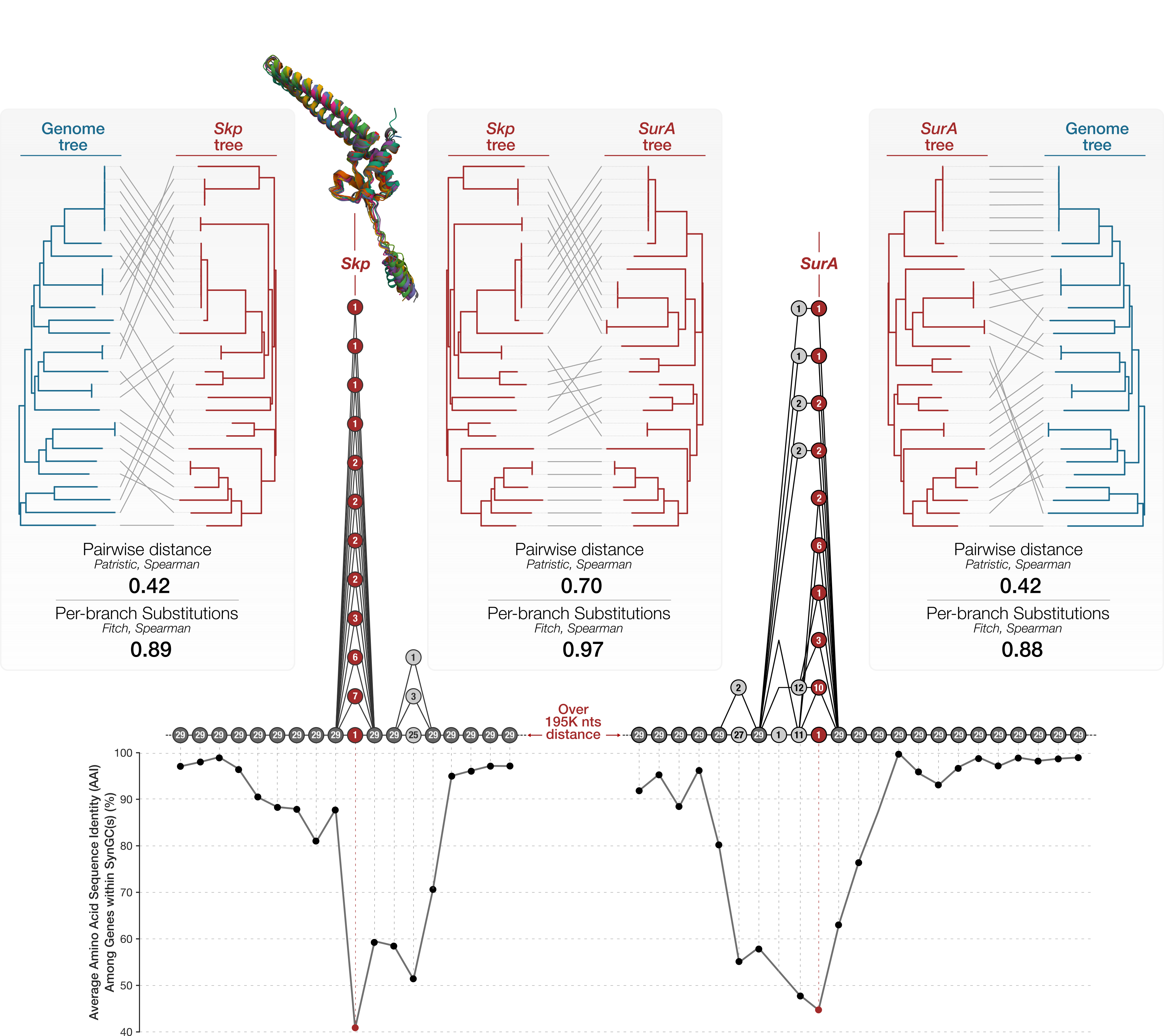
Comparison of Skp vs SurA vs genome trees. Pairwise tanglegrams display three different comparisons: from left-to-right, (1) the genome tree versus the Skp tree, (2) the Skp tree versus the SurA tree, and (3) SurA tree versus the genome tree. Under each tanglegram, the congruence between the two trees are shown as the patristic-distance (Mantel) and per-branch (Fitch) Spearman correlations. The figure also includes the pangenome subgraphs for the region that encodes Skp and the one that encodes SurA along with within-SynGC average amino acid sequence identity of all genes. The superimposed protein structures show the congruence between AlphaFold2-predicted protein structures for all Skp sequences and all SurA sequences (Figure 6 in our manuscript).
Going back to the reason why we did this analysis at the first place, now we can confidently say the answer appears to be a resounding yes in deed: under the pairwise distance (Mantel) test the Skp and SurA gene trees are about as congruent with each other (Spearman r = 0.70) as the genome tree is with itself across two metrics, and roughly twice as congruent as either gene is with the genome (Skp-genome r = 0.42, SurA-genome r = 0.42). The per-branch substitution test tells the same story (Skp-SurA r = 0.97 vs 0.89 and 0.88 against the genome). Crucially, the excess survives removing the genome: Skp and SurA remain strongly congruent after the genome distance matrix is partialled out (partial Mantel r = 0.66, p = 1e-4), and their per-branch substitutions still co-vary once genome-wide branch length is controlled for (partial r = 0.78). In other words, two divergence valleys with no physical connection in the genome share a genealogy that the genome phylogeny alone does not explain, exactly as expected if a single co-selective regime on the periplasmic chaperone / outer-membrane-protein biogenesis pathway shapes both.
Since we really were pushing the boundaries of space in our manuscript, we included a very short summary of this very big finding towards the end of that section.
But here is one fun note for the curious: The polished figure above includes a distance between the regions that encode Skp and SurA in the pangenome graph. Which is not quite easy to estimate since individual genomes can have different number of genes in between. We came up with that number using this very useful anvi’o program, anvi-export-pan-subgraph, which can export a FASTA file for each genome that contributes to a given subgraph between two SynGCs in the larger graph. So, we first used the first SynGC that was downstream to Skp, and the first SynGC that was upstream to SurA, to export the FASTA files from each genome that represented the target region:
anvi-export-pan-subgraph -p 01_DATA/UNDATIPELAGIBACTER-PAN-GRAPH.db \
                         -e 01_DATA/UNDATIPELAGIBACTER-CONTIGS-DBs.txt \
                         --graph-nodes GC_00000724_1,GC_00000909_1 \
                         -o 02_RESULTS/FROM_SUR_A_TO_SKP_REGIONS
which produced the following terminal output::
Pangenome graph database .....................: UNDATIPELAGIBACTER
Pan graph database ...........................: 01_DATA/UNDATIPELAGIBACTER-PAN-GRAPH.db
Nodes to export ..............................: GC_00000724_1, GC_00000909_1
Loci .........................................:
    - 756 to 987 (231 genes) for HIMB122
    - 757 to 994 (237 genes) for HIMB140
    - 785 to 1045 (260 genes) for HIMB1488
    - 776 to 999 (223 genes) for HIMB1491
    - 727 to 948 (221 genes) for HIMB1493
    - 801 to 1072 (271 genes) for HIMB1506
    - 750 to 996 (246 genes) for HIMB1507
    - 757 to 986 (229 genes) for HIMB1513
    - 728 to 949 (221 genes) for HIMB1518
    - 741 to 969 (228 genes) for HIMB1526
    - 741 to 969 (228 genes) for HIMB1552
    - 774 to 1001 (227 genes) for HIMB1556
    - 820 to 1061 (241 genes) for HIMB1559
    - 797 to 1032 (235 genes) for HIMB1573
    - 732 to 988 (256 genes) for HIMB1577
    - 741 to 968 (227 genes) for HIMB1593
    - 809 to 1050 (241 genes) for HIMB1597
    - 782 to 1020 (238 genes) for HIMB1611
    - 733 to 989 (256 genes) for HIMB1631
    - 730 to 958 (228 genes) for HIMB1636
    - 738 to 966 (228 genes) for HIMB1641
    - 720 to 959 (239 genes) for HIMB1662
    - 756 to 989 (233 genes) for HIMB1685
    - 758 to 1029 (271 genes) for HIMB1701
    - 750 to 976 (226 genes) for HIMB1702
    - 764 to 1012 (248 genes) for HIMB1723
    - 779 to 1017 (238 genes) for HIMB1758
    - 725 to 957 (232 genes) for HIMB1765
    - 740 to 961 (221 genes) for HIMB1770

✓ export_pan_subgraph.py took 0:00:16.849956
Then ran the following commandline to sort the exported FASTA files by length to get a sense of the shortest ditsance between the two genes:
for i in 02_RESULTS/FROM_SUR_A_TO_SKP_REGIONS/*fa; do length=$(grep -v '>' $i | wc -c); echo $length; done | sort -n
Which produced the following output:
195369
195369
195369
203821
206518
206542
208325
208515
208665
208665
208665
208665
210616
213142
213317
214262
215052
216872
219457
219457
221560
222238
222238
224251
229419
232595
232595
245448
247036
That’s why in the figure we reported the distance between Skp- and SurA-coding regions to be over 195 kbp (even though it can be up to closer to 250 kbp in some genomes).
Closing notes
If you ran into something that did not behave as described, please open an issue on the anvi’o GitHub repository or leave a comment below; both are read regularly and bug reports help us improve the tooling for everyone.
If you would like to build a pangenome graph from your own genomes rather than only analyzing the Undatipelagibacter one described here, the pangenome graph tutorial walks through the same steps starting from raw FASTA files.
Thanks for reading, and feel free to reach out to me with questions, suggestions, or just to share what you discovered in your own pangenome graphs.